And on the final day of Comic-Con, here are the top 25 Comic Covers.
For Part I, Part II, or Part III click the links.
025.

X-Men #190. Chris Bachalo. There’s something about this cover that I just can’t get out of my mind…but I have trouble putting my finger on what exactly it is that speaks to me. I mean I love all the white (as mentioned previously) and I obviously adore the integration of the title into the illustration so we’ve got less crap covering it all up, and it’s a great concept, but I don’t know, there’s just something sweet about it. That kiss, which maybe is supposed to look passionate…to me looks…compassionate. It’s Bachalo’s best cover to date if you ask me. And I’m a fan.
024.

Fables #18. James Jean. This one never fails to move me. The vibrant luscious colors, the subtle but definite dark outline. The composition. The desire to get lost in whatever world that Jean creates. This was the first of Jean’s covers I ever saw, and I think the first of his work I ever saw, and it shocked me with its stunning beauty on the stand. If I recall correctly I said, “OH.” and dropped everything else I had to pick it up. And such began a fervent love affair with James Jean’s work.
023.

Astonishing X-Men #2. John Cassady. More monochromatic blues…YUM. The dichotomy of the simplicity and complexity blended together here is what really does it for me I think though. You’ve got the blank background, barely a different color than Emma, and with the title open and see through to that background. The intensity of Emma’s eyes, commanding the reader’s attention. The power of her over Cyclops optic beams, and the power of her over Scott himself. It’s all rather brilliant while beautiful and because of how this story arc of Whedon’s plays out, it’s a great tease to the readers of all the complexities that are to come.
022.

The Walking Dead #48, Charlie Adlard. All of Aldard’s work is pretty wonderful, but I picked this one, because to me (and Mr. Adlard and I have of course had no actual conversations about this – so maybe I’m way off the mark) but to me, he’s placed the horizon line so high on the page because our characters become more and more enveloped by the dead around them with every issue. As if they’re trapped in a room with a rising tide, and we just know that eventually, they will drown. Our main character Rick is seen here, already missing a hand, burying the dead, and almost pushed off the page because the dead fill it. It’s such a simple little thing, but is really an inspired and brilliant choice.
021.

Batman #1. Bob Kane. This iconic cover, portraying my favorite comic book hero Batman in his own comic’s first issue, is instantly recognizable. And though the color scheme has changed much over the years (yellow and red in today’s Gotham? Never!) the swinging into action position of Batman (and Robin) is dead on. This issue is also notable for being the first appearance of Catwoman/Selina Kyle then known as The Cat in 1940. Very cool stuff.
020.

Action Comics #2. Leo E. O’Mealia. It blows my mind how fantastic this cover is, and how overlooked is often is, simply because Action Comics #1 was the first appearance of Superman. But really look at this cover – the movement, the composition, the positive and negative space, the color scheme, and really just the quality of the illustration work – it’s all quite stunning – and it was done in 1938…Amazing.
Although, it is worth noting that I also found this scan (see below) of Action Comics #2, with a decidedly different feel in the color work – no bad or worse than the one above, but decidedly different and since I’ve never seen an original I can’t say which is more accurate to the original color – anyone else know? I personally prefer the first one, but both are nice and deserving of their place.

019.

The Spirit #4. Darwyn Cooke. I spent the last few weeks pouring over comic book covers and you’d be shocked, SHOCKED I tell you, to find how few covers have a woman carrying a man, whereas I’m sure you can guess how many have a man carrying a woman (I’d guess somewhere around a billion). Anyway, so that alone is enough to earn this cover my undying love, but then it’s also drawn by Cooke and so it’s freaking gorgeous too boot. This is another example of all that great positive and negative space – the sun, the dunes, the figures – it’s really quite beautiful. And then you’ve got lots of white space which we’ve established I’m a fan of in combination with the great movement to Cooke’s figures – her knees nearly buckling, the sand shifting below her, the way her shoulders are turned to carry the weight – it’s wonderful. But the face is what really sells it for me. There’s such determination but also sadness and fear there – it’s an amazing bit of cartooning. Love it.
018.

Uncanny X-Men #141. John Byrne. What a classic. You’ve got old man river Wolverine and grown up Kitty Pryde, trapped in a spotlight in front of a poster of all their friends and loved ones and the horrible fates they’ve met. Are you kidding me?! That concept is just made of WIN! And then of course it’s John Byrne, so it’s beautifully executed. This is one of the most iconic and recognizable comic covers of our time – how could it not rank in the top 20?
017.

Batman #648. Jock. Wow. The angle on this is freaking incredible and seeing the Batman figure jumping from the roof from below is powerful. The shape that Batman and his cape create in the negative space of the alley…with all the bats in the sky…it’s really wonderful stuff. I could certainly do without the giant yellow “All They Do Is Watch Us Kill” text and that cheesy Bat logo…yuck…I don’t know who’s responsible for that garbage…but someone should lose a job or something. But nothing in life is perfect I suppose.
016.

X-Men #137. John Byrne. Another classic and iconic X-Men cover by Byrne. Everyone knows this moment. I don’t think I need to explain myself. Especially since I’m going to use words like “amazing positive and negative space”! I do want to say that I’m sure we all wish we could go back in time and convince Marvel to remove that giant “This marvel comic could be worth 2,500 to you!” banner from the top of this iconic masterpiece. They couldn’t wait until we were onto a less milestone-y moment to get super advertiser-y on the freaking cover? Jeez Marvel. Fail. Fail HUGE.
015.

Top Ten #1. Alex Ross. I really like Ross’ new take on the “team shot” here, and it’s also very different from most of his Astro City stuff. A little darker and grittier, much like the Top Ten world is. The characters are lovingly rendered here, as usual by Ross, but there’s a real immediacy to the cover that’s somewhat hypnotic. Also, like most of Ross’ work there’s so much layering and detail in his work that you can constantly find things you missed the first dozen times you looked at it.
014.

Watchmen #1. Dave Gibbons. ‘Nuff said.
013.

Acme Novelty Library Presents – Jimmy Corrigan: Smartest Kid On Earth. Chris Ware. Within my circle of artist friends and colleagues Chris Ware is generally considered one of the best (if not the best) working cartoonist today. I guess I don’t really know how the mainstream world of comics feels about his work…or if they even know about it. But as someone that has basked in the genius of Chris Ware, I say you must try it out. And there’s nowhere better to start than Acme Novelty Libarary #1 and Jimmy Corrigan: Smartest Kid On Earth. It’s truly brilliant stuff and you can tell from just the cover above that you’re going to have to put in some time. Ware’s layering knows no bounds and every single thing he draws has purpose.
012.

Catwoman #43. Jock. Love it. Talk about iconic images. Catwoman, whip in hand, leaping from buildings, a red Gotham sky behind her, and the city alive and pulsing, but in some ways totally different than Batman’s Gotham hovering below her. The juxtaposition of the great negative space of the sky contrasted with the incredibly deteailed city of lights and traffic is fantastic. And the Catwoman figure is just nailed. It’s heroic. It’s iconic. And it makes me want to be Catwoman…even more than usual.
011.

Y The Last Man #21. Aron Wisenfeld. This is great on so many levels, particularly if you’ve read the Y The Last Man series. The badass chicks only in silhouette, the shapes that their shadows make across the pavement, the way those shapes take on a now familiar Y shape, the moodiness of the colors, and the sketchiness of the illustration all working together in perfect harmony to create a sublime cover moment. There’s also a real female power vibe to me about this cover that I dig. These women are completely not sexualized, yet we know they’re women…because of course there are many ways to know a figure is female without overtly sexualizing her…but that rarely happens in comics. It’s interesting and thoughtful…I’m a fan.
010.

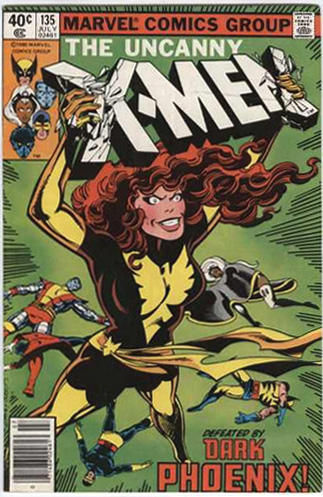
Uncanny X-Men #135. John Byrne. The first in our top 10, we have the last of the classic and groundbreakingly iconic X-Men covers. And it’s a doozy. Jean transformed into The Dark Phoenix, huge like a god, her teammates defeated at her feet, and her, literally crushing the X-Men title with her hands (a symbol of what she plans to do to the real things…oooooh!). A truly amazing cover, from one of the most famous (and notorious?) stories the X-Men and comics in general had to offer.
009.

Nightwing #124. Jock. I don’t even read freaking Nightwing and this cover has me totally bewitched. I mean are you kidding? The slightly stylized iconic hero figure (a trademark of Jock’s at this point), sailing through the air with perfect superheroic form, bent on who knows what destination, in the company of only blue sky and birds (or are they bats? I kind of love that they look like both). I particularly love in this cover how empty the right side of the page is, with all the action and the building anchoring the left. Really beautiful stuff. Somebody tell me more about this…Nightwing character…
008.

Detective Comics #745. Dave Johnson. How cool is this cover? I mean, seriously, try to convince me that you don’t want to be friends with it. I dare you. Because it is just fucking sweet. The totally desaturated city, the perfect iconic dark black streak of Batman shooting through the sky? It’s picture perfect. I love it. What’s that you say? Why don’t I marry it? You know what? I will marry it!
Update: I originally had this listed as Jock – don’t know what I was thinking – Johnson is clearly listed as the signature – chalk it up to too many late nights looking at these covers over and over again. Thanks to ramon and Greg who pointed out the error in the comments – and apologies to Dave Johnson and Jock!
007.

Love & Rockets #1. Jaime Hernandez. I know Jaime, I know you thought all these iconic superheroes had you beat…but don’t despair…I’ll never forget you. This great Usual Suspects type line up has been used dozens of times for comic covers, and will be used dozens of times more I suppose (even I’ve used it) but nobody does it better than Jaime Hernandez. Fucking beautiful.
006.

The Walking Dead #19. Tony Moore. The first appearance of Michonne, one of the most badass female characters ever created for comics. How can you not fall in absolute love with a bitch that shows up with her dead zombie boyfriend and his friend, both armless and chained up behind her, so that it keeps the other zombies off her scent? Also, she has an equally badass katana blade as her only weapon. Hello, I think I love you.
005.

Batman: The Dark Knight Returns #1. Frank Miller. With The Dark Knight Returns Frank Miller changed Batman forever and blew our minds in the process. And he started with this unbelievably powerful and iconic cover. I don’t really think I need to explain myself here…just bask in the glory.
004.

Black Hole #4. Charles Burns. Oh Charles – what a devil you are. I LOVE this shit. First of all the colors are just off the charts amazing here (and I don’t even like purple) and if you’ve read Black Hole, you know exactly who this girl with the tail is and how great it is to see her here eating a sandwich…naked. It’s just one of those great covers that grabs you by the collar and shakes you until you wake up from the pathetic coma of your life and you slowly walk to the register going “must…must know…what lurks inside…”
And lucky for you one of the greatest stories ever told is inside. Congratulations.
003.

Fables #71. James Jean. In my next life I want to come back as this woman. And that’s the outfit I want to be wearing. Other than Jean having reached into my head and plucked out my dreams and fantasies and put them on the cover of a comic book for all to see, I think the thing that I love most about this cover is that this woman is like bottled sex, and yet she’s showing about an inch of skin. I mean, I don’t want to sound like someone’s grandmother here, but I think the ladies of today…and the idiot boys that follow them around…and the artists…and well, all of Hollywood…could learn a little about sexuality and class by looking at this cover. You don’t have to show it all for everyone to know what you have. You can be the most beautiful badass on earth, and you can do it wearing a parka…just ask Jean to show you how.
Oh – also, lots of white space – loooooove it!
002.

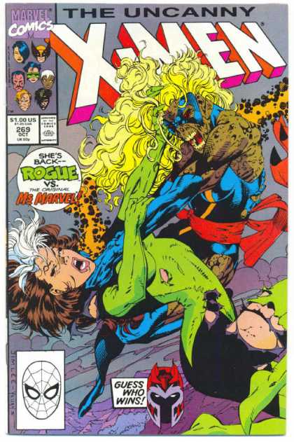
Uncanny X-Men #269. Jim Lee. I know, I know, how on earth is this cover better than The Dark Knight Returns #1…and how dare I put a Jim Lee cover as number 2 of 100 covers when so many other (more) talented artists barely made the top 25. I know. And I understand if you throw rotten fruit at me.
But the sixteen year-old in me would just not be silenced here. As a teenager I loved Rogue like I loved nothing else. She was the be all end all comic book heroine for me, and quite frankly, though I am now WAY past being a teenager, I still love her. I seek her out all the time. Unfortunately, countless writers/editors/heads of places that rhyme with CARVEL have ruined her…or at least ruined who she was to me when I so fell in love.
Regardless of that though, this was my single favorite comic book as a child and I must have read it a thousand times. In fact, my copy is in really shit shape (anyone have a spare they want to donate?).
There are so many things wrong with this cover. The floating Magneto head? Lame. The text bubble proclaiming unnecessarily who we’re looking at? Lame. The weird grey maybe it’s mountains…maybe it’s sky…maybe it’s both background? Lame. And most lame of all, something that bothered even my sixteen year-old self – the colorist fucked up the coloring on the title – some bits are pink, some are orange…or if that’s not a fuck up I hope that guy was immediately fired for thinking hmm..pink and orange? That will look awesome!
But let’s talk about what’s great about the cover. Rogue looks the best she ever has or ever will. In her sweet green and black costume, with the punk rock hair, the skunky stripe, and sass to spare. For my money, back in the day, nobody drew Rogue as well as Jim Lee. Silvestri often got close, and Art Adams gave them both a run for their money, but Lee wins out.
On top of looking awesome, she’s fighting a decaying zombie-like Ms. Marvel – how does it get better than that?! Additionally from an illustration point of view the cover is completely kinetic, with wonderful action and great positive and negative spaces created by our two dueling figures.
But at the end of the day, it’s really just about me, seeing Rogue on the cover, and knowing she was not only back, but that she was going to star in her own issue (or maybe a whole arc!). It was the best feeling ever. And despite its flaws I still love this cover…almost above all others.
001.

Batgirl #45. James Jean. WIN! And bonus points to those of you who have been reading this blog long enough to recognize this:

That’s right, before I manned up and did my own header (which is super lame in comparison to this) I borrowed temporarily from Jean to start this blog off and running. It was actually a horrible mistake because I fell so in love with it that changing it to something terrible that I had created myself felt like cutting off an arm. But it was unfair to “borrow” from Jean, so I sacrificed the arm.
Anyway, what is it that is so perfect about Jean’s cover…that makes is so deserving over all the others?
Well for me it’s a combination of so many things, beginning with the look on Batgirl’s face. A look that can basically kill – don’t look too close – seriously. The painstaking attention to his Batgirl figure here juxtaposed with the incredibly graphic and stylized villian she’s making short work of, and mingled with the patterned background…well it all just comes together and makes pure magic. I don’t know. Beyond that I can’t really describe it to you. I mean it has all the things I’ve been going on and on about for days here – the positive and negative space, the dead on color palette, the kinetic action of the figures flying across the page, the white (er, cream) space, the stylized figures, and the almost graphic design quality, it’s all here. Plus, as a bonus, the Batgirl logo (though not Jeans’) is one of the better logos around – with that off-center bat full of movement with her little dark eyes.
Well, I just can’t describe it more than that. I think, though I knew doing this would be challenging and highly personal, I didn’t realize until just now how hard it is to really describe what moves you inside. What makes you want to read a comic, or paint a beautiful illustration, or be a superhero. It’s all very personal and subjective. But for me – this is it.
Thanks for reading everyone! I hope you all enjoyed it, even when you didn’t agree. The hits for these posts went through the roof and I just wanted to thank everyone who stopped by and I hope some of you found something interesting here on 1979 Semi-Finalist and will be back! 🙂
-
I like the concept of this series of posts and your content is interesting and personal. I also like that your top cover is unexpected. I wanted to know what your favorite was and had forgotten about that Batgirl cover, so it was a surprise, a good surprise.
I think there is a lot to disagree with here and it tempts me to put up a list of my favorite covers (though not 100). It is a personal list though, so what can I really disagree with? “You don’t like that cover more than this one.” That doesn’t work.
-
Wow, this is great :] I really enjoyed reading through all of this, and it really made me realize something… I’m TERRIBLE at covers. I assume I’m not alone in this but damn, I’ll never be able to do anything even close to the caliber of these pieces.
Again, it was an awesome read, totally inspiring…and it kind of makes me want to try my hand in drawing superhero comics. Maybe one day.
-
Adam: How did I know you would disagree? Of course you would! But thanks for the compliments anyway. The post took forever. I doubt I would have ever finished if I’d been gainfully employed. It was just too massively time consuming. But I enjoyed it – and the hit ratio pay off has been tremendous as you know! 🙂
If you’re really going to do a post don’t tell me – but if you’re just talking big then tell me – what would be your number one cover?
Tara: Thanks. Yeah, doing this half made me want to work so much harder on becoming a more “legitimate” artist/illustrator and half made me want to give up all together. So many talented people out there. It’s incredible. Do you have a favorite comic cover? Maybe some Scott Pilgrim? 🙂
You should totally try drawing some superhero comics!
-
All of these are great picks, Kelly, but the cover for Uncanny X-Men #141 really hits home for me. I’m instantly back in the local shop, sifting through boxes and boxes of cheap comics. I remember grabbing it the moment I saw it, already in love with X-men, wondering how I’d missed such an issue/storyline. Then I went and lost in sometime between high school and college.
It’s also nice to see the image where your (old) header came from.
-
Once again you are as sharp as you were when we were in class together old chum. As you kknow I have my own opinions…it seems we are not entirely off sink on this one. I will leave you with my thoughts on the covers I admire on your list…a lot…I pock a few holes here there, just to spice things up. The choice for number one (Jean’s) is both very you and a strong selection. I also love 2 (Lee), 4 and 28 (Burns…I have yet to dive in to this series…but there are few who can compete with his covers), 5 (Miller, any of these would have been strong choices), 8 and 9 (Jock, this is one of those covers that you know will juet let you down when you open the book…but boy is it enticing), 13 (Ware, but honestly this is his worst cover), 14 and 37 (Gibbons, again any would have been good), 18 (Byrne, he did a she-hulk that should have made the cut), 19 and 78 and 82 (Cooke, does anyone working today get it about DC comics better then this guy…he captures the hart and sole of an era), 20 (O’Mealia, I had never seen this before…so cool…there should have been more pre marvel age stuff on this list), 30 and 139 (J. Hernandez…these covers corrupted my childhood), 31 (Sienkiewicz, you ever have those moments that solidified your love with comics…staring at this cover for hours through the window at comics and comics in Berkeley while skipping camp waiting for the store to open…that was one of those moments for me), 40 (Tomine, while not my favorite of his early issues covers…these books still make me home sick), 45 (Kirby), 47 (Smith, pure), 53 (Shuster…has anyone read about how superman was not the first superhero), 68 (J. H. Williams III, again not my favorite of his), 70 and 79 (Silvestri…79 maybe my favorite of his…I remember it blowing me away), 72 (Clowes, could be my favorite cartoonist and this could be his best cover), 80 and 88 (Davis, still my favorite to draw X-Men and these aren’t even his best Excalibur covers), 81 (Mazzucchelli, is an amazing teacher and cartoonist…this cover is only a small facet of his success from marvel to DC to City of Glass to his latest book he is amazing), 85 (Adams, this cover made the Uncanny X-Men my favorite book even when is sucked and Longshot my favorite superhero of all time…plus it made the Dazzler cool), 90 (Ross, message from adolescent Ben: if you admire the female form it is hard to resist this…more power to you when it comes to covers Ross…despite what I think of your effect on comics from time to time), 91 (Eisner, can’t think of a better cover by this master of composition…), and 92 (Sale, before I noticed Cooke, I noticed Sale).
-
Paul: Thanks for reading. I’m sure you can imagine (especially since you’re doing a list of your own) how time consuming and almost aggravating it is do do a list like this. It sounded fun when I started, and I’m glad I did it, but man it was difficult. Also, almost instantly after hitting ‘publish’ I thought of ones I wished I’d included…or at least re-considered. Maybe I’ll have to do it again in a year and see what’s changed my mind. 🙂
Ben: Thanks for reading…and for commenting. I’m glad you’re a fan of at least some of it. It’s really hard to nail these down, the choices are so personal. And how much do you base on memory and feelings, and how much on actual artistic perfection/style. It killed me in some ways to leave some of those covers in and have other artists with brilliant work fall by the wayside, but they still had power over me, and deserved to be included.
Did I read correctly that you haven’t read Black Hole yet? That can’t be right. If it is though – what are you waiting for!?
-
Chris Gardner did that Batman logo. Personally I like it, and it really keeps a tradition of Bat Logos. Here’s a little history on it.
-
-
‘tec 745 is by dave johnson (his sig’s on the lower right of the cover), not jock. 🙂
-
What a great roundup!
“Detective Comics #745. Jock.”
One of my absolute favorite covers of this era, but also a slightly correction—it’s by Dave Johnson, not Jock.
-
McGone: Thanks for commenting. I still hate that logo – but your link was great – it’s awesome to see that evolution.
ramon: Thanks for the correction! I’ve updated the post.
Greg: Thanks to you as well (again) – I updated the post! I’m so glad you enjoyed the list. It’s highly subjective, as all lists are I suppose, but I really enjoyed doing it. I do have a lot of “ah man, I wish I’d included that’s” though, which sucks. I guess I’ll just have to do another one next year and see how much changes. 🙂 I hope you come back!
-
Oh, I’ll definitely be back — that’s what RSS feeds are for! Thanks for putting the good reading out there and I’ll browsing the site from now on.
-
What, no love for Dave Stevens? The Rocketeer No. 1 should be in there somewhere. It’s #1 on MY list, anyway!
-
And what about The Tick? Ben Edlund did amazing covers for him.
-
Greg: Glad to hear it!
Chris: Dave Stevens was an amazing illustrator, however his work is a little female pin up girl/female exploitative for my tastes…his Rocketeer stuff being the notable exception…and that #1 cover is even prettier than I remember. It’s a solid suggestion…I can see why it would be on your list…and maybe why it should be on mine 🙂
I love the hell out of the Tick and Ben Edlund, but I do find The Tick style a bit cartoony for my comic cover tastes – in general. If I was doing a list of books instead of covers – The Tick would be on it though.
Thanks for reading – come on back sometime!
-
Some gorgeous works in your top 100. I would recommend you check out some of Mike Zeck’s Marvel covers – particularly from Kraven’s Last Hunt. He has some powerful and iconic works of his own.
Very glad I stumbled across this, you have a great eye. -
Pingback from Las 100 mejores portadas de cómics on August 19, 2009 at 11:45 am
-
Thanks for putting in the effort to create this list…my prime nostalgia years are late 70s/early 80s but still enjoyed reading your descriptions. Didn’t see much from the top artists of those days that worked on X-Men (BWS, Adams, Steranko, etc) so you may want to check some of those out–also, a popular cover by BWSmith is Conan Vol 1 Issue 24 cover with Red Sonja–although the detail and may not be your style.
-
Mark Levy: Thanks for stopping by and for commenting. I’m glad you enjoyed the post.
I did actually have a couple Neal Adams and Steranko covers in the running (although the Steranko I had picked out were a Punisher and an Avengers I think – not an X book – Steranko actually did very few comics covers – but they were all pretty beautiful) but they just didn’t make the cut…perhaps a mistake. That Conan issue is pretty great – a lot of energy and movement to it – you’re right that it’s not really my style as far as the details go – but definitely a fantastic cover.
-
Pingback from » Portadas de comic on September 16, 2009 at 10:49 am
-
Man there are some good covers here! If you like covers that are really white, you should check out the cover to Alpha Flight #6. Also, for negative spaces and stuff like that you should take a look at issues #2 and #8 of Moon Knight. (First series)
Just for fun, I’m going to put down a list of some of my favourite covers:
Amazing Spider-Man #122
Alpha Flight #130
Daredevil #182
Daredevil #184
Daredevil #200
Moon Knight #2
Moon Knight #8
Uncanny X-Men #143
Uncanny X-Men #163
Uncanny X-Men #165
Tales of Suspense #80 -
Harry: Thanks for stopping by – I’m glad you’re enjoying the covers. That Alpha Flight #6 is a great example of white, I think it didn’t make the cut, just because the drawing on the figure is so simple, almost too simple, in the face of such an all white cover. I like it a lot though. For Moon Knight are we talking about the Sienkiewicz covers? They are nice. I think I have never really read Moon Knight, so it doesn’t spring to mind as powerful imagery for me, but they are nice (everything Siekiewicz does is nice!)
You have some really nice picks. Of note is that CBR picked Uncanny #143 in their top 5 iconic Kitty Pryde covers earlier this month. Also, Daredevil #200 is sweet. I’ve never really been a fan of DD #182 – but TONS of people are. Interestingly enough, I love Uncanny X-Men #165 – but have you seen Mignola’s cover for the reprint of #165, I think it’s X-Men Classic #69. Both covers are great, but since I’m a girl that loves white space and lone figures…I think #69 is going to make my (coming soon!) list of 15 covers I wish I’d included.
Thanks again for reading and commenting.
-
that was a great batgirl cover. i loved that one. and i always liked the original costume.
-
All-in-all these are some solid choices. Seeing as lists are subject to personality, personal history and individual taste I have to agree on a large number of your choices. Superb art by talented artists. I’m sure I would my own list would be far different, as your list was the first time I had seen some of these pieces. I have always had a soft spot in my heart for Arthur Adams and Bill Sienkiewicz. You have stoked the fire of my own thoughts and I will have to share my list with you when I’ve finished.
Thank you,
David -
As the saying goes, “There is no accounting for taste.”
-
Charles: Me too. It’s likely to be my favorite for many years coming. I rarely see such a great combination of character and movement and white space, negative space, and graphic design elements.
Fanboy 77/David: Please do come back and share your picks. I’d be interested (as I always am) to see someone else’s take. As I mentioned upthread…I’ve since reconsidered some of these (pretty much since I hit publish) and if I had to do it over again I’d definitely make some different choices…it will still please nobody 100% though 🙂
Von Weeks: The saying does go that way. How observant.
-
Pingback from The 15 Covers I Wish I’d Included… « on July 20, 2010 at 5:37 pm
-
What a fun list! (I didn’t start reading you until this year, and I’m glad you linked this) I love the explanations for why these covers worked for you, what made them important, what made them great for you. And smart call on being clear that this is a personal list: it cuts down on the whinging later!
I have to say, I kinda love having Uncanny X-Men #269 clock in at #2 here. It’s a great cover, and I think you’re right: Jim Lee drew Rogue better than anyone. (and I tend to agree with your 2nd & 3rd choices in Silvestri & Adams. I kinda like Bachalo too)
I was a little surprised Walt Simonson didn’t make your list anywhere, but I suspect he wasn’t drawing books you cared about very often. Still, if you want iconic, cosmic covers, check out Simonson’s Thor work again. Gosh, it’s good.
-
Pingback from 52 Favorite Comic Covers Of The Year « on July 24, 2010 at 6:37 pm
-
Okay, I have to ask, since you mentioned it for entry #19… just how many covers DID you find of women carrying men, and do you have samples or references for them? I’d really like to know! (Not that I mind all those covers of the guys carrying the gals, as long as the art’s well done, but hurray for equality…)
-
Most of the times i visit a blog I notice that most blogs are amateurish.On the other hand,I have to say that you have done a good job here.
Comments are now closed.
BUY THE BOOK!

BUY THE BOOK!

37 comments