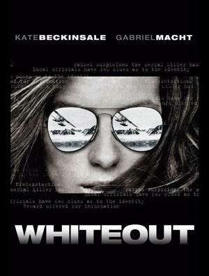
So I saw this first poster for Whiteout LONG ago, and thought it looked pretty badass. It got my hopes up a bit that they might not botch the translation to film.
Then I saw the trailer and thought it looked pretty “eh”
Then I realized they recast the other lead female role to be a man and I said “F U Hollywood. Why you messing with awesome shit that already WORKS!?!”
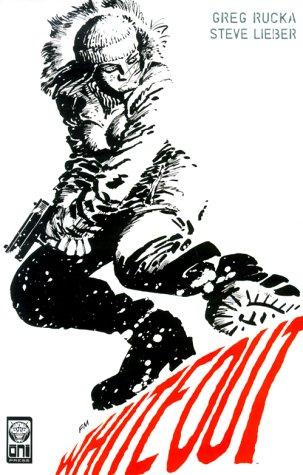
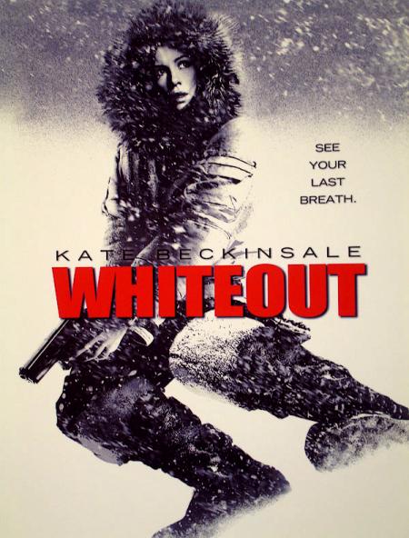
THEN, just yesterday I saw a NEW poster for the film and my heart when all pitter pat, pitter pat. They did SUCH a good job emulating the badass Frank Miller Whiteout TPB cover. Check it out:
Nice – right?!
Man, I’m such a sucker for things that look good.
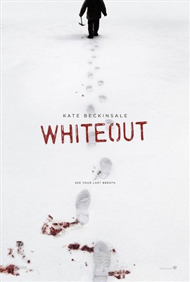
There’s also this poster, which I think is mostly great. It’d be better if you could tell the figure is a woman – although that’s tough to do in a parka…
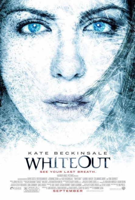
And then there’s this new one, which is mostly blech. I mean, it’s very pretty (Kate Beckinsale IS very pretty – it’s hard to hide that kind of prettiness) and the effect of the ice is nice – but it so doesn’t speak to the strong visuals that already exist for this book – and it doesn’t really give you any clue what the movie is about – so why make something so ordinary and non-impactful…? I guess just because we’ve learned that people respond to pretty? Bah. I’m so bored with pretty.
Anyway, I don’t know if I’ll actually see this in the theater – so far as I can tell the score is dead even 3 points for, 3 points against. Anyone care to push me one direction or another?
-
I give points for the Miller homage — but Beckinsale looks more frightened than determined in the pic. The rest is all seriously “meh” to me, and the trailer — yeah, ick.
The problem, I think, is that Beckinsale is *too* pretty. And they can’t pass up doing pretty pictures of her. And that’s so not the character (at least from the comic).
Unless I hear monstrously good word of mouth, I’ll be giving this a pass (which kills me, as I loved the original and Rucka’s work in general).
-
Hey Kelly!
I actually worked on this! we built an airplane interior for some pick up shots. I hated the job. Near the end of the job I stabbed myself in the palm with a #11 x-acto blade and wished I had done it sooner to get out of it. Rebecca just showed me your post about Walking Dead. A friend of ours has been lending us the comic and we are both hooked! We wonder how they can make it a show that is NOT so depressing that you end up not wanting to watch it. The comic walks that fine line so well.Hope all is well you rockstar.
-
Dave: You’re totally right…the poster is still not as good as it should/could be, but I’m still giving points for the Miller homage. Beckinsale is definitely too pretty for the role, but you know how it works – they’re never going to cast someone medium pretty when they can get super pretty. The good news is that though I don’t always love Beckinsale, she has turned in some pretty good performances (Laurel Canyon is a particular high point for me).
Also, that first teaser poster? Not that they uglied her up, but they did a nice thing where her jaw looked more real and less perfectly oval…it looked real. It looked like a woman that lives in the freaking wilderness and doesn’t wear any make up except chapstick. So I was intrigued. The last poster loses ALL of that. Big fail for me.
Brian: I’m sorry it was such a bummer to work on – but knowing that your genius hands touched it kind of gives it slightly more credibility…TWD is my absolute favorite – I’m so excited/worried. Prepare to cross fingers for like…eighteen months I guess

PS – saw Otto’s new picture on the website – almost died from the cuteness.
-
I’m about 90% sure that’s not supposed to be Beckinsale in the poster with the footsteps and parka.
Comments are now closed.

5 comments