Detective Comics #854. Greg Rucka (writer) J.H. Williams III (illustrator). Fiction – Comics.
First, a confession. I really haven’t been reading mainstream comics. Sure every once in a while I pick up an issue of X-Men, Batman, or Wonder Woman and such, but with the exception of The Walking Dead (and until recently Buffy) I’m never that impressed and so I never bother to keep up. Comics often disappoint me. It’s possible my expectations are just way too high, but comics are just never quite what I want them to be…maybe more to the point…what they were to me in the beginning when I so fell in love. So, especially unemployed, I can’t afford to spend the money unless I’m almost in love. Did you know an average full color comic is four bucks?! Ah, the good old days when they were $1.50…sigh…I’m so old…
Anyway, I only tell you this, so that my review can be taken in the full context of me as a comics reader…compared to the super committed fan. But onward…
[SPOILERS]
The Good: It was well written and fairly easy to follow considering the fact that with most mainstream comics you need to pick up about a thousand issues to understand what’s going on if you just jump on board randomly. I thought Rucka did a good job of juggling both the existing fans that maybe have read those thousand issues and new fans that might be trying out Detective Comics for the first time (since there has been such excitement over Batwoman’s premiere).
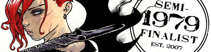
So the writing is solid throughout, but it’s the art that’s likely to bring fans back in droves. The art is stunningly good. From the Batwoman/Kate Kane basic design and execution to the individual pages and panels – really just gorgeous stuff. Huge credit is also due to Dave Stewart who did the colors as they are just absolutely dead on and badass.
If we must deal with the whole ‘lesbian thing’ – and I think it would be the most progressive of us if we didn’t even have to talk about it – but we’re clearly not there yet as a society so I’ll comment.
I think it was handled perfectly…in that it wasn’t really handled at all. The scene that gives a glimpse into Kate Kane’s flailing personal life is honest and matter-of-fact, the way I’d expect any other relationship to be handled and so for that, I’m happy. And I hope it continues as such. Time will tell. Rucka tends to write strong women well, whether lesbian or not, and so I have faith that he can handle Kate Kane and all her intricacies.
The Bad: The Batwoman costume design is so perfect – I mean look at those totally sensible – totally badass non-high heeled boots! – that I’m willing to forgive some sins. I mean really…bright red? It looks fantastic on the page, but let’s face it, what ‘creature of the night’ would wear fire engine red on their costume? Anyway, I’m willing to forgive the red, because I am just that generous, but I’m not going to go along with this ‘hair piece thing’.
For those who haven’t seen the designs or read the issue yet, Kate Kane has short very red hair (see below), but as Batwoman she has this same very red hair, but very long and flow-y (see above). They do make a minor plot point out of it in this issue as Batman makes an offhand remark about it (stating that the long hair is a liability), and it is revealed a few pages later to be a wig attached to the mask/helmet. I suppose making Kane seem ‘oh so clever and unpredictable’. But this is forced characterization to me, and one that doesn’t actually work, so I find this annoying and kind of frustrating. Let’s explore…
Do we have this hair situation just so we can have that moment between Batwoman and Batman? If so, it’s not worth it.
Do we have the long hair because we “think it looks better on the page”, much like the fire engine red in the costume? If so, I say we should have broken some boundaries there as well – like with the boots and gone for more realism…especially if you want me to buy all the bright red.
It should also be noted (as seen above) that it totally absolutely does NOT look like a wig attached to a helmet…it looks like hair, or MAYBE a wig attached to her head – which we all know would never stay on in a fight.
And as I obsess over this tiny (and really, let’s face it, totally insignificant detail) I realize (as we all eventually do) that Batman is still right.
The hair is a liability whether it’s real or not. The hair getting pulled as real hair might hurt more – potentially ending a fight by taking our hero down – but if it’s a wig attached to the mask it’s highly likely to aid in yanking the mask off…which is a huge problem.
So at the end of the day, Batman is right (as always) and Kane actually ends up looking a little weak, which I think is probably the opposite of what Rucka intended. Bottomline: Kane should ditch the wig. If she’s concerned about being identified I say she goes with a full head mask/helmet like Batman. If that’s not the concern then no reason her regular awesome short hair can’t be the hair that goes with her badass costume.
But when this is the only complaint I can come up with for “The Bad” you know you’re doing something right.

The Ugly: Not an ugly thing about this book. Personally, I found the action page layouts to be a little fussy and unnecessarily difficult to follow. But I think that’s personal taste. I tend to prefer more standard/basic comic book layouts – whether action scene or not. Although I have to give credit to Williams III, if you’re going to do crazy layouts, do them as well as he does – they’re well thought out and from a graphic design standpoint are quite frankly stunning. I just happen to prefer readability to graphic design achievement (in comics that is).

one of the less complicated action pages
Overall I give this issue 4.0 Stars (out of 5) and I will definitely be following along…until I’m totally hooked or until these guys screw up. So I’m in for another hand…at least.*
*I didn’t want to confuse the issue by also talking about the “Second Feature – The Question” eight page story in the back of this issue, but it’s a good story – well written and well drawn and is something I’m excited to read – which is rare – usually those “second features” are total throwaways – so nice work Rucka and Hamner.