book reviews

You are currently browsing the archive for the book reviews category.

Two new blog reviews went up today for THE GIRL WHO WOULD BE KING – both rate the book 4.5 stars.

The first is from THE PREEMINENT LITTERATEUR and TGWWBK was the first book read in her Theme Month for March – “GIRL SQUARED.”

Caitlin sums it up as: “My love for this book has been like a stick of dynamite with a long fuse. It snuck up on me, and now I am eagerly awaiting sequels and movies.”

The second review is from Miranda from ON THE NIGHTSTAND and she sums it up as “everything [I’ve] ever wanted in a comic book, in book form.”

Thanks Ladies!

You all know where to buy the limited edition illustrated hardcovers, right???


Tags: , , ,

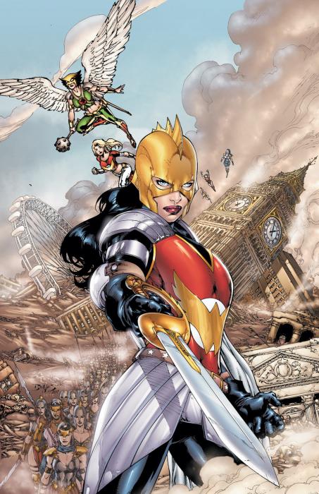
““Wonder Woman And The Furies” #1 is a book I did not expect to like given some of the promotional material and my dislike of seeing the Amazons presented as crazy man-hating warriors thirsty for blood. However, against all odds Dan Abnett and Andy Lanning turn in a fairly interesting story that sets a reasonable stage for the war fans know is coming crashing through “Flashpoint” this summer…”

Read the rest of my review on CBR here.

As always, likes and tweets appreciated, and you can read all my CBR reviews thus far here.

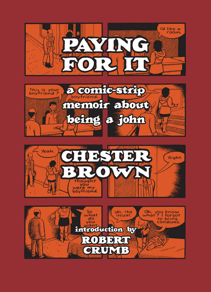
My review of Paying For It is up on CBR.

Also, the review made the CBR front page today…so you know that means it’s good! 😉

As always, likes and tweets are much appreciated!

And you can check out all my CBR Reviews thus far, here.

Tags:

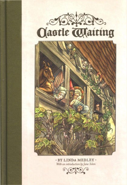
New SHE HAS NO HEAD! is up – a review of Linda Medley’s excellent tome, Castle Waiting.

Tags:

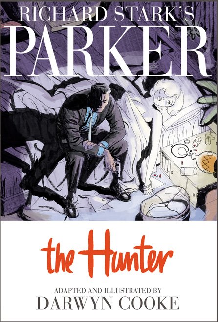
Parker The Hunter Cover

Parker: The Hunter.  Darwyn Cooke (Writer/Artist).  Comic Books/Graphic Novels.

I have been salivating over this new Darwyn Cooke adaption of Richard Stark’s Parker for months, and finally, to “reward” myself for finishing my big novel revision, purchased it at Jim Hanley’s last week and then devoured it in one sitting – my preferred method – swallowing it whole – going back for second reads later.

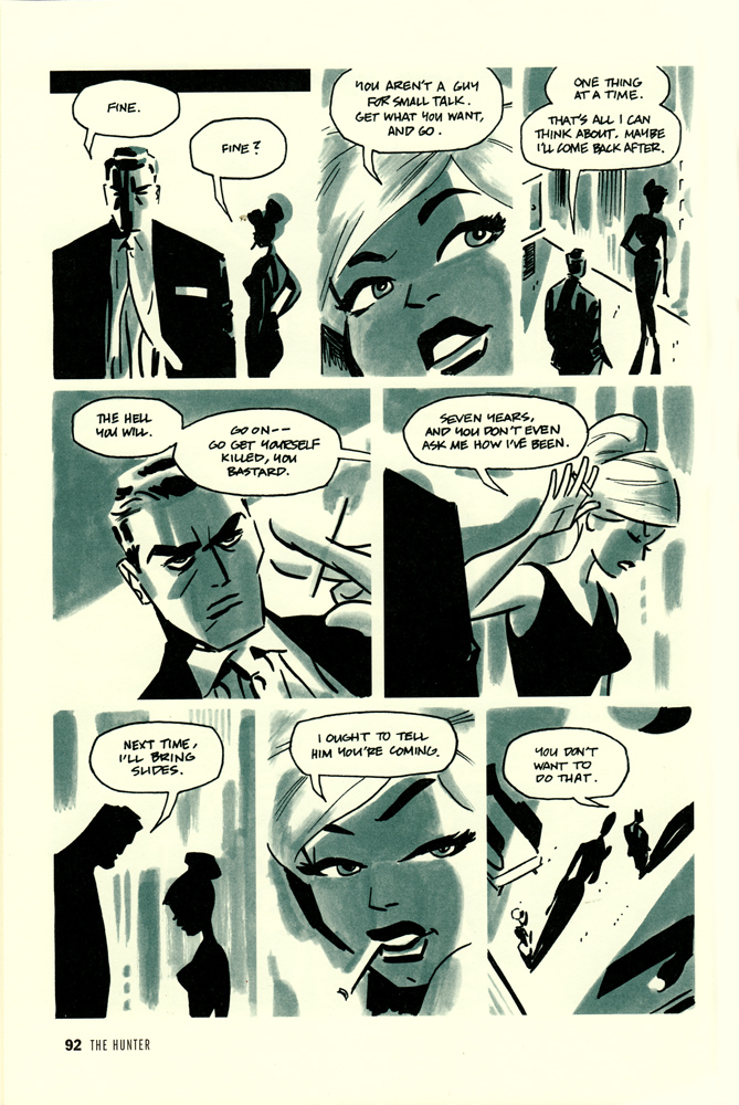
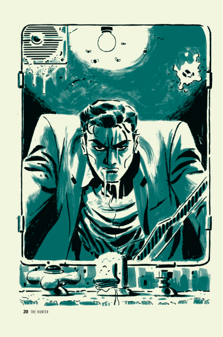
It’s a beautiful book.  I’m a huge fan of Cooke’s illustration/penciling work (see his many covers in my Top 100 list – including one in the Top 25), and this is no exception as it is picture perfect.  Individual panels being matched in beauty by the overall pacing and muted color palette.

I have not read the original material, but I assume Cooke was fairly faithful, it certainly feels authentic.  I think my main issue with the book, lies not in Cooke’s hands but in Stark’s hands (though I cannot be 100% sure without having read the original material) and that issue is primarily that I tend to have some drama with these kinds of noir/detective-y books.  I love a good detective yarn, and who doesn’t love noir?  But as a card carrying (and ranty) feminist, it’s easy for me to get my hackles up about the female portrayals in the traditional noir style.  They’re always gorgeous femme fatales and bitches that would betray you for a nickle.  And while I’m happy to read that character, I get a bit annoyed when that’s all there is.  And in this particular story all we have are a betraying wife and a handful of hookers.  Now I suppose it’s a given that Parker runs with a more criminal crowd, but it would be nice to see SLIGHTLY more variety there…and perhaps more importantly all the women here are portrayed pretty strongly as victims.  So it’s even a step down from the ‘betraying femme fatale’ type, who though not exactly revolutionary, is at least a strong woman with a plan, whereas here we have more of the ‘worthless beautiful victim’ type.  Boring.  At least as drawn by Cooke they are stunningly beautiful images.

Parker The Hunter page

[SPOILERS}

The story sets up well with the badass master thief Parker penniless and looking it, but thumbing his nose up at offers of a ride.  Once in the city he fakes an i.d. (much easier back in the day) and makes off with someone’s entire bank account.  Well on the road to being all fixed up – clean (ish) and in a suit, he hunts down his old flame, that has betrayed him – ‘natch.  Parker does away with her in an extra special way and moves on, following the trail to the man that set him up, betrayed him, stole from him, and got him sent to prison.

parker

My one complaint in the story (other than the female characters issue) is that everything comes REALLY easy to Parker.  I mean, I love that he’s the ultimate badass, but there’s very little tension in that there’s just no doubt in your mind that he’s going to get his man and come out the other side smelling like roses.  He is perfection…well when perfection comes as revenge and badassitude.  And because of that, because there is no weak link in his armor – perhaps his one weak link is his presumably now dead feeling for his wife – but since he offs her first it leaves him free of any weakness – there’s not a lot of surprise in how it all works out.

If I hadn’t been spellbound by Cooke’s artwork, and drawn panel to panel by the beautiful pacing, I think I would have noticed that the actual story was leaving me pretty cold.  it’s a masterful feat for Cooke, which makes me appreciate him all the more, but regardless of the skill involved, I didn’t think of the book once after putting it down, there just wasn’t enough story to stay with  me.

Ultimately it made for a beautiful but uneventful read.

4.0 Stars*

*on illustration alone I’d give it 4.5 stars easily, but for story, I’d give it a 3.0.  I’m going to give Cooke’s illustration the upper hand and split the difference at 4.0

BG Cv1 VAR.qxp

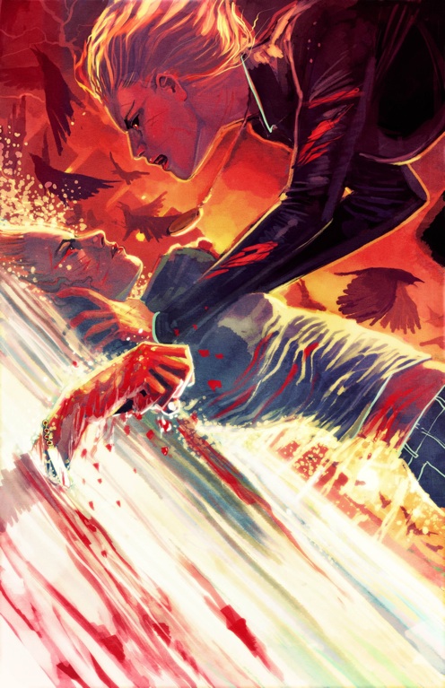
Well, they revealed Batgirl’s identity in the first issue, which is good.  And I have to take back my bitching and moaning about the idea of trying to drag it out.  Officially, thank you DC for not dragging it out.  Unfortunately…

SPOILER

Read the rest of this entry »

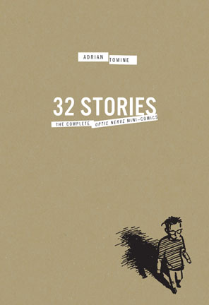
32Stories.indd

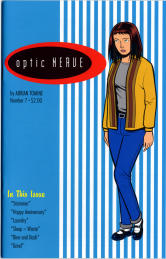
32 Stories: The Complete Optic Nerve Mini-Comics Box Set.  Adrian Tomine (Writer/Artist).  Comic Books/Graphic Novels.

I’m a huge fan of Adrian Tomine’s later works – Summer Blonde, Shortcomings, every New Yorker cover he does – but I largely missed out on his early Optic Nerve mini-comics, so I was delighted to see Drawn & Quarterly release this gorgeous box set of his original mini-comics (Optic Nerve #1 – # 7).

I dug into them this past week, and it was such a great experience, I doubt I can accurately explain how much I enjoyed it.  Reading them seemed somehow both progressive and also like a total throwback to when comics used to really genuinely make me happy.  It’s also great, as I’ve discussed before in relation to reading Alison Bechdel’sDykes To Watch Out For collected , to be able to see the evolution of a writer/artist in one sitting like that.  Tomine’s drawing, inking, lettering, his very style evolves before your eyes and it’s a wonderful thing to behold – to see an evolution captured like that.  Not that issue #7 is better than issue #1 – just different.  There was a real rawness and almost sloppiness to the early issues that I loved.  But it was amazing to see Tomine’s drawing slowly evolve more into the style that I’m familiar with today.

Optic Nerve

As I said there’s a real gritty and honest style to Tomine’s early work and when I realized that the first four issues of Optic Nerve were self-published by Tomine before he even graduated from high school I almost fell out of my chair.  Even with the rawness of it, this is an incredible accomplishment and really underscores the talent Tomine possesses.

Some of my favorite stories in this collection are: Back Break in #2; Rodney in #3; Adrian Quits His Job in #3; All Choked Up in #4; Haircut in #5; Mike The Mod in #5; My Appearance On The Jane Pratt Show in #6; Leather Jacket in #6; Allergic in #6; Smoke in #6 (#6 was my favorite issue); and Happy Anniversary in #7.

Adrian Tomine

I also really enjoyed the additions to the Box Set in the form of another book with an introduction and some special features including a handful of unpublished sketches and strips.  The best of this to me was Tomine’s discussion in ‘A Note on this Edition’ of another writer/artist having gotten a copy of his high school yearbook years ago and posting his high school picture on a heavily trafficked web forum.  Tomine talks honestly and frankly about how he felt about this (badly), how he dealt with it (badly) and how he feels about it today (not so badly – and to prove it that same high school photo is the cover of the introduction book).  But it really gives you some perspective – that no matter how talented and amazing we are (I will never in my life come remotely close to touching the badass-ness that is Adrian Tomine) we are all vulnerable and sometimes vain…but that ‘this too shall pass’ is something that really is true, and if we can remember it and laugh it off, we’d all be better off.

4.0 Stars.

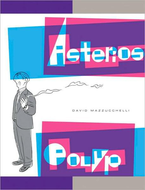
Asterios Polyp Cover

Asterios Polyp.  David Mazzucchelli (writer/artist).  Fiction.  Comics/Graphic Novels.

I am an idiot.  Why you ask?  Because I was not in favor of Adam buying this book.  You see, it’s thirty bucks and he’s trying to save up for a short film that he’s doing in September.  And so I was very naggy about the whole thing when he talked about how much he wanted to splurge and buy it.  Of course I never bothered to look it up.  If I had I could have saved us all a lot of naggy bitching.  Hell, I would have bought it myself and saved him the trouble.

HELLO GORGEOUS!

SOOOO worth the thirty bucks.  When I think of the other worthless things I’ve wasted thirty dollars on…oh the horror.   I have a secret Mr. Mazzucchelli…I would have paid $50…maybe even $75.  It’s stunning – the perfect blend of form and function…of art and content.

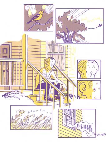
You want to see a little taste of what I’m raving about?  Here ya go:

asterios page

That’s not enough?  Okay, check out the Vulture Blog’s eight page excerpt.

I feel like just dispensing with the actual “review”, but for record’s sake, let’s do it.

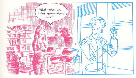
The Good: Mazzucchelli’s use of color, use of panel, use of white space.  His pacing and storytelling abilities – my god!  His perfect cartooning.  The heartbreaking tale of Asterios Polyp and the writing that blends seamlessly with the art…sometimes becoming the art.  A tale that flies in the face of simple and easy ideas like “karma” but also has a light of hope and redemption for our hero.  There’s a reason some pieces of literature get called “masterpieces” and there’s a reason we don’t throw that term around all willy nilly.  Asterios Polyp is a masterpiece.

ap panel 1

The Bad: Nothing.  I mean really, I can’t think of anything negative.  I read this book in one sitting, spending most of a long afternoon totally engrossed.  And I have to say, I can’t wait to go back and read it again.  I know there are still literally dozens of hidden treasures that I missed on first reading that will reveal themselves to me in each new chance I get to sit with it.   It’s a book I will enjoy my entire life.  Unfortunately it belongs to Adam.  Damnit.  If we had room for two copies on our shelves I’d get my own copy…just in case.

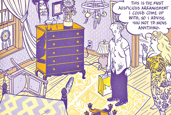
ap panel 2

I mean look at this!  Illustrating different people (in a relationship no less) in not only different colors, but with completely different styles and they talk with different text.  It’s brilliant and important.

The Ugly: The word ugly and this book should never be used in the same sentence.  Ever.

5.0 Stars

Essential Dykes to Watch Out For Cover

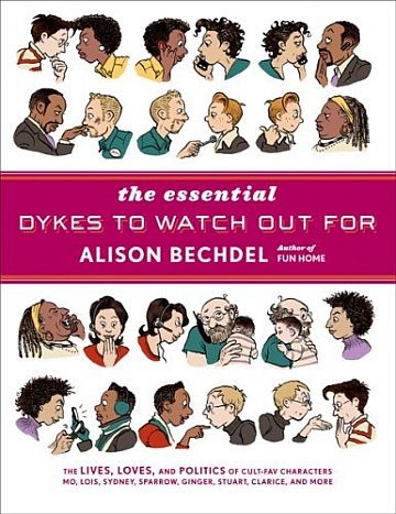
The Essential Dykes To Watch Out For.  Alison Bechdel (writer/artist).  Graphic Novels/Comics.

So I have a confession.  Though I have known Bechdel’s name for years and years (I went to art school and studied comics for christ’s sake), her book Fun Home: A Family Tragicomic was my first real immersion year into her work earlier this year.  If you read that review, you know I was pretty blown away.  This collection, blew me so away I don’t even know how to articulate it.

One advantage to learning about something suddenly and getting to absorb it all at once (or waiting for too long and absorbing it all at once – see my Y The Last Man post) is that you get the unique experience of just drowning in a new discovery – head first – and without having to look up.  I read Bechdel’s Essential Dykes in less than three days (and since it’s 390 full page, text heavy strips, that is no joke) but I could NOT put it down.  I just fell head over heels in love with these characters and all their beauty and flaws.

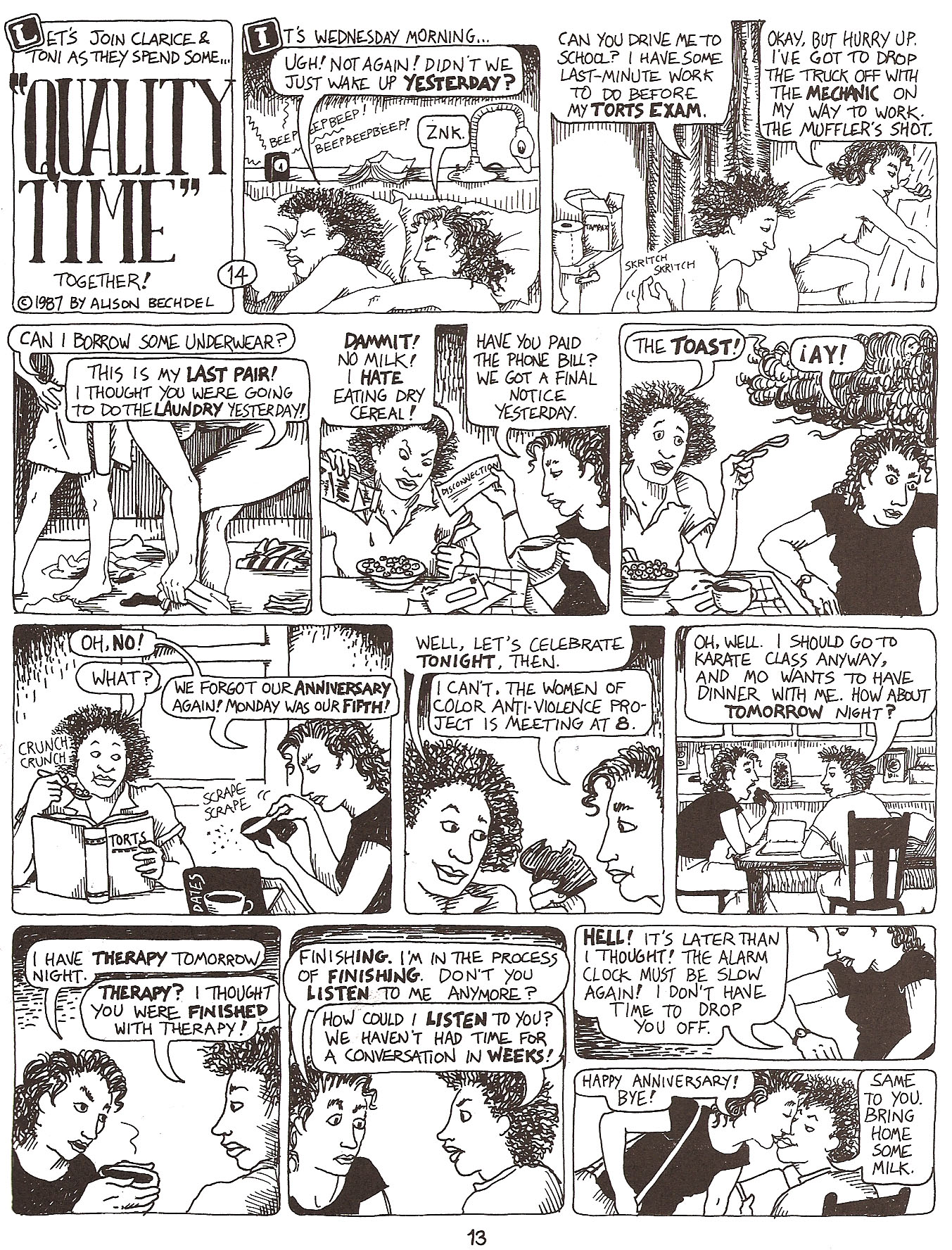
The Good: The absolute best thing about reading Bechdel’s work in a collection like this, maybe especially for me as an artist was the amazing experience of seeing her growth as an artist.  Read over time, because Bechdel was a great cartoonist from page one, I don’t know how obvious her evolution would be, but read all in a big chunk like this it was hard to miss the amazing transformation.  Check out the page below, an early strip in the collection from 1987 and featuring Clarice and Toni:
Bechdel 1

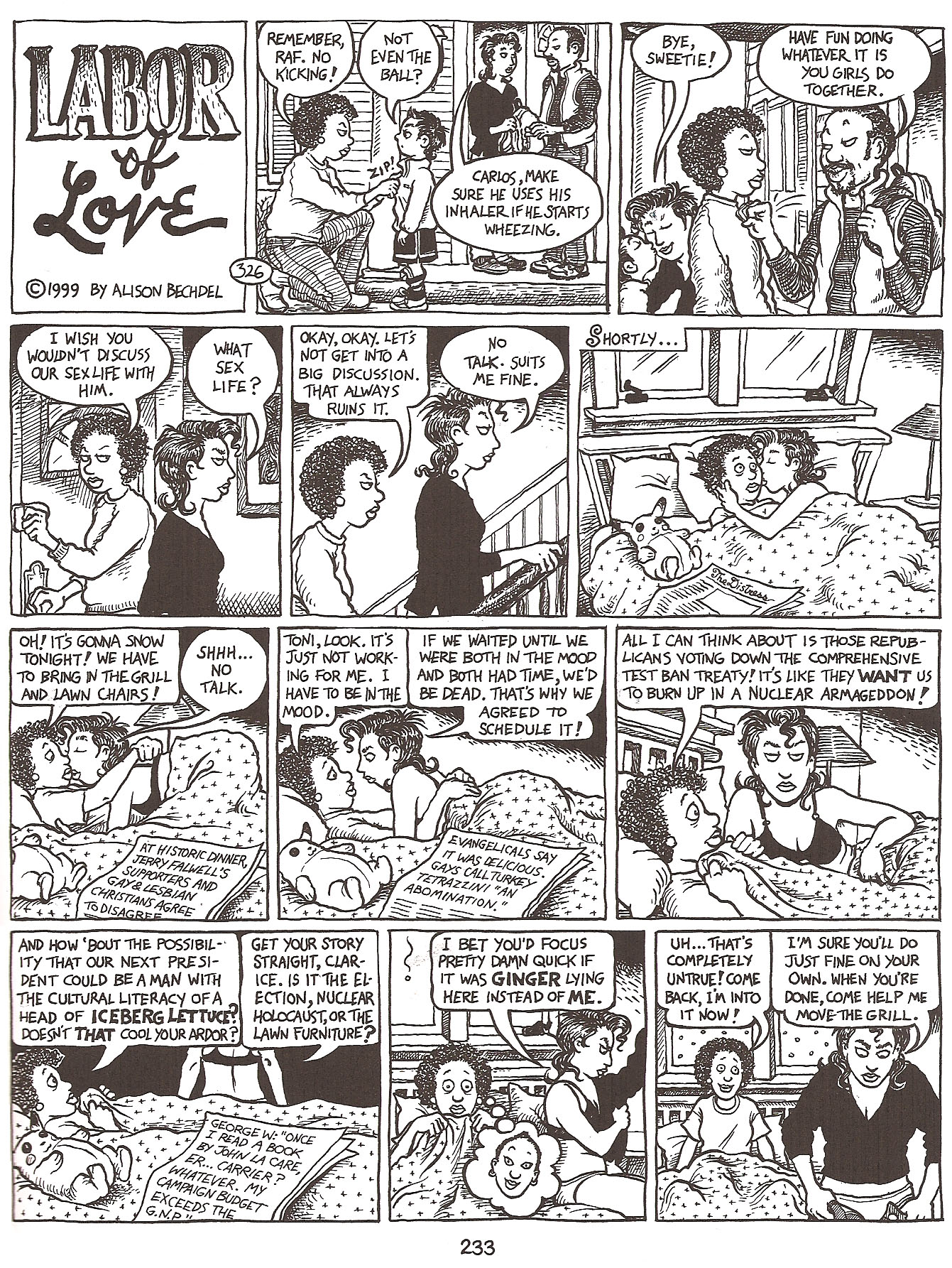
And a strip from 1999, featuring the same characters.
Bechdel 2

It’s just amazing to see the development, the characters are so much more refined (and defined) their looks really having settled in over the years, and Bechdel’s inking has so much more depth, and she’s willing (and able) to tackle much more complex panels, with greater depth of field, without confusing the eye – a real struggle for many cartoonists.  Every line seems considered and confident, unlike the early strips, where she was still incredibly competent, but in retrospect obviously still finessing her work.  It’s the kind of evolution that a cartoonist of Bechdel’s caliber will probably continue with her entire career and it’s a beautiful thing to behold.
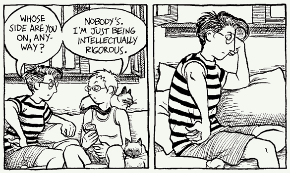
Dykes Sample Panel1

Also fantastic is the subject matter, which Bechdel tackles unflinchingly, whether it be the intimate details of relationships, or potentially unpopular political issues.  It’s a slice of life that very few people ever get to see from the inside in such an honest and open way and we should all be grateful for the opportunity – I know I am.  I think because of Bechdel’s incredible talent as a cartoonist, her writing often gets ignored (I’m half doing it myself) but I do think it’s important to point out, that it’s the very subtlety with which she writes that is so brilliant.  I rarely think about her words – and that – in my opinion – means it’s working – they are effortless and real.  As it should be.

The Bad: Nothing bad to report.  There were times when the political tirades of Mo (or various others at different points in their lives) wore a little thin, but had I been reading the strips as they were released as opposed to in a couple high intensity sittings I don’t think I would have thought twice about them as anything other than an accurate and important reflection of what was going on in the strip.

The only other negative I can offer, is a completely personal reaction I had to some of the material.  Because it is so honest about relationships in particular, including the ways that people often cheat or stray when together for long periods of time, I found that aspect a little depressing.  As someone in a long term relationship, and someone who is too familiar with the horrors of cheating, I sometimes felt like giving up on my real life relationship…that if these amazing smart beautiful characters were incapable of staying faithful, maybe it was just an impossible task period…whether you’re real or fictional.  But, personal depression aside, Bechdel actually deals with all the relationships – cheating or no – so realistically (some characters work through those hurdles and stay together and others don’t) – that I can’t REALLY complain – it’s no fault of the material – but of the world we live in.  But it sometimes made me unbelievably sad.  But again, my reaction to those complex relationships was also likely a symptom of reading it in three giant sittings.

The Ugly:  Nothing.  Let’s look at another gorgeous strip, if only for proof of that:
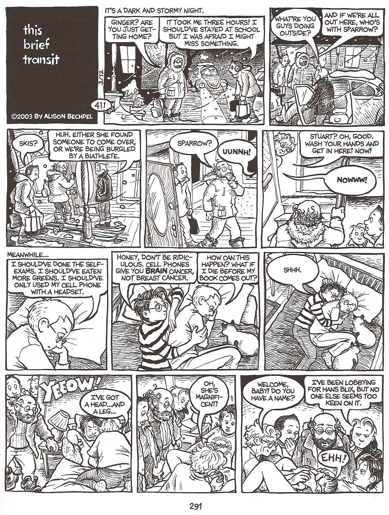
Bechdel 3

4.5 Stars.

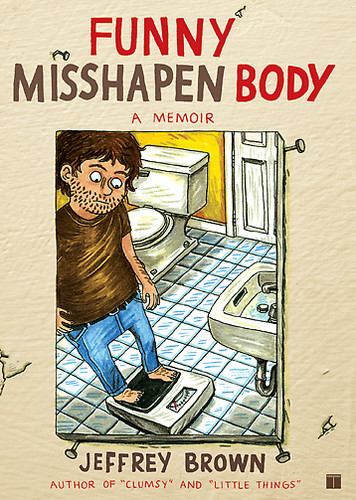
Funny Misshapen Body Cover

Funny Misshapen Body.  Jeffrey Brown (writer/illustrator).  Graphic Novel/Comics.

If you’re expecting an unbiased review of Brown’s latest book, Funny Misshapen Body, you’re totally in the wrong place.  I’m a huge Brown fan and really, he can pretty much do no wrong with me.  That said, I really enjoyed his latest offering.

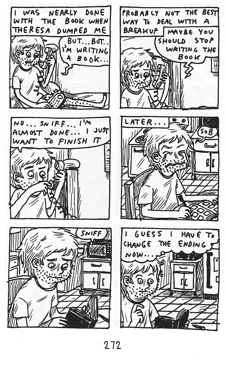
Funny Misshapen Body is essentially the story of Brown’s evolution as a cartoonist, and maybe a to a lesser degree his evolution as a person.  Like most of his work, the story is not told sequentially, but in random vignettes that shuttle back and forth in time.

Brown 1

The Good: As always with Brown, he has an incredible way of telling a story simply and honestly – no matter how embarrassing.  In Funny Misshapen Body he covers everything from having Crohn’s disease in highschool, to the break up of his first real relationship, and including the horror of trying to get started as an artist and going through the ‘drunk college experience’ – Brown cuts no corners and spares nobody – least of all himself – and it is that honest unflinching look at his life that so endears him to me time after time.

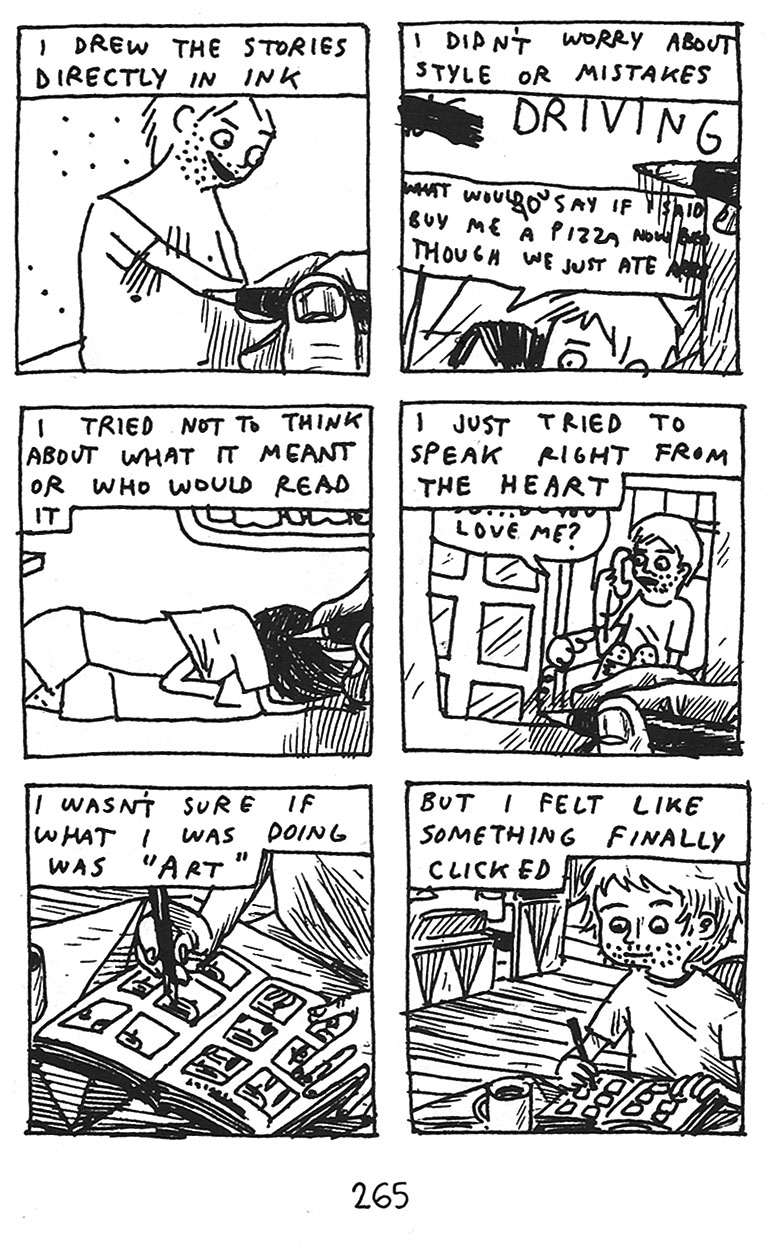
Brown’s signature scratchy style (which you get to see how he came to in this book) remains one of the many ways that I think Brown keeps things honest – drawing straight on the page in pen, with no pencils done beforehand – almost forces the authenticity of his work.  There’s no chance to filter, water down, or second guess it.  He just draws what he feels and for me, it just works on so many levels.

Brown 2

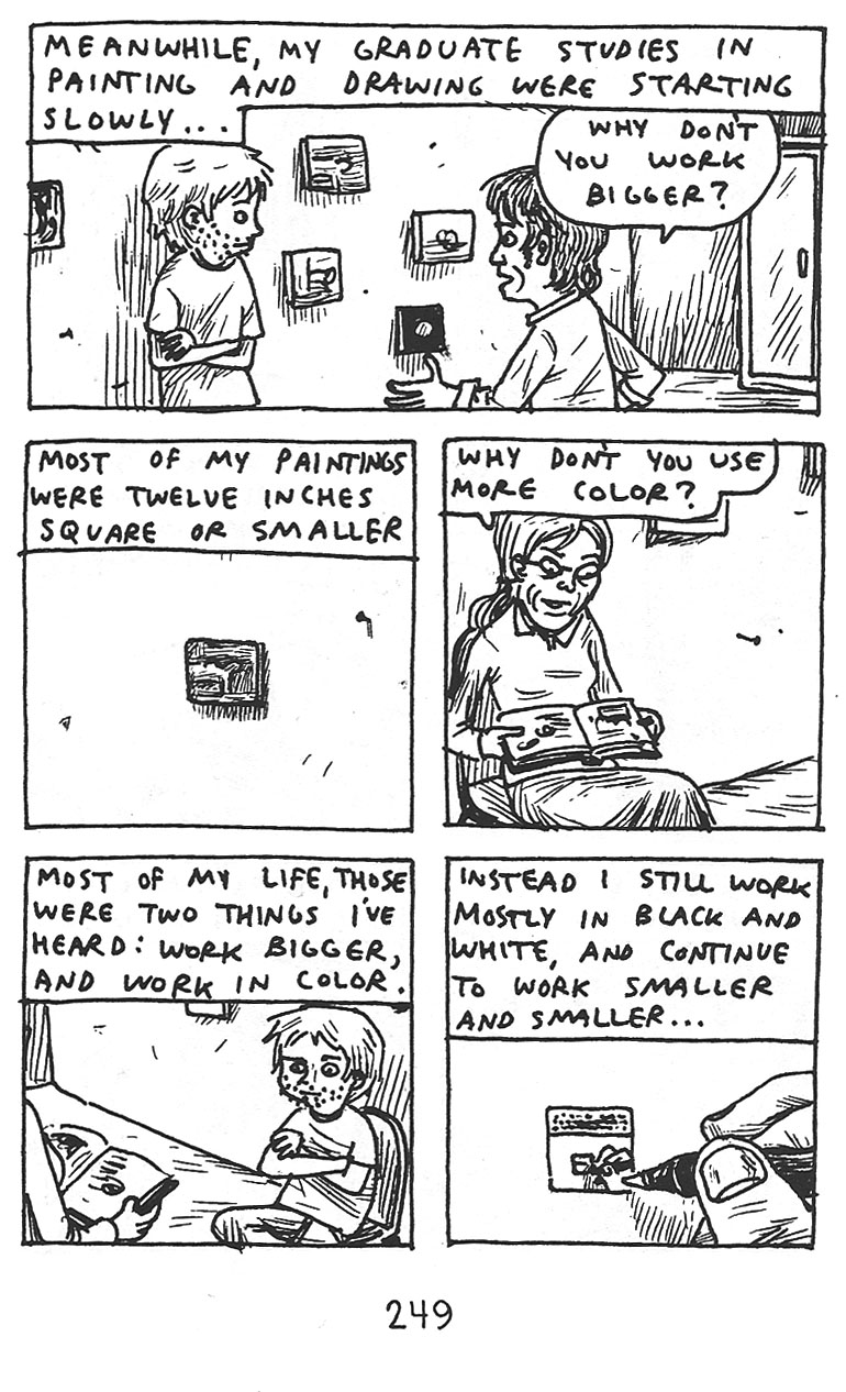
The Bad: I wouldn’t really rate this as bad, but though I found the subject matter here fascinating, it was slightly less effective for me than I expected, I think in part due to the non-sequential style.  I’m not exactly sure why, because even though an evolution seems like a sequential process, it’s really not.  There are so many ups and downs and back and forths as you try to figure out who you are in life, and what kind of artist you will be that the non-sequential aspect shouldn’t be a problem – and I have loved that unique element in his other works  – but it wasn’t as effective here for me.  I can’t quite put my finger on why it was less effective for me here.  Perhaps the fact that the vignettes seemed like more fleshed out fully realized stories – longer and more complex than his other stories – and so the out of sequence order became more confusing here, whereas in a work like Unlikely, it was almost impossible to tell things were out of order anyway…I’m really not sure.  But at the end of the day it was a bit less successful than I hoped.

Brown 3

The Ugly: For me, there’s not an ugly panel here.  For people that are not fans of Brown’s scratchy cartooning style I suppose this is not the book for them.  As I’ve said to people that are not on board with Brown’s style before, whether you like it or not, you have to remember that it is a stylistic choice he is making.  This is not the only way Brown draws, but he chooses to draw these small, kind of impromtu and unrehearsed panels as a way of further conveying his message.  It’s one of the best things about cartoonists that write and draw their own books – the art is so integral to whatever they are trying to tell you – and in my opinion it’s never more true than with Brown’s work.  If you don’t get it, you don’t get it, and that’s fine.  But for those of us who “get it” there’s nothing better.

4.0 Stars

« Older entries