I often take a (totally unofficial) stab at NaNoWriMo. I’ve only successfully managed it one year (the glorious year that was 2011). But that was a crazy success in that I not only DOMINATED my word count (over 75k on that novel) AND that novel became my book STORYKILLER.
So it’s both hard to resist the siren song of that one year’s awesome success and it’s also often something that feels like a too high standard (which I will constantly fail to meet). Anyway, I have A LOT to write right now, including really needing to get a high number of words down on a novel project, so I thought I might just give it a try again this year and might have a better shot of hitting some of these goals if I was forced to document it and be accountable.
So here we are.
Yesterday was a massive failure (long story, don’t ask) but I am determined not to be derailed!
So here’s what I have to accomplish this month writing wise. Going forward I’ll track novel writing count as one number and then I’ll just merge all the others into a second number:
NOVEL X: 50k
I need more than 50k – I’d feel better about 80k, but 50k would be amazing especially considering everything else I’m committed to.
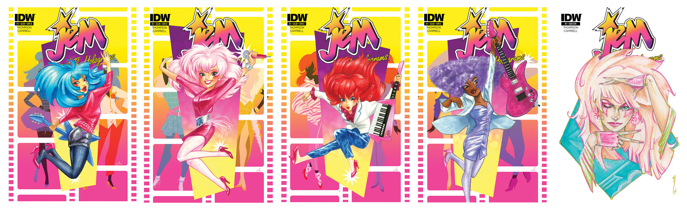
COMIC BOOK SCRIPTS: 6 scripts
I’d actually like to get 7 done, but 6 are necessary
COMIC BOOK REVISIONS: 1 script
I’ll probably have to do more, but for now this is the one on deck
COMIC BOOK SHORT: 1
Short Story for a comic (8 – 10 pages)
COMIC OUTLINES: 1
This is due asap, so it’s first on the list
COMIC SYNOPSIS: 2
Two mini-series synopses due (asap on this one)
COMIC PITCHES: 2
I actually have 3 due, but one can wait until December (I think) so I’m backburnering it
SHORT STORIES: 4 – 6
More accurately I need to finish 3, and do 2 to 3 completely new ones
This looks like A LOT (and Jesus, typing it out it FEELS like a lot) but technically it’s probably around 100k and if I did 75k while working a full time job in 2011 then I don’t see why I can’t do 100k while THIS is my full time job. RIGHT?
Guess we’ll see!
Off to get a reasonable word count down for today. Also I’m cross posting this on my Tumblr, which, I’m sorry to say is where I do most of my “blogging” these days. So you might want to follow me over there if you want to be sure to stay in the loop.
Thanks for reading!
Kelly
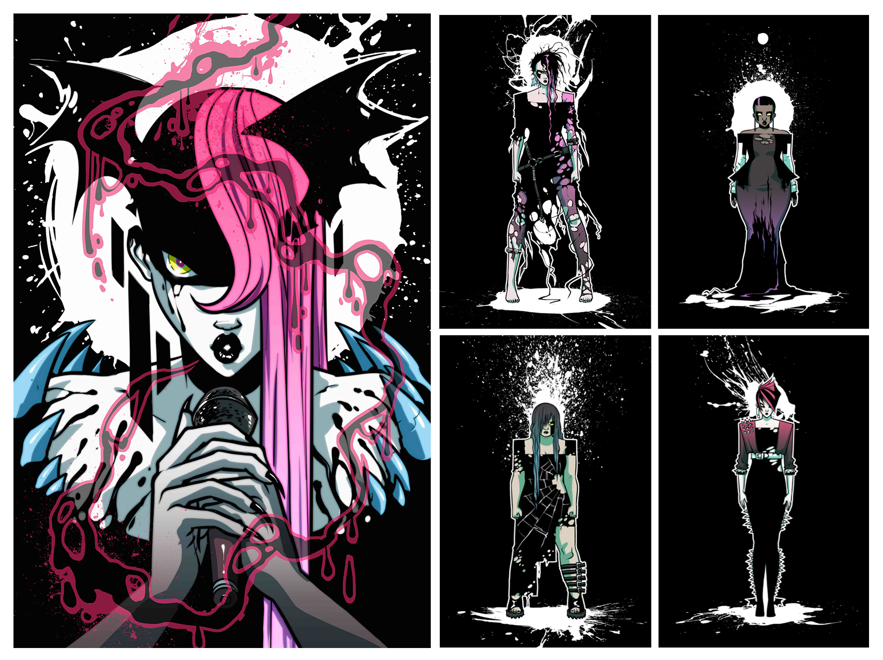
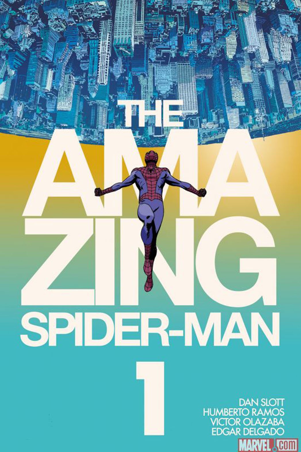
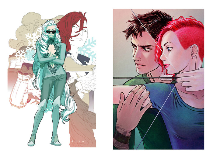
Oh, here’s an image for today…cover for A-Force #2, which yes, I AM WRITING with the amazing G. Willow Wilson. WOOOO!
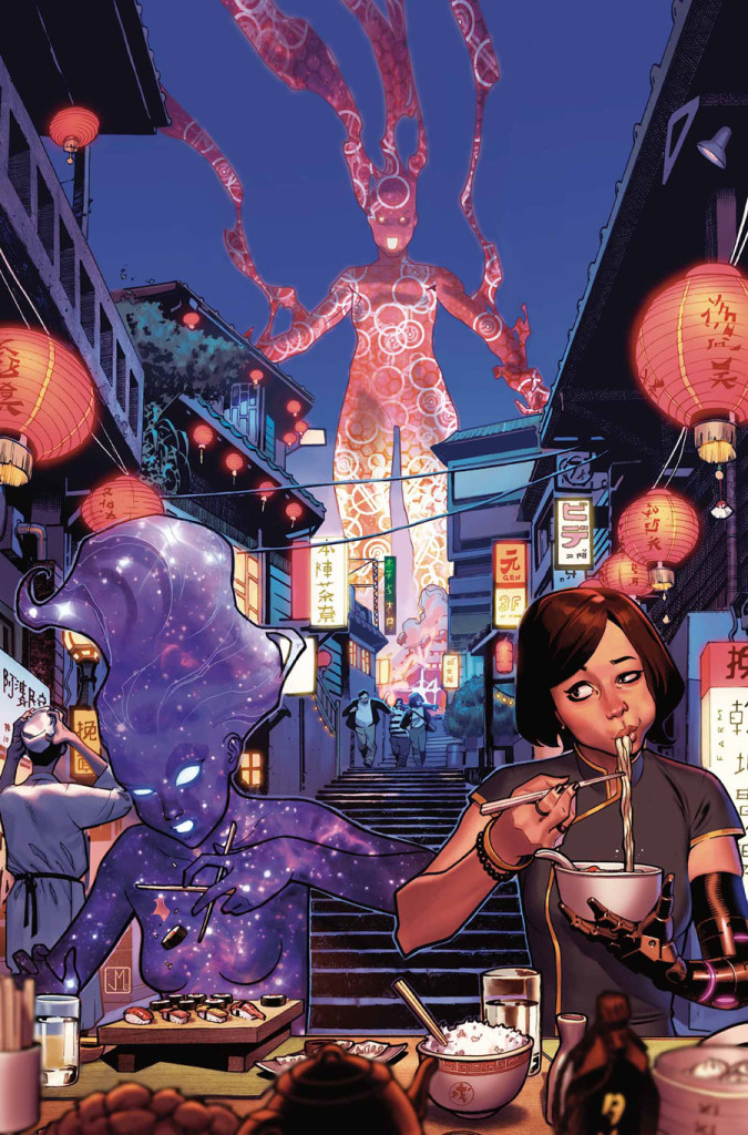
Cover by Jorge Molina.