So we’ve got a tie this week, mostly cause I just love me some Emma Frost and Chris Bachalo. First is this great splash page panel by Daniel Acuna of Luke Cage (POWERMAN!) and his wife Jessica Jones (POWERWOMAN?) having dinner in New Avengers #8.
I love it. It’s really fun and smart and has great attention to detail from the clothing of our heroes, to the one slightly falling sock of our waitress…it’s just damn fine looking comics. And really, this scene goes on for several pages and with the exception of one very weird Jessica Jones expression panel it’s pretty fantastic. I miss Stuart Immonen like crazy on this book already and am horribly disappointed that he’s no longer on the book…but Acuna is a good replacement if I have to have one. I’m really bummed that I have to drop the book when Deodato (and Chaykin?) come on board…but maybe Acuna will stay? Maybe I can keep reading? In fairness to Deodato, I thought his cover to New Avengers #8 was pretty good, and very restrained in his depiction of Jones…which is usually where he loses me (his depiction of women).
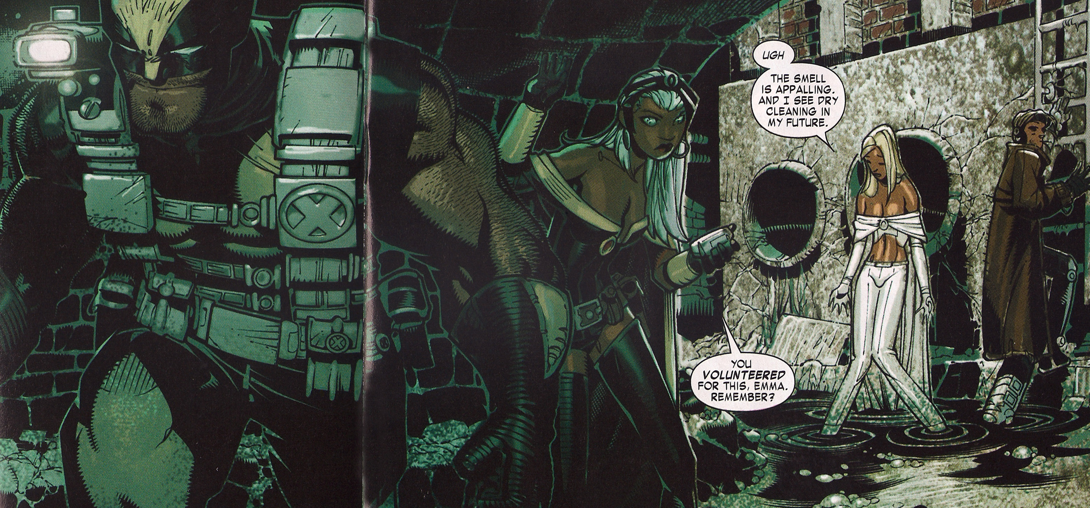
But I couldn’t resist Chris Bachalo’s great cartoon-y fun take on the X-Men and especially Emma Frost in this panel from X-Men #7. Apologies to Mr. Bachalo for the liberties I took (I had to crop a bit as it was an unwieldy shape – also the crease is terrible – double sorry!) but look past it please to the beautiful extremely detailed personality filled artwork there. The combination of lights and darks, the highly complex detailed work, the great composition, character design and acting. FABULOUS. Also, Emma, you so funny. 🙂
And now for the fun stuff…
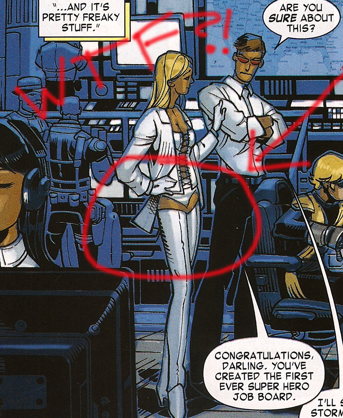
Apparently Emma’s clothing is SO CRAZY all the damn time, that even though Bachalo has made an effort to put Emma in pants (and thank you for that Mr. Bachalo) colorists DO NOT KNOW WHAT TO DO WITH SOMETHING AS SIMPLE AS PANTS.
They probably went to color it and were like…”No…just regular pants? That can’t be right…This is EMMA FROST! I bet it’s some kind of weird underwear thigh-high boots situation…!”
And that is how you end up with something that looks like this:
Yeah. That’s just wrong. Even for Emma.
Tags: comics!, Panel Of The Week
-
Great pick! I loved both the art and dialogue in both of these as well (well, more the art in the latter maybe).
Regarding Emma in that freaky panel, she is supposed to be wearing a combination of bootpants and panties there it seems. Just compare with the previous and following panel featuring her in the same outfit. I guess this middle one just had a very lacking execution or unfortunate perspective.
-
@NB: You bring up a really good point…because it’s true that this outfit is different than the one that features later (in the panel above) so maybe it’s not supposed to be pants, and the best evidence of that is the panel that follows it…even though it’s all in shadow…it still does seem to be underwear and really really high boots (bootpants fits nicely!).
However, I don’t think that the woman on the previous page is supposed to be Emma. But there are a few problems there. That previous page is DEFINITELY the worst page of the book and Bachalo falling into his worst habit which is making beautiful comics pages that are really hard to read/follow. I read that page three or four times trying to determine WTF was going on there…it seems Scott and Wolverine are in the lounge on Utopia…but who “works” on Utopia? I’ve never though about it before now, but surely they have some staff there or is everyone just doing their own thing? It seems weird to think about waitresses and chefs on Utopia…but surely they must have that? This page makes all of that very unclear to me. If there are no waitresses/bartenders then it makes sense that the woman in those panels (who looks like a waitress) IS in fact Emma. However, there are a major problems with that being Emma…
Reasons that woman is NOT Emma? Well, the hair is WAY too long, she’s missing the jacket if that’s supposed to be the same outfit, and I have trouble imagining Emma actually SERVING anyone, let alone Wolverine…and especially with a freaking tray. Most importantly though, Wolverine appears to be checking her out in one panel, something he would never do to Emma (with Scott in the room or not). And in the second to last panel it looks to me like Wolverine has left his beer to go hit on her. So I think it’s NOT supposed to be Emma and is just a colorist error – the colorist also thinking it was supposed to be Emma because of the similar clothing and so putting her all in white and thus “making” her Emma.
The only reason that woman looks like Emma is because of the coloring. Even the outfit, which from the back does look very similar and Emma-like could totally be some other superhero (?) outfit or waitress (?) outfit and if it wasn’t white, we wouldn’t think Emma at all. Although if that woman IS really a “waitress on Utopia” and that is her uniform then I have to seriously question Scott’s leadership on this issue.
Now, much as I love Bachalo, I can’t really blame the colorist here, because it’s the penciller’s job to be clear and that page is crazy indecipherable.
This whole double page spread is really just a mess.
Good thing he makes up for it elsewhere!
And with that I’ve spent WAAAAAY too much time thinking about this! 🙂
-
I was actually a little disappointed in the way Bachalo depicted Storm and Emma’s costume in the issue. Overall I really like his art and I thought the issue as a whole was well drawn, but there were several times in the issue where Storm and Emma’s top were so low cut that they were literally about to fall out. If either of them had to hop over a pile of debris or maybe climbed up on a slight ledge and then hopped down — everything would have popped out.
The panel you displayed is probably the best example. Neither costume has straps over the shoulder, so the only thing that can be holding their top up is how tightly it must be bound to their body (and that isn’t good in a fight in terms of someone needing to catch their breath). But that tightness isn’t going to help keep things contained in the event of a quick drop and impact.
In addition to that, You get the feel that Emma’s top just isn’t really built for physical activity by the way she seems to be favoring it. You look at the outfit she was wearing in the previous section (the one with the thigh high boots and underwear). That top is laced up (not to mention it isn’t cut quite as low), so there is less chance of things becoming exposed when they are not supposed to be.
But going back to the outfit she is wearing in the sewer, it is far less practical. Looking at the panel immediately following the favorite panel you presented, Emma looks like she might be trying to keep her top up with her left hand. Then go several pages over when the group is attacked. Emma is surrounded by a bunch of creepies and again she is holding her top up (in her defense, there are lots of grabby hands so certainly there is the possibility someone/thing could have pulled it down —- but that just further speaks to the impracticality of it). -
Oh — by the way.
It is impossible that the colorist got confused as to who the woman was who served Logan the beer.
Chris Bachalo is listed as the colorist in the credits for the issue.
So he knows perfectly well who the character is.
Now, if it isn’t supposed to be Emma (and my interpretation is that it was), then he could certainly have done a lot better job in either drawing or coloring that page so as to make it clear to the reader that it is someone else. -
That the first caption in that last panel is “…and it’s pretty freaky stuff.” is a pretty awesome transition. If that was intentional, bravo. If not, it’s a great coincidence. Either way.
-
Also, my grammar in that last comment was atrocious. Ew.
-
That panel of Emma is really confusing, more so by the fact that Bachalo penciled AND colored it.
What’s even stranger is that it looks like Dum Dum Dugan is in the background there. Was it supposed to be in some S.H.I.E.L.D. base or something?
Or maybe (and this is just a theory), this was drawn for an altogether different scene, and Bachalo re-used some bits from it?
-
And Scott and Emma look like Muppets…
-
I don’t think it’s a mistake on Bachalo’s part so much as an abstraction. I’ve been reading his stuff for a very long time, and sometimes he leaves out little lines here and there to save time and also cause it’s his style. To me, it’s pretty obvious what’s happening there and not some sort of weird pervy mistake.
Comments are now closed.


12 comments