Yikers.
There’s a good discussion going on over on CSBG…
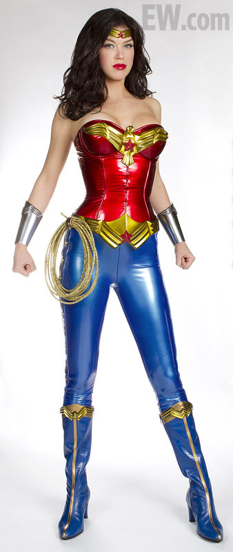
My two cents is that this is a huge misstep, not just in the super cheap looking costume itself (and the hair and make-up, which are also really bad) but in the way it’s been revealed. Palicki looks uncomfortable at best and miserable at worst as she poses awkwardly in bright light in a white room with no context. She’s not channeling a single “Diana” thing in this image…what is that expression supposed to be other than “what the hell have I gotten myself into?”
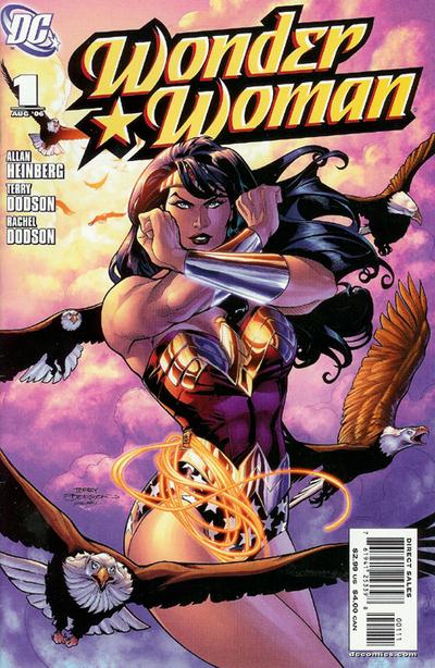
How much more interesting would a “real life” version take on this be (with or without the eagles of course!):
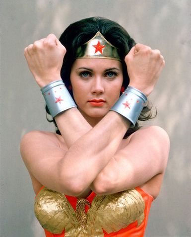
Or hell, even an updated version of this:
Then again, maybe this is about lowering expectations? If so, congratulations to everyone involved!
Tags: comics!
-
More than anything, it reveals how ridiculous 99% of superhero costumes are in a real world setting. It seems like they went half way toward the X-men style of donning leather, and came up with something that went terribly wrong.
-
maybe it’s easy for me to say because i don’t know anything about the character or really care about her, but i don’t think it’s that bad. i think the bigger problem is the lighting like you said, the awkward stance, and that some of it looks photoshopped together, like look how the lasso doesn’t seem to be casting any shadow or reflection and it looks like her legs/hips were cut-and-pasted underneath her torso, her golden belt thing doesn’t “attach” at all, there’s no visual “friction” there.
i’m actually surprised at how similar the basic design is to the comic look, i would have expected something more real-ified and “gritty” but i guess this is a David Kelley show, not Dark Knight or X-Men.
i think one thing i’d change is make it less shiny and have her belt be lower on the hips, right now it makes it look like old lady-cut pants or something.
-
@ross: yeah and look at this massive image at Bleeding Cool – makes a lot of it – and the belt especially – look WAY photoshopped. Also, I’ve decided that the roundness and lack of definition/bone structure in her face is really kind of freaking me out…it seems very cherub-y and very not regal, which is how I picture Diana.
http://www.bleedingcool.com/2011/03/18/first-look-adrianne-palicki-in-wonder-woman-costume/
-
I will leave here what I did at CSBG:
I am never going to understand the casting for Wonder Women. Palicki is adequate for a Smallville nock off, but Wonder Women in my mind is a complex character who without the physical and emotional stature and presence of a strong feminist women falls flat. Clearly undeserving of both the public and at the time private intentions of her creators. I think in the modern era, Cooke, has captured her best.
That said, this costume is better then I had pictured the other day, when I first heard it would emulate the garbage being drawn in the #600 ect…Wonder Women comic. Giving WW her deservid No. and take away her iconic stature. Anyway, this costume is to shinny, there are not enough stars, and I hate the boots. Kelly is right on about comfort (again), make up and hair…everything. Practicality and her origin takes a back seat to modern fashion and emulating 2D in 3D. Due to her age and style, she seems more like a Wonder Girl meats Mary Jane Watson. In other words not the mature women in the comic or even the Super Friends. Yet, she channels some iconic resonance. We know it’s WW. Because of the real issue.
In fairness even Cooke could not escape the issue. The bustier is for Wonder Women, what Power Girls “boob window” is…an iconic distraction that undermines the integrity of the character, and in turn leaves an iconic sexual impression that helps keep the character in circulation (and forever part of her S&M heritage). In this case it is what is, and at least they aren’t shying away. Covering up her past is even less respectful then exploiting it somehow. That said, it should help the male teen demographic. I just don’t see that as being the right choice for a target demographic. Of course it could be worse and part of the propaganda machine sexualizing female icons, making them appear younger and sexualized in order to get our daughters to have body image issues, play the part of bad girl sex toys and supporting industry of cosmetics, fashion, porn ect… Oh wait, that’s what this is. How would Wonder Women stand on this? We may never know.
I guess I should put up and shut up. After I finish my current strip, I will post a WW drawing. I will try and problem solve. That is what art is, innovation. Some people who actually get paid for it, should consider that more seriously.
-
Honestly, at first I barely even noticed the costume; I was too distracted by how awful the make-up was.
Comments are now closed.


10 comments