So over on She Has No Head! I mentioned that two categories, “Best Cover” and “Best Single Issue” were incredibly hard to decide this year thanks to an influx of great stuff I had trouble deciding between. As a result I decided to do a top 30 covers for 2011 on 1979. As always with these cover posts, I stick to Saddle Stapled North American releases, since that is what I have the most access to, and because I don’t feel a monthly comic should be rated against a graphic novel or trade.
Without further ado…these are my “30 Best Covers of 2011″…
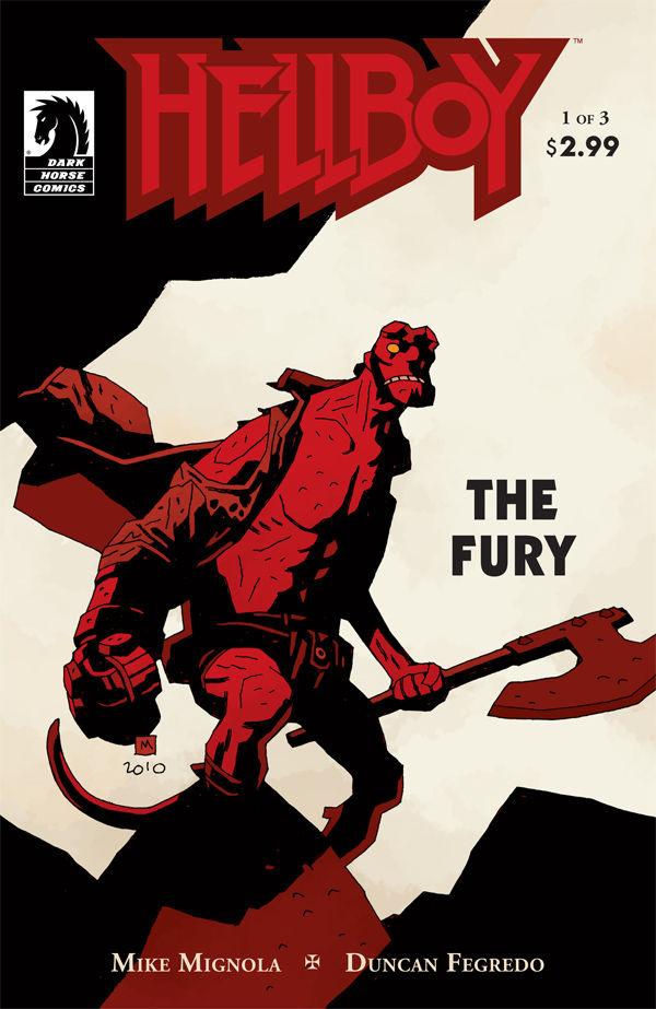
030. HELLBOY: THE FURY #1 – Mike Mignola
So simple and yet so effective. When you have a character as wonderfully designed as Hellboy you really just need the confidence to let him command the page, and Mignola obviously has that. With a limited Black, Red and Grey-ish white color palette, single figure (with a big ass axe) and a lot of white space you have powerful imagery that also creates amazing positive and negative shapes. Gorgeous stuff.
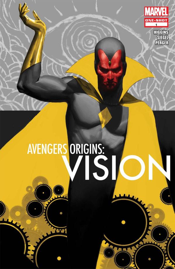
029. AVENGERS ORIGINS: VISION – Marko Djurdjevic
The limited color palette with a big swath of yellow and a small pop of red is inspired. Almost as much as Djurdjevic’s use of wonderful simplified graphic elements and shapes with ah highly rendered and realistic figure. A cover absolutely deserving of Vision!
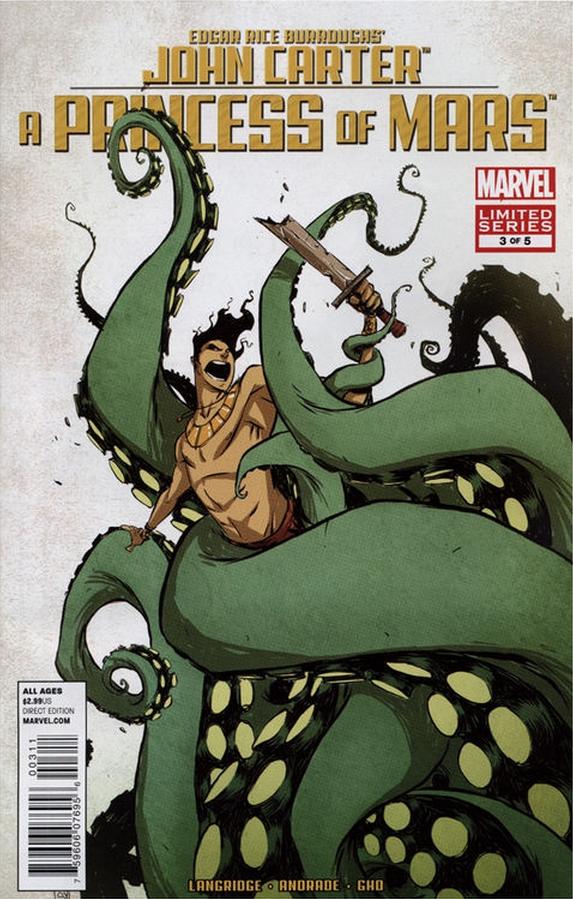
028. JOHN CARTER: A PRINCESS OF MARS #3 – Skottie Young
This is wonderful on so many levels. The composition has such energy and creates such great shapes, both positive and negative. The size and complexity of the tentacles while still remaining graphic and simple – how in places it devolves into just basic shapes is wonderful. The color choices, as always with a Young cover are inspired and subtle. Huge bonus points for it being one of the first tentacle covers I’ve ever seen in comics that doesn’t feel “kinda rapey”.
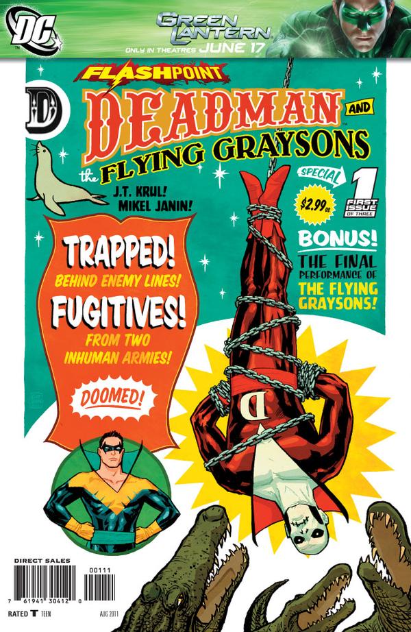
027. DEADMAN & THE FLYING GRAYSONS #1 – Cliff Chiang
A wonderfully fun and surprisingly accurate take on old fashioned circus posters. Exceptional use of text and graphic design really sell this as being exactly what it’s supposed to be. I already said fun, right? Too bad it’s crowded by a horrible Green Lantern banner. Boo to banners man, BOO.
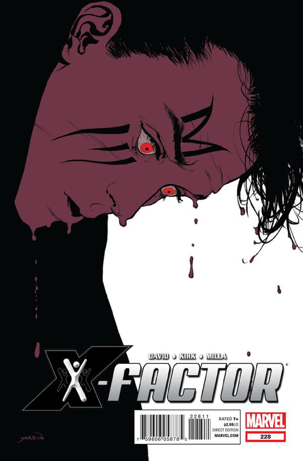
026. X-FACTOR #228 – David Yardin
Really compelling and, especially if you know the context, quite sad. The horrified and shocked expression on Madrox’s face combined with this look of him almost melting or bleeding and watching it…well, it’s haunting and powerful imagery. The restraint Yardin uses both with color, and composition serves him well and gives the cover all the more impact.
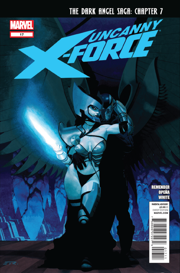
025. UNCANNY X-FORCE #17 – Esad Ribic
This is probably the biggest surprise on the list for most people that know my tastes. Psylocke in a bikini (which is even MORE revealing than her regular silly costume) IS an odd choice for this list, but there are some things I love about it – most especially the colors -everything bathed in gorgeous blue light. I also like the rendering work on Psylocke, she looks very real and fleshy and not plastic and fake, like so many comics default to portraying women. This cover also has a nice emotional element in that Psylocke’s costume harkens back to darker days, and her intense embrace with Archangel suggests crazy intense relationship stuff going on inside. I love it.
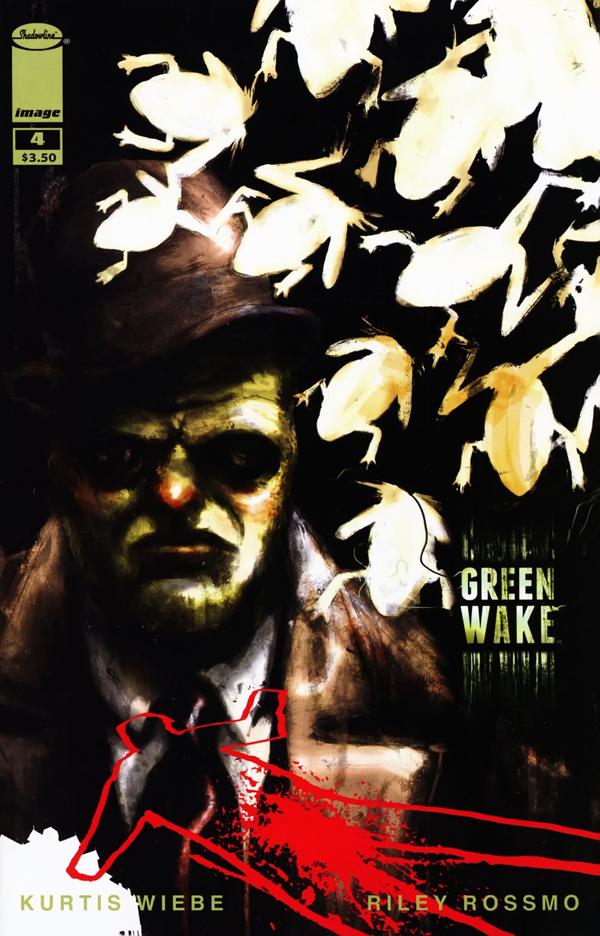
024. GREEN WAKE #4 – Riley Rossmo
Dark and gritty with some wonderful graphic elements, Rossmo does wonderful layering and makes excellent color choices. Additionally the title text is wonderfully placed and perfectly designed. Sometimes it’s the little things that really make a cover like this work.
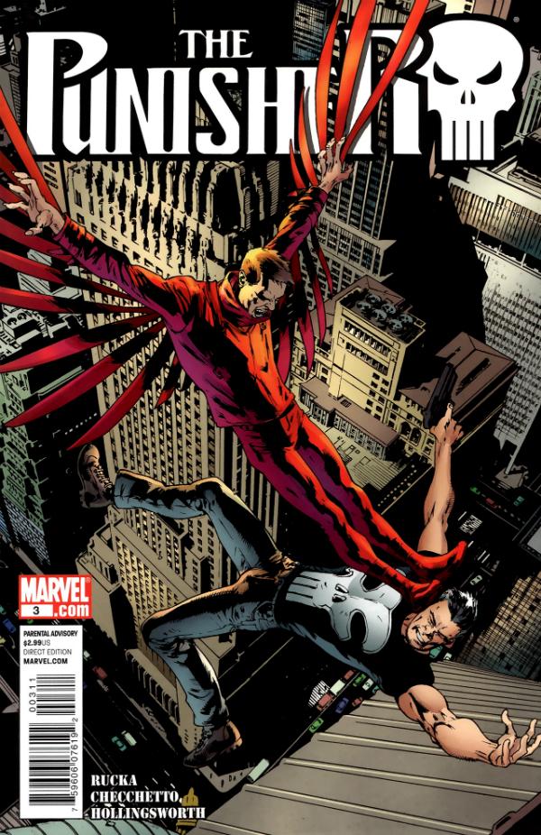
023. THE PUNISHER #3 – Bryan Hitch
Wonderful mid-air action that brings new meaning to the word intensity. To see a non-flying character get a double kick to the face high above the city is INTENSE. Wonderful details and great composition combine to make this a fantastically fun cover.
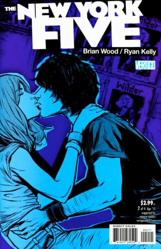
022. NEW YORK FIVE #2 – Ryan Kelly
Perhaps not for everyone (if you’re opposed to kissing in your comics…and who would be?), this cover to me sums up exactly what comics need to be doing if they want to capture that elusive (but very rich) younger female demographic. Of course you have to find a way to get this in front of them, but if you could, I suspect they’d eat this up. The illustration work is wonderful, the almost monochromatic colors are smart and evocative, and the characters are effortlessly emotional. Combine all that with great composition that creates interesting positive and negative shapes and this cover is a slam dunk.
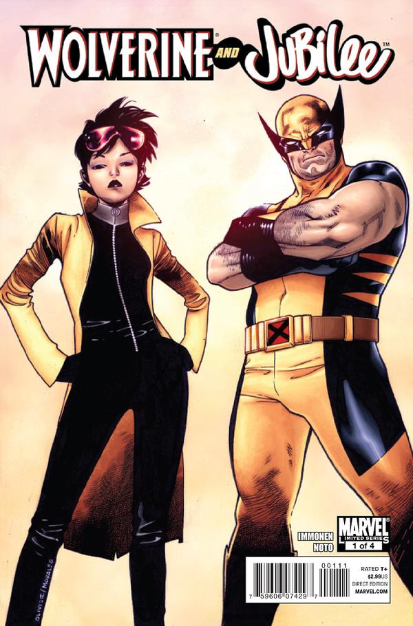
021. WOLVERINE & JUBILEE #1 – Oliver Coipel
While this seems deceptively simple compared to a lot of covers on this list, the reality is that you simply cannot value enough a cover of wonderfully designed characters, looking like badasses. So much of superheroes is caught up in iconic imagery and attitude, so when you slightly redesign a character badly in need of it (Jubilee I’m looking at you girl) and then get a talented artist to render them perfectly on the cover of a new series…well, it goes a long way. This cover stayed with me for an entire year because it was effortlessly cool and a great example of what more superhero covers should look like if they want to attract new readers. If only the rest of the series’ covers had been as effortless and easy to understand.
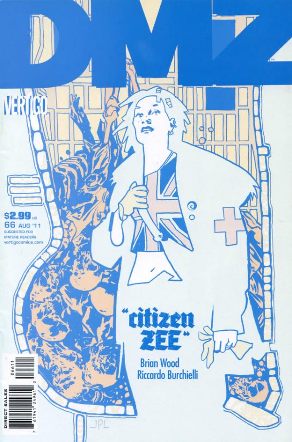
020. DMZ #66 – John Paul Leon
Absolutely fantastic flat graphic imagery and use of limited color here to create something both disturbing and beautiful. Like the best covers usually do, this works instantly as powerful visual, but as you delve more deeply you find all sorts of hidden gems – the grid of the city, the bodies layered in behind the figure. Exceptional.
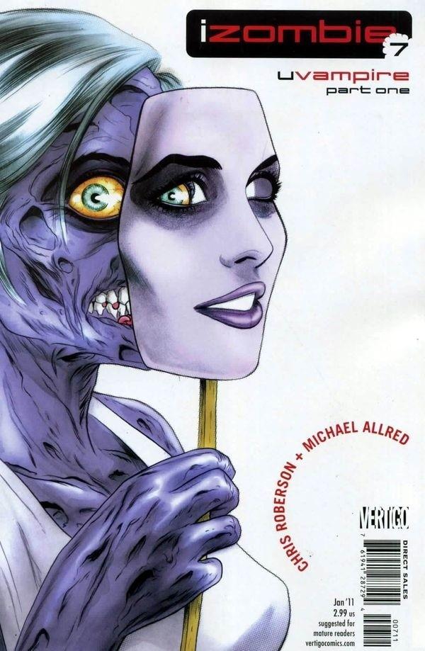
019. I, ZOMBIE #7 – Mike Allred
Because Allred is a genius and he does all the I, Zombie covers, they’re all pretty great, but this was definitely the best one of 2011. It’s so damn disturbing, but beautiful at the same time that you can’t help but stare. The way that eye fits perfectly into the mask raises this cover up to a whole other level – had that aspect not been perfectly executed this would still have been an interesting cover, but it would have lost much of its impact. Allred’s ingenious use of the mask with Gwen’s zombie body is not only striking to look at, but speaks volumes about the character and her journey both physical and emotional. Wonderful stuff.
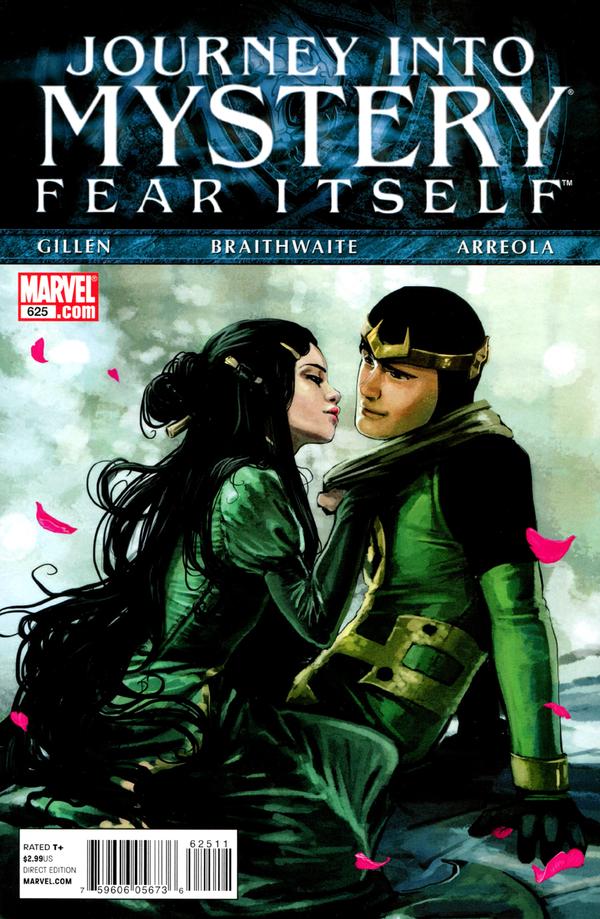
018. JOURNEY INTO MYSTERY #625 – Stephanie Hans
Another absolutely stunning cover hamstrung by a terrible event banner. The title “Journey Into Mystery” is cumbersome enough, but adding to that with “Fear Itself” and the giant solid block that dominates a full third of the cover is a damn crime. As a matter of fact…let’s take a look at this illustration sans the banner so you can better see how brilliant it is.
All right now! Here we go! The complementary colors – green and pink – just absolutely make this sing, especially since the green is layered in an almost monochromatic way it’s so dense. The figure work is sublime, and while I’m sure Hans left the top blank to account for the title, a much smaller title would have helped immensely as part of the beauty of this cover is the composition and the positive and negative space that’s created by leaving so much open at the top. Just gorgeous. My favorite of her covers over the last year – and there were many beauties to choose from.
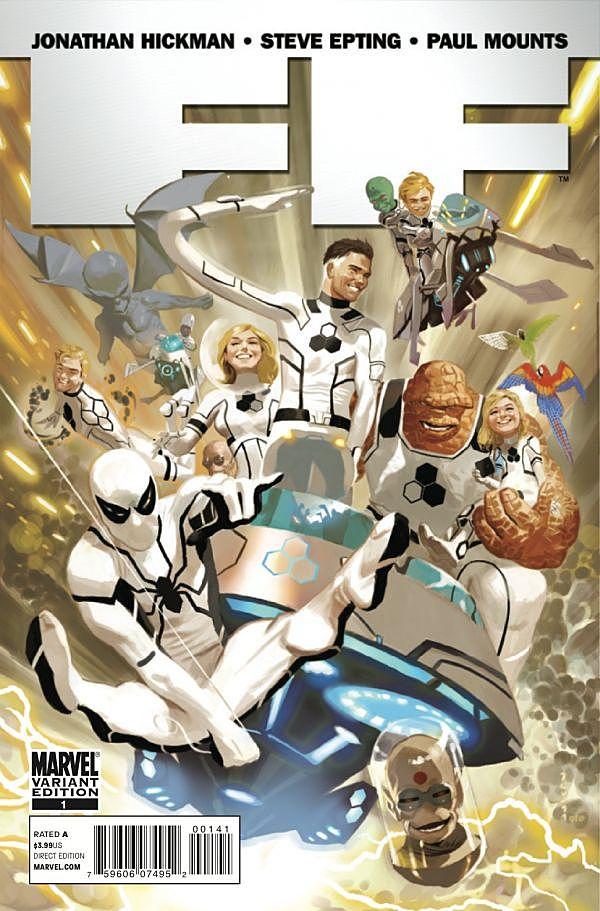
017. FF #1 – Daniel Acuna
Acuna has absolutely nailed a kind of vintage feeling for this Future Foundation cover, but one that manages to feel not at all old fashioned. It’s somehow modern and cool, while calling back to simpler times. The figure work and expression is exceptional and the motion, even with so much going on is just wonderful. You can’t look at this cover without smiling, which, quite frankly, should be the goal of more comics covers.
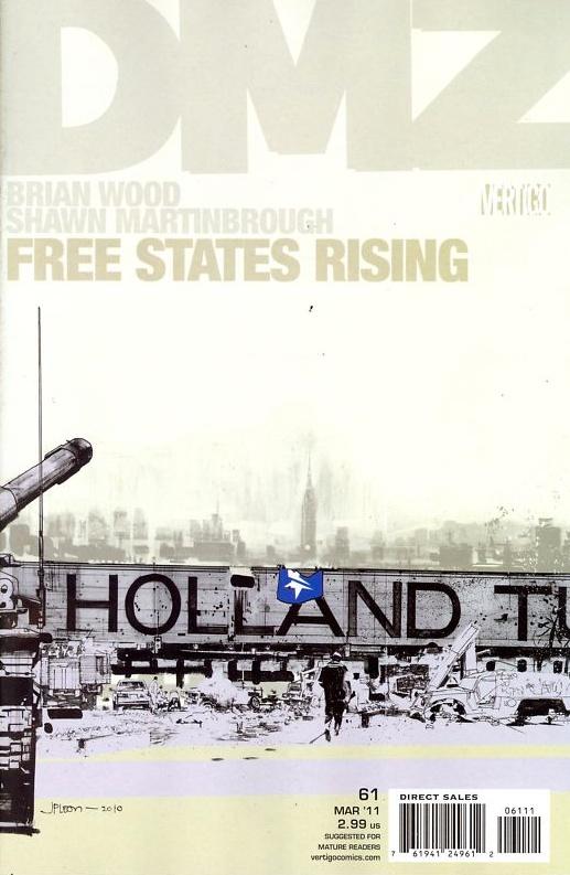
016. DMZ #61 – John Paul Leon
Maybe it’s the New Yorker in me, but this cover fills me with so much emotion – many of them conflicting – horror, beauty, dread, shame, pride. While I attribute some of what I feel to what I personally feel for New York anyway, it’s a truly great cover that can create emotion in a single image.
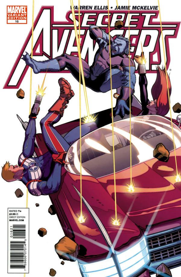
015. SECRET AVENGERS 16 – Jamie McKelvie
Everything about this is fun. It is 100% fun. The energy and color, the composition and feeling of motion. After reading this issue I learned this was not a flying car but a falling one, which takes a few points off, but it’s still undeniably cool. If there’s one thing I need more of in my comics it’s good old fashioned fun, which this has in spades.
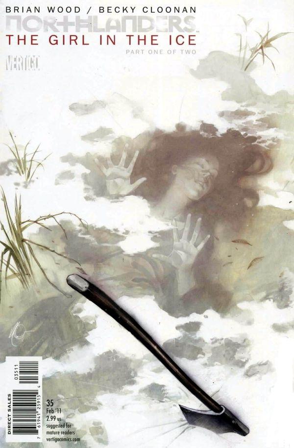
014. NORTHLANDERS #35 – Massimo Carnevale
How so many great artists can create things of such beauty that are also so grippingly horrifying I will never know. This haunting piece by Carnevale has incredibly subtle choices made regarding color and even composition so that you are not distracted by the horrifying reality of what’s being conveyed.
013. OZMA OF OZ #6 – Skottie Young
I mean, this deserves to place on sheer personality alone. Look at the eyes…the smile…the eyebrows! Fantastic work with character design and expression, combined with bold color decisions and exceptional text integration makes this a cover everyone will remember.
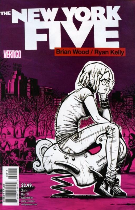
012. NEW YORK FIVE #3 – Ryan Kelly
Exceptional illustration work full of character combined with smart monochromatic color choices, and a black and white element that speaks volumes about how this character feels and where she is in her life. Rarely to comic covers manage to convey so much with so little.
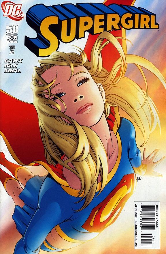
011. SUPERGIRL #58 – Amy Reeder
One of the crappiest things about 2011 is that we got far too few Amy Reeder covers. This Reeder cover does everything a sueprhero cover should do. It’s iconic and emotional, beautiful and inspiring. Most importantly perhaps, I really want to know and read about Amy Reeder’s Supergirl.
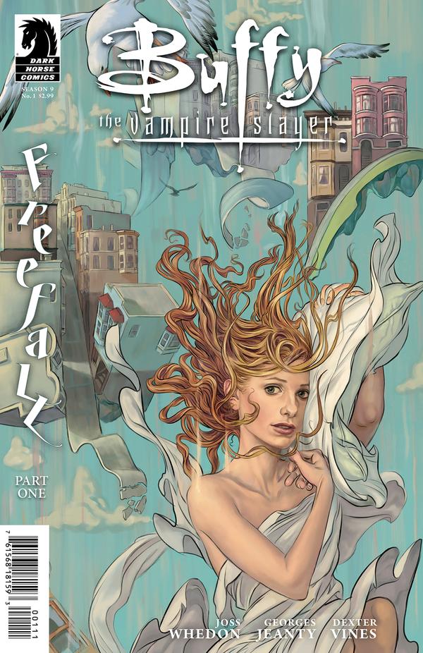
010. BUFFY THE VAMPIRE SLAYER: SEASON 9 #1 – Steve Morris
I don’t know if Steve Morris just happened to be the perfect artist to pick for a story arc called “Freefall” or whether he’s just such a great artist that he would excel at any concept handed to him, but the net result (and especially on the covers for issue #1 and issue #2 of the series) has been absolutely sublime. Morris manages to render an absolutely perfect Buffy/Sarah Michelle Gellar face that feels quintessentially Buffy without being too slavishly devoted to Gellar to feel weird. The soft heavenly color choices are ideal for the feeling he’s trying to get across, and the attention to detail in everything from the floating/falling buildings, to the birds in the sky come together to create truly powerful imagely.
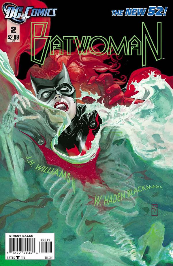
09. BATWOMAN #2 – J.H. Williams III
Incredibly smart and viscerally moving, perfectly executed so that it feels powerfully real. The illustration work is sublime, but I suspect my favorite aspect is the attention to detail on the Bat symbol as it is submerged. Beautiful and haunting.
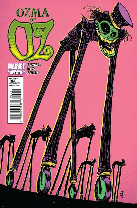
08. OZMA OF OZ #2 – Skottie Young
Unbelievably smart use of color and composition. The figures Young creates with these simple shapes is haunting and horrible, but also beautiful. This cover just goes to show that simplicity – when perfectly executed and creatively conceived – is just as powerful as the most detailed of covers. Take away the pink background and this cover is
07. BATWOMAN #1 – J.H. Williams III
What is there to say about Williams Batwoman work that has not already been said? The man is a genius whether constructing compelling and intricately detailed covers, or crafting perfect interiors. Like all his covers, this manages to work instantly when you look at it because it is nicely graphic and clear, but the more you examine it the more hidden treats you discover.
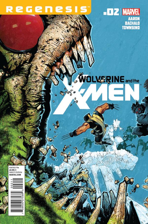
06. WOLVERINE & THE X-MEN 2 – Chris Bachalo
So damn fun. I wish Bachalo could draw all my X-Men covers…FOREVER. This was even better when it was simply Krakoa and Wolverine, but it held up nicely in the final translation, thanks in part to Marvel letting Bachalo integrate the text in a creative way. The figures and movement, composition and positive and negative space are just wonderful. The colors are bright and poppy and as always, Bachalo has no fear of extremes across the board. Bachalo also still draws the best damn Wolverine around – a short stocky badass.
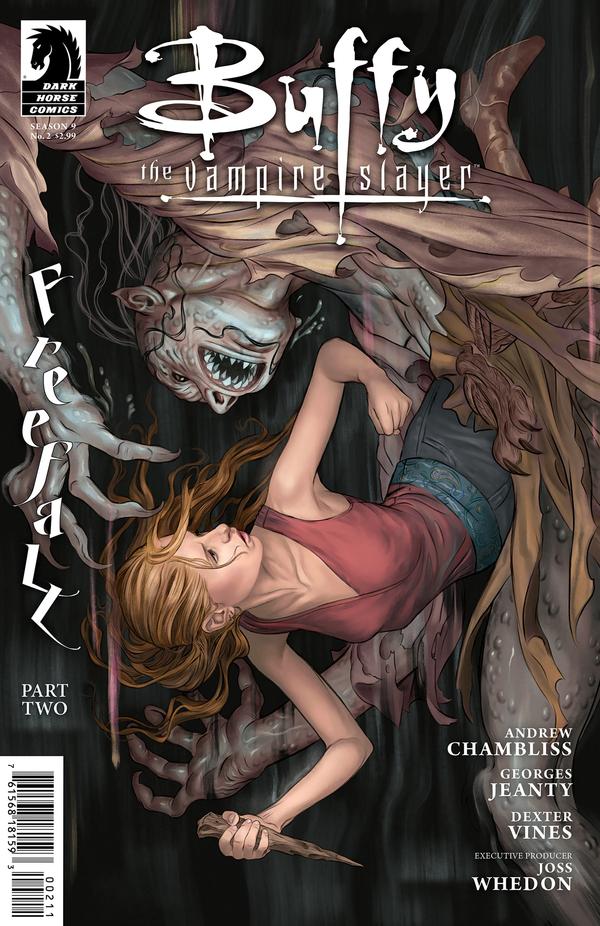
05. BUFFY THE VAMPIRE SLAYER: SEASON 9 #2 – Steve Morris
Absolutely wonderful composition…there’s so much movement and energy as the figures seem to fall off the page. Nice integration of the story name. Beautiful rendering work, and pitch perfect color choices, dark and saturated yet a muted palette fitting the tone of the illustration.
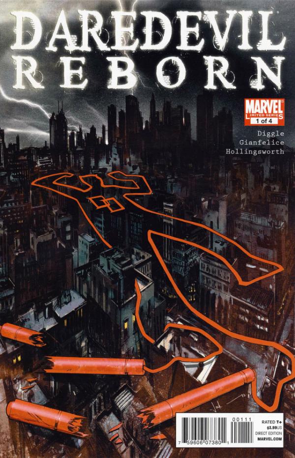
04. DAREDEVIL REBORN 4 – Jock
Another absolutely brilliant visual idea, perfectly captured. The limited color use is particularly powerful and the fact that it is the cable from Daredevil’s billy club that creates the outline? Well…I did say brilliant already, yes?
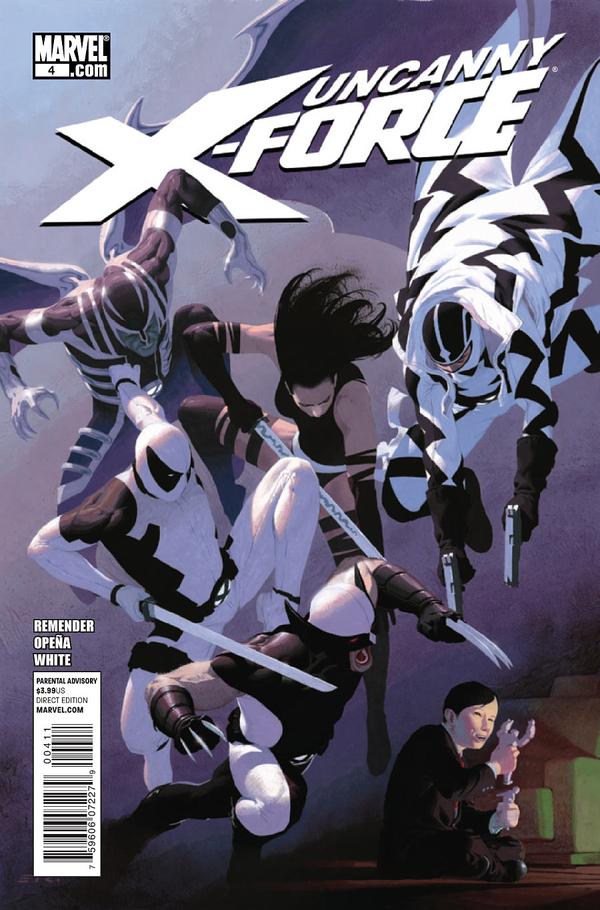
03. UNCANNY X-FORCE #4 – Esad Ribic
Absolutely wonderful in how it captures motion and creates interesting patterns and shapes. With Fantoxmex, Psylocke, Wolverine, Deadpool, and Archangel all with busy detailed costumes this could have been a complete mess, but Ribic uses the shapes and patterns to his advantage and creates a brilliant image in the process. Frequently illustration work this detailed and precise can look static and dead on the page, but Ribic makes the absolutely smartest composition choices and the result is a split second captured in time that has all the energy of a cocked fist. Brilliant.
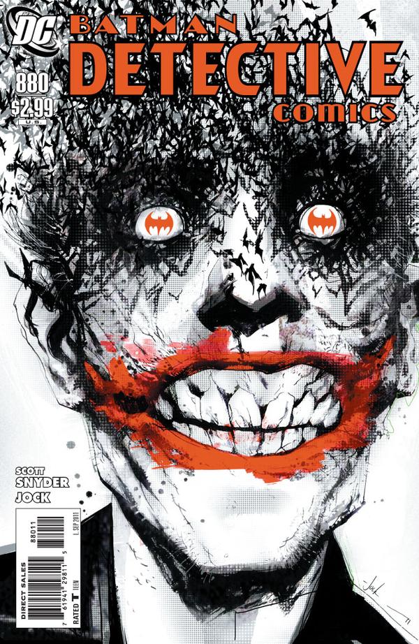
02. DETECTIVE COMICS #880 – Jock
Absolutely horrifying and brilliant. Completely effective and wildly smart. Jock proves himself again and again with his comics work (he’s only in my top 30 twice, but if I had done a top 50 he could have had as many as eight spots thanks to his amazing work on Detective Comics and Daredevil Reborn alone) but this is his best and most haunting work of the year. Just take a moment to marvel at what he has done with three simple colors. Incredible. When a character is as overexposed as Batman (over 70 years of comics and media, with any number of books and beyond out there being created every year…every month!) it’s hard to find new ways to represent Batman (and his world) Jock is constantly surprising me with his creativity and this one grabbed me by the throat and shook me like crazy when I first saw it. I doubt I’ll ever forget it.
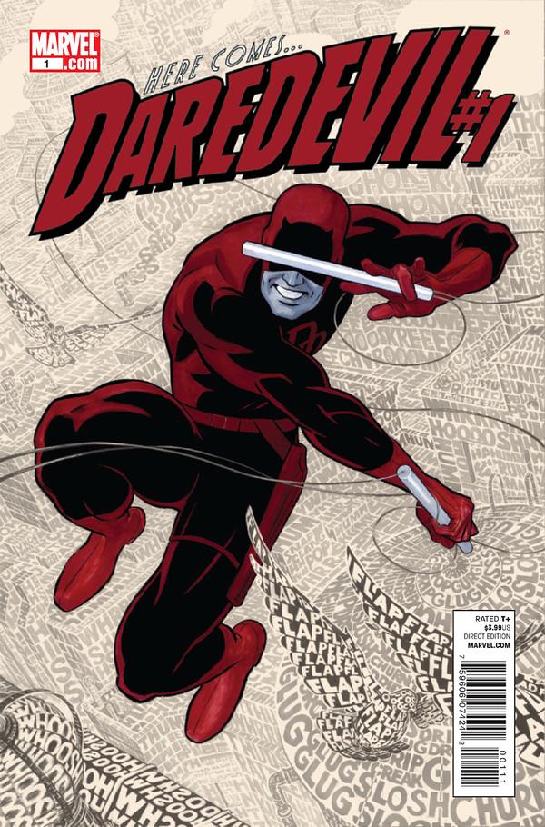
01. DAREDEVIL #1 – Paolo Rivera
As I said on She Has No Head! A truly brilliant idea and a flawless execution. Bravo Rivera, Bravo!
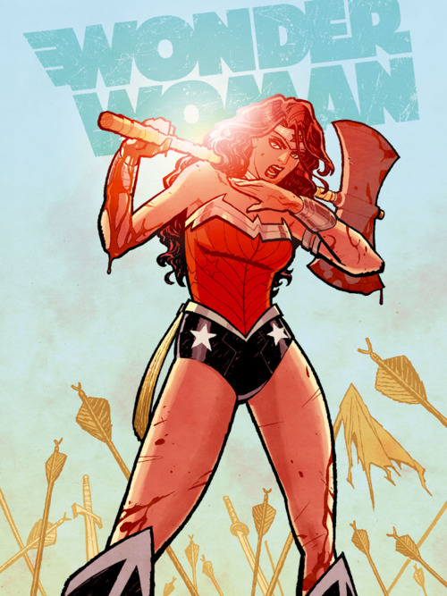
It’s also worth noting that had this rejected Wonder Woman cover by Cliff Chiang (below) been the cover to Wonder Woman #1, it would have easily placed in the top 5 of my list. Easy come, easy go! I know some people don’t like seeing Diana with the bloody axe, but I have no problem with it and find it much more compelling visually than the cover that they ended up with. It’s actually my desktop as we speak. So honorable mention to Cliff Chiang, for a cover I never go the chance to buy but am excited to at least have via the magic of the internet!
Tags: comic covers, comics!
-
Hard to argue with any of those.
Did you pick any covers for books you don’t read? I think that would be the hardest part in picking – the story or characters inside would influence me too much.
-
@Hooper Triplett: Actually, yes, I don’t read all of these.
I am very behind on DMZ and a little behind on The Punisher. I did not read Daredevil Reborn at all and have not yet started on the new Daredevil series. I don’t read Journey Into Mystery, though I’m thinking of trying it out (again, I just didn’t get on board soon enough) and I don’t read I, Zombie. I tried (for about a year) since I love Allred’s art but the story/writing just doesn’t work for me.
Comments are now closed.






4 comments