The following is a selection of comics released this week (6/30/10)* that focus heavily on women in comics – whether that be characters, creators, or even readers.
The books are rated as BUY, TRADEWAIT, or SKIP.
*It should be noted that this list will focus on North American/English releases as that’s mostly what I have access to. Additionally, as I am in general unfamiliar with Manga, I will not be including Manga titles in my lists. For some great reviews and discussion of Manga titles I urge you to check out Danielle Leigh on CSBG.
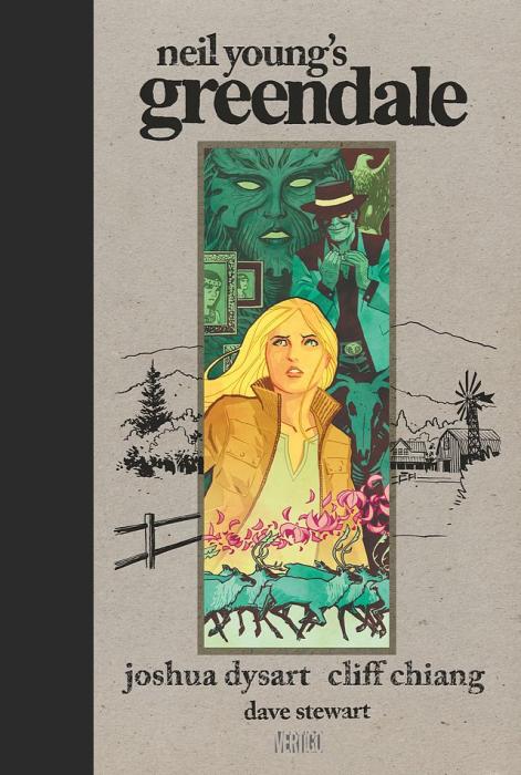
First off…Last week I should have mentioned Neil Young’s Greendale, the graphic novel by Joshua Dysart, Cliff Chiang, and Dave Stewart, which is excellent and most certainly a BUY. You can read a more detailed post about it and a preview, here.
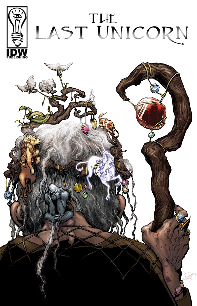
Also, I was unable to pick up The Last Unicorn #2 this week. I suspect, based on The Last Unicorn #1 (and that incredible cover), that I’ll be marking that one as a buy…but we’ll have to wait for next week. My shop also didn’t have a copy of Ghost Projekt #3, which I’ve been enjoying and also suspect will be a buy…so expect that review and rating next week as well.
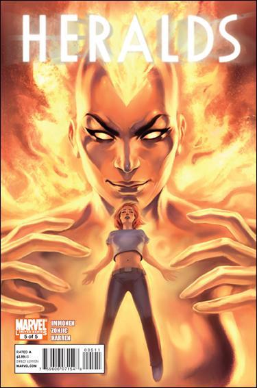
HERALDS #5 (of 5). Kathryn Immonen (writer). Tonci Zonjic and James Harren (art). Nathan Fairbairn and Antonio Fabela (colors). Jelena Djurdjevic (cover). Marve. 32 pages. $2.99
While I’m still a big fan of this mini-series, and it was some of the most fun I’ve had reading comics in a long while, I have to admit that the beginning was stronger than the ending. The first issue has such great humor and fun, but as we delved deeper into Nova/Frankie Ray/Frances the story became a bit unclear…especially for those of us that weren’t completely familiar with the story of Nova/Frankie Ray to begin with. Generally I feel a mini-series needs to be able to stand on its own, and I’m sure many readers would be left with a lot of questions here…and not the good ‘what happens next’ kind (although we do get to wonder that as well). Additionally, this issue is the weakest from an art perspective. Though Zonjic has more of the book and it’s excellent, some of Harren’s pages made it really hard to tell the ladies apart and made for some confusing reading. Also, though I am loathe to admit this, because I LOVE the cast, I think there were just too many awesome people in this book and the end result was that while it was a lot of fun, I didn’t care that much about Frances and her fate, so the necessary punch at the end is really missing. Too bad. I still rate this as a BUY for fun value alone, and if you haven’t been picking it up, I’d recommend getting the trade when it’s released. It’s not a perfect book, but it’s unlike almost anything on the shelves by the big two these days…and I support that and encourage it.
I stand by my desire to have an ongoing Heralds book helmed by Immonen and Zonjic. With either this cast, or a rotating cast of ladies…I don’t care. I think Immonen and Zonjic could deliver a monthly book that I’d adore. I certainly would buy (and blog) the hell out of it if this was a taste of what it could be.
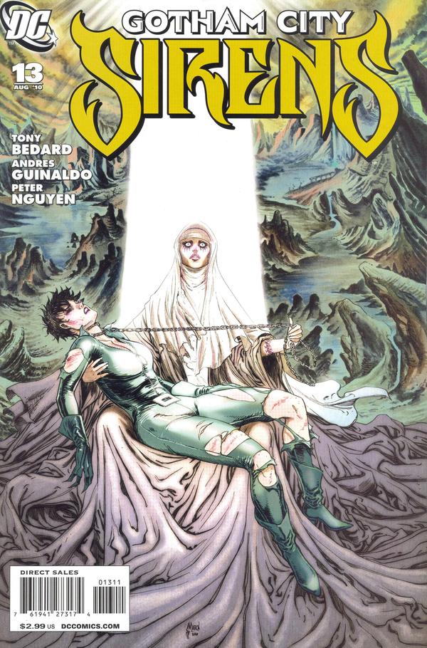
GOTHAM CITY SIRENS #13. Tony Bedard (writer). Peter Nguyen and Andres Guinaldo (pencils). Jack Purell and Raul Fernandez (inks). Gony Avina (colors). Guillem March (cover). DC. 32 pages. $2.99.
This didn’t really work for me. Though I love seeing Harley and Selina actually caring about each other and working together, the story didn’t have much punch, and even seemed kind of silly. Maybe my being an atheist just made it hard to take the giant blonde naked winged angel possessing (and literally standing behind) Selina’s sister seriously. I know, I know, suspension of disbelief…considering there’s a “Catwoman” and a crazy girl dressed up in a jester costume running around a church cemetery, it should be easy to suspend my disbelief, but I don’t know…I just couldn’t get there. Also, I have a pretty strong aversion to stories where characters fight and argue for two issues only to have things resolve by it all being a misunderstanding…and that’s pretty much what happens here. ALSO we’ve got the cheesy horrible childhood montage scene in here too…which is never good. I want to be on board with the art because it is far less male gaze induced and the T&A is completely minimal to non-existent unlike in previous Guillem March issues, but unfortunately it was really inconsistent and not very strong overall. If we could get a good non-T&A leaning artist on this book regularly I’d really appreciate it…and maybe be able to stand behind it, because I do love these characters, but so far, we’re not getting there. SKIP.
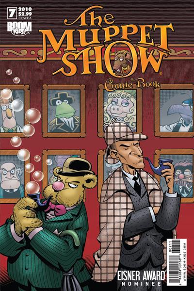
THE MUPPET SHOW #7. Roger Langridge (writer). Amy Mebberson (art). Eric Coban (colors). Boom Kids! 24 pages. $2.99.
Honestly…I was pretty disappointed in this issue. Especially in comparison to last month’s issue – which was my first foray into The Muppet Show and which I adored. The drawing is still great and the character voices seem really accurate but I found a couple weirdly disturbing things that I didn’t expect. For one…why doesn’t Scooter’s sister have a name (it’s Skeeter isn’t it?). She’s referred to multiple times in this book as “Scooter’s Sister” even though she’s easily the co-star of this issue and that is just…weird. It was really bizarre, seriously. Also, while the overall lesson, that of Fozzie Bear learning that his mother is proud of him no matter what and that he didn’t need to lie to her about his successes is good, there’s a bit of an unfortunate sub plot in that Fozzie doesn’t want to be “set up” with Nora, a bear he knew when he was a kid. He is doubly sure he doesn’t want to be set up with Nora when he sees a “fat bear” in the audience and assumes it’s her. Yet when he finds out that that wasn’t Nora, and that Nora is in fact a “super cute slender bear”, he pretty much changes his mind. While “Scooter’s Sister” does make a remark saying he shouldn’t say what he says about the “fat bear” because he’ll hurt her feelings…it’s a bit too little too late. The whole sub plot is tired and I was a bit shocked by its lack of creativity and insight. Considering the great lessons in the book in general, this sub plot seems a bit limited in its perception. Also, I didn’t laugh once in this issue…whereas in issue #6 there were quite a few great funny moments. That said, you can’t ask for the world in a children’s comic I suppose, my expectations may just be too high. But I can’t in good conscience give it a buy or tradewait. You can SKIP this issue.
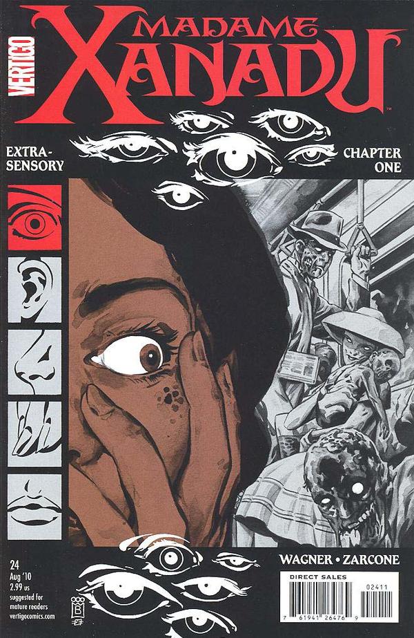
MADAME XANADU #24. Matt Wagner (writer). Marley Zarcone (art and color). Mark Buckingham (cover). Vertigo. 32 pages. $2.99.
This was a great issue, and for those of you who haven’t been reading, it’s the beginning to a new arc (Extra Sensory) and you really can jump into this issue without ever having read a single other Madame Xanadu issue. The art is unusual but quite good and a nice match for the tone. The story, despite it’s done in one aspect, is quite satisfying. I suspect that all of the “Extra Sensory” stories are going to be linked through the senses aspect (as seen on the cover) but done in one as this was…which is rather brilliant as it makes it easy for new readers to get on board, while still linking them so that regular readers are not going to feel like the issues don’t matter. A really great comic. I highly recommend Madam Xanadu this week – a GREAT jumping on point. BUY.
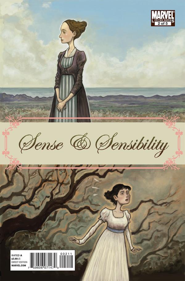
SENSE & SENSIBILITY #2 (of 5). Nancy Butler (writer). Sonny Liew (art and cover). Sotocolor (colors). Marvel. 32 pages. $3.99.
Though the art is gorgeous, $3.99 still seems a bit high to me for a 32 page comic book with no extras. But I’m enjoying it as the writing is strong, the cartooning is fantastic, and the adaptation feels accurate and on point tonally. If you’re a fan of the classics, or of adaptation of them, this is definitely a BUY, if you’re interested but on a budget you might want to wait for the trade.
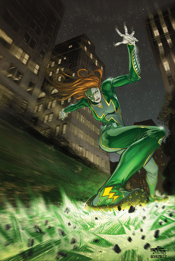
VELOCITY #1. Ron Marz (writer). Kenneth Rocafort (art) Sunny Gho (colors). Chris Cross & Snakebite (cover B – shown above). Top Cow. 32 pages. $3.99.
I was kind of surprised by this. I expected, judging by the 0ther horrible T&A cover (the one I got and seen above is good) and T&A opening splash page that I was going to hate it…but it’s not so bad. It helps that I was able to get the only cover of the 7 that were produced that wasn’t super objectifying…yeah, the cover that I got was pretty cool…way cooler than most everything else that was going on. The cover I got feels kind of modern and interesting, and if the rest of the book felt the way that cover felt, I might have been able to rate this as a buy but instead it feels really dated.
But again, I didn’t truly hate this as I expected to. Velocity is a character that I’ve always been intrigued by – maybe it’s her interesting design – the pale skin and short super red hair combined with the lightning bolt on her face…it’ a fun design. Very 90’s I suppose, but fun. And some of that fun is really evident here. I think, despite my dislike for comics that are primarily narration, which this book is, Marz found her voice and the story seems to have the necessary drama and high stakes to deliver an interesting arc. And though I despise Rocafort’s cover and opening splash page, for the most part the art, once it loosened up, was good. I really dislike the way they’re doing the panel layouts – all crazy shapes that make the pacing frustrating and super annoying to read (and this also feels like a throwback), but the actual drawing for the most part is good.
Unfortunately, between the T&A cover(s), the really T&A splash page, a totally gratuitous ass shot, and the fact that Velocity’s costume is cut open to somewhere near her belly button I can’t call this female positive and as such it can’t be a buy, even if I did kind of like the story.
Additionally, I think they really missed out on a chance to update Velocity and modernize her…not unlike the way that Brian Wood and Rebekah Isaacs have modernized DV8. Instead this feels like I comic that could have literally been made in 1994 and just not released until now. Which is a shame because I think Velocity deserves better and I think Marz, with his handle on her voice, could have delivered it. But they’d need to seriously update the art and style and feel of the whole book. Too bad. If you’re jonesing for some Cyberforce circa 1994, by all means, pick this up…but I have to rate it as a SKIP for a variety of non-female friendly offenses.
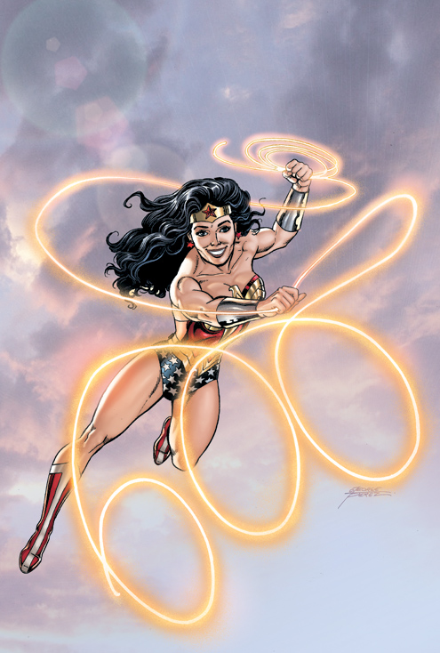
WONDER WOMAN #600. Amanda Conner, Gail Simone, Geoff Johns, Louise Simonson, and J. Michael Straczynski (writers). Amanda Conner, George Perez, Eduardo Pansica, Scott Kolins, Don Kramer (art). Scott Koblish, Bob Wiacek, and Michael Babinski (inks). Hi-Fi, Paul Mounts,Pete Pantazis, Michael Atiyeh, and Alex Sinclair (colors). Adam Hughes; Nicola Scott & Jason Wright; Ivan Reis, Oclair Albert, Rod Reis; Gullem March; Greg Horn; Francis Manapul & Brian Buccellato; Phil Jimenez & Hi-Fi; Jock; Shane Davis, Jamie Mendoza, Nei Ruffino (pin ups). Lynda Carter (introduction). DC. 56 pages. $4.99.
Here’s the thing. You should buy this because it’s a landmark issue. You should buy this because Wonder Woman is finally getting her #600. You should buy this because Amanda Conner’s got a great little five page Wonder Woman/Power Girl story in there. Other than that…well, I’ll probably be talking about Wonder Woman in my She Has No Head! column next week…probably. But you should buy it because you love Wonder Woman and she deserves our support. That’s all I got.
EDITED TO ADD:
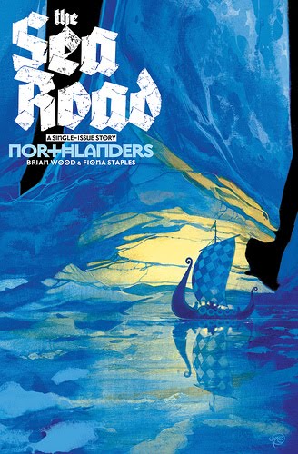
NORTHLANDERS #29. Brian Wood (writer). Fiona Staples (art). Dave McCraig (colors). Massimo Carnevale (cover). Vertigo. 32 pages. $2.99.
I didn’t have this issue Wednesday night, but I’ve got it now. And it’s a great issue. For people that haven’t been reading Northlanders it’s a single-issue story, so you can jump on, see how awesome it is, and then pick everything else up. There are no female characters to be had in this issue, but it merits mention on a column about female focused comics as the art is by uber talented up and comer Fiona Staples. Unfortunately, I agree with Greg Burgas over at CSBG that the interior colors leave a bit to be desired and don’t complement Staples art as much as I’d like. But it’s still a great book. BUY. And when you finish it, buy all the other Northlanders stuff, it’s great.
-
i don’t see what’s so bad about that Velocity cover, other than her being really twisted the waist. her boobs aren’t crazy, there’s a slight kind of bit of her butt showing but it’s nothing oversexed. i kinda dig it except for her weirdly long arm, and her foot and the speed effect is awesome. does she have a different costume inside the actual book? the one on the cover isn’t unzipped/cut-out at all. i should do a Velocity drawing…
-
Thanks babe.
@ross: I think you misread the post (I added something to help clarify it)…that cover I posted is pretty great. Really strong and doesn’t feel objectify-y at all. The shoes are awesome…and the cut out is not a cut out, but kind of sheer which I totally dig…I really like it…the whole thing is good.
This one:
http://www.imagecomics.com/gallery2/g2data_373ph4nt/albums/comics/2010-06/velocity01a_cover.jpgAnd all the other version however, which were the ones I was talking about being “bad”…BLECH.
-
ohh, i see, okay. confused. i’ve seen that other Velocity cover before, i was just recently looking at Rocafort’s website and it’s weird because the stuff there isn’t T&A at all. i’m torn on his Velocity because i like how he draws her face and shoes so much and i actually like that other cover quite a bit, she’s trying on all these different shoes, so funny, but then her dumb neckline. is she still supposed to be a kid like she was in the old series? i guess not. argh but then look how awesome this is: http://1.bp.blogspot.com/_YU6-Uil_-LQ/TCvUfm4p07I/AAAAAAAABHs/mQDA11wbDEs/s1600/art.kenneth+rocafort.velocity%5Byearbook%5D2.jpg
i think it might also be my affection for Velocity talking here. -_-
-
@ross: yeah, I knew we must have our signals crossed. I’m not that familiar with Rocafort’s work, but other than the one splash page, the gratuitous ass shot and the cover…I REALLY liked what he did. It’s not his fault the costume is ridiculous…and even though it was ridiculous, except in the splash page he kept the fake boobage look pretty minimal…like for a comic character she’s fairly small on top…which is nice to see…and with her speed…makes TONS of sense.
I don’t love that one you posted just because again, the outfit and also…the hair…if she’s running on water and that fast…no way that’s what her hair is doing. But yeah, mostly I liked the art inside but was disappointed by the cover and a few select pages. The cover to #3 goes in a terrible direction though – serious brokeback pose.
-
Trackback from World Wide News Flash on July 1, 2010 at 10:16 pm
-
I’m not sure how you do these – it seems like any comic with any connection with women is fair game, whether it’s creators or characters. So you missed Northlanders, which Fiona Staples drew. Check it out now!!!!!
I guess you liked Madame Xanadu more than I did. But it appears I liked the art more than you did.
And I feel bad that you didn’t get Ghost Projekt. It was pretty keen.
-
@Greg: Northlanders was also missing from my pile, but I tracked it down today and will probably amend the post tomorrow as I really liked the issue and think Staples art is fantastic.
There’s no perfect situation for how I do it…simply because I can’t afford to buy ALL the comics and whether there are women involved as characters or creators or not, there simply are some titles that I’m just not interested in or can’t bear to spend my money on. But I try to hit a big variety of what comes out weekly and heavily focuses on women and hope that it’s helpful to someone. The whole reason I started this was the idea to help give people looking for something female positive a bit of a guideline in the mass of weekly books…but I don’t really feel like it’s working and it’s exhausting to read and put out this post so quickly…(I don’t know how you do What I Bought…exhausting!). Honestly…if a few really awesome creators hadn’t emailed me about the posts I probably would have given up already.
-
I guess the word “unusual” to describe Zarcone’s art threw me. I didn’t think it was all that unusual, and although you backed it up with “quite good,” it sounded like you might have been a tiny bit ambivalent about it. But that’s just me, reading into things!
Well, I always look around for reviews of various comics, because so many comic blogs simply focus on one big book, and who really cares what happened in Avengers this week? So I’d encourage you to keep it up, for what that’s worth. Especially because of the angle you’re taking, which is always interesting and something I, for instance, can’t really take (given, you know, that chromosome thing).
-
Even if you cut it down and only did a few books each time, it’s helpful to me to find out about things that wouldn’t otherwise have crossed my radar.
-
I think you are, like, the only blogger out there talking about Madame Xanadu, which has been a fantastic book from Day One. I like your headless column on Wonder Woman 600 as well, and I’m now a regular reader who regrets taking this long to find you.
(You don’t say much here about Greendale, but it’s so on my Buy list, as well. I think Cliff Chiang illustrating the phone book would be on my Buy list …)
-
@Greg: Thanks man. Between you and a few emails and comments I got from readers I’m definitely going to soldier on…until I can soldier on no longer… 🙂 For what it’s worth I know you can’t offer a feminine perspective, but I love it when feminist men talk passionately about issues dear to my heart…in fact, I think I appreciate it all the more for them being men and not women in that it’s not a battle they necessarily need to feel obligated to fight (as I sometimes do) but they fight alongside us nonetheless. 🙂
@skyekilaen: Thank you so much for the comment. It’s feedback like yours (and Guy Smiley’s) that makes all the headache worth it.
@Guy Smiley: Thank you! And I’m so glad you found me.
I didn’t talk much about Greendale here because I did a massive review (rave of course) of it on my CSBG column She Has No Head!, which you can find here in case you’re interested:
http://goodcomics.comicbookresources.com/2010/06/21/she-has-no-head-review-neil-youngs-greendale/
I’m always excited to get a new regular reader – they’re worth their weight in gold! 🙂
-
Pingback from The Secreter Robot Spy Factory on July 17, 2010 at 2:42 am
Comments are now closed.



14 comments