art

You are currently browsing the archive for the art category.

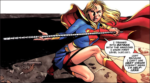
supergirl shorts

Supergirl with her new shorts (above)

So I’ve been reading all the Supergirl’s shorts posts and posts and posts – there was even a bit about it on NPR apparently – and I wasn’t adding to the discussion because frankly, it’s been very well covered.  Also, I agree with the majority opinion (at least what I’ve read – I’ve not polled any actual fanboys to see if they disagree) that the shorts are a WAY overdue addition to Supergirl’s costume.

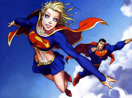
supergirl no shorts

For the uninformed – some wise men at DC have finally stated that they never want to see Supergirl’s panties again – thus she wears red biker shorts under her skirt from now on.  See image above in which Superman’s line of thinking is probably something like this:

“Oh, crap, gee, this is really uncomfortable, I’m supposed to be a hero for the entire planet and now I can see right up my teenage cousin’s skirt and I’m looking at her underwear and OHMIGOD is that her teenage lady parts? Crap…and I’m not looking away…crap…this went bad fast…mental note to never fly behind…or below her again…even in battle…crap – I’m still looking!”

Maybe I’m overstepping, in part because I’ve never been a true Supergirl fan, so I don’t feel like mine should be the voice of changing her, but aren’t the shorts – though totally a step in the right direction – still just a drop in the bucket?

birds and lady bits Birds…meet Supergirl’s lady bits!

I mean WHY THE HELL IS SHE WEARING A SKIRT AT ALL?  Honestly, I know it sounds petty but this is the single biggest reason I’ve never been able to be a true fan of Supergirl and take her seriously…what kind of superheroine wears a skirt to fight crime in?  Especially when one of your most valuable powers is the ability to fly.  How does this make any sense?!

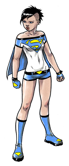
Now I’m sure there are some purists out there that love Supergirl and feel that without the skirt she’s just not Supergirl, but c’mon. This costume was a mis-design from go…it might have made some sense forty years ago (though I doubt it) but it’s time to update.  REALLY update.  No self-respecting superheroine, especially one that by modern standards is relatively modest would be caught dead fighting crime in a miniskirt.  Plus, what’s progressive about a miniskirt anyway?  If you’re trying to get the teens to sit up an pay attention a flow-y miniskirt is not the ticket.  Let’s really take things to the next level and ditch the skirt…entirely.  In fact, let’s look at Project Rooftop’s recent request for a Supergirl redesign for inspiration.

Ross Campbell Supergirl

My personal favorite by far is Ross Campbell’s hardcore badass Supergirl (see above), I know the purists would likely have my (and Ross’s head) but it’s a step in the right direction if you ask me.  If you’re not ready for it then there are a few other skirtless examples on Project Rooftop, and even those that still employ the skirt, do so in a much more modest, practical, and updated way.

But still I say, let’s just slightly update this awesome cry from

“YES! SHORTS! FINALLY!” to

“YES! NO MINISKIRT! FINALLY!”

Our girl deserves it.  I might even start reading her books.

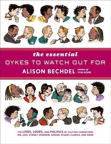
Essential Dykes to Watch Out For Cover

The Essential Dykes To Watch Out For.  Alison Bechdel (writer/artist).  Graphic Novels/Comics.

So I have a confession.  Though I have known Bechdel’s name for years and years (I went to art school and studied comics for christ’s sake), her book Fun Home: A Family Tragicomic was my first real immersion year into her work earlier this year.  If you read that review, you know I was pretty blown away.  This collection, blew me so away I don’t even know how to articulate it.

One advantage to learning about something suddenly and getting to absorb it all at once (or waiting for too long and absorbing it all at once – see my Y The Last Man post) is that you get the unique experience of just drowning in a new discovery – head first – and without having to look up.  I read Bechdel’s Essential Dykes in less than three days (and since it’s 390 full page, text heavy strips, that is no joke) but I could NOT put it down.  I just fell head over heels in love with these characters and all their beauty and flaws.

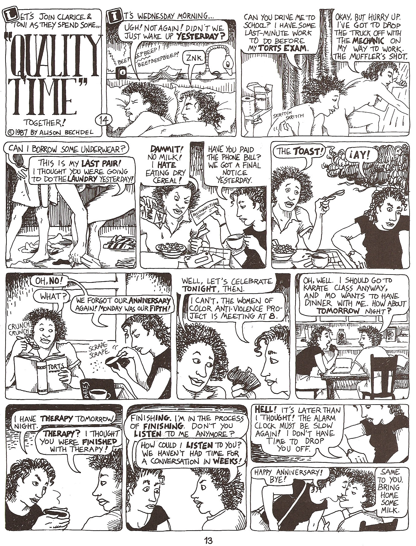
The Good: The absolute best thing about reading Bechdel’s work in a collection like this, maybe especially for me as an artist was the amazing experience of seeing her growth as an artist.  Read over time, because Bechdel was a great cartoonist from page one, I don’t know how obvious her evolution would be, but read all in a big chunk like this it was hard to miss the amazing transformation.  Check out the page below, an early strip in the collection from 1987 and featuring Clarice and Toni:

Bechdel 1

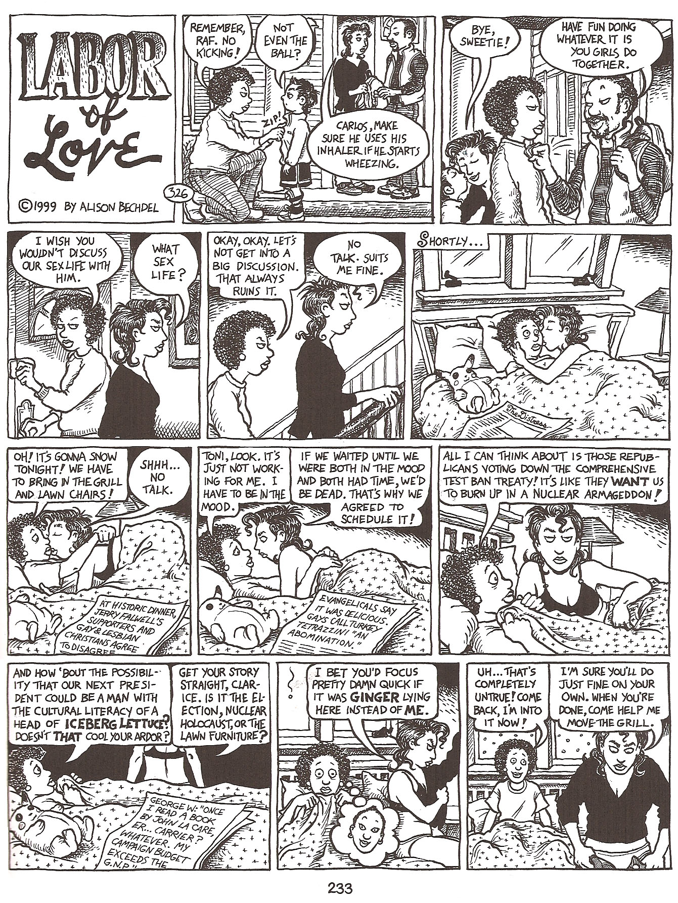
And a strip from 1999, featuring the same characters.

Bechdel 2

It’s just amazing to see the development, the characters are so much more refined (and defined) their looks really having settled in over the years, and Bechdel’s inking has so much more depth, and she’s willing (and able) to tackle much more complex panels, with greater depth of field, without confusing the eye – a real struggle for many cartoonists.  Every line seems considered and confident, unlike the early strips, where she was still incredibly competent, but in retrospect obviously still finessing her work.  It’s the kind of evolution that a cartoonist of Bechdel’s caliber will probably continue with her entire career and it’s a beautiful thing to behold.

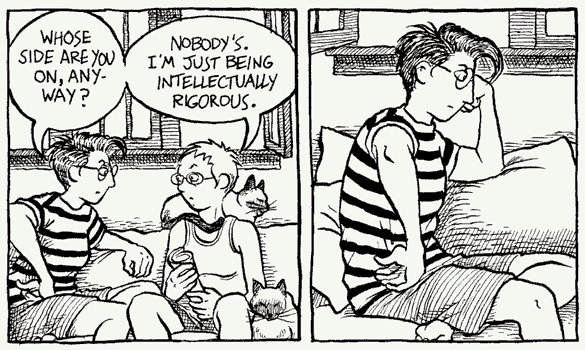
Dykes Sample Panel1

Also fantastic is the subject matter, which Bechdel tackles unflinchingly, whether it be the intimate details of relationships, or potentially unpopular political issues.  It’s a slice of life that very few people ever get to see from the inside in such an honest and open way and we should all be grateful for the opportunity – I know I am.  I think because of Bechdel’s incredible talent as a cartoonist, her writing often gets ignored (I’m half doing it myself) but I do think it’s important to point out, that it’s the very subtlety with which she writes that is so brilliant.  I rarely think about her words – and that – in my opinion – means it’s working – they are effortless and real.  As it should be.

The Bad: Nothing bad to report.  There were times when the political tirades of Mo (or various others at different points in their lives) wore a little thin, but had I been reading the strips as they were released as opposed to in a couple high intensity sittings I don’t think I would have thought twice about them as anything other than an accurate and important reflection of what was going on in the strip.

The only other negative I can offer, is a completely personal reaction I had to some of the material.  Because it is so honest about relationships in particular, including the ways that people often cheat or stray when together for long periods of time, I found that aspect a little depressing.  As someone in a long term relationship, and someone who is too familiar with the horrors of cheating, I sometimes felt like giving up on my real life relationship…that if these amazing smart beautiful characters were incapable of staying faithful, maybe it was just an impossible task period…whether you’re real or fictional.  But, personal depression aside, Bechdel actually deals with all the relationships – cheating or no – so realistically (some characters work through those hurdles and stay together and others don’t) – that I can’t REALLY complain – it’s no fault of the material – but of the world we live in.  But it sometimes made me unbelievably sad.  But again, my reaction to those complex relationships was also likely a symptom of reading it in three giant sittings.

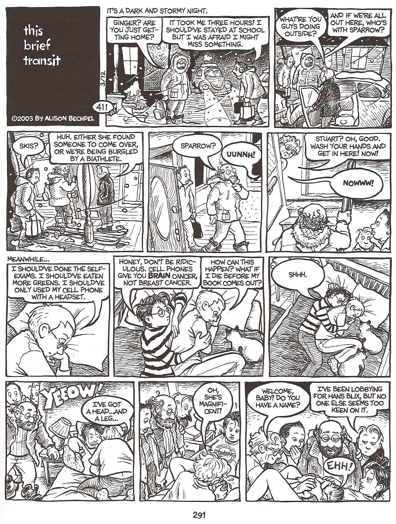
The Ugly:  Nothing.  Let’s look at another gorgeous strip, if only for proof of that:

Bechdel 3

4.5 Stars.

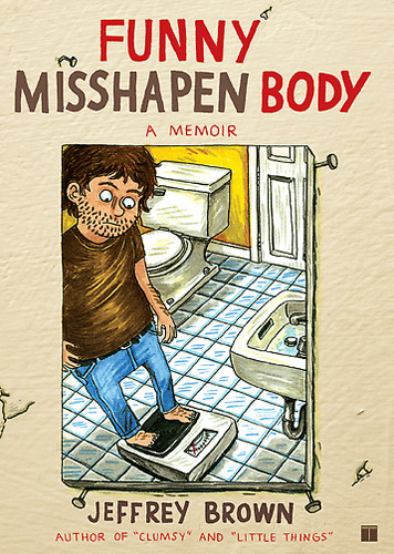
Funny Misshapen Body Cover

Funny Misshapen Body.  Jeffrey Brown (writer/illustrator).  Graphic Novel/Comics.

If you’re expecting an unbiased review of Brown’s latest book, Funny Misshapen Body, you’re totally in the wrong place.  I’m a huge Brown fan and really, he can pretty much do no wrong with me.  That said, I really enjoyed his latest offering.

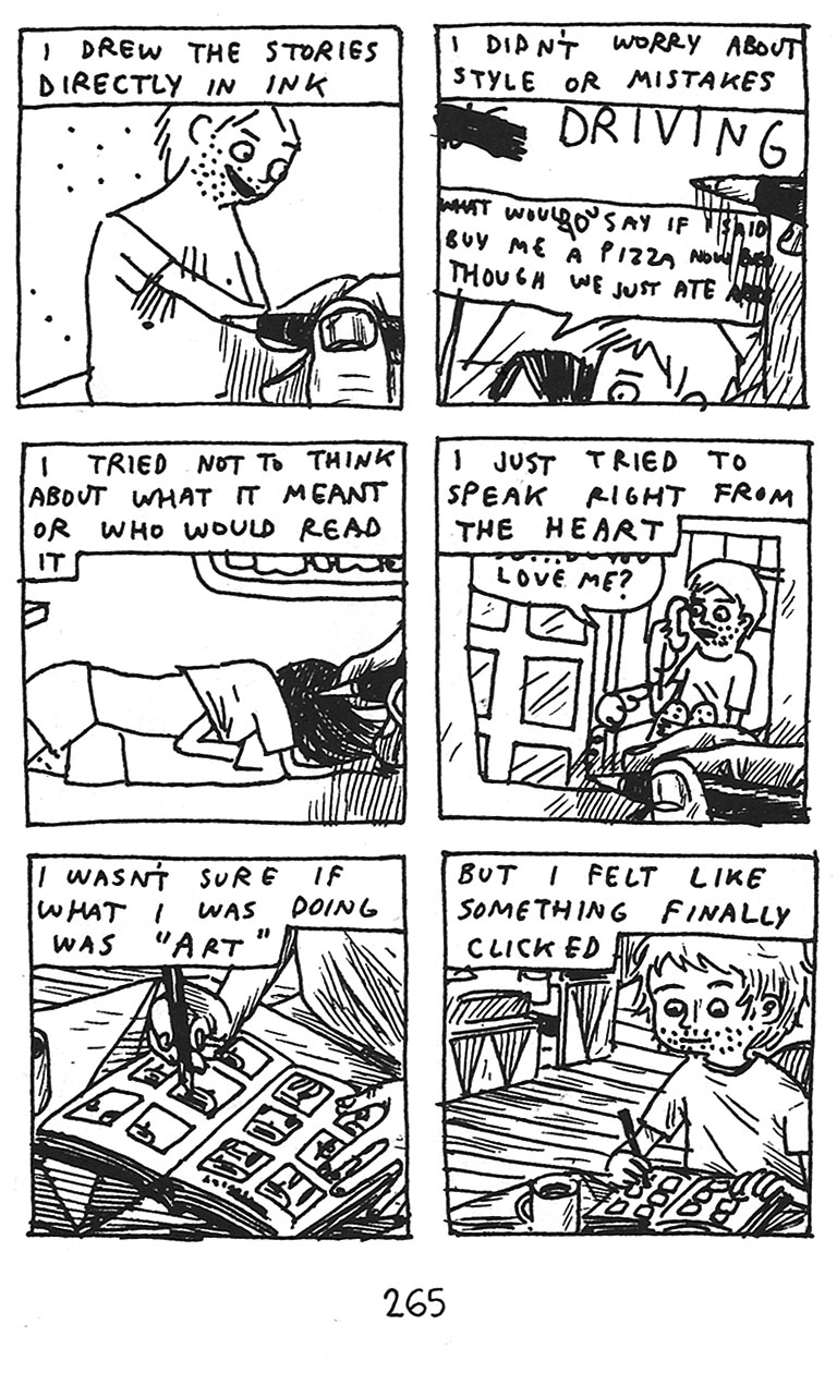
Funny Misshapen Body is essentially the story of Brown’s evolution as a cartoonist, and maybe a to a lesser degree his evolution as a person.  Like most of his work, the story is not told sequentially, but in random vignettes that shuttle back and forth in time.

Brown 1

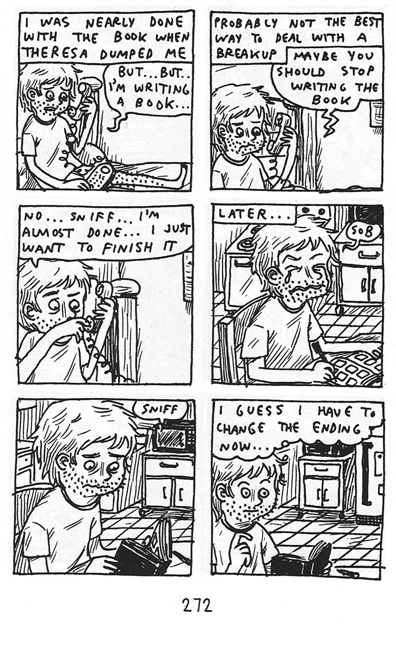
The Good: As always with Brown, he has an incredible way of telling a story simply and honestly – no matter how embarrassing.  In Funny Misshapen Body he covers everything from having Crohn’s disease in highschool, to the break up of his first real relationship, and including the horror of trying to get started as an artist and going through the ‘drunk college experience’ – Brown cuts no corners and spares nobody – least of all himself – and it is that honest unflinching look at his life that so endears him to me time after time.

Brown’s signature scratchy style (which you get to see how he came to in this book) remains one of the many ways that I think Brown keeps things honest – drawing straight on the page in pen, with no pencils done beforehand – almost forces the authenticity of his work.  There’s no chance to filter, water down, or second guess it.  He just draws what he feels and for me, it just works on so many levels.

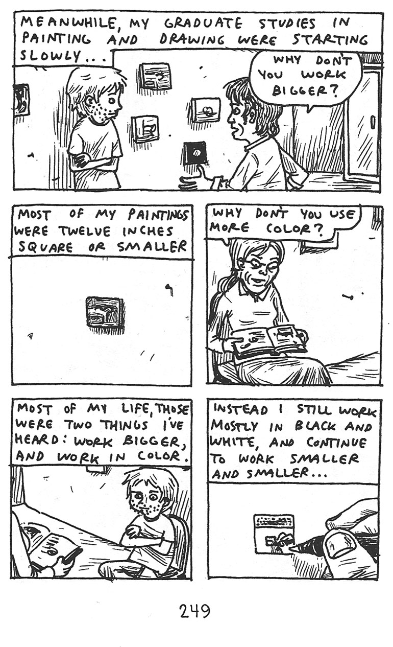
Brown 2

The Bad: I wouldn’t really rate this as bad, but though I found the subject matter here fascinating, it was slightly less effective for me than I expected, I think in part due to the non-sequential style.  I’m not exactly sure why, because even though an evolution seems like a sequential process, it’s really not.  There are so many ups and downs and back and forths as you try to figure out who you are in life, and what kind of artist you will be that the non-sequential aspect shouldn’t be a problem – and I have loved that unique element in his other works  – but it wasn’t as effective here for me.  I can’t quite put my finger on why it was less effective for me here.  Perhaps the fact that the vignettes seemed like more fleshed out fully realized stories – longer and more complex than his other stories – and so the out of sequence order became more confusing here, whereas in a work like Unlikely, it was almost impossible to tell things were out of order anyway…I’m really not sure.  But at the end of the day it was a bit less successful than I hoped.

Brown 3

The Ugly: For me, there’s not an ugly panel here.  For people that are not fans of Brown’s scratchy cartooning style I suppose this is not the book for them.  As I’ve said to people that are not on board with Brown’s style before, whether you like it or not, you have to remember that it is a stylistic choice he is making.  This is not the only way Brown draws, but he chooses to draw these small, kind of impromtu and unrehearsed panels as a way of further conveying his message.  It’s one of the best things about cartoonists that write and draw their own books – the art is so integral to whatever they are trying to tell you – and in my opinion it’s never more true than with Brown’s work.  If you don’t get it, you don’t get it, and that’s fine.  But for those of us who “get it” there’s nothing better.

4.0 Stars

Batwoman

Detective Comics #854.  Greg Rucka (writer) J.H. Williams III (illustrator).  Fiction – Comics.

First, a confession.  I really haven’t been reading mainstream comics.  Sure every once in a while I pick up an issue of X-Men, Batman, or Wonder Woman and such, but with the exception of The Walking Dead (and until recently Buffy) I’m never that impressed and so I never bother to keep up.  Comics often disappoint me.  It’s possible my expectations are just way too high, but comics are just never quite what I want them to be…maybe more to the point…what they were to me in the beginning when I so fell in love.  So, especially unemployed, I can’t afford to spend the money unless I’m almost in love.  Did you know an average full color comic is four bucks?!  Ah, the good old days when they were $1.50…sigh…I’m so old…

Anyway, I only tell you this, so that my review can be taken in the full context of me as a comics reader…compared to the super committed fan.  But onward…

[SPOILERS]

The Good: It was well written and fairly easy to follow considering the fact that with most mainstream comics you need to pick up about a thousand issues to understand what’s going on if you just jump on board randomly.  I thought Rucka did a good job of juggling both the existing fans that maybe have read those thousand issues and new fans that might be trying out Detective Comics for the first time (since there has been such excitement over Batwoman’s premiere).

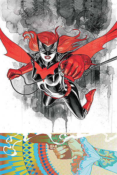
So the writing is solid throughout, but it’s the art that’s likely to bring fans back in droves.  The art is stunningly good.  From the Batwoman/Kate Kane basic design and execution to the individual pages and panels – really just gorgeous stuff.  Huge credit is also due to Dave Stewart who did the colors as they are just absolutely dead on and badass.

If we must deal with the whole ‘lesbian thing’ – and I think it would be the most progressive of us if we didn’t even have to talk about it – but we’re clearly not there yet as a society so I’ll comment.

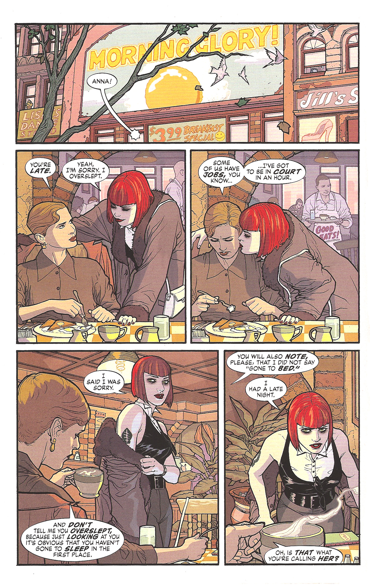
I think it was handled perfectly…in that it wasn’t really handled at all.  The scene that gives a glimpse into Kate Kane’s flailing personal life is honest and matter-of-fact, the way I’d expect any other relationship to be handled and so for that, I’m happy.  And I hope it continues as such.  Time will tell.  Rucka tends to write strong women well, whether lesbian or not, and so I have faith that he can handle Kate Kane and all her intricacies.

The Bad: The Batwoman costume design is so perfect – I mean look at those totally sensible – totally badass non-high heeled boots! – that I’m willing to forgive some sins.  I mean really…bright red?  It looks fantastic on the page, but let’s face it, what ‘creature of the night’ would wear fire engine red on their costume?  Anyway, I’m willing to forgive the red, because I am just that generous, but I’m not going to go along with this ‘hair piece thing’.

For those who haven’t seen the designs or read the issue yet, Kate Kane has short very red hair (see below), but as Batwoman she has this same very red hair, but very long and flow-y (see above).  They do make a minor plot point out of it in this issue as Batman makes an offhand remark about it (stating that the long hair is a liability), and it is revealed a few pages later to be a wig attached to the mask/helmet.  I suppose making Kane seem ‘oh so clever and unpredictable’.  But this is forced characterization to me, and one that doesn’t actually work, so I find this annoying and kind of frustrating. Let’s explore…

Do we have this hair situation just so we can have that moment between Batwoman and Batman?  If so, it’s not worth it.

Do we have the long hair because we “think it looks better on the page”, much like the fire engine red in the costume?  If so, I say we should have broken some boundaries there as well – like with the boots and gone for more realism…especially if you want me to buy all the bright red.

It should also be noted (as seen above) that it totally absolutely does NOT look like a wig attached to a helmet…it looks like hair, or MAYBE a wig attached to her head – which we all know would never stay on in a fight.

And as I obsess over this tiny (and really, let’s face it, totally insignificant detail) I realize (as we all eventually do) that Batman is still right.

The hair is a liability whether it’s real or not.  The hair getting pulled as real hair might hurt more – potentially ending a fight by taking our hero down – but if it’s a wig attached to the mask it’s highly likely to aid in yanking the mask off…which is a huge problem.

So at the end of the day, Batman is right (as always) and Kane actually ends up looking a little weak, which I think is probably the opposite of what Rucka intended.  Bottomline:  Kane should ditch the wig.  If she’s concerned about being identified I say she goes with a full head mask/helmet like Batman.  If that’s not the concern then no reason her regular awesome short hair can’t be the hair that goes with her badass costume.

But when this is the only complaint I can come up with for “The Bad” you know you’re doing something right.
Kate Kane page

The Ugly: Not an ugly thing about this book.  Personally, I found the action page layouts to be a little fussy and unnecessarily difficult to follow.  But I think that’s personal taste.  I tend to prefer more standard/basic comic book layouts – whether action scene or not.  Although I have to give credit to Williams III, if you’re going to do crazy layouts, do them as well as he does – they’re well thought out and from a graphic design standpoint are quite frankly stunning.  I just happen to prefer readability to graphic design achievement (in comics that is).
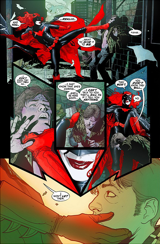
batwoman action page

one of the less complicated action pages

Overall I give this issue 4.0 Stars (out of 5) and I will definitely be following along…until I’m totally hooked or until these guys screw up.  So I’m in for another hand…at least.*

*I didn’t want to confuse the issue by also talking about the “Second Feature – The Question” eight page story in the back of this issue, but it’s a good story – well written and well drawn and is something I’m excited to read – which is rare – usually those “second features” are total throwaways – so nice work Rucka and Hamner.
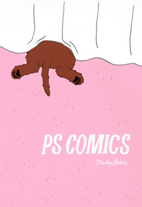
ps comics cover

P.S. Comics.  Melanie “Minty” Lewis.  Fiction – Graphic Novel/Comics

I picked this up totally randomly last week at the comic book store.  And it’s a great little book.  And completely what I was in the mood for.  I’m also glad I purchased it because these are the kind of books that I want (need!) to survive in comics.  Totally off the beaten path, with good, but ‘affordable’ production design (i.e. no color), etc.

After doing a little research I found that Lewis’ P.S. Comics started as mini-comics (I suppose self published) and have gained enough awards and recognition to make the leap to full blown book in local comic stores – which is fantastic.  Lewis’ issue #4 of the original mini-comic even won an Ignatz Award for ‘outstanding mini-comic’.

Lewis’ stories are mostly simple little tales that reveal tiny but important truths and are told via unconventional narrators – fruit, dogs, cats, and sometimes even humans.  My favorite tale of hers (available to read on her website if you’re so inclined) was about salt and sugar falling in love.  Their friends (pepper and coffee) of course make things a bit difficult for them, but their love prevails…at least for a little while.  It’s a great little story and I smiled all the way through.  Her dog and cat stories are good as well, but I personally found myself drawn more to her fruit stories – perhaps because I identified with poor apple – but that’s a whole other post.

Regardless, this is a great little book, and I encourage anyone that likes independent comics, or is looking to discover something new, to pick up P.S. Comics.

3.5 Stars

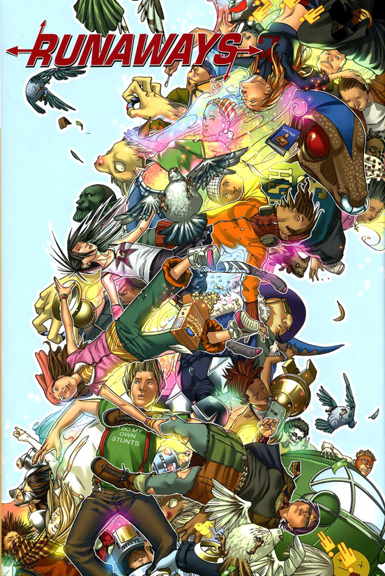
runaways-vol-2-hc

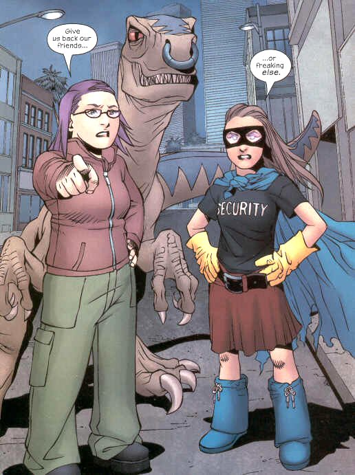
Runaways Vol 2 & Vol 3 (issues #1 – 24).  Brian K. Vaughan (writer) Adrian Alphona, Takeshi Miyazawa, and Mike Norton (illustrators).  Graphic Novels/Comics

Runaways is still better than most mainstream (especially superhero) comics out there.  But I have to be honest that Volumes 2 & 3 fell considerably for me from the bar Volume 1 set.  Like Volume 1, the strongest aspect of Volume 2 & 3 are Vaughan and Alphona’s likable realistic characters and the fantastic art.  But also like Volume 1, the weakest aspect in the subsequent books is the forced plot.

[SPOILERS]

As I read Volume 2 and 3 however I had to consider that maybe I’m just too old to be reading Runaways…maybe it succeeds on all levels and I fail it by simply being too old?  It’s entirely possible, because like Volume 1, Volumes 2 and 3 are beautifully drawn and well written, but I just can’t seem to fall in love.  I found the plot to be weak in these two volumes overall and I really wasn’t pleased that Vaughan killed my favorite character (Gert).  Though it’s possible she could come back, in a way I hope she’ll stay dead as bringing characters back from the dead in comics is one of my least favorite and most overused devices.  There were some great little arcs in these two volumes:  Karolina’s off world love story and subsequent growth is interesting and her fiance a good new complex character;  the ‘Gert from the future’ story was pretty cool and inspired; the bit with Spiderman eating sushi and Wolverine fighting Molly was fun, as was Molly’s one issue adventure as a sewer thief, but that’s about where my enjoyment ended.

runawayarsenic300

Aw Gert, I’ll miss you.

[MORE SPOILERS]

Read the rest of this entry »

the-eternal-smile

The Eternal Smile.  Derek Kirk Kim and Gene Luen Yang.  Fiction – Graphic Novel/Comics.

I picked up The Eternal Smile because of Vulture’s excerpt of one of the stories in this collection of three – and I was not disappointed (click on the Vulture link to read a large excerpt).  That story, Urgent Request, is one of my favorite short graphic stories I’ve ever read.  I loved the concept and the execution equally and had I liked all the stories in The Eternal Smile as much, I would have been hard pressed to give this collection anything less than a 5 star rating.

Unfortunately, and largely based I think, on personal preference alone, the other two stories just didn’t speak to me as Urgent Request did.  The art is well executed and lovely in all three stories, though different stylistically, which is a nice treat.  Urgent Request is the style that I personally find the most visually interesting and emotionally engaging, though Duncan’s Kingdom is drawn vividly and is complex in its own right.  The pages are really quite beautiful and I wish more mainstream comics were drawn as well as it is.  Gran’pa Greenbax and The Eternal Smile was the least interesting visually for me, though still, excellent in execution overall.

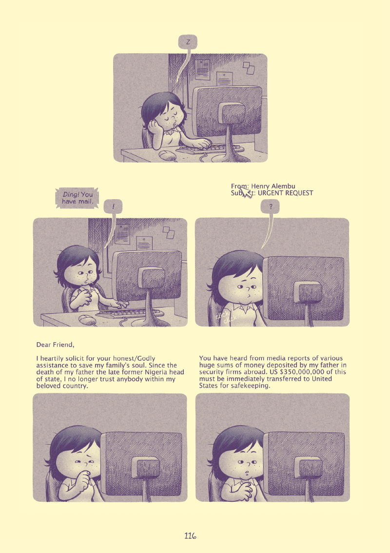
EternalSmileexcerpt

Excerpt from Urgent Request.

Unfortunately, though there is nothing wrong with Duncan’s Kingdom or Gran’pa Greenbax and The Eternal Smile and each bring nice stuff to the table, neither really did it for me plot/concept wise.  Neither story was as nuanced or poignant as Urgent Request and thus ended up suffering in comparison.  Urgent Request is a story about a shy, mild mannered office worker named Janet and her experiences with an urgent email request for assistance from Africa.  Janet makes unique choices and as such gets unique results and I found the story to be charming and innocent and missing the cynicism of ‘real life’ in all the good ways.  Duncan’s Kingdom is the story of a knight that makes good, but just can’t leave well enough alone, and through his own curiosity unravels the wonderful life he’s set up for himself.  Gran’pa Greenbax and The Eternal Smile is a loose parody of Uncle Scrooge and Ducktales (which I was never really a fan of – perhaps why this story didn’t hit home for me) and touches on interesting themes like money and religion.  The ‘Eternal Smile’ part of the Gran’pa Greenbax story is rather insightful and interesting, but that alone couldn’t save the story as a whole for me. But don’t get me wrongDuncan’s Kingdom and Gran’pa Greenbax and The Eternal Smile are not bad stories – not at all – they just didn’t live up to Urgent Request for me and so I was left feeling that Yang and Kim could have done better.

Even if you feel mixed about the collection, as I did, it’s still more than worth the $16.95 purchase price – beautiful packaging, stunning artwork, and thoughtful stories, and you never know, you may prefer different stories – or love them all.

Overall I give the collection 3.0 Stars, though if I was rating the pieces separately I’d break it down thus:

Urgent Request:  4.5 Stars

Duncan’s Kingdom:  3.5 Stars

Gran’pa Greenbax and The Eternal Smile:  3.0 Stars

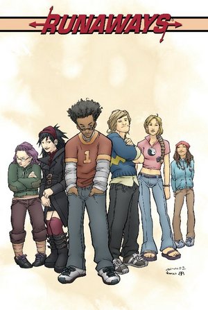
Runaways Vol 1 Cover

Runaways Vol. 1 (issues #1 – 18).  Brian K. Vaughan (writer), Adrian Alphona and Takeshi Miyazawa (illustrators).  Graphic Novel/Comics

So here’s the biggest problem with Runaways…I read it after Y The Last Man.

So though it’s very good…it’s not even close to Y The Last Man and so ultimately, I was disappointed.  I’m going to try my best to review Runaways without comparing it to Y…we’ll see how I do.

Let’s talk about the art first, if only because it’s easier.  Alphona is responsible for the bulk of the eighteen issues, with Miyazawa penciling only two of the whole volume (#11 & 12) and it’s to their credit that you almost don’t notice the switch…which is especially important in the collected work, so that it reads flawlessly without the characters changing drastically from issue to issue.  Frankly, I barely noticed the change and part of that credit should go to the inkers and colorists of the book (Craig Yeung and David Newbold inks and Christina Strain and Brian Reber colors) for keeping with the beautiful overall look and consistency.

The character designs are also particularly good in this book, and specifically for a teen book they are well considered and realistic, with some variety in ethnicity and body type and style, as teenagers really are.  The artists (all of them) keep everything nice and consistent within that framework throughout.

runaways excerpt

Now onto the actual characters.  I like Vaughan and Alphona’s characters.  This is the strongest aspect to me of Vaughan’s work in the book.  They’re interesting and work as teenagers, and it’s nice that there are more girls than boys (Vaughan continues to write women – and girls – very well).  I also really liked their powers, which are unique and not always pretty.  One character (Nico) has to bleed in order for a giant ass scepter to come out of her chest…not exactly like your run of the mill super strength.  Another character (Gert) has a pet velocirapter (Old Lace – which it turns out may not actually be a velocirapter) that is connected to her both physically and mentally.  Old Lace will do Gert’s bidding and will do anything to protect her but when Old Lace is hurt, Gert is hurt; and on top of that, Gert has no powers except for her link to her pet, and so she is pretty vulnerable as ‘superheroes’ go.

All the powers are pretty interesting, including the brute strength of the team, which is found in the youngest member, eleven year old Molly.  Karolina wins for best drawn power as her light power is absolutely fabulously rendered.  The book is also well written, especially by comics standards (which frankly, are generally too low for my tastes) but Vaughan delivers – the characters speak realistically and bottom line – it’s just consistently well written.

[SPOILERS]

Read the rest of this entry »

waterbaby

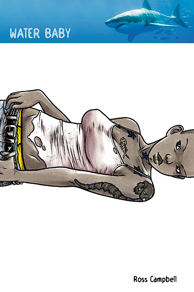
Water Baby.  Ross Campbell (writer/artist).  Fiction – Graphic Novel/Comics

I loved the hell out of this little book.  Campbell’s art is stunningly beautiful and I wish more artists – men or women – could draw women this way.  They are scantily clad for most of the book (okay, ALL of the book) but it fit the young surfing beaching characters and any concerns I would have otherwise had about it were put to rest by the fact that Campbell not only draws all his women with vastly different body types (as they exist in the real world – gasp!) but also, none of his female characters are window dressing in the first place – they’re the stars.  They’re the characters you love and spend the most time with.  So if they want to wear tank tops and tiny jean shorts and bikinis and such (and it fits their characters – which it does) then I’m on board.

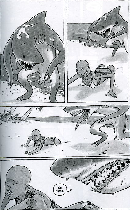
Beyond the art, the writing is solid.  The story is a great (and horrifying) little tale about Brody our badass female main character, a surfer that loses a leg early on in a shark attack.

waterbaby

Brody’s best friend Louisa takes care of the newly shaped Brody and when Brody’s ex Jake shows up it sends them on a road trip adventure that includes a troublesome teen they pick up on the road.  The basic story is enjoyable, but it’s Brody’s internal struggle that is so fascinating and well handled here – her nightmares and fantasies of her attack are disturbing and profound and speak volumes in mostly silent panels about what a struggle it must be to recover from such an accident…and that maybe you never really do.

WaterBaby2

Overall Brody is a fantastic hero – or maybe anti-hero – she’s strong willed and smart (though no rocket  scientist) she knows who she wants to be and isn’t afraid of it.  She tackles her problems as head on as she’s able and she seems to understand that she’s still figuring herself out – a measure of self awareness rare in the young.  I could have done without the gross factor (she picks her nose – though not too graphically) but otherwise I loved her.  Full of flaws and beauty, as we all are.  Louisa is similarly well-rendered, and is both alike and different than Brody in the ways that best friends usually are.  Jake is a bit of a sketch instead of a full blown painting, but as he’s not the star, or of too much importance I think he’s characterized just enough.

So here’s my confession.

This is a book from the now defunct DC Minx line intended for girls/women.  And I’m a jerk for not getting on board sooner and if not supporting these books, than at least checking them out.  I did look at the line when it first came out and like many fans (female and male alike) I found the first few books a bit lacking and I didn’t like some of the stuff I was hearing about the line.  First of all, it’s called Minx, which is annoying, and just (maybe) one step above Divas or Sirens, but as usual I can forgive the title if that’s the only place they go wrong.  But unfortunately, almost all of the creators (writers/artists/editors/etc.) were men, which is doubly annoying.  It’s not that men can’t write women well (case in point Ross Campbell, or my post earlier about Brian K. Vaughan) but it just stands to reason that if you want to start an entire imprint FOR girls/women you might want to get some amazing talented WOMEN involved.

Anyway, my complaints are valid, and I really didn’t like some of the stuff I originally saw come out for Minx, but if Minx could bring us Water Baby (a title that would likely be impossible to get published with any of the major houses – other than maybe DC’s Vertigo line) then I have to say I’m wrong.  And I wish I had gotten involved in this line (not that I’m some prolific blogger that changes the shape of the world or anything) earlier.  To at least throw my opinion out there, even if initially it couldn’t have been full blown support.  Another missed opportunity for the big publishing houses, gods know how long it will be before we get another shot.

4.0 Stars

If you want to check out more Water Baby, go to the Vulture Blog which has a large excerpt from the book.

Possibly.

But there’s a really really good reason for it.  Sorta.  I somehow missed the boat initially when the issues were coming out, even though I’d heard about it and was interested all along.  And then I missed enough issues that it was going to be difficult to catch up…without missing issues and having holes.  So I figured I’d wait until they came out all collected and I could read them in one sitting (which is my favorite way to read a great series anyway).  But the shit was taking WAY too long.  So here we are.

I finally got my hands on the first two big collected volumes a few weeks ago and plowed through them in a day.  Amazing stuff.  And then, unable to wait for however long it might take for everything else to come out, I hunted down the rest of the issues and read everything else in a couple days.

Amazing stuff.

y-the_last_man

Y The Last Man.  Brian K. Vaughan (writer), Pia Guerra (illustrator). Fiction – Graphic Novel/Comics.

[SPOILERS]

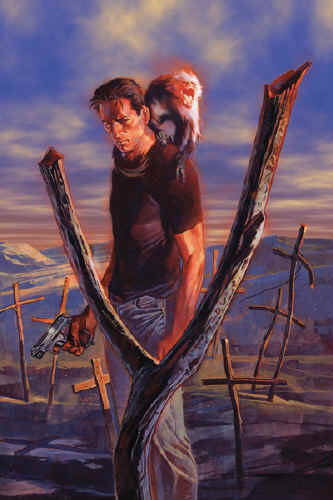
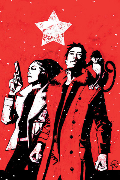
So for anyone who doesn’t know, Y The Last Man is essentially about Yorick, the last man on earth (along with his monkey – Ampersand – also male) after something kills all the men on the planet except him (er…them).

Yorick is a wonderfully layered character and he is surrounded by fascinating women, of all kinds, which is so refreshing to see in popular comics that I just don’t really have words to describe how happy it made me.  Vaughan’s world is filled with women that are good and bad and beautiful and ugly and horrifying and badass and brilliant, they are all of these things, because women ARE all of these thing, rather than just “sexy” as they so often get boiled down to in comics.  And Vaughan has established himself, at least in my mind, as being a writer that can write the hell out of women.  He gets it and I would welcome his take on any number of things I love any day.  It’s interesting to know that one of his other wildly successful projects, Runaways, also stars a mostly female cast.  Interesting.

Y The Last Man takes place over sixty issues, and one of the great strengths is that artist Pia Guerra is always there – so the art is always consistent and it’s fair to say, consistently gorgeous.  Guerra is a master and it’s such a treat to be able to see an entire series collected together with no deviation in the art.  Even in the best of circumstances an artist is rarely able to do every single issue of the series, so this is a real treat.

Guerra’s style matches Vaughan’s writing perfectly, and the result is one of those perfect books we rarely get to see in comics.

y the last man cover

My only complaint, and it’s a mild one, is the ending.  Like many fans of the story, I really did want a satisfying “answer” for what caused the plague.  I understand why Vaughan doesn’t give it to us – life – real life – is rarely that simple and spelled out and so it’s realistic for him to suggest possible answers but not say for sure, but so much time is spent on it over the 60-issues that I couldn’t help but feel disappointed and maybe a little cheated not to get a real resolution.  It felt a little like he’d possibly written himself into a hole he wasn’t sure how to escape from.  Regardless, the story in its entirety will remain a benchmark in graphic novels/comics for years to come and has solidified Vaughan’s status in my mind as both a sensational writer and also one of the few men out there who write women as well as women themselves do.

4.5 Stars

Also, if you want more information on Y The Last Man (though beware of spoilers) the wikipedia page is really detailed about the series – very nice. 

« Older entries § Newer entries »