Hey Kids…in case you missed the announcement on twitter, I was on Audioshocker this week to guest host “A Podcast With Ross & Nick”…it was incredibly fun (as I’ve learned guest hosting always is when you can just walk away and someone else does all the heavy lifting for you!)/ Also, because I apparently can’t shut up, it was really damn long. But worth it! We talk about Batman, creator responsibility versus fan entitlement, the existence of talent, and a few other things. Both Ross and Nick also try to make me sing…apparently this is going to be a “thing” with me. Let it go people, it’s never going to happen!
You are currently browsing the archive for the art category.
So over on She Has No Head! I mentioned that two categories, “Best Cover” and “Best Single Issue” were incredibly hard to decide this year thanks to an influx of great stuff I had trouble deciding between. As a result I decided to do a top 30 covers for 2011 on 1979. As always with these cover posts, I stick to Saddle Stapled North American releases, since that is what I have the most access to, and because I don’t feel a monthly comic should be rated against a graphic novel or trade.
Without further ado…these are my “30 Best Covers of 2011″…
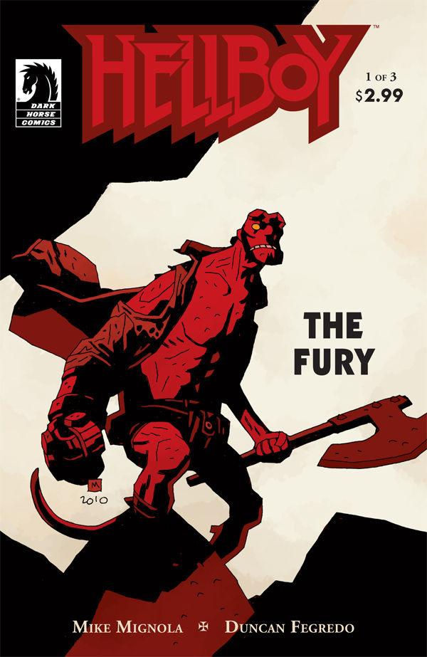
030. HELLBOY: THE FURY #1 – Mike Mignola
So simple and yet so effective. When you have a character as wonderfully designed as Hellboy you really just need the confidence to let him command the page, and Mignola obviously has that. With a limited Black, Red and Grey-ish white color palette, single figure (with a big ass axe) and a lot of white space you have powerful imagery that also creates amazing positive and negative shapes. Gorgeous stuff.
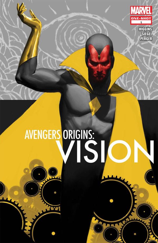
029. AVENGERS ORIGINS: VISION – Marko Djurdjevic
The limited color palette with a big swath of yellow and a small pop of red is inspired. Almost as much as Djurdjevic’s use of wonderful simplified graphic elements and shapes with ah highly rendered and realistic figure. A cover absolutely deserving of Vision!
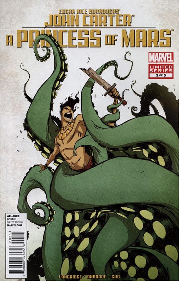
028. JOHN CARTER: A PRINCESS OF MARS #3 – Skottie Young
This is wonderful on so many levels. The composition has such energy and creates such great shapes, both positive and negative. The size and complexity of the tentacles while still remaining graphic and simple – how in places it devolves into just basic shapes is wonderful. The color choices, as always with a Young cover are inspired and subtle. Huge bonus points for it being one of the first tentacle covers I’ve ever seen in comics that doesn’t feel “kinda rapey”.
Tags: comic covers, comics!
Edited to Add: Jezebel has picked up this post and republished – check it out!
Last year I did two massive posts about the 20 best female comics creators of 2010. I thought  about revisiting that list this year, but I felt a lot of those ladies still belong on that list and I wanted to make sure to feature new creators. So instead I decided to add to it, with 13 new ladies who did great work in 2011 that I’d like to recognize. So, without further ado, here are 13 fantastic female creators in comics that you should be watching, reading, and supporting.
Please, before filling up the comments with women you think are missing, make sure to check out 2010’s list which includes: Kate Beaton, Rebekah Isaacs, Becky Cloonan, Amy Reeder, Jill Thompson, Gail Simone, Faith Erin Hicks, Kathryn Immonen, Emily Carrol, Amanda Connner, Hope Larson, Linda Medley, Fiona Staples, Colleen Coover, Raina Telgmeier, Lucy Knisley, Sarah Glidden, Katie Cook, Jen Van Meter, Nicola Scott, and Gabrielle Bell.
Tags: comics!, fantastic female comics creators, women in comics
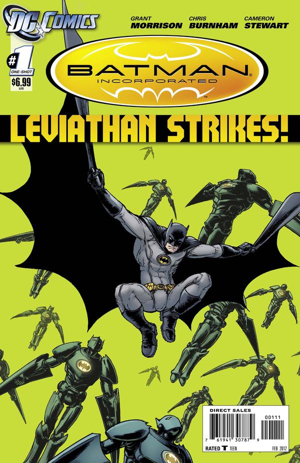
Have to give this week’s Cover Of The Week to Chris Burnham’s Batman Inc. Leviathan Strikes #1 – though it’d look a lot better without so much crap splashed all over it:
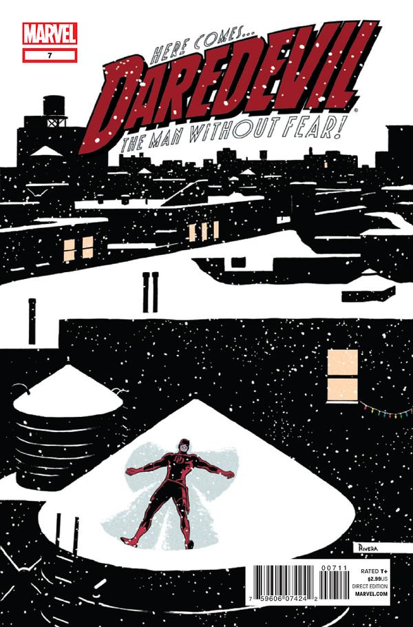
Although for “holiday spirit” I have to give it to this wonderful Daredevil #7 from Paolo Manuel Rivera:
Tags: comic covers, comics!, Cover Of The Week
Still no panel of the week since my scanner remains dead to the world, but I can still offer up some Cover of the Week choices.
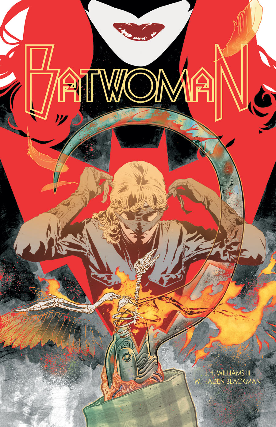
Of course it’s a Batwoman week…so are you surprised to see Batwoman #4 by J.H. Williams III here? No, you certainly are not. Gorgeous.
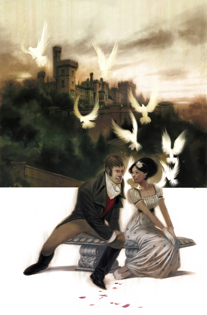
Also strong this week is Julian Totino Todesco’s Northanger Abbey #2. All of his covers are looking lovely but this one, thanks to those birds is my favorite. I love how they glow white and draw the eye. They also create a great graphic shape. Really wonderful stuff.
Tags: comic covers, comics!, Cover Of The Week
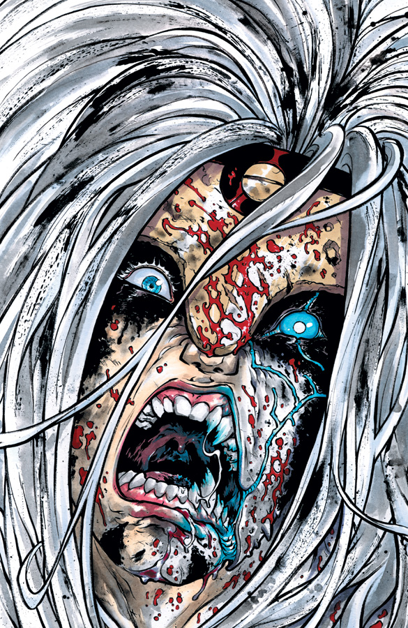
I bitch and moan (fairly regularly) during Drunk Cover Solicits about being tired of “split face” covers where a comic character’s face is split down the middle. I think I even said recently that I was officially over those kind of covers.
Well, sometimes it’s damn good to be wrong. Check out this dynamic completely badass Ross Campbell Glory #24 cover (which is issue #2 since its “re-start”). “Split face” and all, it’s awesome.
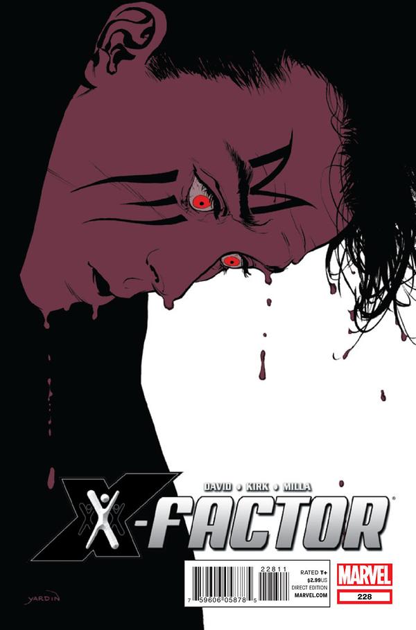
Love this David Yardin piece for X-Factor #228. Beautiful and haunting and very unique for mainstream superhero comics.
Tags: comic covers, comics!, Cover Of The Week
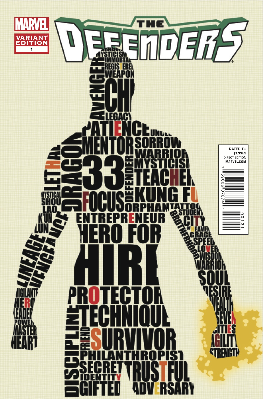
Much delayed, I loved this variant Defenders #1 cover from 12/1/11, but I can’t find the artist. Anyone know? It’s awesome.
Update: Arg. The paint fumes really ARE getting to me. This came out 12/7/11…I’m all mixed up since I did the advance review of this…that said, I’m too tired and busy and paint fume-y to change it all. So in the world of 1979 Semi-Finalist…this stands.
Tags: comics!


