artists

You are currently browsing the archive for the artists category.

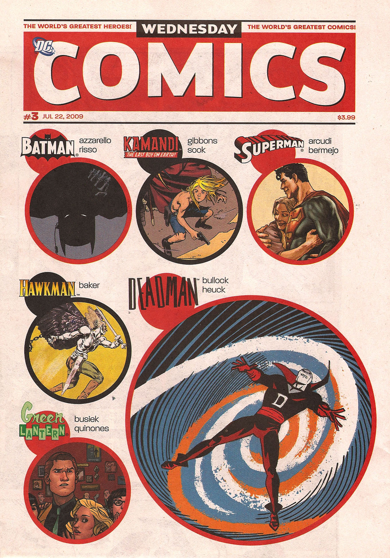
Wednesday Comics #3

Someone at DC deserves a raise (probably Mark Chiarello) because the limited 12 issue run Wednesday Comics is the best idea (and the best execution of said idea) I’ve seen in a very long time.  These beautiful, full color newsprint broadsheet style comics, each telling 16 individual full page on-going weekly stories by some of the most talented writers and artists working in comics today are quite frankly…awesome.

The real genius of the project comes from DC Art Director Mark Chiarello approaching some of the absolute best writers and artists in the industry and simply asking them what character and story they would most like to tell given the opportunity.  That freedom to tell any story, to take on any character, without having to worry (so much) about all the other stuff – like heavy editorial interference (etc.) had absolutely breathtaking results.  The authors and illustrators love for the characters and story is not only palpable, but contagious.

EXCERPT FROM MARK CHIARELLO’S INTERVIEW WITH NEWSARAMA:

MC: I think that’s an astute observation. In comics, creators are often asked what they would want to do with a certain character within certain boundaries, but this is “what do you want to do?” from the very start.

That’s what I did when I did Solo, I picked the artists, like Tim Sale, for example, and just let him go. As an artist myself, I can tell you that you’re very rarely asked to do what you really want to do – historically, I think every comic book company could take a bit of a lesson from that. I don’t think someone called Alan Moore and Dave Gibbons and said, “We’ve got this idea called Watchmen that we’d like you to take a go at.” That sprung from them.

Emphasis mine.  And what a great lesson that is. I hope that Chiarello quote gets posted on the walls of corporations everywhere.

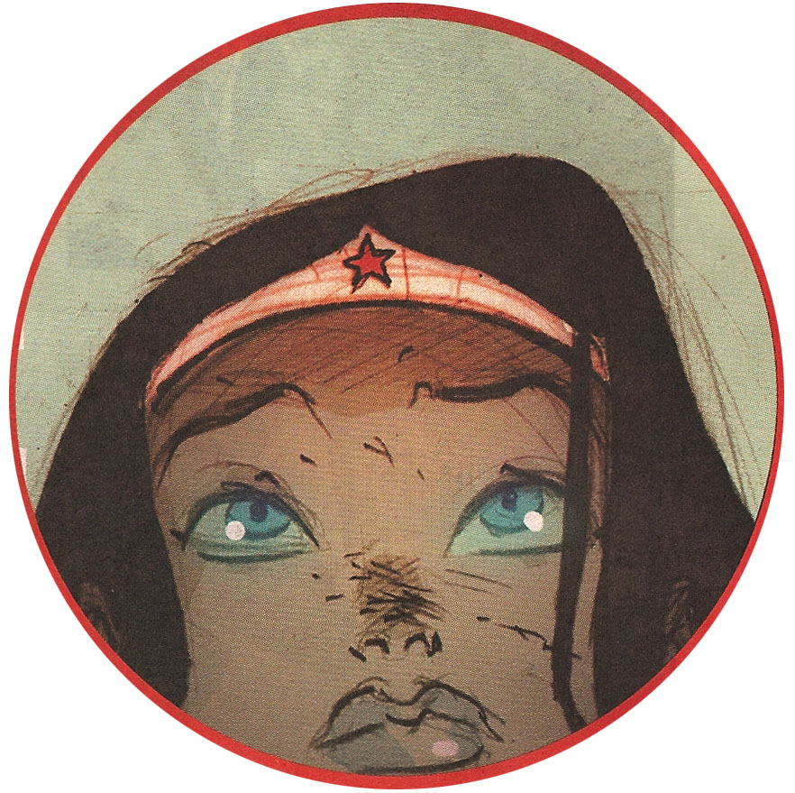
I didn’t read all of the stories, mostly because some characters just interest me more than others – for example despite Dave Gibbons being an utter genius I’ve just never been that interested in Kamandi.  There are a few cases where the format does not work to the authors’ advantage such as in the Wonder Woman strip.  Ben Caldwell’s Wonder Woman has perhaps some of my favorite illustration work in the entire series, but the layout for the story is overly complicated, too small, and confusing, making it nearly impossible to read.  At some point (issue #2?) I gave up on reading Wonder Woman…but that’s the great thing about Wednesday Comics…where one story fails one person or another, there is still so much left to choose from and to still get incredible enjoyment (not to mention your money’s worth) out of a single issue.

wonder woman caldwell

Above: Caldwell’s Wonder Woman – beautiful!

The art across the board is fantastic, although Amanda Conner, Eduardo Risso, Joe Quinones, Brenden Fletcher, Rob Leigh, Kyle Baker, and Lee Bermejo stand out as particularly exceptional.

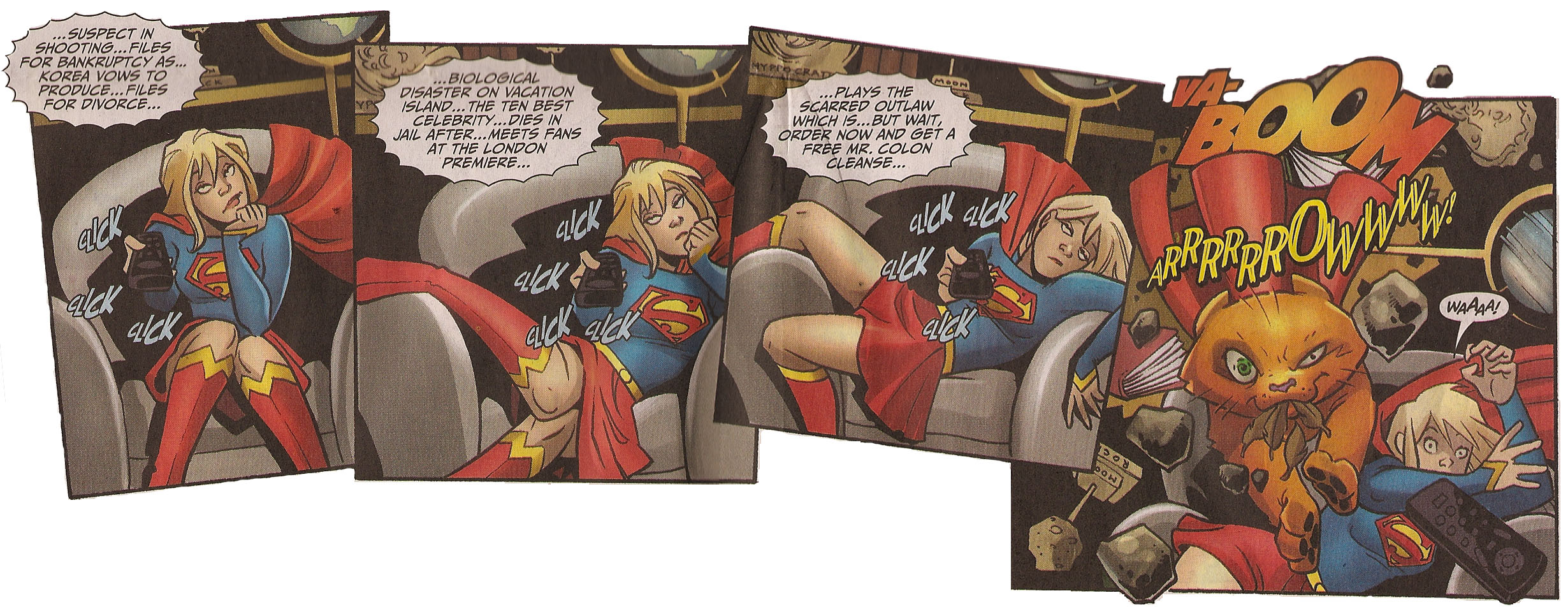
My personal favorites are Batman (natch), Superman, Green Lantern (shocking! I’ve never thought of myself as a Hal Jordan fan), Flash, Deadman, Metamorpho, and The Demon and The Cat Woman.  I’m not usually a fan of the silliness of super pets but Palmiotti’s Supergirl is a nice breath of fresh air in the usually so serious superhero world and Conner’s cartooning for Supergirl really cannot be beat.

Supergirl Conner

Above: Amanda Conner’s Supergirl

I think one of the things that Wednesday Comics also nails, without perhaps even trying to, is their success in capturing the nostalgia of a simpler time.  I’m not that old (okay, I’m sorta old) but I never really had the true youth experience of reading superhero comics in the newspaper like many others, but I can still appreciate the format and it somehow still reminds me of my childhood, which given all the screw ups in comics these days is really one of the reasons I always come back to them.  Better memories of simpler times in my life…and my perceived belief that that meant a simpler time in the world at large.

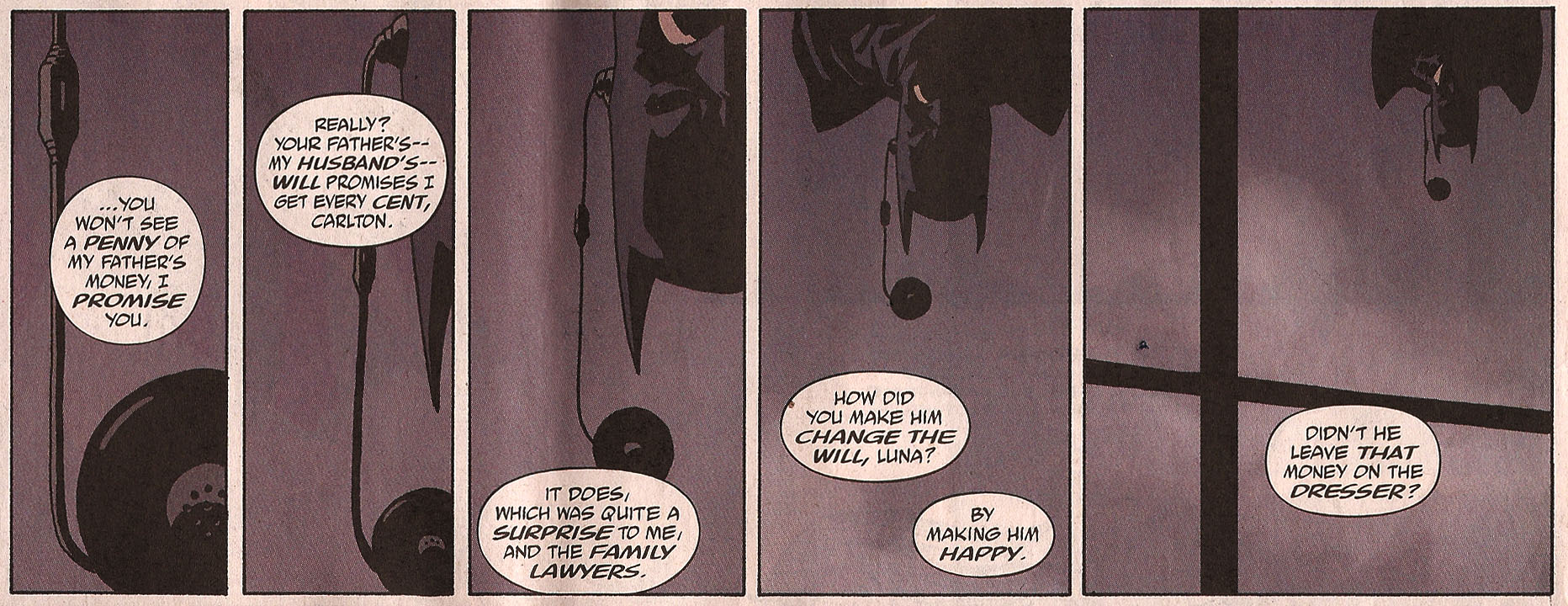
Batman

Above: Eduardo Risso’s Batman

Today (9/23/09) marks the last issue of the twelve week, twelve issue run.  The finale in a great experiment that I hope DC will make a habit of – perhaps every summer for the rest of my life?  Or better yet, perhaps they can find a way to translate what made these stories so refreshing and wonderful to their regular books…now wouldn’t that be a sight?

You can pick up Wednesday Comics #1 – 12 at your local comic book store – or if you’re having trouble tracking some of the issues down, you can find them on Amazon (some are already above cover price – so don’t delay).  Also, below the jump you can see the writer and artist for each of the strips.

Read the rest of this entry »

But no, I can’t tell you when, because though Cartoon Network’s Adult Swim has released a preview trailer for Season 4 of The Venture Brothers, there is still no official premiere date.  Check out the trailer though – it’s awesome.

Venture Brothers

If you don’t know about The Venture Brothers then this trailer will only confuse the hell out of you…well, even if you know The Venture Brothers it might confuse the hell out of you, but you’ll be used to it, because you’re used to the random awesome magic of…The Venture Brothers.  Nice circle logic I did there, huh?  If you watch until the end of the trailer you’ll automatically go into the next video which is The Venture Brothers creators talking at the San Diego Comic-Con Panel…and it’s pretty funny in its own right.

On thing to note, that panel is looking very man heavy…it sure looks like you guys could use some strong female writers…and um, just so you know…yes, I’m available.  :)

There are also some great stills from Season 4 (among other awesome posts) on Jackson Publick’s blog Publick Nuisance – check it out.

batgirlforbatgirl

thanks to pasrimonia for the awesome ‘batgirl for batgirl’ poster image.

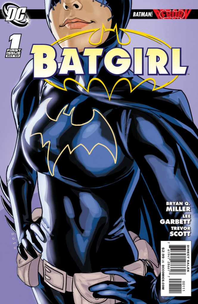
All signs point to the new Batgirl not being Cass.  And the most recent hints suggest it is either Steph (The Spoiler) or a combination of two or three women (possibilities that seem to include : Cass, Steph, Babs, or Misfit) taking up the cowl together…which is an interesting idea, but I admit I’m not really on board, mostly because I just don’t understand why it’s not Cass straight up and with no ‘battle for the cowl’ bullshit.

I feel like the fans really love her and have long embraced her, but DC just somehow never has, and I don’t know why.

I guess the only thing I’m truly glad about is that it doesn’t LOOK like the plan is for it to be Barbara – which I would hate.  There’s speculation that because of dropped hints that they wanted to bring her back as Batgirl and changed their minds.  I would love if this was true, because it suggests that they do listen to fans (everyone loves Barbara, but almost nobody wants her back in the Batgirl uniform) or at least to themselves when they realize something isn’t right.  The bottom line is that Barbara has so evolved beyond being just Batgirl.  Barbara is so much more as Oracle and she can’t go backwards in time…which is what it would be for her to put on the Batgirl uniform again.

Anyway, let’s be all scientific like and look at the hints:

There were the three images released as Batgirl teasters, and each of them are basically different costumes, and thus suggests different women…which I guess is where we’re all getting idea that it will either be a team up of multiple women donning the cowl, or at least a battle to be the one and only.

The first (and my favorite of course) is pure Cass (although a bit heavy om the boobage).

Batgirl 1

Read the rest of this entry »

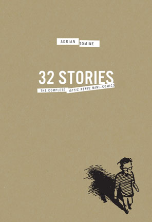
32Stories.indd

32 Stories: The Complete Optic Nerve Mini-Comics Box Set.  Adrian Tomine (Writer/Artist).  Comic Books/Graphic Novels.

I’m a huge fan of Adrian Tomine’s later works – Summer Blonde, Shortcomings, every New Yorker cover he does – but I largely missed out on his early Optic Nerve mini-comics, so I was delighted to see Drawn & Quarterly release this gorgeous box set of his original mini-comics (Optic Nerve #1 – # 7).

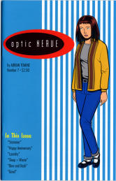
I dug into them this past week, and it was such a great experience, I doubt I can accurately explain how much I enjoyed it.  Reading them seemed somehow both progressive and also like a total throwback to when comics used to really genuinely make me happy.  It’s also great, as I’ve discussed before in relation to reading Alison Bechdel’sDykes To Watch Out For collected , to be able to see the evolution of a writer/artist in one sitting like that.  Tomine’s drawing, inking, lettering, his very style evolves before your eyes and it’s a wonderful thing to behold – to see an evolution captured like that.  Not that issue #7 is better than issue #1 – just different.  There was a real rawness and almost sloppiness to the early issues that I loved.  But it was amazing to see Tomine’s drawing slowly evolve more into the style that I’m familiar with today.

Optic Nerve

As I said there’s a real gritty and honest style to Tomine’s early work and when I realized that the first four issues of Optic Nerve were self-published by Tomine before he even graduated from high school I almost fell out of my chair.  Even with the rawness of it, this is an incredible accomplishment and really underscores the talent Tomine possesses.

Some of my favorite stories in this collection are: Back Break in #2; Rodney in #3; Adrian Quits His Job in #3; All Choked Up in #4; Haircut in #5; Mike The Mod in #5; My Appearance On The Jane Pratt Show in #6; Leather Jacket in #6; Allergic in #6; Smoke in #6 (#6 was my favorite issue); and Happy Anniversary in #7.

Adrian Tomine

I also really enjoyed the additions to the Box Set in the form of another book with an introduction and some special features including a handful of unpublished sketches and strips.  The best of this to me was Tomine’s discussion in ‘A Note on this Edition’ of another writer/artist having gotten a copy of his high school yearbook years ago and posting his high school picture on a heavily trafficked web forum.  Tomine talks honestly and frankly about how he felt about this (badly), how he dealt with it (badly) and how he feels about it today (not so badly – and to prove it that same high school photo is the cover of the introduction book).  But it really gives you some perspective – that no matter how talented and amazing we are (I will never in my life come remotely close to touching the badass-ness that is Adrian Tomine) we are all vulnerable and sometimes vain…but that ‘this too shall pass’ is something that really is true, and if we can remember it and laugh it off, we’d all be better off.
4.0 Stars.

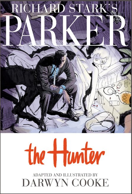
the hunter cover

Man, I want to get my hands on this SO bad.  No luck last night at the comic shop.  Will keep trying.  SO pretty.

Check out the 18 page preview on IDW.

Tell me that doesn’t make you sing deep down into your toes.

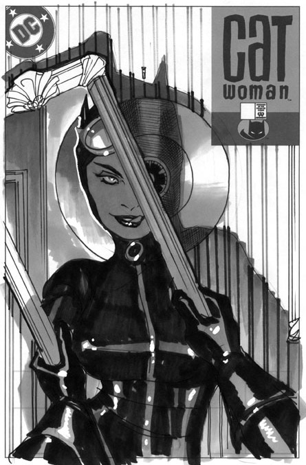
A commenter mentioned the other day, that his favorite Catwoman cover was #74 by Adam Hughes.  And I’m inclined to agree that it’s a beautiful cover – quite frankly you’d be hard pressed to find a cover of Hughes that isn’t stunning.

Catwoman 74 published

However, the primary reason Catwoman #74 did not make my list, is because of unnecessary boobage – which I’m sure you can imagine – I encountered a lot in my search – and by no means was Hughes the only offender.  But what’s interesting about Catwoman #74 is that in my searches I came across an unpublished sketch version of the same cover – but without the excessive totally unnecessary pornstar cleavage.

Catwoman 74 Unpublished

As someone who is very well endowed myself (TMI!), I speak from personal experience that the last thing you want are those babies hanging out while you jump from rooftop to rooftop…not that I jump rooftops…but really anything remotely athletic?  You want those babies zipped up and contained!  So it’s just silly looking to me.  And that zipper must have superpowers of its own to stay RIGHT THERE.  The laws of physics do not apply to that zipper!  Additionally, though Selina’s expression is gorgeous in both drawings, I much prefer the sketch version where her eye is on the safe behind the mirror (her true goal) and not on herself in the mirror apparently approving of how hot she looks.

If Hughes had executed the sketch version of this cover, I would likely have included it in my list, as it’s a great concept and Hughes pretty much always delivers on execution – but as the pornstar version is the one that found its way to our comic book stores, it just never had a chance on a list made by me.

But the real question is…was it Hughes choice to unzip the front of Selina’s costume…or was it DC’s suggestion…?

Also of note on the Adam Hughes front is that a surprising number of people have complained about no Hughes Wonder Woman covers being included in my list.  I did have several I was considering, but in the end, though all beautiful, it’s the boob factor that inevitably got them booted from the list too.  Officially, I don’t approve, and where better to make myself heard than here?  That said, I feel confident that Adam Hughes is really well represented (perhaps too much) as he has four covers on this list already.

Also, I like Catwoman way more than Wonder Woman (I try to love WW, I really do, but she makes it SO hard).

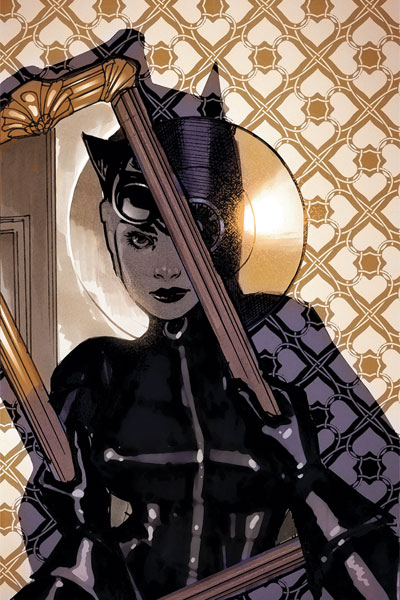
Update:  A reader sent me a copy of this even further developed sketch from this issue.  I still love the way this looks and prefer it to the boobage one, however I think the expression here is less powerful.

Catwoman 74 solicitation

*I guess, TECHNICALLY Catwoman is a villain, not a superhero, but we all know it’s more complicated than that…right?

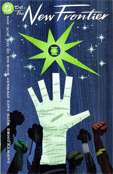
Darwyn Cooke New Frontier

Hey all you Comic fans, Pop Candy fans, and 1979 Semi-Finalist fans – check out Pop Candy, which linked to 1979 Semi-Finalist today for the 100 Best Comic Covers post.  Anytime I can get featured on Pop Candy by the delightful Whitney and mentioned in the same article as Jeffrey Brown, the world is a very very good place.  Thanks Whitney!  And welcome to any newcomers that stop on in. I hope you stay a while.  :)

Kelly aka 1979 Semi-Finalist

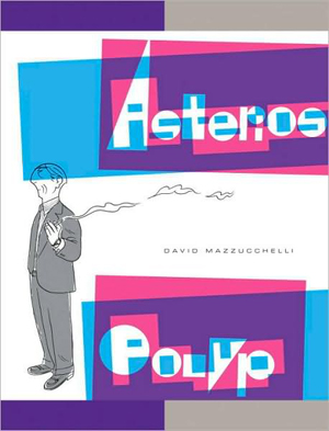
Asterios Polyp Cover

Asterios Polyp.  David Mazzucchelli (writer/artist).  Fiction.  Comics/Graphic Novels.

I am an idiot.  Why you ask?  Because I was not in favor of Adam buying this book.  You see, it’s thirty bucks and he’s trying to save up for a short film that he’s doing in September.  And so I was very naggy about the whole thing when he talked about how much he wanted to splurge and buy it.  Of course I never bothered to look it up.  If I had I could have saved us all a lot of naggy bitching.  Hell, I would have bought it myself and saved him the trouble.

HELLO GORGEOUS!

SOOOO worth the thirty bucks.  When I think of the other worthless things I’ve wasted thirty dollars on…oh the horror.   I have a secret Mr. Mazzucchelli…I would have paid $50…maybe even $75.  It’s stunning – the perfect blend of form and function…of art and content.

You want to see a little taste of what I’m raving about?  Here ya go:

asterios page

That’s not enough?  Okay, check out the Vulture Blog’s eight page excerpt.

I feel like just dispensing with the actual “review”, but for record’s sake, let’s do it.

The Good: Mazzucchelli’s use of color, use of panel, use of white space.  His pacing and storytelling abilities – my god!  His perfect cartooning.  The heartbreaking tale of Asterios Polyp and the writing that blends seamlessly with the art…sometimes becoming the art.  A tale that flies in the face of simple and easy ideas like “karma” but also has a light of hope and redemption for our hero.  There’s a reason some pieces of literature get called “masterpieces” and there’s a reason we don’t throw that term around all willy nilly.  Asterios Polyp is a masterpiece.

ap panel 1

The Bad: Nothing.  I mean really, I can’t think of anything negative.  I read this book in one sitting, spending most of a long afternoon totally engrossed.  And I have to say, I can’t wait to go back and read it again.  I know there are still literally dozens of hidden treasures that I missed on first reading that will reveal themselves to me in each new chance I get to sit with it.   It’s a book I will enjoy my entire life.  Unfortunately it belongs to Adam.  Damnit.  If we had room for two copies on our shelves I’d get my own copy…just in case.

ap panel 2

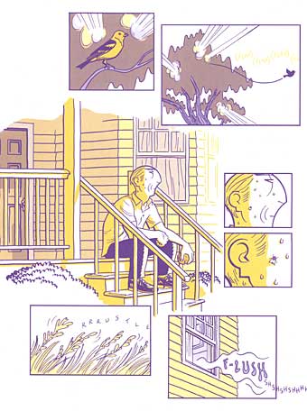
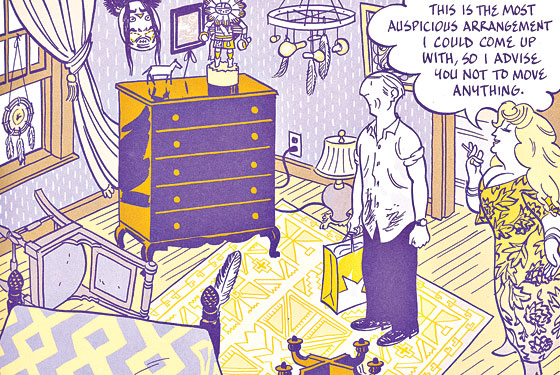
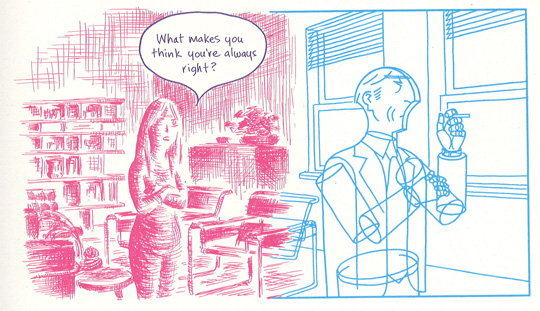
I mean look at this!  Illustrating different people (in a relationship no less) in not only different colors, but with completely different styles and they talk with different text.  It’s brilliant and important.

The Ugly: The word ugly and this book should never be used in the same sentence.  Ever.

5.0 Stars

And on the final day of Comic-Con, here are the top 25 Comic Covers.

For Part I, Part II, or Part III click the links.

025.

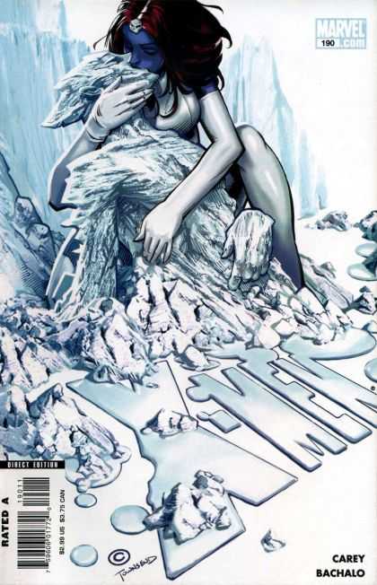
025 Chris Bachalo

X-Men #190.  Chris Bachalo. There’s something about this cover that I just can’t get out of my mind…but I have trouble putting my finger on what exactly it is that speaks to me.  I mean I love all the white (as mentioned previously) and I obviously adore the integration of the title into the illustration so we’ve got less crap covering it all up, and it’s a great concept, but I don’t know, there’s just something sweet about it.  That kiss, which maybe is supposed to look passionate…to me looks…compassionate.  It’s Bachalo’s best cover to date if you ask me.  And I’m a fan.

024.

024 James Jean

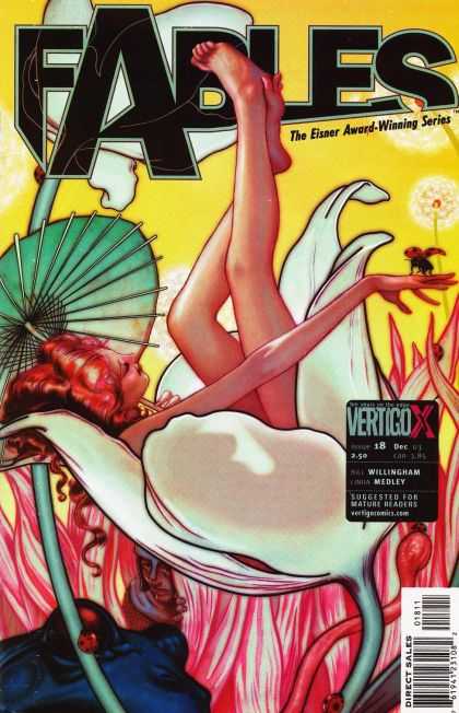
Fables #18.  James Jean. This one never fails to move me.  The vibrant luscious colors, the subtle but definite dark outline.  The composition.  The desire to get lost in whatever world that Jean creates.  This was the first of Jean’s covers I ever saw, and I think the first of his work I ever saw, and it shocked me with its stunning beauty on the stand.  If I recall correctly I said, “OH.” and dropped everything else I had to pick it up.  And such began a fervent love affair with James Jean’s work.

023.

023 John Cassady

Astonishing X-Men #2.  John Cassady. More monochromatic blues…YUM.  The dichotomy of the simplicity and complexity blended together here is what really does it for me I think though.  You’ve got the blank background, barely a different color than Emma, and with the title open and see through to that background.  The intensity of Emma’s eyes, commanding the reader’s attention.  The power of her over Cyclops optic beams, and the power of her over Scott himself.  It’s all rather brilliant while beautiful and because of how this story arc of Whedon’s plays out, it’s a great tease to the readers of all the complexities that are to come.

022.

022 Charlie Adlard

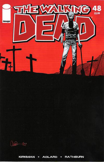
The Walking Dead #48,  Charlie Adlard. All of Aldard’s work is pretty wonderful, but I picked this one, because to me (and Mr. Adlard and I have of course had no actual conversations about this – so maybe I’m way off the mark) but to me, he’s placed the horizon line so high on the page because our characters become more and more enveloped by the dead around them with every issue.  As if they’re trapped in a room with a rising tide, and we just know that eventually, they will drown.  Our main character Rick is seen here, already missing a hand, burying the dead, and almost pushed off the page because the dead fill it.  It’s such a simple little thing, but is really an inspired and brilliant choice.

021.

021 Bob Kane

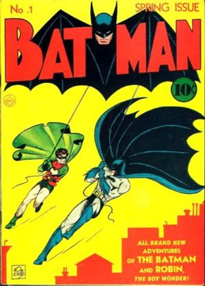
Batman #1.  Bob Kane. This iconic cover, portraying my favorite comic book hero Batman in his own comic’s first issue, is instantly recognizable.  And though the color scheme has changed much over the years (yellow and red in today’s Gotham?  Never!) the swinging into action position of Batman (and Robin) is dead on.  This issue is also notable for being the first appearance of Catwoman/Selina Kyle then known as The Cat in 1940.  Very cool stuff.

020.

020 Leo E O'Mealia

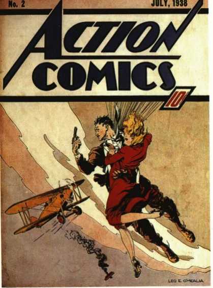
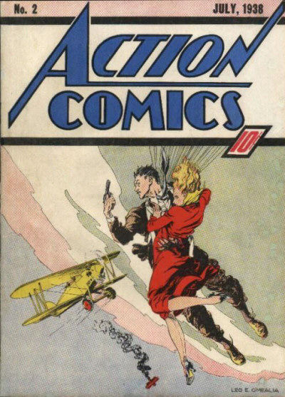
Action Comics #2.  Leo E. O’Mealia. It blows my mind how fantastic this cover is, and how overlooked is often is, simply because Action Comics #1 was the first appearance of Superman.  But really look at this cover – the movement, the composition, the positive and negative space, the color scheme, and really just the quality of the illustration work – it’s all quite stunning – and it was done in 1938…Amazing.

Although, it is worth noting that I also found this scan (see below) of Action Comics #2, with a decidedly different feel in the color work – no bad or worse than the one above, but decidedly different and since I’ve never seen an original I can’t say which is more accurate to the original color – anyone else know?  I personally prefer the first one, but both are nice and deserving of their place.

Action Comics #2 - 2

Read the rest of this entry »

And on we go…

For Part I and Part II click the links!

050.

050 Adam Hughes

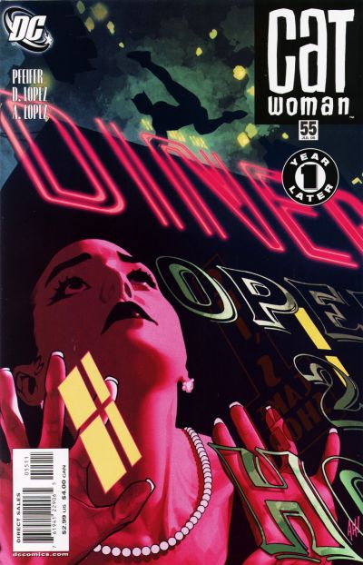
Catwoman #55.  Adam Hughes.  So I think we should all just take a moment to appreciate the beauty of this illustration.  The detail of the signage painted on the glass, the neon light, the amazing colors, it’s all fantastic.  But the real beauty of ths is in the iconic Catwoman figure in silhouette acrobating across Gotham.  It’s a singular immediately identifiable figure and its powerful heroic (or anti-hero in this case) shape speaks volumes about superhero icons.

049.

10549_4_014

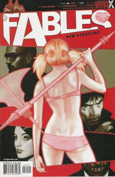
Fables #14.  James Jean. I wish I could explain to people (not you of course dear reader) but people that don’t understand misogyny in comics why this is NOT misogynistic, despite being a woman in basically underwear drawn from behind.  Because this is not exploitative.  But I’m not sure how to explain why not to people that don’t immediately see the difference.

I suppose the first thing you can say is that if you look at the body (no pun) of Jean’s work you’ll find very little to no unnecessary exploitation of the female figure…so he immediately gets the benefit of the doubt.  Secondly, the figure is not coyly looking over her shoulder with a “sexy face” smile…she’s also not arching her back provocatively…or jutting out all her “sexy’ “naughty” parts.  She’s just a figure drawn from behind.  She’s stylized and slightly idealized, but not drawn as a parody of a woman in underwear…or a young man’s wet dream of what a woman might look like in her underwear.  She’s also casually holding a badass weapon as if she absolutely knows how to use it.  And lastly, none of the characters on the cover with her are objectifying her either.

For all these reasons, this is the way a cover with a woman in underwear could/should be drawn.  Learn from this cover, artists…please.  It’s not that you can’t draw women in their underwear, but it’s HOW you draw a woman in her underwear.

Thank you.  *Steps off soapbox* :)

048.

048 Jack Kirby

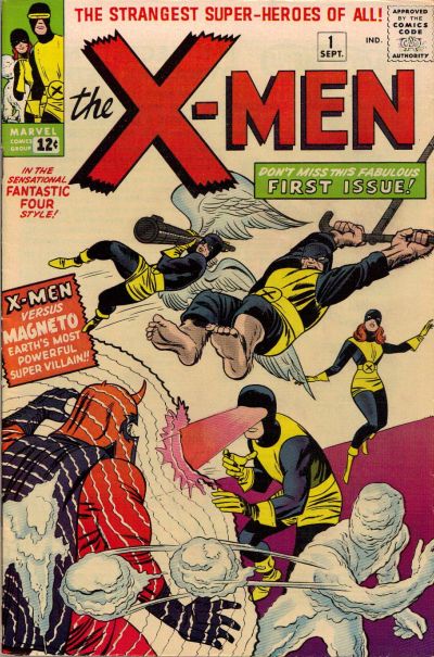
X-Men #1.  Jack Kirby. You knew this one was coming.  And it deserves to be here.  And if Jean Grey wasn’t standing around like a moron in the background while the “men folk” fight the Master of Magnetism then perhaps I would have bumped it up several notches.  I’m willing to concede that her power is difficult to draw and Kirby may have just been at a loss here, but still, it pisses me off a little.

047.

047 Paul Smith

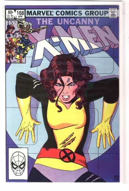
Uncanny X-Men #168.  Paul Smith. A totally iconic Uncanny X-Men cover.  You know I was never a big Kitty Pryde fan (sometimes bordering on hate) though there were times I enjoyed her in Excalibur and Joss Whedon’s run on Astonishing X-Men showed me a whole new side to her that I appreciated.  But regardless of how I feel about Kitty this cover is great – the expression and positioning – up against a wall in a Danger Room – totally makes me want to read the story.

046.

Frank Quietly

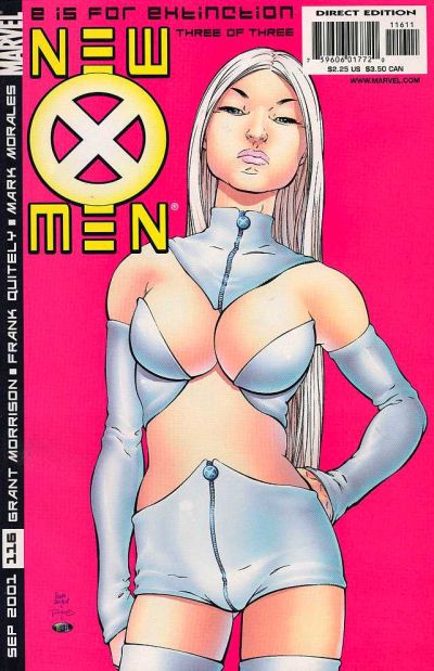
New X-Men #116.  Frank Quitely. Again we have Mr. Quitely, and again, people love it or hate it in my experience.  As my brother said “It looks like she’s smelling something nasty”…and he’s right, but y’know, that SHOULD be Emma Frost’s expression.  She’s pretty much a bitch, so I think that expression is just about dead on.  I love this cover because it just owns everything.  Emma’s skin is just alive on the page – it looks fleshy and real and spongy and not plastic and over processed and that is a rare rare thing in comics.  Also, the hot pink background is totally inspired.  I know Josh hates the crotch of her shorts, but honestly – that shit looks real too – if you put on some crazy costume like this, I guarantee you’d get some weird bunching…in strange places.  I much prefer the reality of the folds and imperfections in a costume than the usual which is supposed to be spandex, but just looks like colored body paint.  It just makes the cover all the more real for me.

Also, I suppose I should address the “is this exploitative” issue.  To me, no.  Largely because THIS is Emma Frost.  She’s like this.  She would TOTALLY wear this, and she would have that expression while you stared her down in this outfit trying to find your voice.  So for me, the character justifies the artwork here.

045.

045 Jack Kirby

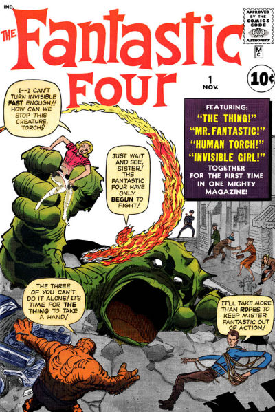
Fantastic Four #1.  Jack Kirby.  This absolutely belongs on the list as one of the iconic superhero covers of our time.  It’s great – I just love that monster with the giant gaping mouth.  Though Kirby’s work is really beautiful I tend not to love Fantastic Four covers because they’re always covered with text balloons and I’m not a fan of that so much, but this is a benchmark cover and it deserves a spot in the top 100.  I suppose, much like with the X-Men #1 cover, I would give it a little more credit if Sue Storm didn’t seem so much like a worthless damsel in distress and more like the superhero that she is.

Read the rest of this entry »

« Older entries § Newer entries »