chris ware

You are currently browsing the archive for the chris ware category.

I’ve been meaning to post about this very cool event MIX 2012 sponsored by Columbus College of Art & Design for a long while now, but have been so swamped that now I look at my calendar and it is upon us!

So it’s terribly late notice for those of you not in the area, but if you are in the area, you really should consider attending this amazing new event organized by the Columbus College of Art & Design and featuring two days of symposiums, a 24-hour comics marathon, and an exhibition.  The schedule looks great, and when Chris Ware is your keynote speaker, you know you’ve done something right!

It’s held at the Columbus College of Art & Design campus and begins on October 3rd and runs through October 6th. You can get all the details at the link and if you’re in the area, you should definitely head over there!

 

Tags: ,

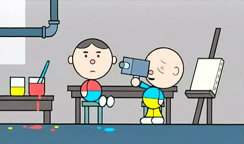
If you’re a fan of This American Life, or of Chris Ware, or just of all things awesome, check out this animated short by Chris Ware and John Kuramoto from the second season of This American Life on Showtime.  Awesome stuff.

Do yourself a favor and watch the whole thing (it’s about four minutes long) as it is well worth it and gets funnier and funnier as the story progresses. 

Below is a still I found (thanks google images) of Chris Ware’s animation for another bit on This American Life with he and Ira Glass I believe.  Good times.

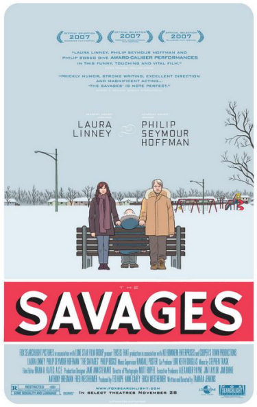
 savages_ver1.jpg

Chris Ware is a god among men, it’s good to see EVERYONE is finally getting this.  I was already interested in seeing the Savages thanks to a couple great previews I saw in the theaters that look chock full of amazing performances by powerhouses like Laura Linney and Philip Seymour Hoffman.  And now I see the poster.  Created by cartoonist/genius Chris Ware, this is the best movie poster I have ever seen.  Let’s have more of these. 

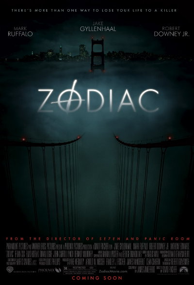
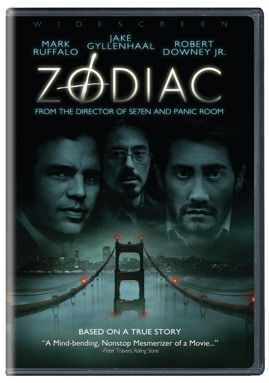
You know what would be really great?  If when the DVD came out this was the cover…I am so sick of horrible DVD covers that only slightly resemble the original great movie poster, because of actors and agents and studios (or WHOEVER) deciding that we have to have photoshopped floating heads and huge names printed all over what was a beautiful original work, because apparently we won’t buy or rent or whatever a dvd if it doesn’t have a giant floating Robert Downey Jr. head.  Zodiac (see below) is a perfect example of this.  Great poster.  Horribly destoryed DVD cover.  I almost didn’t buy the DVD because of it, but the strong performances made me cave in the end.  Curse you Hollywood.

zodiacposter.jpg

Look at this poster – GORGEOUS. 

zodiac_dvd__large_.jpg

And here’s the crappy DVD version, complete with giant floaty heads.  Just terrible.