comics

You are currently browsing the archive for the comics category.

Been a while since I did these. But I’ll be CRAZY biased next year thanks to my work on IDW’s JEM AND THE HOLOGRAMS with Ross Campbell so I figured I should get in a final year. I did a comprehensive “Best of 2014” over on CSBG for this week’s SHE HAS NO HEAD! and this is simply an extension of that piece.

As always, you can see my biases in my choices. Title integration is important to me (which is why I’m only showing cover art with the titles on it), so are interesting compositions and great use of positive/negative space. I also tend to love bold colors (and a lot of white is a personal favorite) as well as simple, graphic, iconic images. Creativity is obviously key, but a lot of what makes a cover work for someone is just gut – how it makes you feel – and that it DOES make you feel. All these covers make me feel to some degree or another. This list is also only single issue comics – usually US since that’s what I have access to (no graphic novels or trade covers were considered for the list). As always I’m never quite sure if I got the order right, but it is what it is!

Here we go, counting down from 52 – one for each week of 2014.

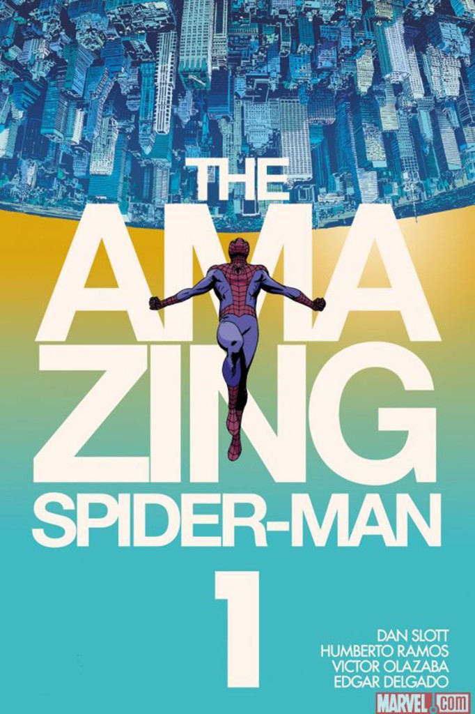
52. THE AMAZING SPIDER-MAN #1 BY MARCOS MARTIN

051 amazing_spider_man_1_cover - marcos martin

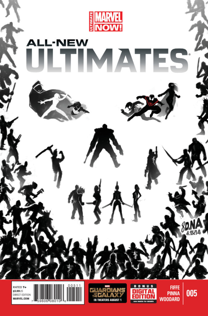
51. ALL-NEW ULTIMATES #5 BY DAVID NAKAYAMA

050 All New Ultimates 5

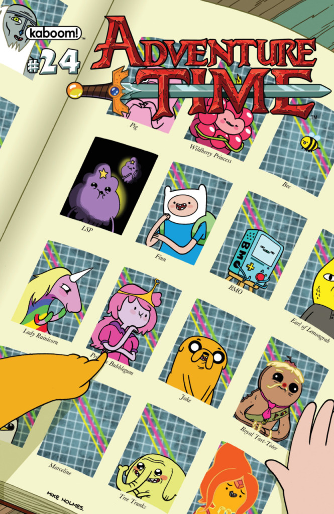
50. ADVENTURE TIME #24 BY MIKE HOLMES

049 Adventure Time 24a - Mike Holmes

49. LUMBERJANES #8 BY NOELLE STEVENSON

048 Lumberjanes 8 - Noelle Stevenson

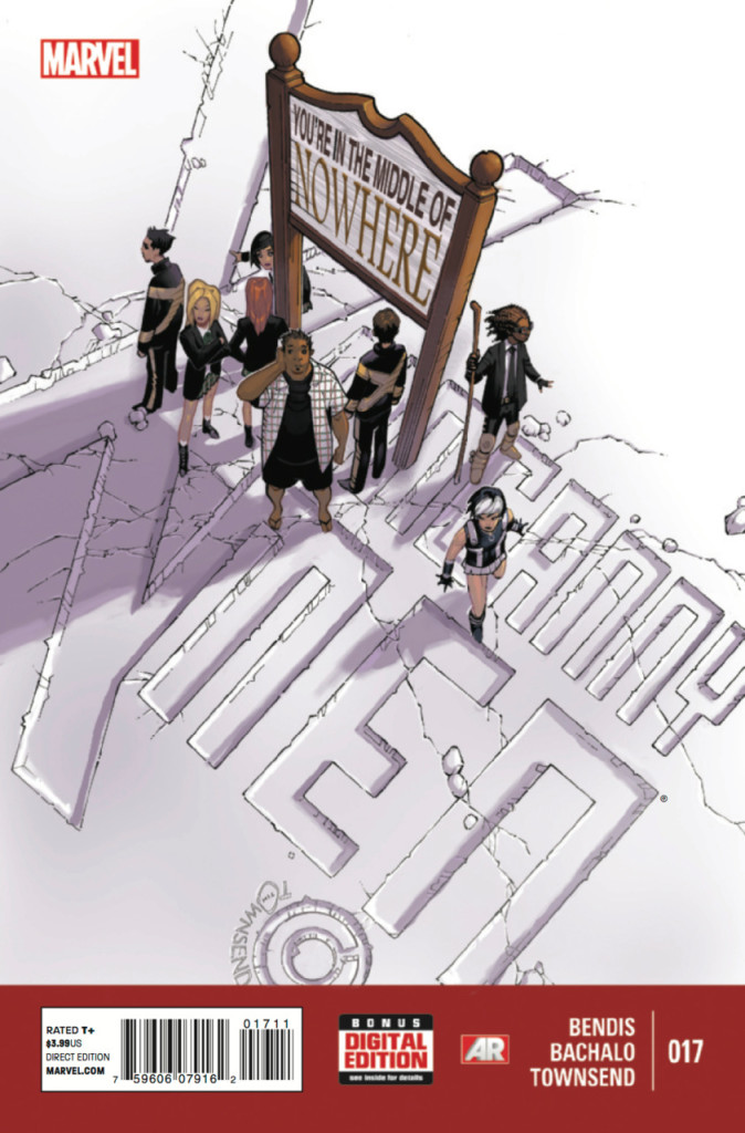
48. UNCANNY X-MEN #17 BY CHRIS BACHALO

047 Uncanny X-Men 17

Read the rest of this entry »

Tags: ,

I wrote a new piece over on CSBG about how disturbing I find DC’s (very pretty) Bombshell Variant Covers for the month of June – after only a handful of hours we’re up to over 100 comments because people really have problems when you criticize mainstream superhero work and marketing…even though many agree it’s backwards and ill-thought out regularly.

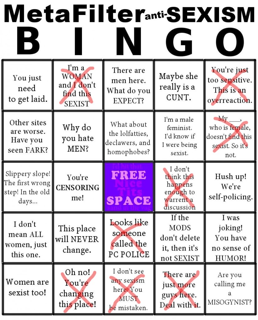
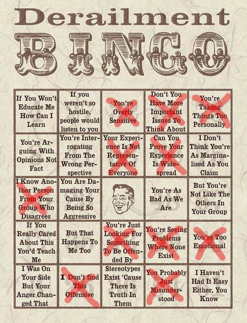
Anyway, posting here two images to show how well we’re doing already on Derailment Bingo and Sexist Bingo. Enjoy!

Sexism BingoVia Geek Melange

And DERAILMENT BINGO TOO!

Today's Derailment BingoVia Piranha

GOOD TIMES!!!

Tags: ,

Covers of the week for 10/09/13.

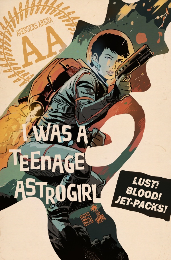
Mainstream: I love that this cover feels anything but mainstream. This gorgeous entry for Avengers Arena #20 by Francesco Francavilla is badass in its retro-ness. Honestly, Fracavilla has done some great covers but I think this is my favorite by far. Love it:

avengers_arena_16_FF_cover_low

Independent: Though I didn’t love the first issue of Coffin Hill, this cover by Dave Johnson is awesome (and the title design most especially – not sure who’s responsible for that?):

COFFIN_Cv1_REV_823iqzml0v_


Tags: , ,

Last week’s cover of the week:

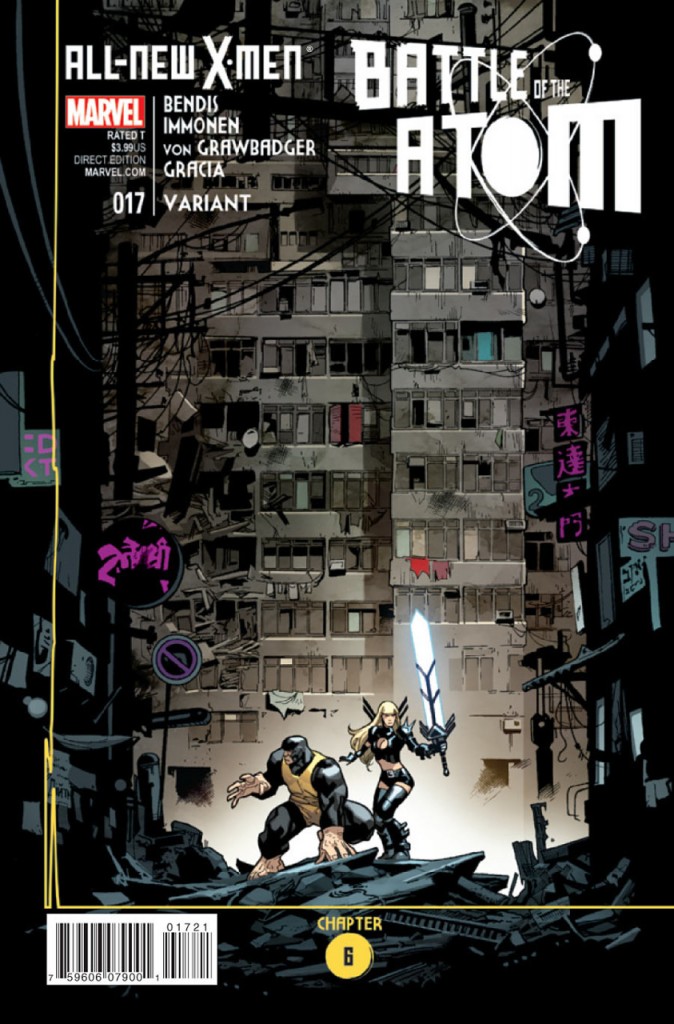
Mainstream: I love this alt cover by Stuart Immonen for All-New X-Men #17. It’s so not a traditional superhero cover and I like that they did their best to let the unconventionally awesome illustration speak for itself in how they approached the titles and even the chapter notation (etc.). I’d still like it better with less words on the cover, but it’s pretty awesome overall:

3345486-17b

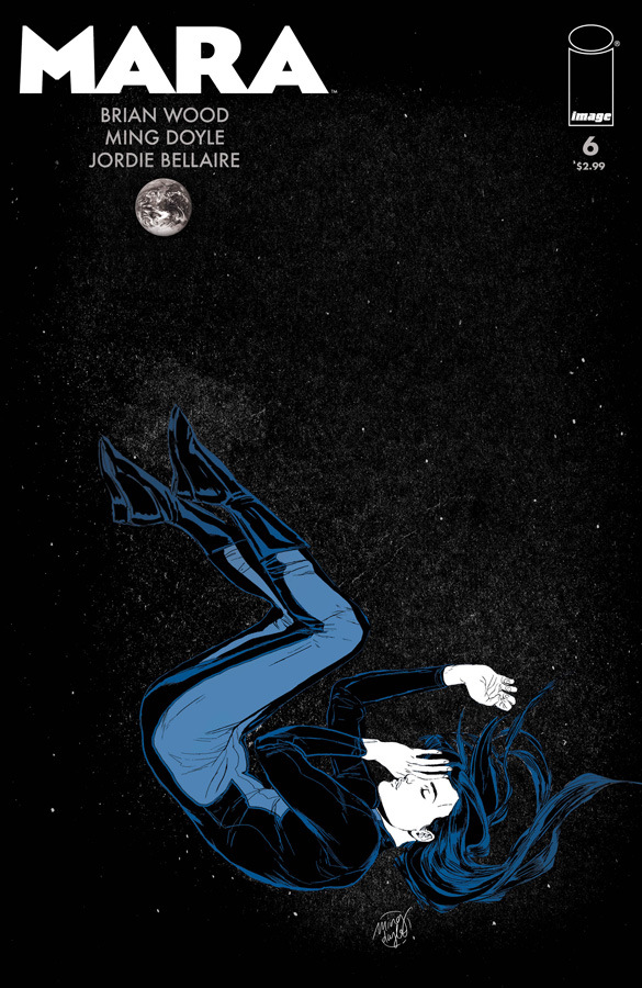
Independent: Ming Doyle’s gorgeous final cover for Brian Wood (and Ming Doyle’s) Mara mini-series – Mara #6 – gorgeous use of negative space, and limited colors. Love it:

mara06_cover

Tags: , ,

Yeesh. Sorry guys. Things have been…things.

But Matt Fraction and Chip Zdarsky’s cover to Sex Criminals #1 from Image is enough to rouse even the dead:

3330358-sex+criminals

See?

Anyway, to be honest, there’s nothing from the Marvel/DC side really worthy of cover of the week. I like the Young Avengers cover, it came the closest, but it’s just not quite there. DC is utter crap in covers as we FINALLY emerge from “Villains Month” from here on out known as “Hell Month” or maybe “Utter Waste of Time & Money Month”…you get the picture.

Anyway, more Sex Criminals covers please! :)

Tags: , ,


Amazing, it’s a day of release post. How is it possible???

Rules: one cover from the “mainstream” (i.e. DC/Marvel) and one cover from the “indies” (i.e. anything NOT DC/Marvel).

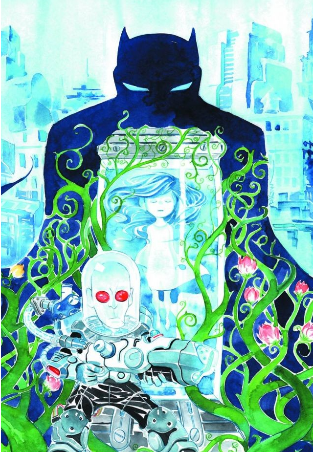
From the mainstream we have a gorgeous watercolor offering from Dustin Nguyen for the print release of Batman: Li’l Gotham #5. SO GORGEOUS:

Batman Lil Gotham 5

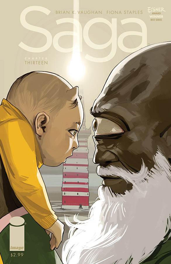
From the indie side, we have the triumphant return of Saga, with Saga #13. Fiona Staples continues to just deliver the most fascinating and wildest covers around. So simple and yet so brilliant. Also…baby Hazel with her horns! Love it:

saga13-cover-fc8ed

Tags: , , ,

Rules: one cover from the “mainstream” (i.e. DC/Marvel) and one cover from the “indies” (i.e. anything NOT DC/Marvel).

I sort of broke the rules this week. But not really.

Let’s explain. This week I used Jeff Lemire’s gorgeous Trillium #1 from Vertigo for our mainstream corner on the technicality that it’s technically DC…this might have been okay, except for last week I did just the opposite, justifying that Vertigo counted as indie, so I could put up Nathan Fox’s Collider #1.

But this is the benefit of running your own damn blog. I MAKE ALL THE RULES! AND RULES THEY ARE MADE TO BE BROKEN (or something).

Trillium #1

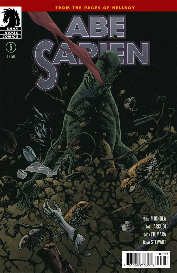
In the indie corner this week we have Abe Sapien #5 from Dark Horse by Max Fiumara. Gorgeous stuff. I ALMOST went with Image’s Sheltered #2 by John Christmas, but I didn’t love the arbitrary way that the trees just turned into black…didn’t quite work. Very cool otherwise though:

3222710-05

Tags: , ,

Sorta on time???

Rules: one cover from the “mainstream” (i.e. DC/Marvel) and one cover from the “indies” (i.e. anything NOT DC/Marvel).

In the mainstream corner we have Kris Anka’s absolutely mind blowing Uncanny X-Force #10. I cannot even with how amazing this idea is from stunning concept to perfect execution. It’s smart, highly relevant to the content within (which I WISH I like a tenth as much as Anka’s covers), and just ballsy and cool on every level. Love it.

Uncanny_X-Force_Vol_2_10_Textless

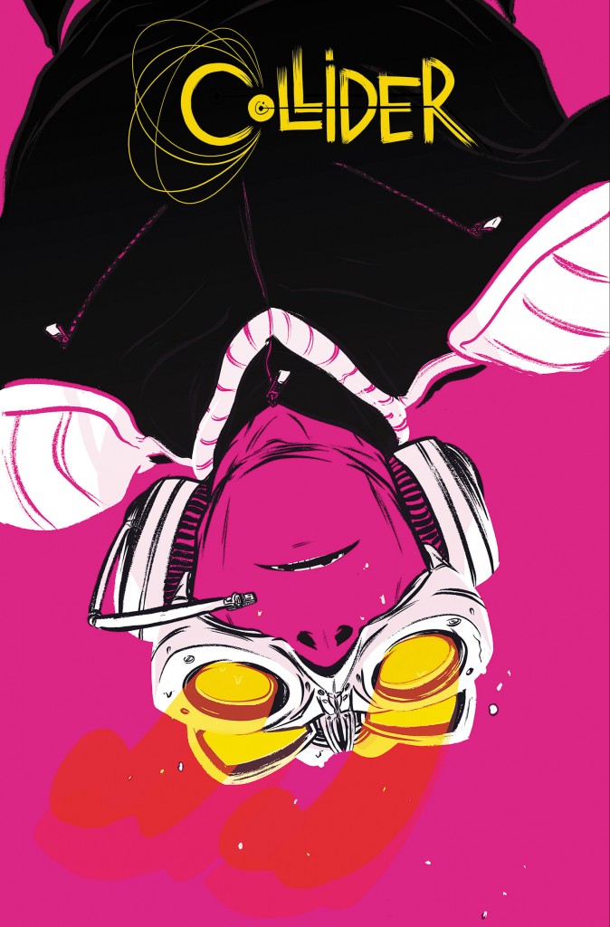
On the independent side, we have a SLIGHT cheat this month, as I’m not sure Vertigo REALLY falls on the indie side, since they’ve technically got the backing of DC. However, the content (and cover, concept, everything) of this book feels indie AND given the state of Vertigo these days (great books, but not nearly enough of them) I feel okay with this choice. Regardless, Collider #1 by Nathan Fox is absolutely deserving of this slot – a STUNNING cover that everyone will have to chase for “best cover of the year” (for me at least). Inspired colors, composition, positive/negative space, text/title block design, and concept. Utterly fantastic. This is comics, kids!

COLLID_Cv1_PRINT_3pncuy4wjo_


Tags: , , ,

Um…super NOT on time! Man guys, I’m sorry, I’ve got a ton on my plate right now and my horrible allergies are making all of it feel Herculean.

Rules: one cover from the “mainstream” (i.e. DC/Marvel) and one cover from the “indies” (i.e. anything NOT DC/Marvel).

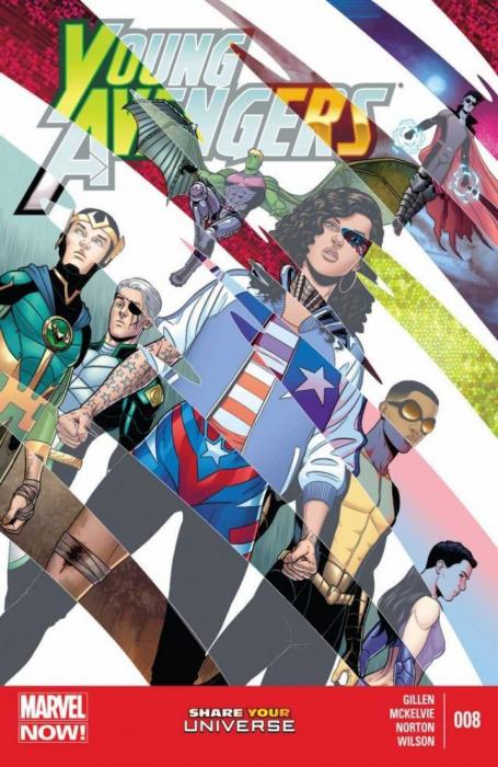
In the mainstream corner we have Jamie McKelvie’s Young Avengers #8, doing it again – two issues in a row – and twice in a month – nice! What I love most about this cover is that though it’s visually striking and very pretty on just face value, it’s in the details where your realize how incredibly smart and cool it is. Love it.

1375133290_cvr

In the independent corner we have Matt Kindt’s gorgeous Mind Mgmt #13, which is both gorgeously illustrated (watercolor? got to be) but more importantly content wise, it’s just so surprising and awesome. Perfectly executed to feel all sweet and 1950’s and then “oh, yeah, she’s got a semi-automatic.” AWESOME.

1375125373_cvr


Tags: , , ,

Yes! Super on time!

Rules: one cover from the “mainstream” (i.e. DC/Marvel) and one cover from the “indies” (i.e. anything NOT DC/Marvel).

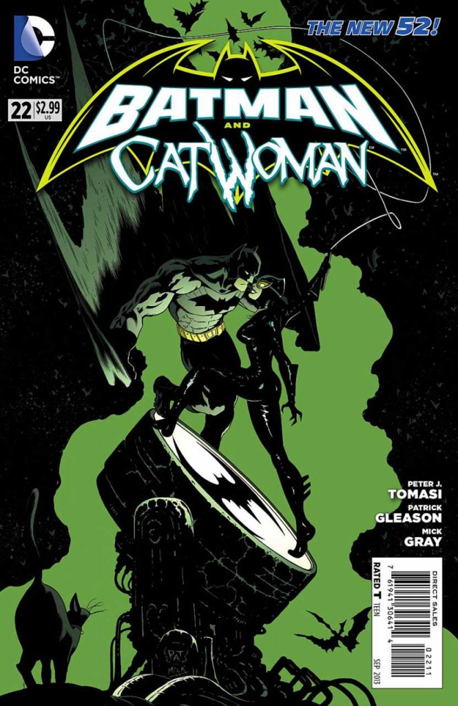
In the mainstream corner we have one of the best covers I’ve seen from DC since the reboot in 2011 – Batman & Catwoman #22 by Patrick Gleason (Mick Gray on inks and John Kalisz on colors). I still wish they’d be a little more innovative (and less fussy) with their title design/placement/what-have-you, but this is a GORGEOUS illustration. Fantastic color choices, positive and negative space, movement, composition graphic shapes, it’s got it all. Oh, and a gorgeously rendered Catwoman. Yes!

3178713-22

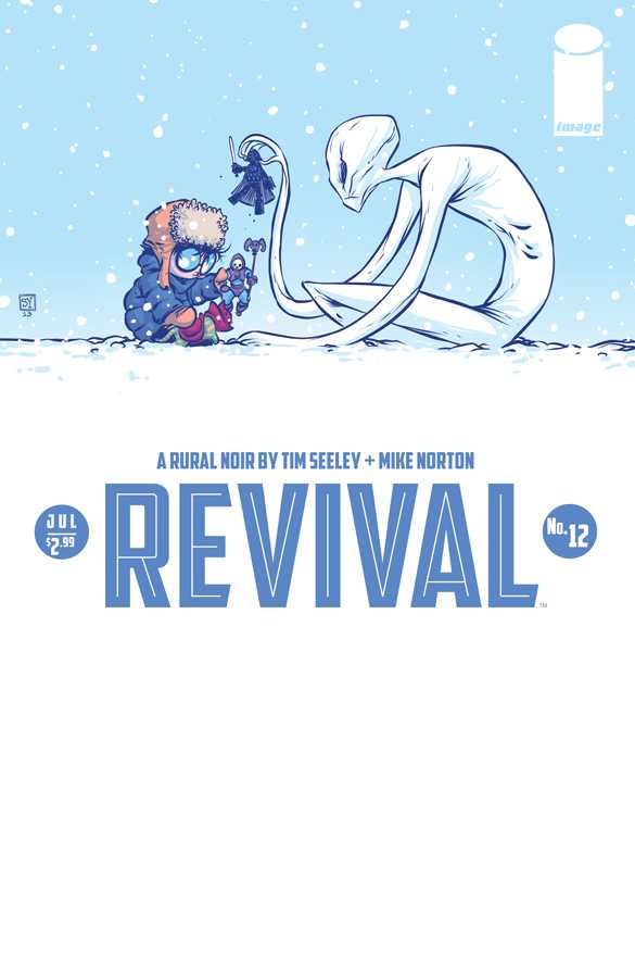
In the independent corner we have a fantastic Skottie Young cover for Revival #12. On the surface you wouldn’t think those two things would go together so well, but Skottie Young is a genius, so he makes it work – it’s both adorable and creepy – and somehow captures the essence of Revival without ever “not being a Skottie Young cover”. Impressive. I’m a big fan of tons of white on a cover when used well and this is a great example. Again, bonus points to Young and Image for being bold with title integration, credits, numbering, etc.  Two great picks for SDCC week!

3177799-revival12_cover

Tags: , , ,

« Older entries