comics!

You are currently browsing articles tagged comics!.

Yeesh. Sorry guys. Things have been…things.

But Matt Fraction and Chip Zdarsky’s cover to Sex Criminals #1 from Image is enough to rouse even the dead:

3330358-sex+criminals

See?

Anyway, to be honest, there’s nothing from the Marvel/DC side really worthy of cover of the week. I like the Young Avengers cover, it came the closest, but it’s just not quite there. DC is utter crap in covers as we FINALLY emerge from “Villains Month” from here on out known as “Hell Month” or maybe “Utter Waste of Time & Money Month”…you get the picture.

Anyway, more Sex Criminals covers please! :)

Tags: , ,


Amazing, it’s a day of release post. How is it possible???

Rules: one cover from the “mainstream” (i.e. DC/Marvel) and one cover from the “indies” (i.e. anything NOT DC/Marvel).

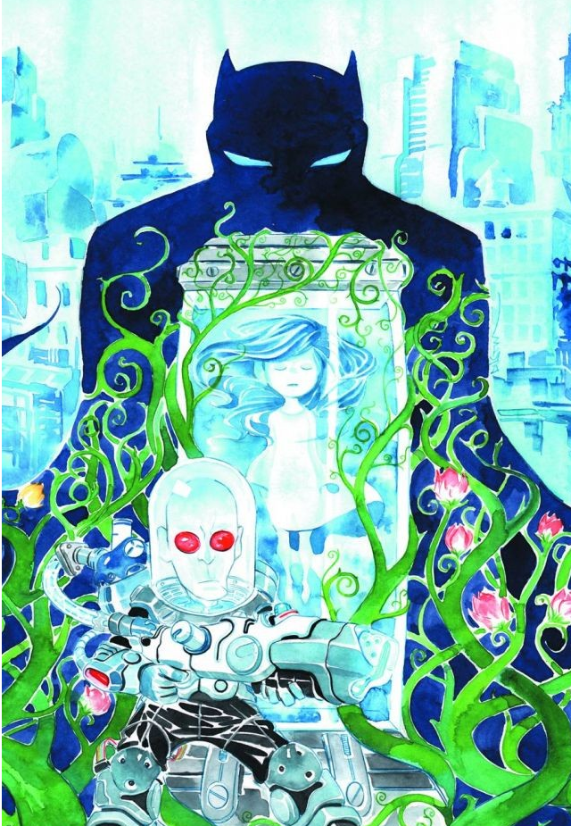
From the mainstream we have a gorgeous watercolor offering from Dustin Nguyen for the print release of Batman: Li’l Gotham #5. SO GORGEOUS:

Batman Lil Gotham 5

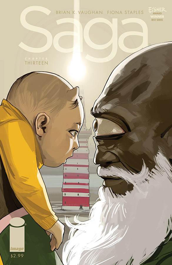
From the indie side, we have the triumphant return of Saga, with Saga #13. Fiona Staples continues to just deliver the most fascinating and wildest covers around. So simple and yet so brilliant. Also…baby Hazel with her horns! Love it:

saga13-cover-fc8ed

Tags: , , ,

Rules: one cover from the “mainstream” (i.e. DC/Marvel) and one cover from the “indies” (i.e. anything NOT DC/Marvel).

I sort of broke the rules this week. But not really.

Let’s explain. This week I used Jeff Lemire’s gorgeous Trillium #1 from Vertigo for our mainstream corner on the technicality that it’s technically DC…this might have been okay, except for last week I did just the opposite, justifying that Vertigo counted as indie, so I could put up Nathan Fox’s Collider #1.

But this is the benefit of running your own damn blog. I MAKE ALL THE RULES! AND RULES THEY ARE MADE TO BE BROKEN (or something).

Trillium #1

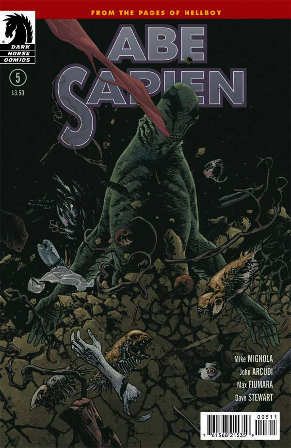
In the indie corner this week we have Abe Sapien #5 from Dark Horse by Max Fiumara. Gorgeous stuff. I ALMOST went with Image’s Sheltered #2 by John Christmas, but I didn’t love the arbitrary way that the trees just turned into black…didn’t quite work. Very cool otherwise though:

3222710-05

Tags: , ,

Sorta on time???

Rules: one cover from the “mainstream” (i.e. DC/Marvel) and one cover from the “indies” (i.e. anything NOT DC/Marvel).

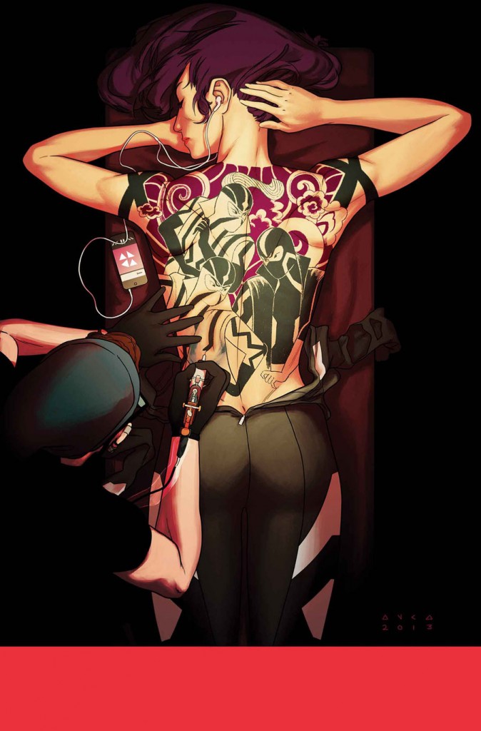
In the mainstream corner we have Kris Anka’s absolutely mind blowing Uncanny X-Force #10. I cannot even with how amazing this idea is from stunning concept to perfect execution. It’s smart, highly relevant to the content within (which I WISH I like a tenth as much as Anka’s covers), and just ballsy and cool on every level. Love it.
Uncanny_X-Force_Vol_2_10_Textless

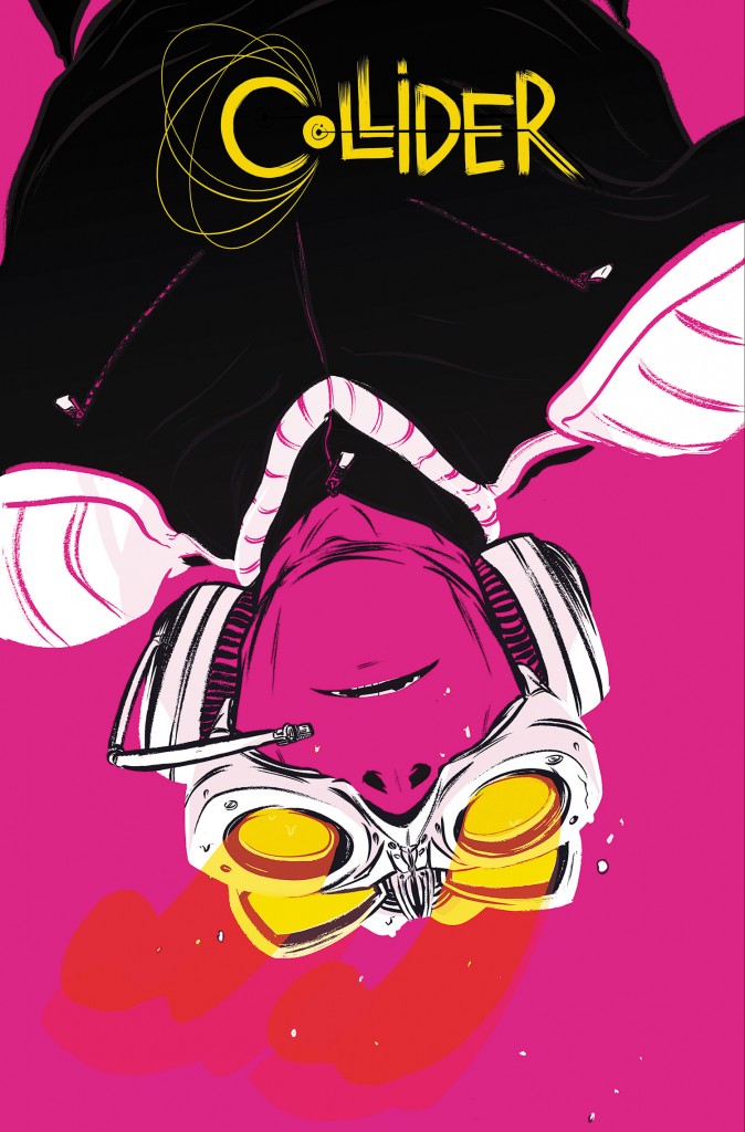
On the independent side, we have a SLIGHT cheat this month, as I’m not sure Vertigo REALLY falls on the indie side, since they’ve technically got the backing of DC. However, the content (and cover, concept, everything) of this book feels indie AND given the state of Vertigo these days (great books, but not nearly enough of them) I feel okay with this choice. Regardless, Collider #1 by Nathan Fox is absolutely deserving of this slot – a STUNNING cover that everyone will have to chase for “best cover of the year” (for me at least). Inspired colors, composition, positive/negative space, text/title block design, and concept. Utterly fantastic. This is comics, kids!
COLLID_Cv1_PRINT_3pncuy4wjo_


Tags: , , ,

Um…super NOT on time! Man guys, I’m sorry, I’ve got a ton on my plate right now and my horrible allergies are making all of it feel Herculean.

Rules: one cover from the “mainstream” (i.e. DC/Marvel) and one cover from the “indies” (i.e. anything NOT DC/Marvel).

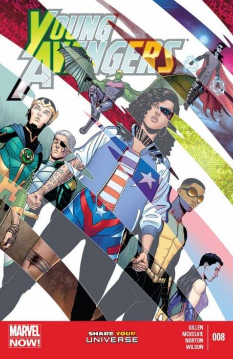
In the mainstream corner we have Jamie McKelvie’s Young Avengers #8, doing it again – two issues in a row – and twice in a month – nice! What I love most about this cover is that though it’s visually striking and very pretty on just face value, it’s in the details where your realize how incredibly smart and cool it is. Love it.

1375133290_cvr

In the independent corner we have Matt Kindt’s gorgeous Mind Mgmt #13, which is both gorgeously illustrated (watercolor? got to be) but more importantly content wise, it’s just so surprising and awesome. Perfectly executed to feel all sweet and 1950’s and then “oh, yeah, she’s got a semi-automatic.” AWESOME.

1375125373_cvr


Tags: , , ,

Yes! Super on time!

Rules: one cover from the “mainstream” (i.e. DC/Marvel) and one cover from the “indies” (i.e. anything NOT DC/Marvel).

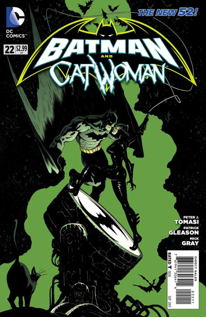
In the mainstream corner we have one of the best covers I’ve seen from DC since the reboot in 2011 – Batman & Catwoman #22 by Patrick Gleason (Mick Gray on inks and John Kalisz on colors). I still wish they’d be a little more innovative (and less fussy) with their title design/placement/what-have-you, but this is a GORGEOUS illustration. Fantastic color choices, positive and negative space, movement, composition graphic shapes, it’s got it all. Oh, and a gorgeously rendered Catwoman. Yes!

3178713-22

In the independent corner we have a fantastic Skottie Young cover for Revival #12. On the surface you wouldn’t think those two things would go together so well, but Skottie Young is a genius, so he makes it work – it’s both adorable and creepy – and somehow captures the essence of Revival without ever “not being a Skottie Young cover”. Impressive. I’m a big fan of tons of white on a cover when used well and this is a great example. Again, bonus points to Young and Image for being bold with title integration, credits, numbering, etc.  Two great picks for SDCC week!

3177799-revival12_cover

Tags: , , ,

I’ve been super stressed out lately (I can’t say why, it will all come out soon enough…probably) so some awesome little surprises yesterday made it all seem worth it.

First, fellow blogger Keith Silva named me in Comics Bulletin’s “10 Of Our Favorite Comics Critics”

Pretty shocking to be in such great company – and thank you Keith so much!

And then, more bizarrely, and possibly not what I think it is, but I’m running with it anyway, Google Alerts gave me a heads up to this review of Red Sonja #1 on Newsarama.

In the review the writer refers to “she has no head” syndrome – check it out:

Screen shot 2013-07-17 at 2.03.57 AM

So…yeah, I’m sure you guys get how huge that is. The idea that you’ve made enough of an impact that others are picking up on it and using it as a definition…well, it warmed the cockles of my cold dead heart, it did.


Tags: ,

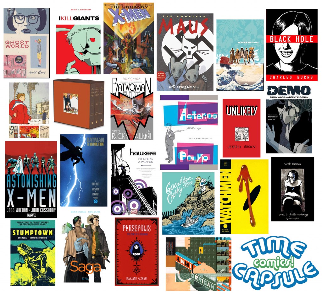
I’m trying to get better about cross posting content again. In that vein…here is a cross post to today’s hopefully super fun SHE HAS NO HEAD! which is all about creating a comics time capsule!

Time Capsule Compliation2

Other posts I’ve done recently that you might have missed?

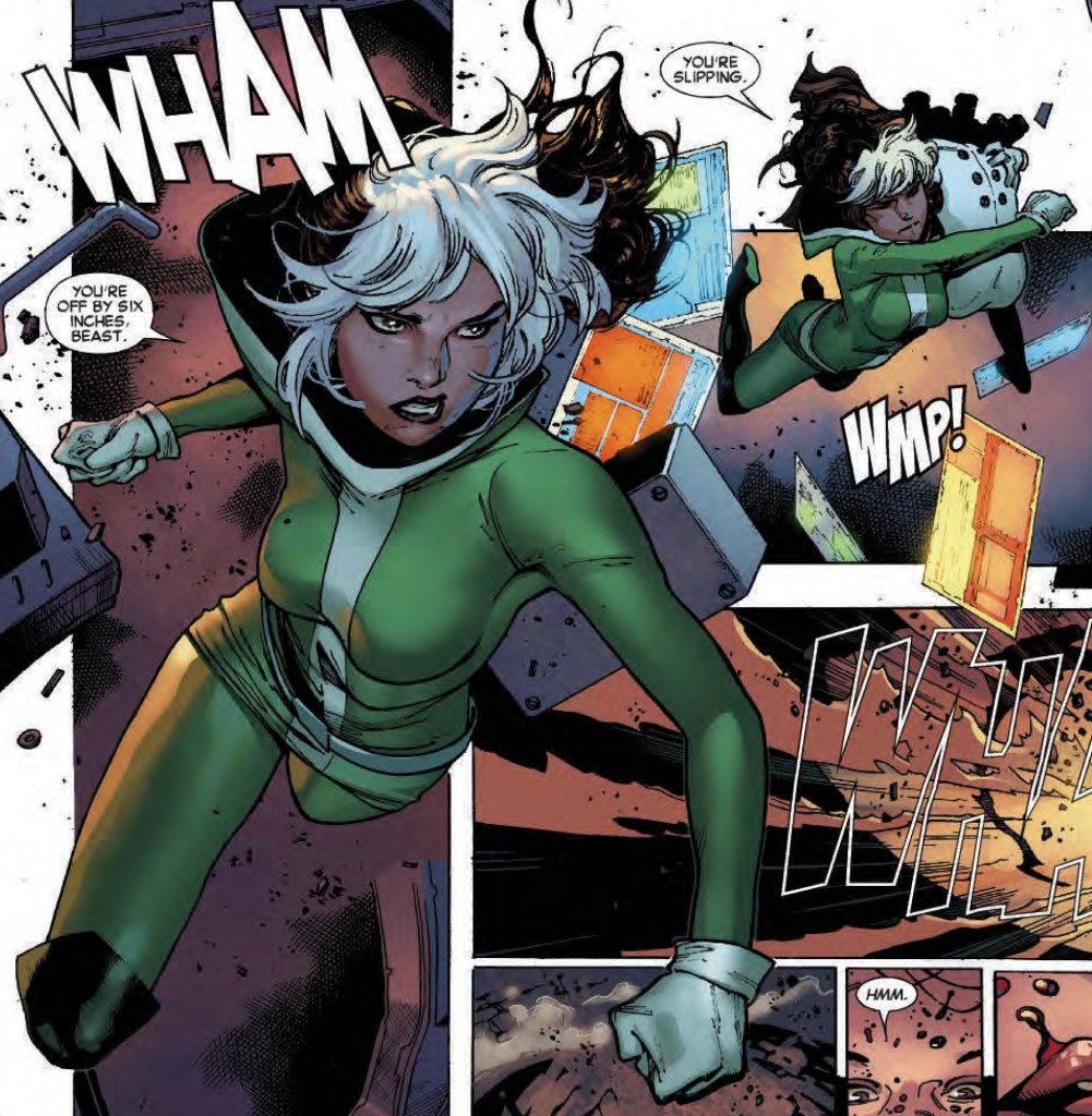
This bit about how the new Brian Wood and Olivier Coipel X-MEN is ALL I’VE EVER WANTED!

Rogue SHNH Header

And I did some pieces on LIT REACTOR:

This one about the resurgence of “choose your own adventure” stories (in comics and elsewhere)

This one about why people should stop hassling me to read Game of Thrones and just let me enjoy the television show (for now).

Of course if you’ve been hiding out and neglected to notice that I borderline broke people’s brains with the fact that I hated Man of Steel (read that here), here is a rather unorthodox Superman “Book vs Film” comparison on Lit Reactor.

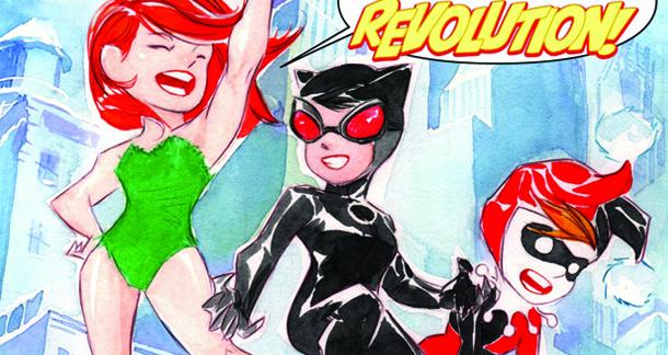
I also did this one about the awesomeness that is Dustin Nguyen and Derek Fridolf’s Batman: Lil’ Gotham.

batman_lil_gotham_header

CBR REVIEWS:

I also had the pleasure of recently giving 4 or more stars to all of the following comics:

Hawkeye #12

Quantum & Woody #1

Adventure Time: Candy Capers #1

Daredevil: Dark Nights #2

Suicide Risk #3

The Wake #2

and

Demeter

Whew. Okay. That’s it for now!!!

Thanks everyone, I hope you find something enjoyable to read!


Tags: , , ,

A little late (and I missed a week), but here we are!

Rules: one cover from the “mainstream” (i.e. DC/Marvel) and one cover from the “indies” (i.e. anything NOT DC/Marvel).

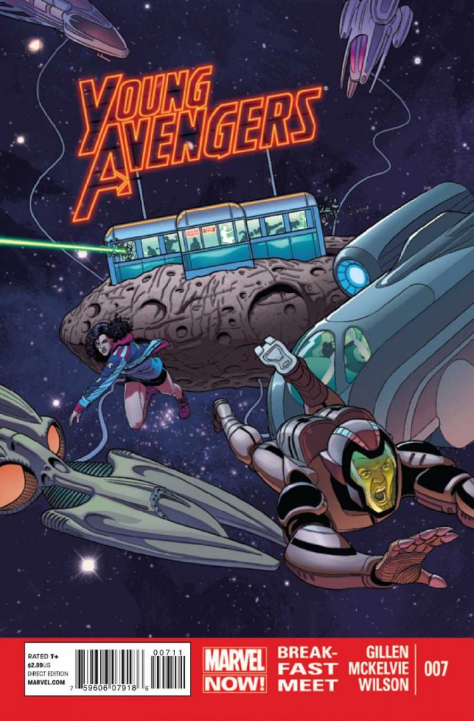
In the mainstream corner we have this absolutely stunning Young Avengers #7 cover from Jamie McKelvie and Matthew Wilson. The text integration alone – “Young Avengers” as an actual gorgeous part of the illustration warrants inclusion, but it also happens to just be a great illustration all around. The big red “Marvel Now” band at the bottom is annoying, but a necessary evil I’m afraid, and it’s honestly pretty mild, comparatively.

3161024-07

In the independent corner we have Image’s utterly fantastic East West #4 by Nick Dragotta. Man does this tick all my boxes! A lot of white space, limited use of color (monochromatic for bonus points!) exceptional graphic design on the text, and then superb text placement. In fact, the cover is so innovative in the way things are placed, it almost doesn’t look like a comic book cover. LOVE IT.

stk612065

Tags: ,

Two weeks in a row! Imagine that!

Rules: one cover from the “mainstream” (i.e. DC/Marvel) and one cover from the “indies” (i.e. anything NOT DC/Marvel).

From the Mainstream:

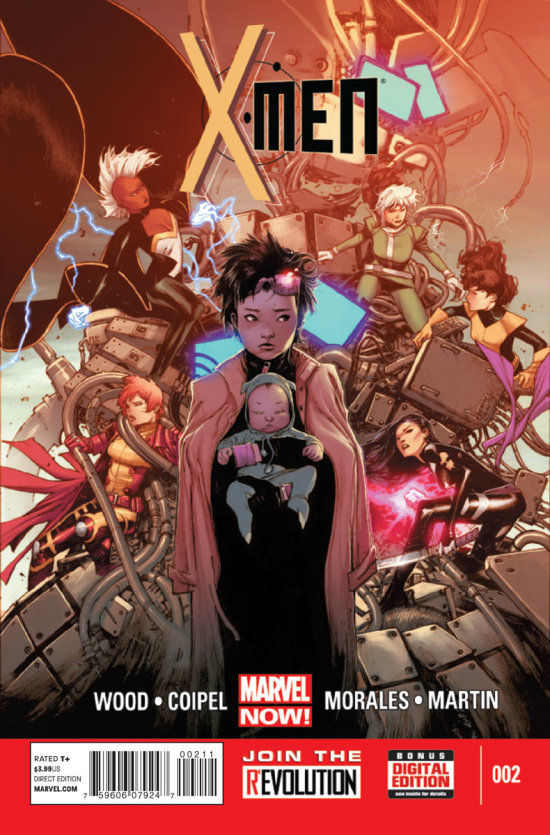
This should have been an easy pick this week, but with excellent covers by Frasier Irving (Uncanny X-Men #7), Kris Anka (Uncanny X-Froce #7) David Aja (Hawkeye #11) and Marvel made it tough on Olivier Coipel, still, his “X-Men” #2 takes it, for a bunch of gorgeous reasons, observe!

X-Men02-Cover

From the Indies, Michael Lark’s cover for “Lazarus” #1:

417278365218407

Tags: , , ,

« Older entries § Newer entries »