So I’ve been working on an exciting two part post for She Has No Head! over the last month, and in the process it had me thinking a lot about comics covers – which is saying a lot as I already think about comic covers quite a bit thanks to my monthly Cover Solicits In Three Sentences Or Less posts. But int the spirit of “Panel Of The Week” and trying to be more positive and find more things I love about comics (ah, why does only the hate come so easy!?) I’ve decided to do a best cover of the week as well. I’m basing this, like Panel Of The Week, solely on comics I buy…so it’s entirely possible that there will be another better cover (even in my eyes) for the week…but if that book didn’t rate a buy I’m not going to consider it eligible. This may be a bit unfair…but hey, I make the rules…and there are so few instances in which I get to say that in life…that I’m just going to revel in it. 🙂
So welcome to our first ever, Cover Of The Week on 1979 Semi-Finalist.
And right off the bat I’m going to set a terrible precedent and give cover of the week to two covers…

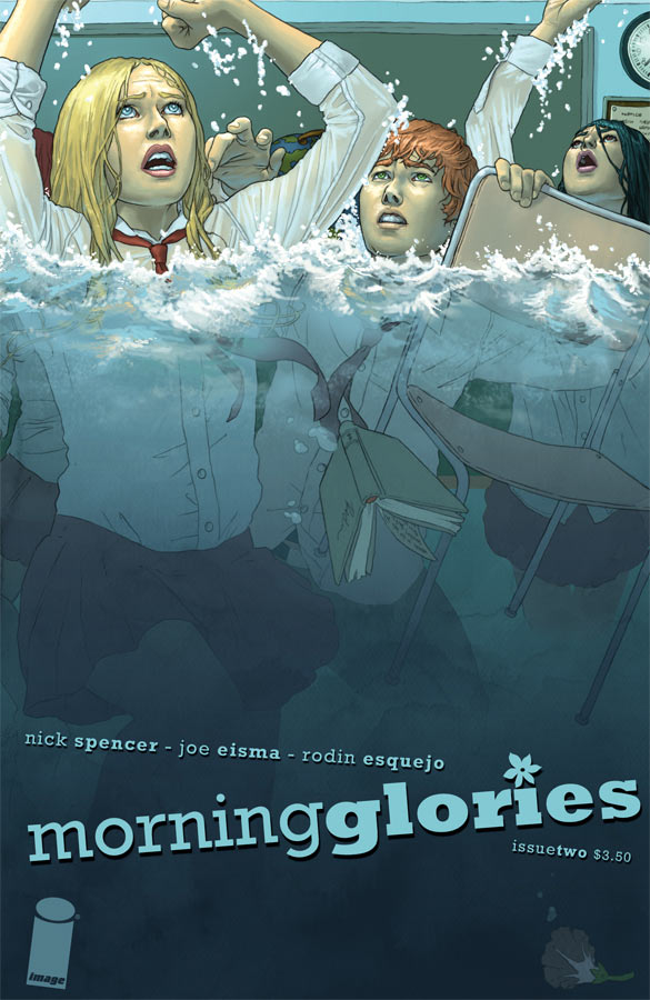
MORNING GLORIES #2
Morning Glories has been selling out like crazy and I have to say…it deserves it. It’s a pretty good book so far. It’s smart and has some nice unexpected twists and turns. The characters are kind of designed to be stereotypes, but then twist nicely and subvert some of those ideas. Additionally, while I love some long slow drawn out deconstructed comics…this is moving at a breakneck pace (but not too fast that they’re screwing it up) and it’s kind of refreshing. A TON has happened already and both issues have ended on fairly awesome cliffhangers. It would be great if the interior art was better and more consistent, but it’s good enough to not get in the way. Also, this cover rocks.

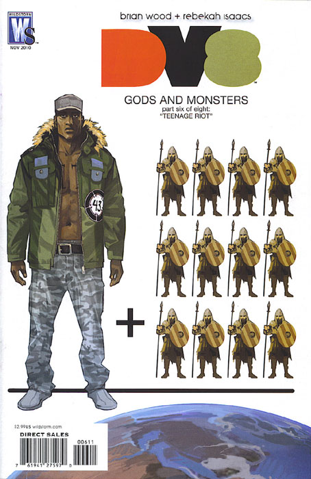
DV8: GODS & MONSTERS #6.
Ironically, though all of Fiona Staples covers for DV8: Gods & Monsters have been outstanding, this is probably my least (or second least) favorite of the bunch and yet it’s still awesome enough to get cover of the week. Fiona has been doing an amazing job and this excellent graphic representation, which nicely reflects what’s going on in the book (and has the lovely white space I so crave) is a home run.

