And on we go…
For Part I and Part II click the links!
050.
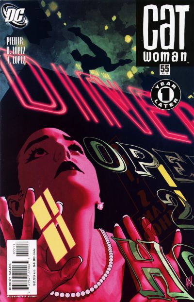
Catwoman #55. Adam Hughes. So I think we should all just take a moment to appreciate the beauty of this illustration. The detail of the signage painted on the glass, the neon light, the amazing colors, it’s all fantastic. But the real beauty of ths is in the iconic Catwoman figure in silhouette acrobating across Gotham. It’s a singular immediately identifiable figure and its powerful heroic (or anti-hero in this case) shape speaks volumes about superhero icons.
049.
Fables #14. James Jean. I wish I could explain to people (not you of course dear reader) but people that don’t understand misogyny in comics why this is NOT misogynistic, despite being a woman in basically underwear drawn from behind. Because this is not exploitative. But I’m not sure how to explain why not to people that don’t immediately see the difference.
I suppose the first thing you can say is that if you look at the body (no pun) of Jean’s work you’ll find very little to no unnecessary exploitation of the female figure…so he immediately gets the benefit of the doubt. Secondly, the figure is not coyly looking over her shoulder with a “sexy face” smile…she’s also not arching her back provocatively…or jutting out all her “sexy’ “naughty” parts. She’s just a figure drawn from behind. She’s stylized and slightly idealized, but not drawn as a parody of a woman in underwear…or a young man’s wet dream of what a woman might look like in her underwear. She’s also casually holding a badass weapon as if she absolutely knows how to use it. And lastly, none of the characters on the cover with her are objectifying her either.
For all these reasons, this is the way a cover with a woman in underwear could/should be drawn. Learn from this cover, artists…please. It’s not that you can’t draw women in their underwear, but it’s HOW you draw a woman in her underwear.
Thank you. *Steps off soapbox* 🙂
048.
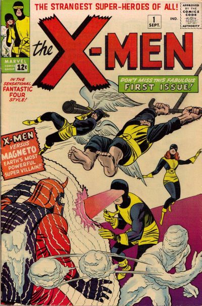
X-Men #1. Jack Kirby. You knew this one was coming. And it deserves to be here. And if Jean Grey wasn’t standing around like a moron in the background while the “men folk” fight the Master of Magnetism then perhaps I would have bumped it up several notches. I’m willing to concede that her power is difficult to draw and Kirby may have just been at a loss here, but still, it pisses me off a little.
047.
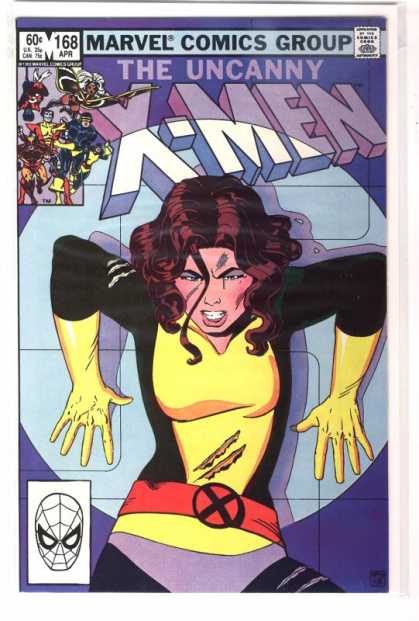
Uncanny X-Men #168. Paul Smith. A totally iconic Uncanny X-Men cover. You know I was never a big Kitty Pryde fan (sometimes bordering on hate) though there were times I enjoyed her in Excalibur and Joss Whedon’s run on Astonishing X-Men showed me a whole new side to her that I appreciated. But regardless of how I feel about Kitty this cover is great – the expression and positioning – up against a wall in a Danger Room – totally makes me want to read the story.
046.
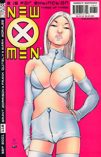
New X-Men #116. Frank Quitely. Again we have Mr. Quitely, and again, people love it or hate it in my experience. As my brother said “It looks like she’s smelling something nasty”…and he’s right, but y’know, that SHOULD be Emma Frost’s expression. She’s pretty much a bitch, so I think that expression is just about dead on. I love this cover because it just owns everything. Emma’s skin is just alive on the page – it looks fleshy and real and spongy and not plastic and over processed and that is a rare rare thing in comics. Also, the hot pink background is totally inspired. I know Josh hates the crotch of her shorts, but honestly – that shit looks real too – if you put on some crazy costume like this, I guarantee you’d get some weird bunching…in strange places. I much prefer the reality of the folds and imperfections in a costume than the usual which is supposed to be spandex, but just looks like colored body paint. It just makes the cover all the more real for me.
Also, I suppose I should address the “is this exploitative” issue. To me, no. Largely because THIS is Emma Frost. She’s like this. She would TOTALLY wear this, and she would have that expression while you stared her down in this outfit trying to find your voice. So for me, the character justifies the artwork here.
045.
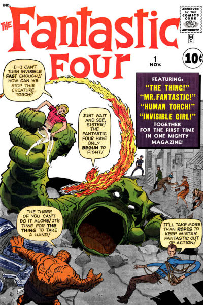
Fantastic Four #1. Jack Kirby. This absolutely belongs on the list as one of the iconic superhero covers of our time. It’s great – I just love that monster with the giant gaping mouth. Though Kirby’s work is really beautiful I tend not to love Fantastic Four covers because they’re always covered with text balloons and I’m not a fan of that so much, but this is a benchmark cover and it deserves a spot in the top 100. I suppose, much like with the X-Men #1 cover, I would give it a little more credit if Sue Storm didn’t seem so much like a worthless damsel in distress and more like the superhero that she is.
044.
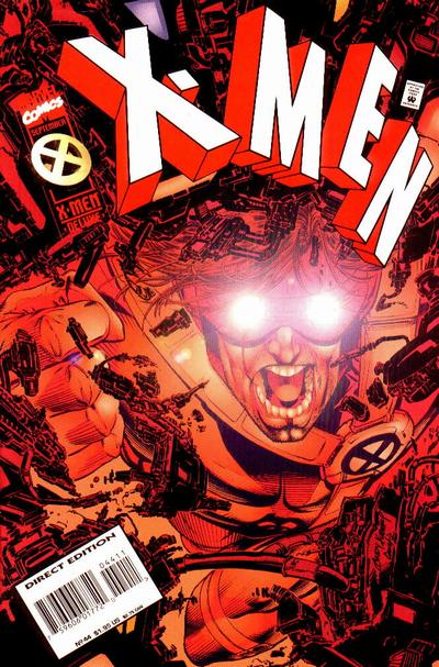
X-Men #44. Andy Kubert. I really like how Kubert is breaking the frame here by upsetting the title and the crooked bar code is quite frankly a little bit brilliant. The monochromatic red coloring driven by Cyclops’ eyebeams is also inspired. But this cover really makes the list because it’s when I fell in love with Cyclops. If you dislike Scott Summers, or are on the fence and haven’t read this issue, I highly recommend it to see if it can turn you around. It was definitely the turning point for me with the character and I’ve loved him ever since. Scott gets such a bad rap. I mean who doesn’t look bad when being compared to and constantly competing with Wolverine? For my money Scott’s totally better off with Emma Frost madly in love with him and naughty as a…well, just naughty I guess. Wolvie can have Jean and all her dying and being reborn drama. Cyclops + Emma 4EVA. 🙂
043.
New X-Men #114. Frank Quitely. I love this take on the “team shot”. The walking towards the viewer is so much more active than your usual posed team shot and having them all cast in shadow with the bright yellow X’s on their clothing is a great effect. It’s particularly great because Wolvie is back there being a rebel and having none of that bright yellow X, and then you’ve got Emma being an even bigger rebel and rocking a totally different (totally Xavier unapproved if you ask me) uniform – that still manages an awesome X. An awesome X MADE OF FLESH. Gods, Emma’s such a badass.
Anyway, I have two minor problems with this cover that keep it from being ranked even higher.
1. I don’t love Jean and Emma’s ridiculously awesome shoes as they are the kind of shoes you would break your ankle in if you were sitting down, much less fighting crime in, and 2. I don’t love that Emma and Jean have basically exactly the same body type. Boo to that.
042.
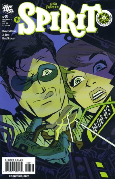
The Spirit #8. Darwyn Cooke. Love this. The unique viewpoint from inside the bomb…the fantastic expressive faces…the monochromatic green color scheme. It’s all freaking beautiful. LOVE!
041.
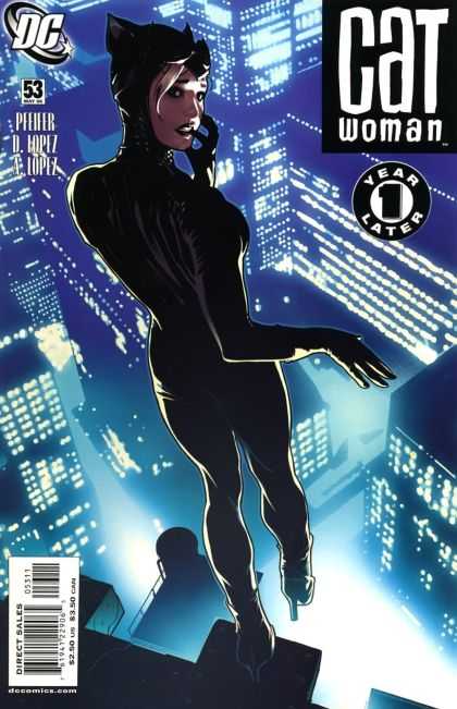
Catwoman #53. Adam Hughes. Okay, sometimes you have to ignore the things that piss you off – what is up with those bullshit high heels on Catwoman Adam!…and while we’re at it…why is Selina giving me an over the shoulder sexy/coy finger in her mouth face…annoying! That said…this cover is STUNNING. The angles, the figure, the glowing light of the city below. I say again…stunning.
I hate it when I have to compromise my soap box-y values for beautiful art. Damnit Adam.
Update: Reader Josie pointed out in the comments that is cover is not actually of Selina, but of Holly, filling in as Catwoman – which completely justifies the face/expression etc. It still doesn’t explain those heels though Adam! Thanks for the info Josie!
040.
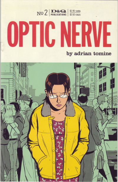
Optic Nerve #2. Adrian Tomine. Optic Nerve put Tomine on the map, and today he is one of the greatest comic book illustrators around. It’s covers like this that got him started. There’s such emotion in that central figure. The background – much sketchier and done in desaturated greens – is fabulous. Separating the main figure from the background like that gives the cover such emotion. You really feel her separation and loneliness. It’s powerful stuff.
039.
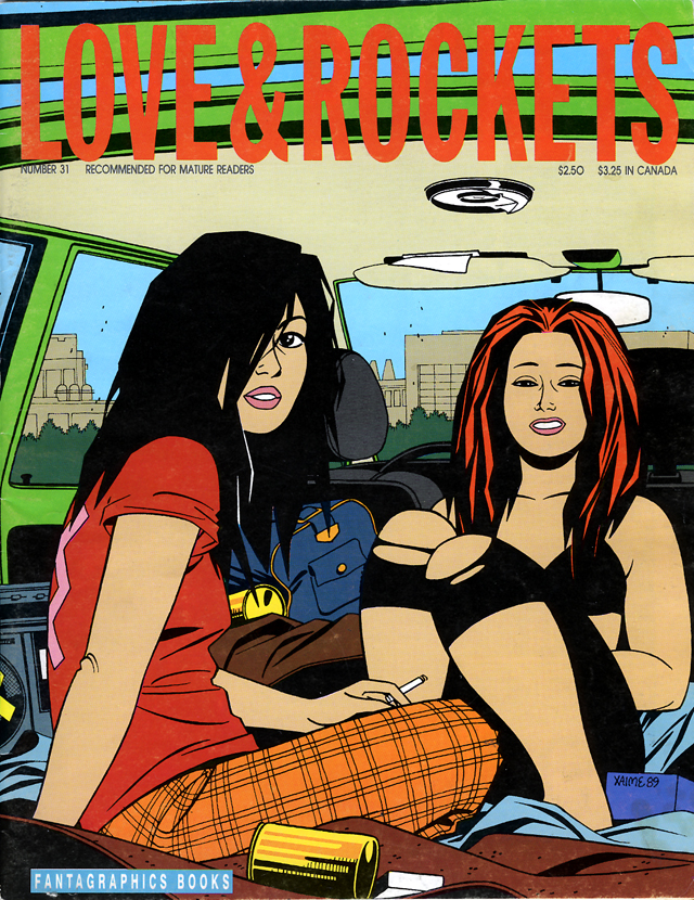
Love & Rockets #31. Jaime Hernandez. I LOVE Jaime Hernandez. If I could pick one artist whose style I most envy, whose style I most wish I could steal for my own, it would be Jaime Hernandez (of course I’d also like to have Adrian Tomine’s, Darwyn Cooke’s, Bruce Timm’s, and of course James Jeans’…but I’m greedy like that). Anyway, this cover is gorgeous to me. It’s such a great example of just a split second in time – captured. These beautiful (not necessarily “traditionally” beautiful – which makes them all the more gorgeous to me) women hanging out in the back of a car – and a picture is snapped of them…it’s a perfect moment captured and I love it.
038.
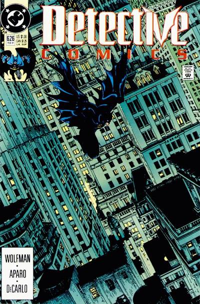
Detective Comics #626. Michael Golden. Hello, awesome? Yes, they name is Michael Golden! The beauty of this cover to me is that we see some version of this all the time – the iconic Batman figure falling/flying through Gotham City, but this looks totally new to me. The great positive and negatives of the buildings, the angle turned just so, the almost monochromatic blue/green of the city at night, and Batman, high on the page, rather than plunked in the middle, effortlessly floating from rooftop to rooftop. It’s just awesome.
037.
Watchmen #11. Dave Gibbons. I don’t really have to explain why this deserves to be here, do I? It’s iconic and timeless and comes from arguably one of the greatest comics of all time…if you don’t know why it’s here, then, and said with all respect, you should read it and find out on your own.
036.
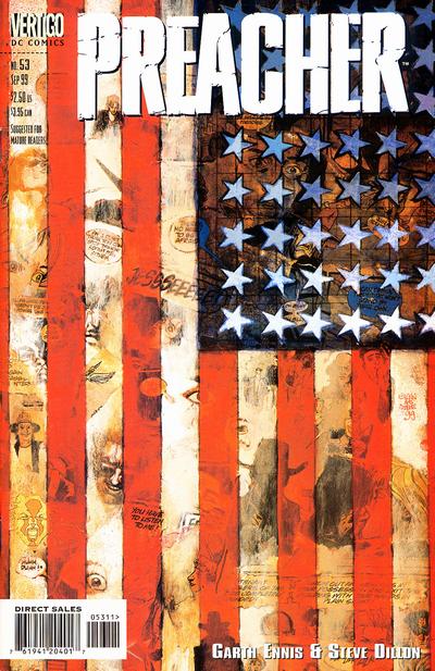
Preacher #53. Glenn Fabry. Preacher had a lot of great covers, but for me this one steals the show. It’s a fantastic interpretation of Jasper Johns (well, that’s what I see at least) but it’s also somehow totally original. It’s powerful imagery. Anytime you can take the American flag and make something new and interesting and thought provoking, I’m all for it.
Update: Thanks again to Greg (my own personal editor?) that caught this, hopefully the last of my errors, I originally attributed this cover to Preacher artist Steve Dillon instead of cover artist for the series Glenn Fabry. Apologies to Mr. Fabry and Mr. Dillon.
035.
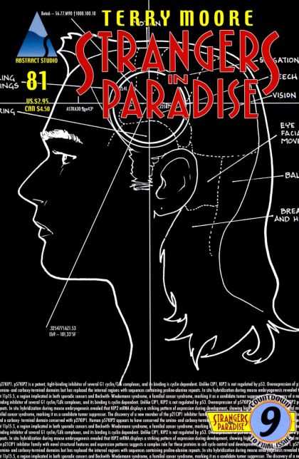
Strangers In Paradise #81. Terry Moore. I love this concept and the execution is great as well. I think it would have worked even better if Moore had been able to incorporate some of the other crap (text, titles, and logos) into the final product, but as is it’s still really strong.
034.
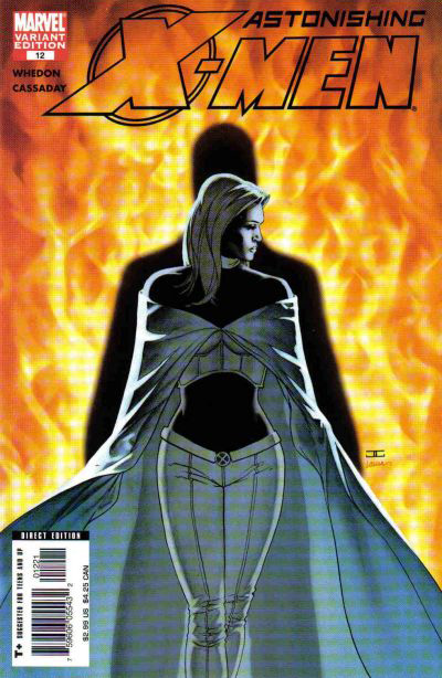
Astonishing X-Men #12. John Cassady. Cassady did some phenomenal work for his Astonishing X-Men run with Joss Whedon and this was one of my favorite covers from him. The figure work is beautiful, as with all of Cassady’s work, but the shadowed figure behind Emma (which I take to be Scott – right?) is really ominous and fascinating. I’d usually not be a fan of the whole flames thing in the background but here it really works for me. It’s also a nice salute to Jean and her whole constantly returning as ‘The Phoenix’ BS and so I like the implications the cover may be suggesting.
033.
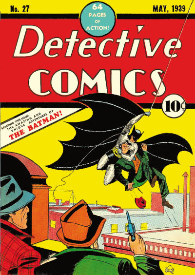
Detective Comics #27. Bob Kane. Debut of Batman baby! How can this not make the list?! It’s great. I love the bright colors and almost Los Angeles looking “Gotham” (is that even Gotham? I really don’t know). Anyway, it’s such a departure from the Batman images we see today, but it’s got such great stuff going on. I don’t know that Bruce would approve of the way this early version of himself is handling that criminal, but swinging from buildings and stunning criminals into such silence that they can’t even shoot their guns? That’s vintage Batman and it was there from day one. Man I love me some Batman. Come back to us Bruce!
032.
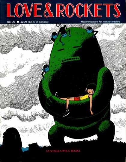
Love & Rockets #23. Gilbert Hernandez. What is going on here!? I LOVE it. It looks like a dream I want to have. With a giant friendly green stone monster covered in monkeys and moss protecting me and rocking me to sleep as I listen to tunes. Somebody drop me off inside Gilbert’s head. I love everything about this.
031.
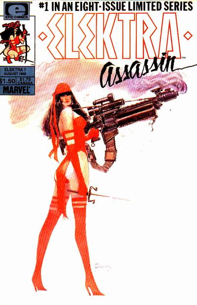
Elektra Assassin #1. Bill Sienkiewicz. Oh Elektra, how I loved you before Marvel ruined you…first with that horrendous 90’s ongoing series with the terrible art where you looked like a bimbo that fell into a drawer that happened to have some weapons in it, then that horror show of a movie with that “actress” Jennifer Garner pretending to be some tortured ugly supermodel-y version of you. Oh how I wish we could go back in time and end you before all of that could happen. And then you could be just as you were supposed to be – the batshit crazy insane ultimate tortured badass that you are…and always drawn by Bill Sienkiewicz.
030.
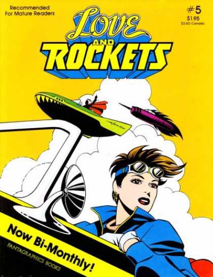
Love & Rockets #5. Jaime Hernandez. It hurts how much I love this cover. Look at it! SO beautiful. The amazing positive and negative space created by everything from the clouds to the spaceships (or whatever the hell they are – space cars?). The absolutely stunning inking work on her face and jacket…the tilting of the images in the frame to create that sense of movement and the popping bright happy colors. It’s got this amazing retro-future feel. As if this is the happy blissful innocent future we were all expecting to have in the 1950’s back when we thought about the year 2000 and the “space cars” we would have (not that I was alive in the 1950’s, but you know what I mean). I love it.
Sidenote: Speaking of space cars…where the hell is my Hoover Board? It’s two thousand freaking nine!
029.
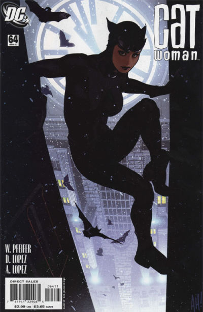
Catwoman #64. Adam Hughes. See, Adam must have gotten my memo. THIS is the face of a superhero (or anti-hero, whatever)…and THESE are the boots of that superhero. Yay! Redemption…I love it. Everything is fabulous about this. From Catwoman’s awesome iconic pose and the perfect positive and negative space that pose creates, to the bats swirling all around her, to the clock illuminated behind her, to the foggy Gotham in the distance below her. Absolute perfection. My favorite Hughes cover ever.
028.
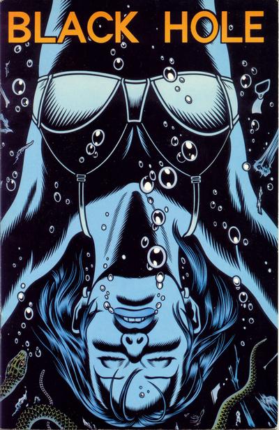
Black Hole #2. Charles Burns. I think it’s the monochromatic blues that really nail this cover for me, I love the feeling the blues illicit. The upside down aspect and the diving/bubbles rising to the surface is also great and gives the cover a real momentum. Also, and I know you’re sick of hearing this – but it creates some really beautiful…yup…positive and negative space. As for the snake…well, I actually find the snake by her head/face kind of horrifying, but her calm offsets that a bit. All in all a beautiful cover – one of my favorites of the Black Hole series – which are all interesting and thought provoking.
027.
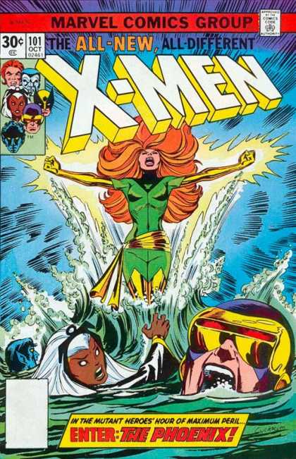
X-Men #101. Dave Cockrum. Another iconic and landmark Uncanny X-Men cover. This one is especially powerful I think because of the point of view Cockrum picked. It’s so low that you more potently feel stuck in the water with the rest of the team while Jean rises up to crush you into dust. Cyclops is particularly powerful here with a mouth filled half with water because he can’t stop from screaming (that’s right Cyke – dump the bitch now – it’s years of misery for you if you don’t…just kidding…sort of). I also like that Storm is featured nicely here. When I was doing this project – looking through thousands and thousands of covers I was surprised how few really good covers featured Storm in some way – considering her importance to the X titles I was a little surprised and disappointed.
026.
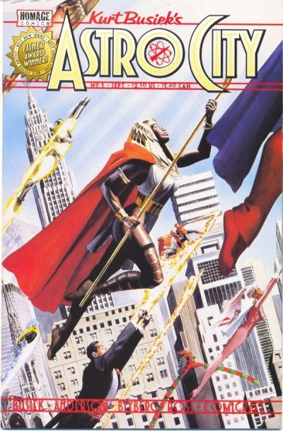
Astro City #1. Alex Ross. Man, nobody creates an awesome City of Superheroes better than Alex Ross. He seems to be iconic and influential without even trying. I mean this cover to me just screams quintessential superheroes. I love how it’s set against a very iconic looking Manhattan background and that the heroes look off to some important battle – or you know – the weekly heroes meeting – whatever. I also love that you’ve got a very Clark Kent “guy in a suit” flying alongside some heroes in full spandex garb. It’s pretty powerful stuff.
From an illustration point of view it’s flawless (as usual for Ross) and from a design standpoint it’s pretty flawless as well – the heroes all flying towards one common goal – strong and straight and powerfully projecting into a sky where we mere mortals cannot hope to follow. And the tilted horizon line only adds to the effect. The cover is full of movement and layers and you guessed it – sublime positive and negative space. This cover is perfection.
-
Actually, the cover of Love & Rockets #23 is by Gilbert, not Jaime — there’s a subtle but distinct difference in their art (and, you can somewhat pick out the sig in the lower right corner — Beto/87, which is how Gilbert signs. Jaime just writes ‘Jamie’ in a loopy font.)
-
jamminjabber: I know you love it…it’s that whole “I think she (he) doth protest too much” kind of thing. I’m getting you one of these outfits for your birthday.
Coyote: Thank you for the assist! You know I looked everywhere trying to verify which one of them it was because I wasn’t sure – and I still can’t really read that signature – it’s just too fuzzy.
I corrected the post – and am glad for it as I had too many Jaime in here and wanted at least one Gilbert. My only real way of telling their work apart for sure in the past (it’s easy if I’m looking at it side by side…but just one panel/cover…not as easy) is how they draw their women. Since there were no women here I was a bit unsure. So again, thanks for the correction.
-
Just letting you know, the cover of Catwoman #53, that isn’t Selina, that’s her friend Holly Robinson standing in for her, the finger in the mouth isn’t meant to be sexy but scared out of her wits stepping into Catwoman’s shoes for the first time, and as for the heels, yeah there’s really no excuse.
-
At Comics Buyer’s Guide http://www.cbgxtra.com in each monthly magazine issue we ask people in the industry what their favorite 10 comics covers are: I did my list a few years back now already and chose 2 that were on this list: Jamie Hernandez’ (who I met last in San Diego this year!) Love and Rockets with the 2 girls, and the Charles Burns drowned cover. And I chose an Adrian Tomine Optic Nerve cover, and a Paul Smith X-Men cover too.
You, or we, have good tastes!!!
-
Catwoman #53 has two covers. One is the hesitant one pictured here, the other has an orange tint and a more confident heroine.
My favorite Catwoman cover (so good it should be a print), is Catwoman #74, where the reflection of Selina matches the shadow beneath. Great expression on Selina, and just enough sex appeal to grab your attention!
Overall, that run of Catwoman has some of the best cover design, which is impressive as there were so many different artists.
-
I feel bad posting corrections on each rundown, so let me first say how much I am loving these posts! So many great covers, some of which I’ve never seen, some of which I’d forgotten, and some which I’d have equally remembered to put on a list.
That said, the Preacher cover is by Glenn Fabry, who provided all the covers for Preacher’s run.
-
Shawn: We DO have good taste 🙂 Although, if you find these posts linked to around the internet you’ll find a lot of disagreement with my list. But I stand by it (mostly). I have a lot of stuff I wish I’d included and some of the more decadent (I personally like but they don’t have as much significance to the rest of the world) would probably get dropped in favor of that if I do this again. We’ll see. People have had a lot of really great comments – and a lot of really horrible kind of unnecessary comments. To each I say, one man’s trash, another man’s treasure…right?
Where’s Skottie Young on this list (I LOVE some of his work), also, what about Sam Keith? There’s a lot of artists missed…100 is just not enough…!
Torsten Adair: The Catwoman #53 with the orange and the slightly different positioning is also beautiful…but I like the blue 🙂 Catwoman #74 is beautiful (aren’t all Hughes covers?) but I think from reading my list you can see why it didn’t make the cut…giant unnecessary super unrealistic Cat Boobs. I wish Hughes would tone that crap down. That said, in my searching I came across another unpublished version of that cover that had her suit zipped up and it was so much better – because the focus was where it belonged. If that had been the published cover – I would have put 74 on my list.
Greg: No, please don’t apologize! It’s so important that these artists get properly credited – especially because I’ve been getting really heavy traffic on these posts – and I don’t want people to get incorrect information. So thank you for your corrections, your comments, and I’m really glad you’re enjoying the list.
-
Wow. MORE Adam Hughes. MORE Y The Last Man. More X-Men.
You’d think there weren’t any other comics around.
-
Pingback from The 15 Covers I Wish I’d Included… « on July 20, 2010 at 5:37 pm
-
Pingback from 52 Favorite Comic Covers Of The Year « on July 24, 2010 at 6:36 pm
Comments are now closed.






17 comments