And here we continue our list…!
075.
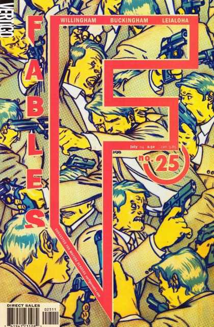
Fables #25. James Jean. Oh James Jean, how I love you. Look at the use of color, the use of text as a design element. The title and issue number all beautifully incorporated into the image flawlessly, rather than just being splashed across artwork without concern for what’s being destroyed. He even manages to work in the creator names so it not only looks like part of the original illustration, but IS a part of it. Fantastic. If you don’t like James Jean you’re gonna hate this list – because his work appears many more times before we get to #1.
074.
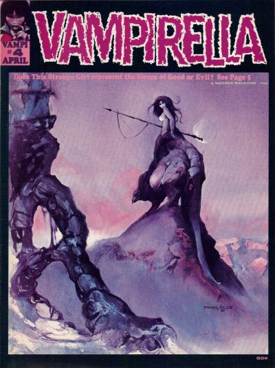
Vampirella #4. Jeff Jones/Vaughn Bode. How can you not love this? I mean, okay, she’s naked and straddling some kind of land monster, but she’s carrying a spear and looks like she would just as soon pierce you through the heart with that spear as look at you.
073.
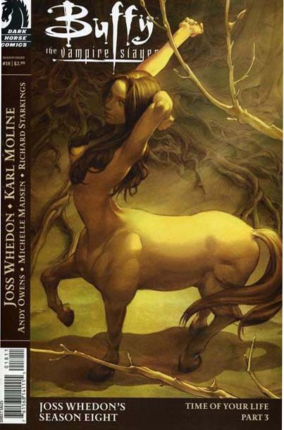
Buffy Season Eight #18. Jo Chen. Another beautiful cover for Buffy by Chen. Dawn as a horse? Illustrated beautifully? Well, you had me at hello.
072.
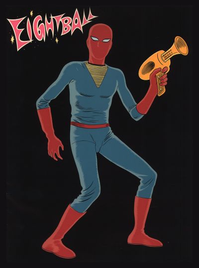
Eightball #13. Daniel Clowes. Part of what I love about this cover to Eightball is that it is absolutely 100% different than all the other Eightball covers. It kind of comes out of nowhere. Artistically Clowes is a master, and the nearly faceless figure, with his awesome space gun, and great title work totally wins me over. You almost never see a solitary figure on a black background and so the simplicity works in Clowes favor. A great and classic cover.
071.
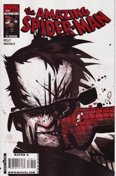
The Amazing Spider-Man #576. Chris Bachalo. I’m usually not a big fan of heavy action on the cover (I also tend to hate word balloons) but this Bachalo cover is so stylized and strong that it really works for me. The desaturated colors are also great – really emphasizing Spidey’s flying fist.
070.
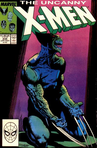
Uncanny X-Men #234. Marc Silvestri. Oooh. Wolvie turning into The Brood…The Brood turning into Wolvie. Good fun! Also you’ve got all those great 1980’s colors going on. Jokes aside, it’s a pretty effective cover with that horrifying Wolvie/Brood face. Look me in the eyes and tell me you don’t care…I dare you.
069.
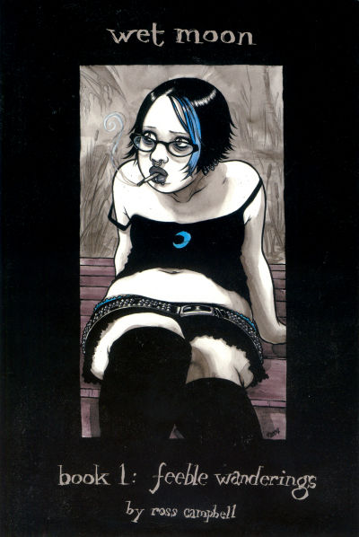
Wet Moon #1. Ross Campbell. I’m a big fan of Ross Campbell’s work. He draws women like nobody’s business. And this cover, other than being a gorgeous bit of illustration, makes the cut largely because a girl like this never gets to make the cover of a comic book, hell, she rarely gets to be IN a comic book. But not with Campbell. Campbell’s women come in all shapes and sizes, just like the real thing, and the more variety we can get on the covers of comic books, the more the world will be bending to my will…which is good for everyone as far as I’m concerned.
068.
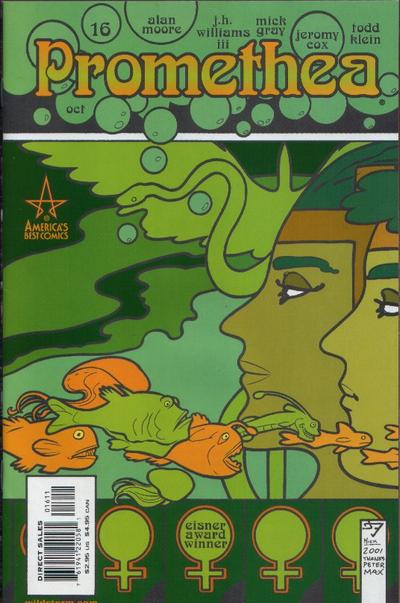
Promethea #16. J.H. Williams III. The colors and graphic illustration work here just blows me away. Williams III has also managed to nicely integrate all the text much like the James Jean covers, so what we’re looking at (minus the bar code) looks like an integrated piece of artwork rather than stunning artwork with titles and creator names slapped all over it. I also love that this doesn’t look like a comic book…it looks like a “real” book, or an illustration, or a mural, something…it really transcends being just a comic book cover. Gorgeous stuff.
067.
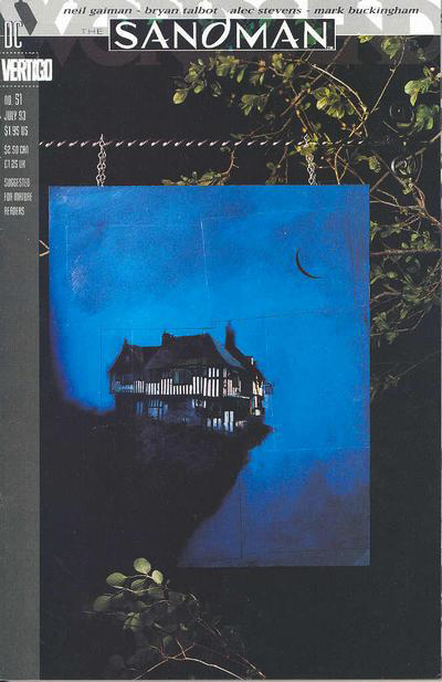
Sandman #51. Dave McKean. McKean has a lot of great covers (as does the Sandman title and also Cages) but this is the one that strikes me the most of all his covers. I’m not sure why, something about the loneliness and maybe desperate nature of the house perched on the edge of a cliff, combined with that brilliant blue night sky. Something about it just works for me though I’ve never quite been able to put my finger on it. As with most McKean’s covers the layering and mixed media feel also work beautifully here.
066.
Strangers In Paradise #9. Terry Moore. Oh Terry Moore, how do I love thee, let me count the ways. I love Moore’s work, strangely though, in doing this project I realized that his covers don’t speak to me as powerfully as his actual pages. Which is unusual, I think generally it’s the other way around for artists – easier to master the “pin up shot” or “group shot” for the cover but hard to figure out pacing and beautiful panel layout. I’ve only got two Moore covers in my top 100, which surprised me, because I never stop loving the way his pages look.
065.
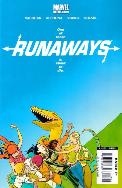
Runaways #18. Marco Martin. This cover is SO Runaways. The bright popping colors, vibrant and full of life, combined with the incredible energy of the figures all entangled together on one side, and then the tilted horizon line. Man, this whole cover just screams Runaways. It’s got a fantastic energy and movement to it, plus that great positive negative space aspect again. As a bonus he’s managed to integrate the text, title, etc., so it all lays beautifully on the page – no small feat. Really, an exceptional cover all around.
064.
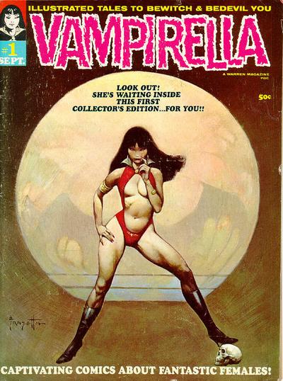
Vampirella #1. Frank Frazetta. Vampirella and Frazetta, what a perfect pairing of original badasses. Frazetta’s work, which is pretty much always beautiful, is amazing here, with Vampy’s flesh looking so…real…so not plastic. And the shadow of wings behind her, is a really nice subtle touch. I don’t know how she’s standing upright with her legs that far apart, but beggars can’t be choosers. Talk about owning a cover (like Will Eisner’s femme fatale from earlier in the list) this Vampy can literally eat that femme fatale for breakfast…which is maybe why I always secretly liked Vampirella, despite the cheesecake.
063.
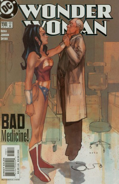
Wonder Woman #198. Phil Noto. Alright! Here we go! Look at that badass-ery! Secretly (well, not so secretly now) I’ve never been a fan of Wonder Woman. I always want to be, but she always seems to get in the way of me falling in love with her. But if I could see this, THIS, in her more, I think we’d be on a road to true love. The drawing is a style I personally like very much, with a subtle but distinct outline around the characters, only enhanced by the sketchy and desaturated background. But really, just the look on her face and the ease with which she holds this man in the air. AWESOME. Show me more of this Wonder Woman…you can do it!
062.
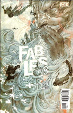
Fable #58. James Jean. Another James Jean – can you see why? I mean look at that! You have to stare at it for hours (okay, ten minutes will probably do it, but still!) to understand everything that is happening in there. I mean right off the bat you see the fantastic graphic aspect of those curlicues of wind, and maybe you also see the great integration (again) of title, text, and number, but if you keep looking there are all these birds that are almost glowing they are so painstakingly painted, and well…I’ll leave the rest to you. Absolutely beautiful.
061.
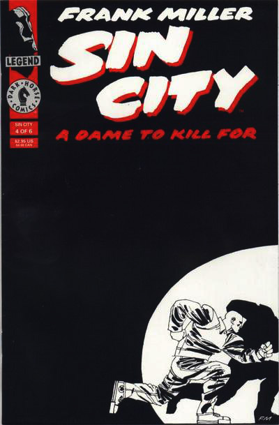
Sin City: A Dame To Kill For #4. Frank Miller. The master of black and white. There was a time when I practically made devotion to Frank Miller into a religion. I got over it, after a while, just like I got over religion (these are the jokes people) but his work will always be influential and amazing. The motion on this cover, the use of solely black and white, and only in big chunks of positive and negative space. Really great stuff.
060.
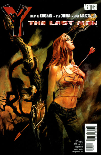
Y The Last Man #57. Massimo Carnevale. Adam tried to get me to drop this one from the list, but he failed. In making me argue its merits, he only strengthened my case in my own mind. Other than the obvious fact that it’s a beautiful illustration, the use of lights and darks here are strong and the expression on Beth’s face is pitch perfect – which doesn’t always happen when you have talented guest artists doing your covers. The effect of the arrow both piercing her heart and going through to the tree is a nice element. Also, again, there’s a monkey. Case closed.
059.
Planetary #21. John Cassady. Love the colors, love the graphic design style, love the text integration, love the psychedelic aspect, love it all.
058.
The Amazing Spider-Man #556. Chris Bachalo. I’m a big fan, for some reason (I have no idea why) of blank white space. Snow, ice, just white space for no reason, I don’t seem to care, I just like seeing it on covers. Maybe because I feel like white is not used enough, who knows. Regardless, I love the lonely desperate feeling of this cover, and Spidey trudging through a blizzard in only his uniform. I didn’t read “brand new day” so I don’t really know what’s going on here and I don’t generally read Spider-Man, but I feel like we never see Spider-Man in the snow (despite the fact that he lives in New York City) so I like this new take (wherever he is). I like the way it looks and the way it makes me feel. Good work Bachalo.
057.
Fables #51. James Jean. More of James Jean being a rockstar. I love the man on mouse figure in the foreground, I love the woman’s expression, I love the intense lights and darks he’s working, and the text, though not as integrated as usual for Jean, is still fabulous. I’m not exactly sure what fable this is from (though I feel like I should know) but I’m curious as hell about the story inside. So, win!
056.
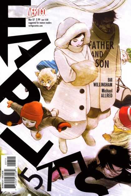
Fables #57. James Jean. And here he is being a rockstar AGAIN. The way he uses the wind to blow the title and issue number around the page with the characters? Genius I say, freaking genius. The way Snow (Snow White) is all in light and hubby The Big Bad Wolf is all in shadow? Brilliant. Their little half wolf – half human cubs/kids running/floating/flying around like crazy – some of them even transformed into little wolves? Adorable. Annnnd…SOLD!
055.
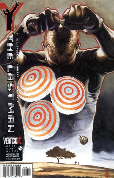
Y The Last Man #14. J.G. Jones. I really can’t explain how much I love this cover. There’s something about those hypnotic orange parachutes and the Yorick body positioning with the heavy orange outline that just works for me. It draws my eye every time. At the end of the day there’s something just graphically magnetic about it for me, though I can’t quite pinpoint why.
054.
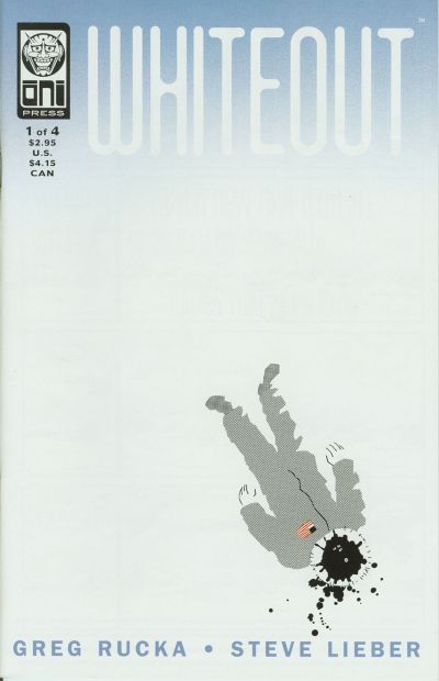
Whiteout #1. Matt Wagner. Remember how I was going on about loving white space a few numbers ago. BAM! Here’s some more. This is some great work by Lieber…everything is working from the positive and negative space, to the colors, to the off center figure, and the slow “white out” of the title. Really solid all around.
Update: Thanks to readers col and Greg that caught my error of wrongly attributing this cover to artist Steve Lieber instead of Matt Wagner. Apologies to both Mr. Wagner and Mr. Lieber.
053.
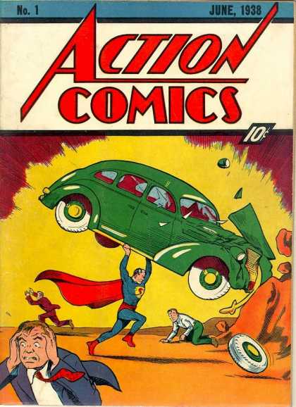
Action Comics #1. Joe Shuster. That’s right folks, the debut of Superman in Action Comics #1. This is great stuff – from the bright saturated colors, to the expression on that guy’s face in the lower left hand corner. But I had this listed in the first group – somewhere in the 80’s, until I saw this. Seeing it photographed front to back so painstakingly, and so real that I could almost feel it in my hands made me realize it deserved a more respectable spot.
052.
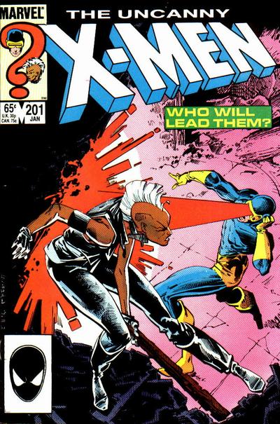
Uncanny X-Men #201. Rick Leonardi. Badass punk rock powerless Storm versus conflicted boyscout Cyclops for leadership of the X-Men? OH YEAH. I’m generally not a fan of unnecessary text on covers – but the “who will lead them” box AND the question mark with both their floating heads totally works for me here. Such an epic battle, captured so well by Leonardi.
051.
Astro City #4. Alex Ross. Ross always does stunning work, but one of the aspects I particularly enjoy about his covers for Astro City is the constant comparison between the powerless people on the ground, leading their lives, and the powerful almost gods that live among them. This is a great example of that. The fascinated, slightly sad and yearning expression of the woman on the bus, juxtaposed with the reflection of a god-like hero in mid flight is fantastic. Add to that Ross’ unparalleled skills as an illustrator and it’s a slam dunk.
-
Frazetta a master, Ross and Miller amazing.
-
Ross and Mckean FTW
-
Frazetta, created a genre that most are trying to catchup to. Alex Ross is definitely rocking the canvas as well. could not stop looking at Kingdom come.
the paintings were amazing. If you ever get a chance, check out “ariel olivetti” to me he seems like a cross between Frazetta and Simon Bisley…Pretty kick ass. -
awwwwwwwww, thank you so much for the inclusion!!! it’s an honor. <3
all your other picks are great. we seem to dig similar types of covers, usually with minimalist elements or lots of negative space around a single figure, etc. love that stuff. and the Quitely covers! nice. i also love his cover for i think New X-Men #119 with Angel on it (too bad she never got to wear the uniform in the actual comic!): http://www.coverbrowser.com/image/x-men/119-1.jpg
and Xorn contemplating a cheeseburger: http://www.coverbrowser.com/image/x-men/127-1.jpg
a couple of my other favorite ones are NYX #1 by Josh Middleton:
http://upload.wikimedia.org/wikipedia/en/f/f9/NYX_-1_Cover_by_Josh_Middleton.jpgand Black Hole #4 by Charles Burns (this was the only pic i could find, kinda crummy):
http://farm4.static.flickr.com/3313/3657959905_a7bff70681.jpg?v=0love the little sliver of salami or whatever in the sandwich.
-
rc67: Frazetta is undoubtably the master…as is Alex Ross. I looked up Ariel Olivetti – pretty great. I’ve seen some of his stuff before – without realizing it. He has a nice stylized look. I’m into it. Thanks for the tip!
ross: Well you’re welcome. I’m not sure how much of an honor it really is, but you certainly deserve it. I do really like minimalist covers, single figures, the positive and negative space aspects. That angel cover you linked to is great – as is the Xorn. Not wild about the NYX, but maybe that’s cause that pacifier shit really freaks me out a little
 Hopefully you’ve finished reading the list now and see that Black Hole #4 made the top five.
  Great minds and all that.
 -
oop, i just read Part 4 with the Black Hole cover! haha. awesome. 😀
the pacifier on the NYX cover is some rave culture thing, like when kids get all hopped up on E or whatever they get the urge to chew stuff. i don’t know. i’m not hip. anyway, it fits the character, right? 😉 i just love her expression.
-
Whiteout #1 is by Matt Wagner,I think.
-
with regards to asm 576 and sandman 51, it would be nice if you could include the other covers it’s sort of “linked to” so as to provide more context. of course, they are great on their own, but it would be interesting to see the asm cover beside the previous one where it was hammerhead’s fist hitting spidey’s face, and the other covers of the sandman worlds’ end arc (which are basically all the same with variations).

-
OMG!!! Semi nude woman on cover! The feminist inside me hates it but damn look at that camel toe! So Lovely!
-
ross: yeah, I know what the pacifier thing is about…but it still creeps me out :O that illustration is pretty gorgeous though.
col: Thanks for the correction col – I updated the post!
ramon: Yeah, it’s funny you say that, because I thought of putting smaller images up for at least the ASM covers that are similar for comparison, but I worried that if I started doing that the list was going to get even bigger…and I’d never finish – so I restrained myself. I was trying to get the covers to stand on their own anyway, but you’re right that some of those are even more powerful in context.
Greg: Thank you again for the correction. Also, I wish Steve Lieber was MY friend

-
Just wanted to comment that the Amazing Spider-Man #576 cover by Chris Bachalo is an homage to the opening splash of Moon Knight 28. Check it here:
http://www.comicartfans.com/GalleryPiece.asp?Piece=332968&GSub=36617 -
Pingback from The 15 Covers I Wish I’d Included… « on July 20, 2010 at 5:37 pm
-
Pingback from 52 Favorite Comic Covers Of The Year « on July 24, 2010 at 6:36 pm
-
Y The Last Man #57 definitely deserved inclusion, IMHO.
It’s a visually striking cover, and there are nice graphic design elements to it. It leads your eye through the cover art.
Comments are now closed.






28 comments