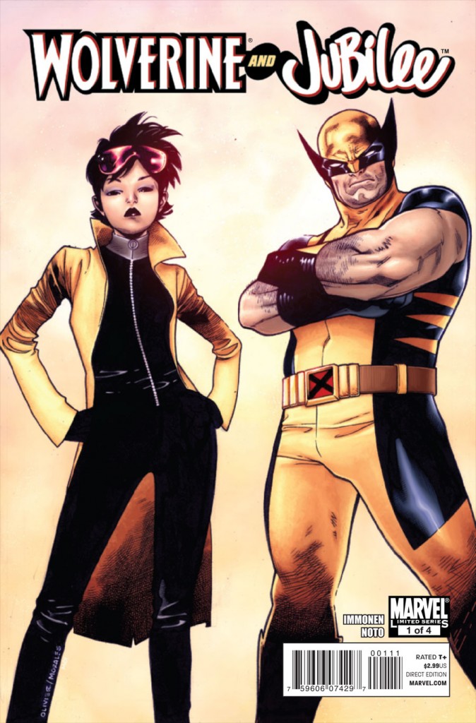
So let me just say, if more superhero art (and design) looked like the following Oliver Coipel cover for Wolverine & Jubilee #1…I would be reading more comics (and bitching A WHOLE LOT LESS). I first thought this was a Stuart Immonen cover…and it has some great Immonen like qualities (highest of compliments coming from me)…but it’s Coipel and I have to give the man props because there is SO much right in this simple image.
First and foremost Wolverine is short. Smaller than Jubilee style short. He’s also a bit stocky. These are great things.
Now, onto Jubilee. First of all, she looks at least a bit Asian…which is so rare, and a huge step in the right direction at a minimum. Secondly, she’s very slight and slim and not crazy curvy and stacked like every other woman in comics – she’s got small proportions that befits the history of the character. It’s so fucking refreshing I had to stare at it for full minutes to understand the wonderfullness (not a word!) that was occurring. Lastly, the fashion forward-ness of Jubilee’s costume…it’s completely streamlined and refined and super cool (and hot) while still being both appropriate for superheroing and totally retaining her identity within the update. The yellow jacket and large pink-ish sunglasses are just unmistakably Jubilee…but paired with a slick black catsuit…I just…I am swooning over this.
AND a zippered costume that is zipped up? PLEASE. MORE COMICS LIKE THIS. ALWAYS. FOREVER. BRING IT.
-
The one thing that could make this better? Switching them around so each character stands under their name. But that’s a nitpick, and this is a great cover. The series proper looks really, really good too and is written by the super-talented Kathryn Immonen. I was hoping to tradewait it but…I think I need this one in singles. Especially at $2.99.
-
I agree, love Olivier Coipel’s cover design. I have been impressed with his stuff since his Legion of Super-Heroes run. Jubilee’s look reminds me of some of Jim Lee’s stuff from the early 90s.
-
Sweeet cover. I agree it should have been flopped so they’re under their respective names, but this is very nice.
And according to Bill Cosby, “Wonderfulness” is a word. 🙂
http://ecx.images-amazon.com/images/I/61SQ8yaQxkL._SL500_AA300_.jpg
-
@Mo: Great image!!! This is my favorite Jubes pic of all-time (another Jim Lee/Scott Williams piece):
http://www.audioshocker.com/wp-content/uploads/2011/01/jubes-pg1-uxm-276.jpg
-
@ross: Whee! Jubilee!
@optionalplayer: Loving all the love for this image and for Coipel, but let’s not get crazy with “can never doing anything wrong”…for example the grouchy 10 year-old child face of Gambit in this otherwise sweet image! 😉
http://blog.1979semifinalist.com/wp-content/uploads/2010/12/alt-x-men.jpg
@Brenden T: It’s funny the placement doesn’t bother me that much…I actually almost think it’s funny…but you’ve definitely got a point and that kind of stuff does usually bother me.
@Nick: I’m with you on “chinese jubilee ftw!” But what’s so wrong with Wolvie’s mask? I’m down with it!
@Fiona: I know, right?!
@Keith: Well, if I’ve got Cosby’s stamp of approval then who cares if it’s right…amirite?!
-
Pingback from Cover Of The Week – 1/19/11 « on January 21, 2011 at 11:13 am
Comments are now closed.


15 comments