Yay! What do we think? Anyone? Anyone?
Old:
New:
[polldaddy poll=1566692]
You are currently browsing the archive for the art category.
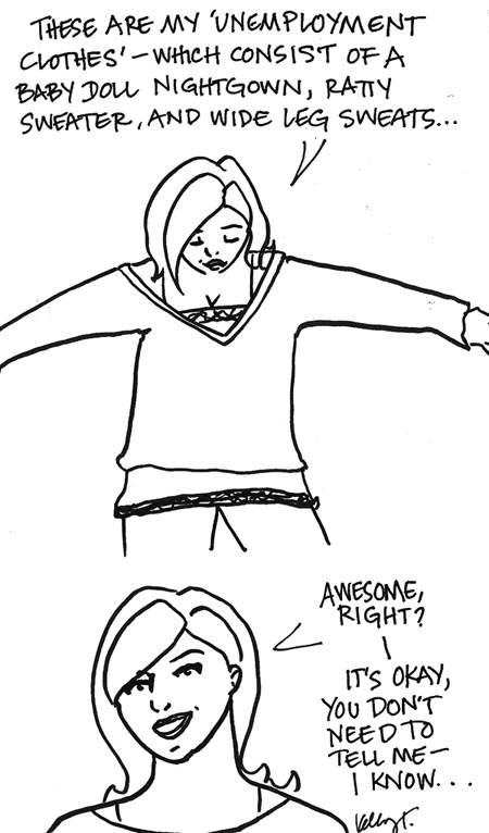
Now, please keep in mind I do of course mix this up with different babydoll nightgowns, ratty sweaters, and sweatpants. But yeah, it’s decidedly not awesome.
If we hadn’t gone out this weekend (twice!) I think Adam would have forgotten what I looked like in real clothes. Speaking of this weekend, we saw two really good films this weeked at the New Directors/New Films series. Treeless Mountain and Cold Souls. I don’t know if either will be getting a wide release, though the latter has enough star power that it seems like it should (Paul Giamatti), it also features in a small role some “new” actress (Katheryn Winnick) that I have to say I could not take my eyes off of. To be “that guy” (or girl, as it were) she looked like a lovely version of Scarlett Johansson…only taller and a bit older. Va va va voom.
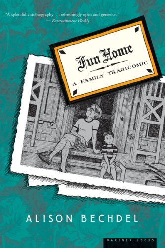
Fun Home: A Family Tragicomic. By Alison Bechdel.
Years ago I was writing and drawing a graphic novel that is fiction, but is based loosely on a relationship I endured when I was 25. I still hope one day to return to it and publish it, and I also hope that it has benefited from sitting on a shelf for five or six years, as with time (and maturity) I have found flaws in the way I chose to tell the story that I wouldn’t have been able to see at 25. I think it is a love of that shelved project that sent me running to Alison Bechdel’s book Fun Home the second I learned about it. Let’s not dwell on the fact that I should have known about the book at least a year earlier, and instead focus on the positive…I found out about it and went to buy it that same day, and then read it that same evening, cover to cover.
It’s a wonderful book and I have to commend Bechdel for being so unflinchingly honest in relaying her story. I think in a graphic novel it’s even more difficult to be honest than in a prose memoir, because it’s not just words, but also pictures, which speak so loudly on their own. And yet Bechdel is not only brutally frank in her portrayal of herself (hard enough to be non-biased as it is), but also of her relationship with her father, and her father himself, which is no small task, especially considering that her father died, likely a suicide. I doubt I’ll ever be capable of such honesty in storytelling, but I’m always going to aim for it, and I think I’ll start using Bechdel as my benchmark.
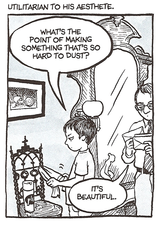
First let’s talk about the art, which is sublime. Check out this panel (from one of my favorite pages in the entire book) in which you get everything so clearly – who Bechdel is (was), who her father is, how their relationship works…all in the space of a single panel. AND it’s funny. Beautiful stuff. I can’t get over her perfect expression while dusting that frustrating chair. This is the expression of dusting children everywhere.
Beyond the artistic achievement of Fun Home, it is also well written, though it’s less about beautiful language than it is about memory and reality and the rawness of all that comes with that. Bechdel is served well by the diaries of her youth, which are shocking in retrospect and so insightful about all that was happening to and around her as a child. It’s a fascinating study of youth and relationships.
From a strictly shallow standpoint, the arc of Bechdel’s story has some slow points where the story really drags compared to the piece overall, which generally moves smoothly and quickly. It’s a challenging story to tell in one piece as there are many elements from childhood through adulthood to address, most of which relate directly to her father, but some of which are tied more loosely to her father and require a bit of a stretch in her formatting of the story.
I’m not sure it’s a failing so much with Bechdel’s narrative as it is a failing of me as a reader, being the impatient video game playing generation that I am I became frustrated looking for the “resolution”. Of course in reality, which Bechdel is very clearly dealing with here, life is rarely so “resolution-y”, and so I have trouble blaming her narrative. I think in the end, whether a few areas dragged and took me off path or not, Bechdel was honest with the material, telling it in the most genuine way she could, a massive undertaking of which I think she is wildly successful.
4.5 Stars
Sometimes it’s good to be wrong.
It’s really late notice, but if you happen to live in Utah now’s your big chance to see Anis Mojgani perform. It’s well worth the time I assure you.
Here are the details, or…just use these:
Friday, March 20, 7:30pm
Utah State University
Taggart Student Center Ballroom
Logan, Utah 84321
Tickets are $5 in advance, $7 at the door
Note: Please Utah and people of Utah, take no offense. All is said in love. I lived in Utah for years, and my family all still live there. But trust me Utah, you usually don’t get things as awesome as Anis Mojgani.
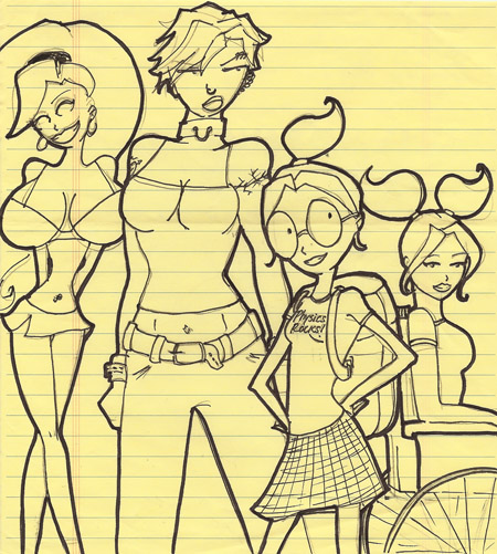
A rare one of all of the girls together. I hate the way Bimbo is drawn here and think she’s evolved, but everyone else looks pretty good. I also love the fact that it’s completely low-rent and drawn on yellow lined paper…
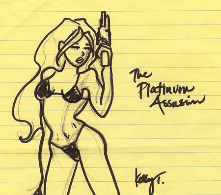
A sketch for the mysterious Platinum Assassin…also on sweet yellow lined legal pad!
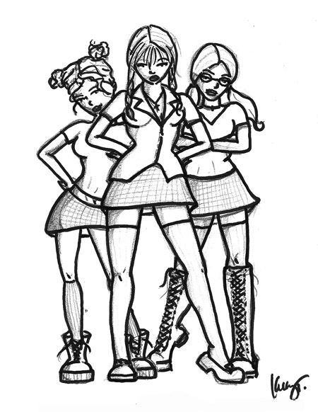
An older (but respectable enough) character design sketch of Evil Catholic School Girls (from left: Mary Jane, Mary Pat, Mary Rose). They’re one of my favorite villains for the series…
I’m sorry to keep pouring on the teasers…there really is an actual project in your future dear readers (I swear) but I’m still (yes, still) hip deep in novel revisions, but as soon as I can get clear prepare for the deluge…!
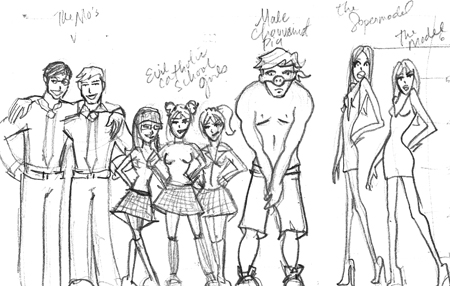
I thought you guys might enjoy a teaser sketch for a drawing I’m working on for a Jilted League “Villains Line Up”.
Here we have, from left to right: ‘The Mos”; Evil Catholic Schoolgirls (Mary Jane, Mary Pat, Mary Rose); MCP aka Male Chauvanist Pig; and The Supermodel and Regular Model.
There are three more pieces to this sketch so far…if you ask nicely maybe I’ll post them in the coming days. Who knows how long before the final (yes, with color!) drawing goes up.
And please, let’s not hassle me about the fact that all their feet are a bit cut off. It’s partially the scanning, and it’s partially I’m always bad about getting the feet to fit on completely the page when I sketch…but Adam’s already given me enough crap for that to cover you all…
Have a great weekend everyone.
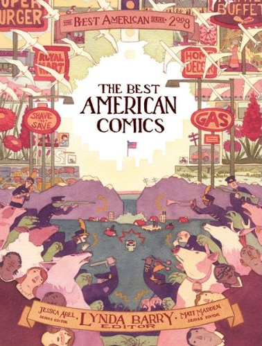
ELEANOR DAVIS is the 1979 Semi-Finalist’s ARTIST OF THE WEEK. I came to Davis’ work actually through her boyfriend and often partner in crime, artist Drew Weing, whose journal comics were one of the original inspirations for me trying out journal comics myself, and who will be featured as Artist of the Week on his own sometime soon. I wanted to write about Davis now though because every time I look up I seem to be seeing more of Davis’ amazing illustration and comic book work. I don’t think I could get away from her if I tried – not that I ever would.
She recently illustrated the cover to The Best American Comics 2008 (see above) and she is constantly popping up in Mome a collection Adam and I both love that is always full of the best independent comic work out there. Her amazing Seven Sacks, featured in Mome’s Spring 2007 issue is completely brilliant and as testament to its brilliance is also included in The Best American Comics 2008.
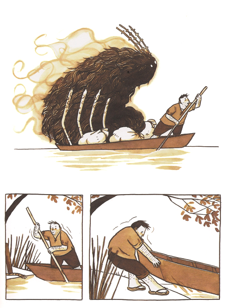
Excerpt From Seven Sacks
Davis has a unique style that is part horrible and disturbing and part playful and fun. Some of what she draws is quite frankly the stuff nightmares are made of, but she draws it all in such a way that you can see there is so much more than nightmare there. It’s almost like her work allows you to identify with the monster first and so seen from the monster’s perspective you can’t help but shrug your shoulders when you see what horrible things they might do…as if to say that horror is really all matter of perspective. Her endpapers for Wide Awake 666 are a good example of this:
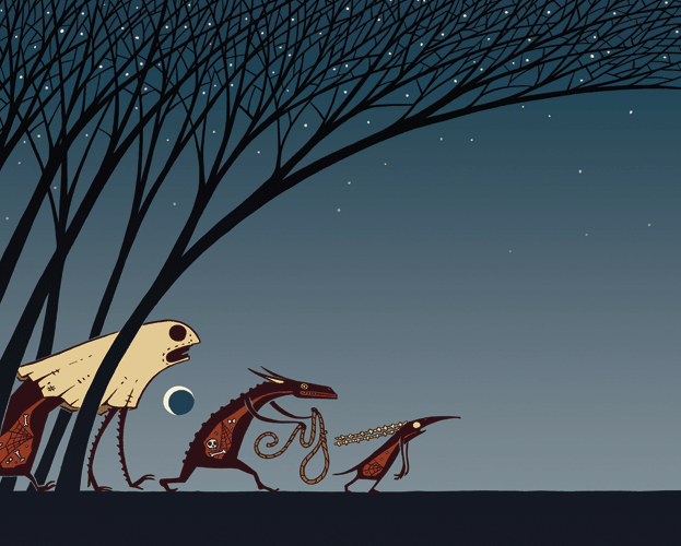
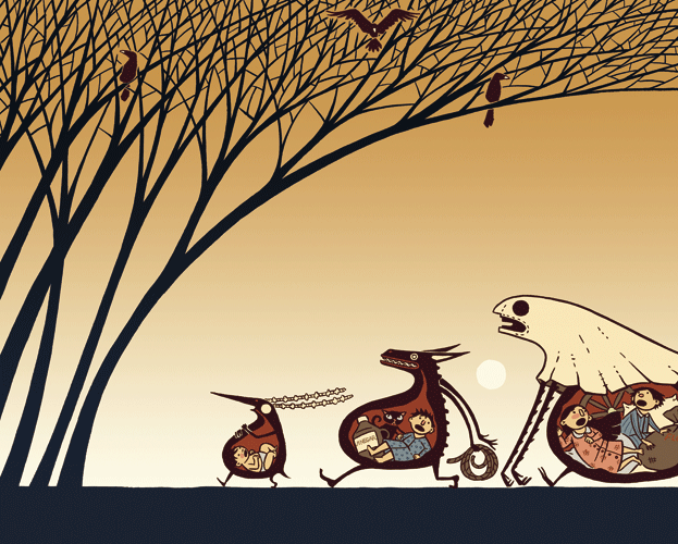
See? Hard to care…those monsters need to eat too, right?

Let me be clear about two things first:
1. I thought Studio 60 was brilliant – one of the best shows I’ve seen in years and I was devastated when it was cancelled.
2. I’m aware this post is about a year (or more?) too late and likely completely unnecessary at this point in time, but I’ve been watching The West Wing reruns on cable in an effort to stave off buying the complete West Wing collection (which I cannot remotely afford right now) and I’ve been moved to write an epic (okay, not quite epic) post…so here it is.
Studio 60 never had a chance, in a nutshell because though it was beautifully written, exceptionally performed, and extraordinarily executed – as few television programs are these days – it just couldn’t compare in content to The West Wing.
What was it about The West Wing that so moved me (us)? Well, I cannot speak for the whole of society, but for me, it was that my life is pointless. I essentially shuffle (or did – more to come on that later) paper. I am (was) incredibly valuable to my company and employers and fellow co-workers for what I do every day, but in the larger scope of the world it means absolutely nothing. The world is not a better place for my working existence and I find myself (then and now) yearning for a purpose. To know that I am doing something with my day that matters. And that is what they did everyday on The West Wing. Regardless of how the story worked out, their main objective, whether obtained or not, was to do good…to try to do good…to try to change the world. My day to day life has nothing to do with these things, and so it remains ultimately completely uninspiring.
And this is why Studio 60 couldn’t work when it came AFTER The West Wing…no matter how brilliantly executed, who can care about some silly hollywood SNL type show and the intricacies involved in producing said show and the relationships revolving in and around it…when the show that came before it was about the people who shape the very world? Studio 60 never had a chance…unless Sorkin did it first…as a beautiful prelude to The West Wing. But that was not to be, and so we lost out on Studio 60 – a ‘could have been’ brilliant long running show…because he showed us his perfection first in The West Wing. The West Wing was the most perfect show I have ever had the opportunity to watch, a program that managed to both entertain and inspire, a show that I nearly had to turn off (and sometimes did) when George Bush became president, because it was too difficult to watch a brilliant and imaginary Jed Bartlett be the president I yearned for while my country was run by a moron. Never have I so wished to transport myself into a television world than when I had to watch Jed Bartlett be good and honest and intelligent, and surround himself with the same, while in my world an idiot boy with a crooked smile was run by corrupt puppeteers and crooks.
But there is hope. Because I’m able to watch The West Wing with renewed faith these days, hoping that Obama will be able to slowly restore my faith in this nation and in my own governement.
And I guess with that, I managed to make this post relevant after all…
SIDENOTE: I should mention Sports Night. Also brilliant, and worthy of mention and a mark in history on its own. It’s a crime it too did not last much longer than Studio 60…only 45 episodes…but since it came first I like to think of it as both proving my point, and as Sorkin getting his feet wet. Of Sorkin learning what he needed to do to make The West Wing so powerful…and he really just nailed it.
SIDENOTE 2: If any benevolent benefactors out there would like to send me The West Wing collected series on dvd, please don’t hesitate to be in touch and I’ll get you an accurate shipping address 
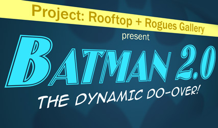
Calling all Bat fans, Project: Rooftop has announced its latest contest, and it’s a good one…design the new Batman…Batman 2.0 if you will, for his most likely successor, Dick Grayson (aka Robin, aka Nightwing) after Bruce Wayne’s untimely (and lets hope non-permanent) recent demise.
Ready…steady…GO!
I am terrible at, and do not enjoy drawing men (even awesome Batmen) so I may have to not participate this time yet again, but I’ll definitely do some sketches and give it a try. If anything remotely interesting comes out of it I’ll post…promise.

I got the most amazing holiday cards this past year, and just wanted to share the beauty since everyone I sent to should have received them by now. I found the cards rather randomly at a little online shop called ShopRedBean. I got three or four different designs – mostly the two awesome reindeer designs on the site and was exceptionally happy. They weren’t cheap, but somehow I never manage to get cheap cards…despite efforts to the contrary. I got more compliments on my cards this year than I ever have before…which is pretty cool.
Because the cards and envelopes are square, they require extra postage for the “irregular shape”, which gave me an excuse to use custom stamps. I had a custome 62 cent stamp made from a piece of the 1979 Semi-Finalist header/logo above. I have to say, that turned out to be my favorite part of the process. And I’ve got some left over, so that will make mailing a little bit more fun…at least for awhile.
I hope everyone had a great holiday – and apologies if you didn’t get a card…I probably didn’t/don’t have your address. 