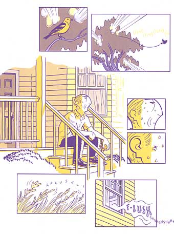
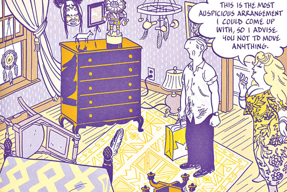
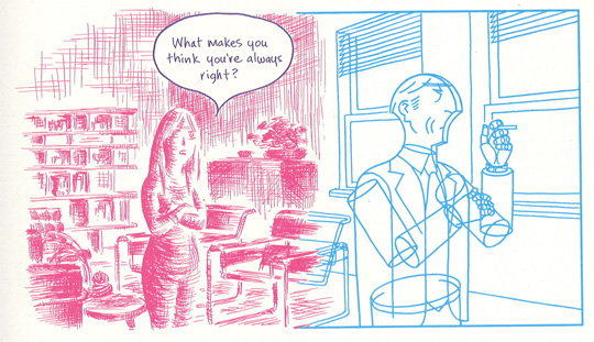
New She Has No Head! is up – a review of Sarah Glidden’s How To Understand Israel In 60 Days Or Less. Check it out!
You are currently browsing the archive for the books category.
Tags: comics!, recommended!, she has no head!
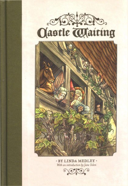
New SHE HAS NO HEAD! is up – a review of Linda Medley’s excellent tome, Castle Waiting.
Tags: fantagraphics
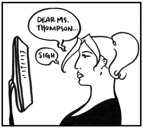 I don’t post a lot on this blog about writing – save a few random comments about what’s going on with my novel and my “rejection status updates” I have deliberately tried to avoid making this a blog about writing. I think I’ve stayed away from this for two main reasons.
#1. I tend to find most blogs about writing a little the same and dull and I doubt I have much unique to add to the discussion.
#2. Many people who know WAY more than me already do it MUCH better.
Super secret reason #3 is that most of the time I’d just rather rant about comics.
All that said, something happened a few weeks ago that made me want to do a post about writing – specifically a post about what I’ve learned over the past three(ish) years about publishing and agents and “how it all works”. As I started writing it turned into a four part post, focusing on different aspects of publishing. This is PART ONE and it’s about SCAMS.
Please keep in mind while reading this that there are still innumerable things I have yet to learn. By most standards I’m still a rookie. If you have a manuscript and are trying to get an agent, or want to be a writer, or want to educate yourself about scams, or just want to learn more about publishing I’d suggest checking out any and all of the following:
Absolute Write, The Rejecter, Duotrope, Writer Beware, Miss Snark, and Pub Rants
Oookay. All of that out of the way. A friend of mine that has a solid childrens book manuscript almost got scammed the other day…which is what prompted the idea for this first post. Now, the person that “scammed” her was actually much more upfront than most in that he acknowledged that there would be money involved in getting her published. This is usually called Vanity or Subsidy publishing. While this gentlemen appeared to be more honest than your average scammer, he still largely presented himself as a “legitimate publisher” that would “love to see her work”, when in fact, if you are paying money you are either self publishing or vanity publishing or getting scammed (the latter two often going hand in hand). My friend, like many honest hardworking writers, jumped at the opportunity and sent him her manuscript. When talking about it with her I heard her mention paying money and I had to slam the breaks on her excitement.
A legitimate publisher never asks you for a penny. NEVER. The publisher pays you. You do not pay the publisher. In fact, as a writer, you pay for nothing (except perhaps postage to send your ms to agents or publishers when you are seeking one if you choose to go the snail mail route). You do not pay agents. You do not pay reading fees. You do not pay editors. You do not pay for a “web page” to help “market” your book. As a writer YOU. DO. NOT. PAY. EVER.
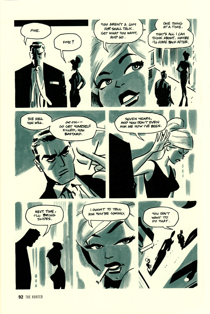
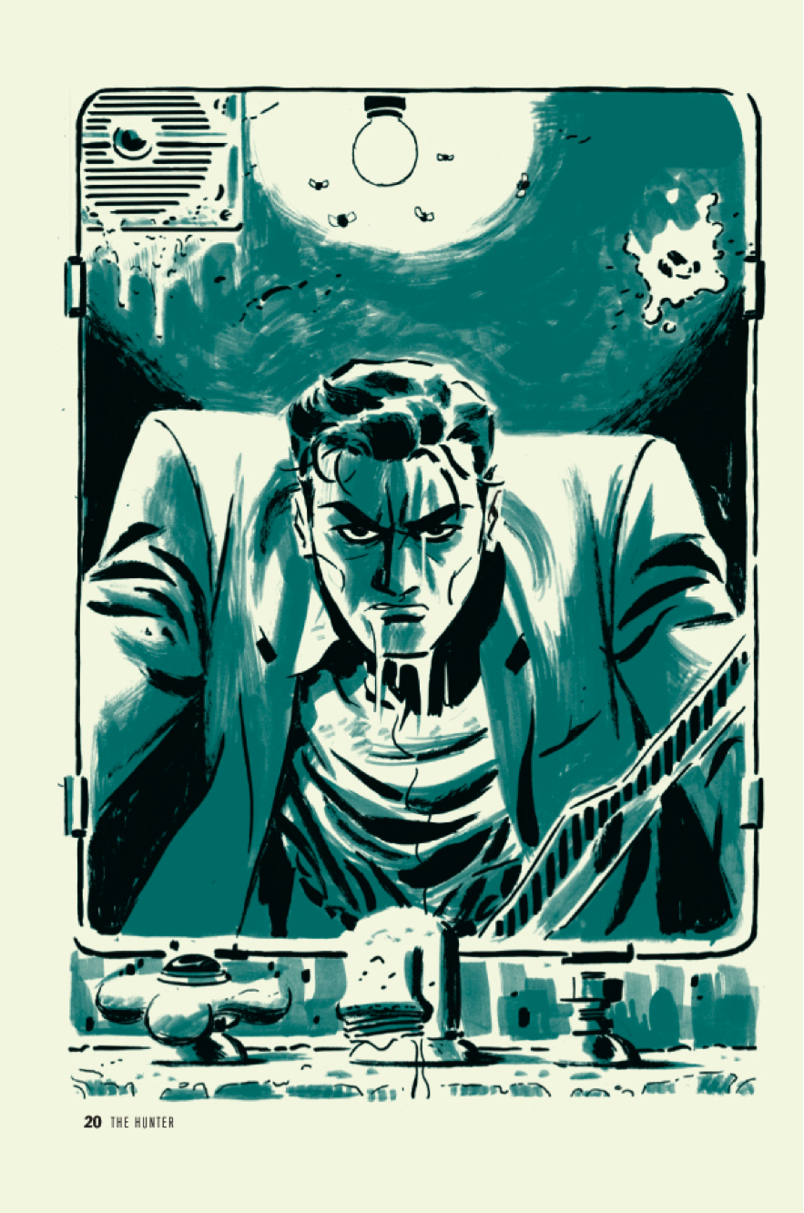
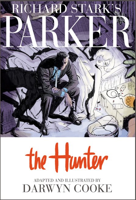
Parker: The Hunter. Darwyn Cooke (Writer/Artist). Comic Books/Graphic Novels.
I have been salivating over this new Darwyn Cooke adaption of Richard Stark’s Parker for months, and finally, to “reward” myself for finishing my big novel revision, purchased it at Jim Hanley’s last week and then devoured it in one sitting – my preferred method – swallowing it whole – going back for second reads later.
It’s a beautiful book. I’m a huge fan of Cooke’s illustration/penciling work (see his many covers in my Top 100 list – including one in the Top 25), and this is no exception as it is picture perfect. Individual panels being matched in beauty by the overall pacing and muted color palette.
I have not read the original material, but I assume Cooke was fairly faithful, it certainly feels authentic. I think my main issue with the book, lies not in Cooke’s hands but in Stark’s hands (though I cannot be 100% sure without having read the original material) and that issue is primarily that I tend to have some drama with these kinds of noir/detective-y books. I love a good detective yarn, and who doesn’t love noir? But as a card carrying (and ranty) feminist, it’s easy for me to get my hackles up about the female portrayals in the traditional noir style. They’re always gorgeous femme fatales and bitches that would betray you for a nickle. And while I’m happy to read that character, I get a bit annoyed when that’s all there is. And in this particular story all we have are a betraying wife and a handful of hookers. Now I suppose it’s a given that Parker runs with a more criminal crowd, but it would be nice to see SLIGHTLY more variety there…and perhaps more importantly all the women here are portrayed pretty strongly as victims. So it’s even a step down from the ‘betraying femme fatale’ type, who though not exactly revolutionary, is at least a strong woman with a plan, whereas here we have more of the ‘worthless beautiful victim’ type. Boring. At least as drawn by Cooke they are stunningly beautiful images.
[SPOILERS}
The story sets up well with the badass master thief Parker penniless and looking it, but thumbing his nose up at offers of a ride. Once in the city he fakes an i.d. (much easier back in the day) and makes off with someone’s entire bank account. Well on the road to being all fixed up – clean (ish) and in a suit, he hunts down his old flame, that has betrayed him – ‘natch. Parker does away with her in an extra special way and moves on, following the trail to the man that set him up, betrayed him, stole from him, and got him sent to prison.
My one complaint in the story (other than the female characters issue) is that everything comes REALLY easy to Parker. I mean, I love that he’s the ultimate badass, but there’s very little tension in that there’s just no doubt in your mind that he’s going to get his man and come out the other side smelling like roses. He is perfection…well when perfection comes as revenge and badassitude. And because of that, because there is no weak link in his armor – perhaps his one weak link is his presumably now dead feeling for his wife – but since he offs her first it leaves him free of any weakness – there’s not a lot of surprise in how it all works out.
If I hadn’t been spellbound by Cooke’s artwork, and drawn panel to panel by the beautiful pacing, I think I would have noticed that the actual story was leaving me pretty cold. it’s a masterful feat for Cooke, which makes me appreciate him all the more, but regardless of the skill involved, I didn’t think of the book once after putting it down, there just wasn’t enough story to stay with me.
Ultimately it made for a beautiful but uneventful read.
4.0 Stars*
*on illustration alone I’d give it 4.5 stars easily, but for story, I’d give it a 3.0. I’m going to give Cooke’s illustration the upper hand and split the difference at 4.0
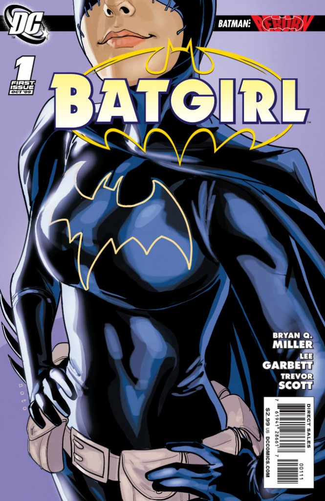
Well, they revealed Batgirl’s identity in the first issue, which is good. And I have to take back my bitching and moaning about the idea of trying to drag it out. Officially, thank you DC for not dragging it out. Unfortunately…
SPOILER
thanks to pasrimonia for the awesome ‘batgirl for batgirl’ poster image.
All signs point to the new Batgirl not being Cass. And the most recent hints suggest it is either Steph (The Spoiler) or a combination of two or three women (possibilities that seem to include : Cass, Steph, Babs, or Misfit) taking up the cowl together…which is an interesting idea, but I admit I’m not really on board, mostly because I just don’t understand why it’s not Cass straight up and with no ‘battle for the cowl’ bullshit.
I feel like the fans really love her and have long embraced her, but DC just somehow never has, and I don’t know why.
I guess the only thing I’m truly glad about is that it doesn’t LOOK like the plan is for it to be Barbara – which I would hate. There’s speculation that because of dropped hints that they wanted to bring her back as Batgirl and changed their minds. I would love if this was true, because it suggests that they do listen to fans (everyone loves Barbara, but almost nobody wants her back in the Batgirl uniform) or at least to themselves when they realize something isn’t right. The bottom line is that Barbara has so evolved beyond being just Batgirl. Barbara is so much more as Oracle and she can’t go backwards in time…which is what it would be for her to put on the Batgirl uniform again.
Anyway, let’s be all scientific like and look at the hints:
There were the three images released as Batgirl teasters, and each of them are basically different costumes, and thus suggests different women…which I guess is where we’re all getting idea that it will either be a team up of multiple women donning the cowl, or at least a battle to be the one and only.
The first (and my favorite of course) is pure Cass (although a bit heavy om the boobage).
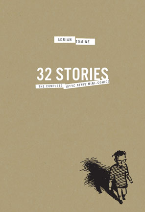
32 Stories: The Complete Optic Nerve Mini-Comics Box Set. Adrian Tomine (Writer/Artist). Comic Books/Graphic Novels.
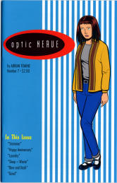
I’m a huge fan of Adrian Tomine’s later works – Summer Blonde, Shortcomings, every New Yorker cover he does – but I largely missed out on his early Optic Nerve mini-comics, so I was delighted to see Drawn & Quarterly release this gorgeous box set of his original mini-comics (Optic Nerve #1 – # 7).
I dug into them this past week, and it was such a great experience, I doubt I can accurately explain how much I enjoyed it. Reading them seemed somehow both progressive and also like a total throwback to when comics used to really genuinely make me happy. It’s also great, as I’ve discussed before in relation to reading Alison Bechdel’sDykes To Watch Out For collected , to be able to see the evolution of a writer/artist in one sitting like that. Tomine’s drawing, inking, lettering, his very style evolves before your eyes and it’s a wonderful thing to behold – to see an evolution captured like that. Not that issue #7 is better than issue #1 – just different. There was a real rawness and almost sloppiness to the early issues that I loved. But it was amazing to see Tomine’s drawing slowly evolve more into the style that I’m familiar with today.
As I said there’s a real gritty and honest style to Tomine’s early work and when I realized that the first four issues of Optic Nerve were self-published by Tomine before he even graduated from high school I almost fell out of my chair. Even with the rawness of it, this is an incredible accomplishment and really underscores the talent Tomine possesses.
Some of my favorite stories in this collection are: Back Break in #2; Rodney in #3; Adrian Quits His Job in #3; All Choked Up in #4; Haircut in #5; Mike The Mod in #5; My Appearance On The Jane Pratt Show in #6; Leather Jacket in #6; Allergic in #6; Smoke in #6 (#6 was my favorite issue); and Happy Anniversary in #7.
I also really enjoyed the additions to the Box Set in the form of another book with an introduction and some special features including a handful of unpublished sketches and strips. The best of this to me was Tomine’s discussion in ‘A Note on this Edition’ of another writer/artist having gotten a copy of his high school yearbook years ago and posting his high school picture on a heavily trafficked web forum. Tomine talks honestly and frankly about how he felt about this (badly), how he dealt with it (badly) and how he feels about it today (not so badly – and to prove it that same high school photo is the cover of the introduction book). But it really gives you some perspective – that no matter how talented and amazing we are (I will never in my life come remotely close to touching the badass-ness that is Adrian Tomine) we are all vulnerable and sometimes vain…but that ‘this too shall pass’ is something that really is true, and if we can remember it and laugh it off, we’d all be better off.
4.0 Stars.
Man, I want to get my hands on this SO bad. No luck last night at the comic shop. Will keep trying. SO pretty.
Check out the 18 page preview on IDW.
Tell me that doesn’t make you sing deep down into your toes.
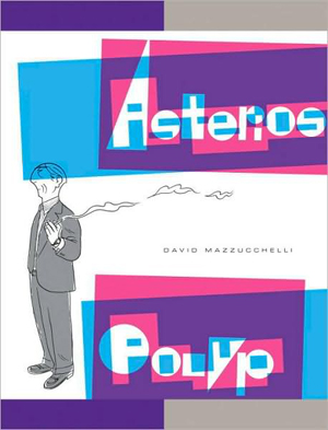
Asterios Polyp. David Mazzucchelli (writer/artist). Fiction. Comics/Graphic Novels.
I am an idiot. Why you ask? Because I was not in favor of Adam buying this book. You see, it’s thirty bucks and he’s trying to save up for a short film that he’s doing in September. And so I was very naggy about the whole thing when he talked about how much he wanted to splurge and buy it. Of course I never bothered to look it up. If I had I could have saved us all a lot of naggy bitching. Hell, I would have bought it myself and saved him the trouble.
HELLO GORGEOUS!
SOOOO worth the thirty bucks. When I think of the other worthless things I’ve wasted thirty dollars on…oh the horror. I have a secret Mr. Mazzucchelli…I would have paid $50…maybe even $75. It’s stunning – the perfect blend of form and function…of art and content.
You want to see a little taste of what I’m raving about? Here ya go:
That’s not enough? Okay, check out the Vulture Blog’s eight page excerpt.
I feel like just dispensing with the actual “review”, but for record’s sake, let’s do it.
The Good: Mazzucchelli’s use of color, use of panel, use of white space. His pacing and storytelling abilities – my god! His perfect cartooning. The heartbreaking tale of Asterios Polyp and the writing that blends seamlessly with the art…sometimes becoming the art. A tale that flies in the face of simple and easy ideas like “karma” but also has a light of hope and redemption for our hero. There’s a reason some pieces of literature get called “masterpieces” and there’s a reason we don’t throw that term around all willy nilly. Asterios Polyp is a masterpiece.
The Bad: Nothing. I mean really, I can’t think of anything negative. I read this book in one sitting, spending most of a long afternoon totally engrossed. And I have to say, I can’t wait to go back and read it again. I know there are still literally dozens of hidden treasures that I missed on first reading that will reveal themselves to me in each new chance I get to sit with it. It’s a book I will enjoy my entire life. Unfortunately it belongs to Adam. Damnit. If we had room for two copies on our shelves I’d get my own copy…just in case.
I mean look at this! Illustrating different people (in a relationship no less) in not only different colors, but with completely different styles and they talk with different text. It’s brilliant and important.
The Ugly: The word ugly and this book should never be used in the same sentence. Ever.
5.0 Stars
And on the final day of Comic-Con, here are the top 25 Comic Covers.
For Part I, Part II, or Part III click the links.
025.
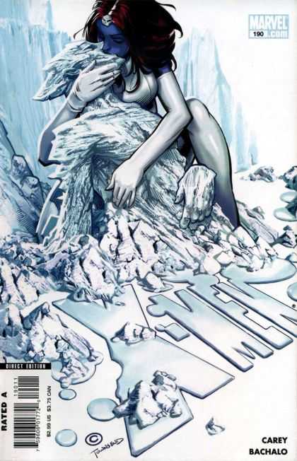
X-Men #190. Chris Bachalo. There’s something about this cover that I just can’t get out of my mind…but I have trouble putting my finger on what exactly it is that speaks to me. I mean I love all the white (as mentioned previously) and I obviously adore the integration of the title into the illustration so we’ve got less crap covering it all up, and it’s a great concept, but I don’t know, there’s just something sweet about it. That kiss, which maybe is supposed to look passionate…to me looks…compassionate. It’s Bachalo’s best cover to date if you ask me. And I’m a fan.
024.
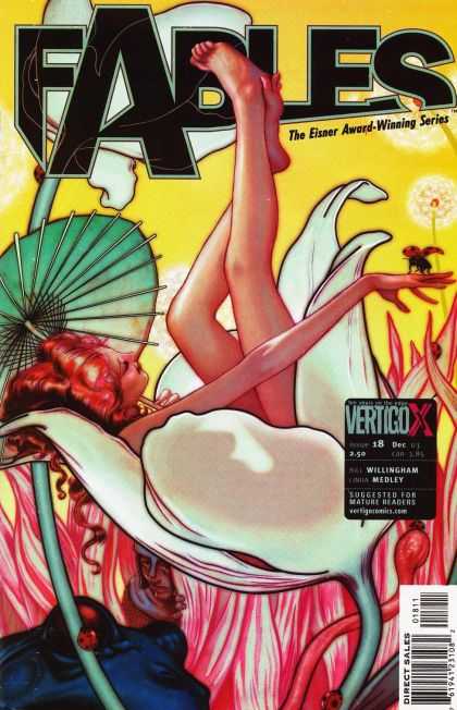
Fables #18. James Jean. This one never fails to move me. The vibrant luscious colors, the subtle but definite dark outline. The composition. The desire to get lost in whatever world that Jean creates. This was the first of Jean’s covers I ever saw, and I think the first of his work I ever saw, and it shocked me with its stunning beauty on the stand. If I recall correctly I said, “OH.” and dropped everything else I had to pick it up. And such began a fervent love affair with James Jean’s work.
023.
Astonishing X-Men #2. John Cassady. More monochromatic blues…YUM. The dichotomy of the simplicity and complexity blended together here is what really does it for me I think though. You’ve got the blank background, barely a different color than Emma, and with the title open and see through to that background. The intensity of Emma’s eyes, commanding the reader’s attention. The power of her over Cyclops optic beams, and the power of her over Scott himself. It’s all rather brilliant while beautiful and because of how this story arc of Whedon’s plays out, it’s a great tease to the readers of all the complexities that are to come.
022.
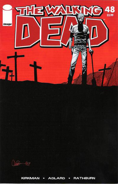
The Walking Dead #48, Charlie Adlard. All of Aldard’s work is pretty wonderful, but I picked this one, because to me (and Mr. Adlard and I have of course had no actual conversations about this – so maybe I’m way off the mark) but to me, he’s placed the horizon line so high on the page because our characters become more and more enveloped by the dead around them with every issue. As if they’re trapped in a room with a rising tide, and we just know that eventually, they will drown. Our main character Rick is seen here, already missing a hand, burying the dead, and almost pushed off the page because the dead fill it. It’s such a simple little thing, but is really an inspired and brilliant choice.
021.
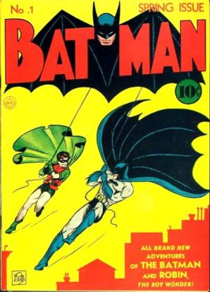
Batman #1. Bob Kane. This iconic cover, portraying my favorite comic book hero Batman in his own comic’s first issue, is instantly recognizable. And though the color scheme has changed much over the years (yellow and red in today’s Gotham? Never!) the swinging into action position of Batman (and Robin) is dead on. This issue is also notable for being the first appearance of Catwoman/Selina Kyle then known as The Cat in 1940. Very cool stuff.
020.
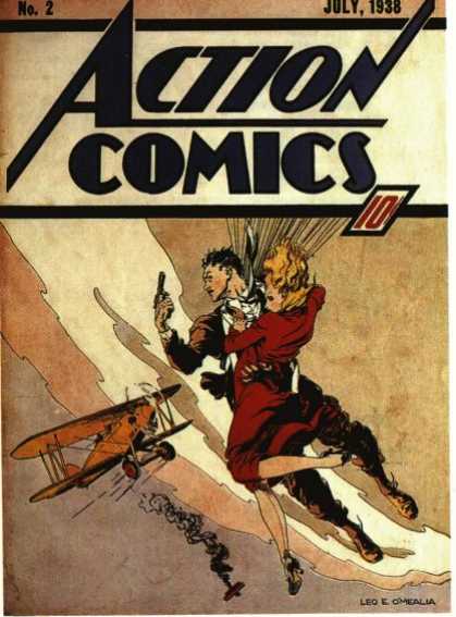
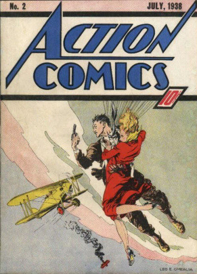
Action Comics #2. Leo E. O’Mealia. It blows my mind how fantastic this cover is, and how overlooked is often is, simply because Action Comics #1 was the first appearance of Superman. But really look at this cover – the movement, the composition, the positive and negative space, the color scheme, and really just the quality of the illustration work – it’s all quite stunning – and it was done in 1938…Amazing.
Although, it is worth noting that I also found this scan (see below) of Action Comics #2, with a decidedly different feel in the color work – no bad or worse than the one above, but decidedly different and since I’ve never seen an original I can’t say which is more accurate to the original color – anyone else know? I personally prefer the first one, but both are nice and deserving of their place.


