books

You are currently browsing the archive for the books category.

And on we go…

For Part I and Part II click the links!

050.

050 Adam Hughes

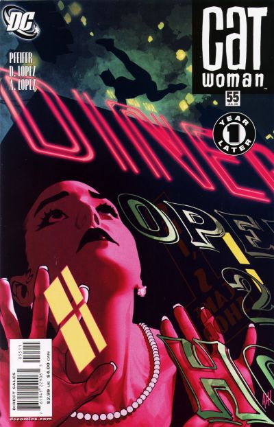
Catwoman #55.  Adam Hughes.  So I think we should all just take a moment to appreciate the beauty of this illustration.  The detail of the signage painted on the glass, the neon light, the amazing colors, it’s all fantastic.  But the real beauty of ths is in the iconic Catwoman figure in silhouette acrobating across Gotham.  It’s a singular immediately identifiable figure and its powerful heroic (or anti-hero in this case) shape speaks volumes about superhero icons.

049.

10549_4_014

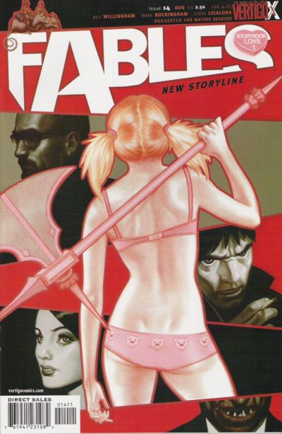
Fables #14.  James Jean. I wish I could explain to people (not you of course dear reader) but people that don’t understand misogyny in comics why this is NOT misogynistic, despite being a woman in basically underwear drawn from behind.  Because this is not exploitative.  But I’m not sure how to explain why not to people that don’t immediately see the difference.

I suppose the first thing you can say is that if you look at the body (no pun) of Jean’s work you’ll find very little to no unnecessary exploitation of the female figure…so he immediately gets the benefit of the doubt.  Secondly, the figure is not coyly looking over her shoulder with a “sexy face” smile…she’s also not arching her back provocatively…or jutting out all her “sexy’ “naughty” parts.  She’s just a figure drawn from behind.  She’s stylized and slightly idealized, but not drawn as a parody of a woman in underwear…or a young man’s wet dream of what a woman might look like in her underwear.  She’s also casually holding a badass weapon as if she absolutely knows how to use it.  And lastly, none of the characters on the cover with her are objectifying her either.

For all these reasons, this is the way a cover with a woman in underwear could/should be drawn.  Learn from this cover, artists…please.  It’s not that you can’t draw women in their underwear, but it’s HOW you draw a woman in her underwear.

Thank you.  *Steps off soapbox* :)

048.

048 Jack Kirby

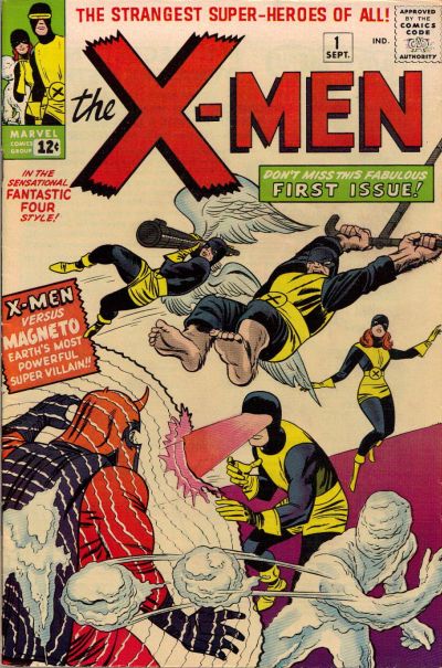
X-Men #1.  Jack Kirby. You knew this one was coming.  And it deserves to be here.  And if Jean Grey wasn’t standing around like a moron in the background while the “men folk” fight the Master of Magnetism then perhaps I would have bumped it up several notches.  I’m willing to concede that her power is difficult to draw and Kirby may have just been at a loss here, but still, it pisses me off a little.

047.

047 Paul Smith

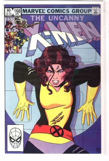
Uncanny X-Men #168.  Paul Smith. A totally iconic Uncanny X-Men cover.  You know I was never a big Kitty Pryde fan (sometimes bordering on hate) though there were times I enjoyed her in Excalibur and Joss Whedon’s run on Astonishing X-Men showed me a whole new side to her that I appreciated.  But regardless of how I feel about Kitty this cover is great – the expression and positioning – up against a wall in a Danger Room – totally makes me want to read the story.

046.

Frank Quietly

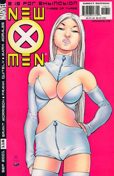
New X-Men #116.  Frank Quitely. Again we have Mr. Quitely, and again, people love it or hate it in my experience.  As my brother said “It looks like she’s smelling something nasty”…and he’s right, but y’know, that SHOULD be Emma Frost’s expression.  She’s pretty much a bitch, so I think that expression is just about dead on.  I love this cover because it just owns everything.  Emma’s skin is just alive on the page – it looks fleshy and real and spongy and not plastic and over processed and that is a rare rare thing in comics.  Also, the hot pink background is totally inspired.  I know Josh hates the crotch of her shorts, but honestly – that shit looks real too – if you put on some crazy costume like this, I guarantee you’d get some weird bunching…in strange places.  I much prefer the reality of the folds and imperfections in a costume than the usual which is supposed to be spandex, but just looks like colored body paint.  It just makes the cover all the more real for me.

Also, I suppose I should address the “is this exploitative” issue.  To me, no.  Largely because THIS is Emma Frost.  She’s like this.  She would TOTALLY wear this, and she would have that expression while you stared her down in this outfit trying to find your voice.  So for me, the character justifies the artwork here.

045.

045 Jack Kirby

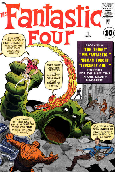
Fantastic Four #1.  Jack Kirby.  This absolutely belongs on the list as one of the iconic superhero covers of our time.  It’s great – I just love that monster with the giant gaping mouth.  Though Kirby’s work is really beautiful I tend not to love Fantastic Four covers because they’re always covered with text balloons and I’m not a fan of that so much, but this is a benchmark cover and it deserves a spot in the top 100.  I suppose, much like with the X-Men #1 cover, I would give it a little more credit if Sue Storm didn’t seem so much like a worthless damsel in distress and more like the superhero that she is.

Read the rest of this entry »

And here we continue our list…!

Click here for Part I

075.

075 James Jean

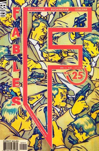
Fables #25.  James Jean. Oh James Jean, how I love you.  Look at the use of color, the use of text as a design element.  The title and issue number all beautifully incorporated into the image flawlessly, rather than just being splashed across artwork without concern for what’s being destroyed.  He even manages to work in the creator names so it not only looks like part of the original illustration, but IS a part of it.  Fantastic.  If you don’t like James Jean you’re gonna hate this list – because his work appears many more times before we get to #1.

074.

Vaughn Bode

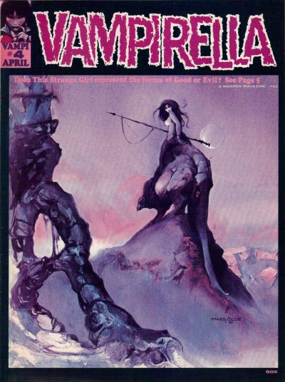
Vampirella #4.  Jeff Jones/Vaughn Bode. How can you not love this?  I mean, okay, she’s naked and straddling some kind of land monster, but she’s carrying a spear and looks like she would just as soon pierce you through the heart with that spear as look at you.

073.

073 Jo Chen

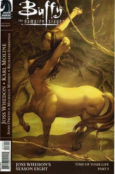
Buffy Season Eight #18.  Jo Chen. Another beautiful cover for Buffy by Chen.  Dawn as a horse?  Illustrated beautifully?  Well, you had me at hello.

Read the rest of this entry »

So in honor of the San Diego Comic Con which I am not attending (boo!) I took a little trip down memory lane, searching out all my favorite comic book covers over the years.  And since I’ve got this blog and it needs content I thought I’d regale you all with my 100 Favorite Comic Book Covers Of All Time!”

A few things you should know:

1. I limited this list to US saddle stitched issues – so you won’t find any graphic novel, anthology, or non-US covers here.

2. A few of these covers are more about the sweet sweet memories of a more innocent (and awesome) time in my life when a great comic book could make my whole week.  When thinking about a comic that was coming out made me so excited I’d get chills. When hunting down a back issue to catch up on something new I was discovering was literally the most important thing going on with me (sad, but true).  And so a few of these covers are more about what they mean to me and less about how beautiful they look to the world at large.

3. As X-Men were my introduction to comics there is definitely a disproportionately high number of X-Men covers.

4. There’s also a high number of badass chick covers, as I, am a badass chick.  :)

Annnnnd, we’re off…

100.

100 Gary Frank

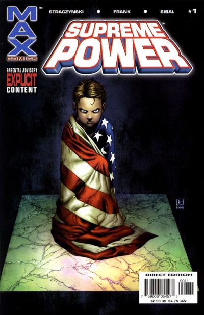
Supreme Power #1.  Gary Frank. This is a good looking cover, but it’s at the bottom of the list because to truly appreciate what’s going on, you have to know that Supreme Power is basically about Superman, if he had been found by the government instead of Ma & Pa Kent.  And then the government makes up a fake Ma & Pa Kent and raises him in a false environment designed to make him feel devoted to “American values” but it’s all a sham so that they can better hope to control him as a weapon.  Yeah, before Supreme Power jumped the rails and became lame, it was AWESOME.  Supreme Power was like Superman meets The Truman Show meets The X-Files and it was badass.  Too bad they couldn’t maintain it.

099.

099 Ben Oliver

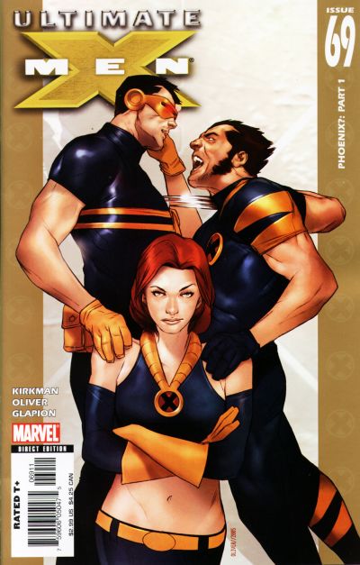
Ultimate X-Men #69.  Ben Oliver. Surely many people would argue with me for putting this cover in a best of list, because frankly, there are far better covers out there. However, it’s the subtext that I love here.  I’ve never been a big fan of Jean Grey, but she’s got a look on her face here that makes me finally ‘get’ her a little bit.  She’s so nonplussed by these two superhero jackasses fighting over her, their hands literally on her and claiming her, meanwhile on a good day (or bad depending on how you look at it) she could sear the flesh off their bones without a thought.  It made me think about that love triangle a little differently than I ever had before (which is saying something considering how long the shit has been going on).  What each of the players want, and also what is really wrong with them inside on some level to want it.  It’s an impressive cover that can do all that with a character’s expression.  Also of note is that Jean, though drawn beautifully,  is not looking weak and waif-y, but strong shoulder and wide-hipped, and just, well, powerful.  Like a superhero should.

098.

098 Lee Weeks

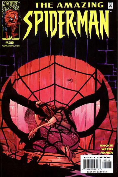
The Amazing Spider-Man #29.  John Romita Jr. I think this cover is beautiful.  The way the ‘spotlight effect’ falls on the wood and the floor is all really fantastic, and the almost entirely monochromatic look is great as well.  Also, while I’ve never been a big fan of Mary Jane myself, this cover speaks volumes about what it might feel like to be the girlfriend (or boyfriend) of a superhero.  Cowering and bathed in the oppressive light of their stardom, of the very largeness of their life…it’s interesting.

097.

097 Jo Chen

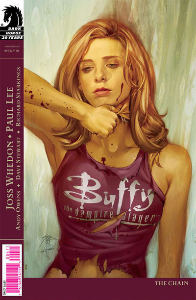
Buffy Season Eight #5.  Jo Chen. Jo Chen does amazing cover work, and the beauty of this cover here is both Chen’s ability to make an illustration look so like Sarah Michelle Gellar and to also retain its own voice.  This cover is made extra creepy by the aspect of Buffy tearing off her face, which I believe pertained to some ongoing aspect of this arc, but even if it didn’t, the concept would fit well into the Buffyverse.  Buffy is always wearing masks and as such the cover really resonates.

096.

096 Andy Kubert

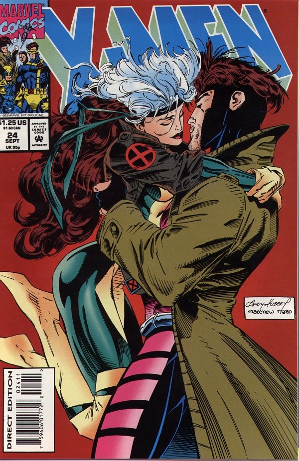
X-Men #24.  Andy Kubert. Alright, you caught me.  There is really nothing great about this cover.  Nothing great except for how it tugs at my 16 year-old heart strings!  Sixteen year old Kelly liked nothing better than some Rogue and Gambit action (there’s no accounting for taste I suppose).  There are many visual problems with this cover, not the least of which is the absolute eyesore of a giant white artist signature box. However, despite this cover’s obvious flaws, the characters are still well drawn and the moment Kubert captured had fans everywhere on the edge of their romantic seats.  Honestly, my 16 year old self is still happy whenever it sees this cover…so long as I can block out everything that writers (and artists) since have done to the characters.  I was excited about Chris Claremont’s new run on X-Men Forever, hoping he could rekindle my love for this botched comic book romance, but so far Forever is a big dud.  <Sigh>.

095.

095 John Romita Jr

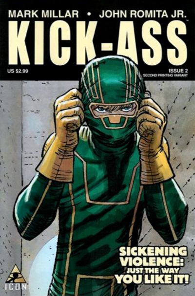
Kick-Ass #2.  John Romita Jr. I’m a huge NON-fan of John Romita Jr.  Whenever he draws those three lines on a woman’s cheek, I guess to define her cheekbones (?) I just want to gag.  Who taught him that trick?  I hate it!  However, this cover (perhaps because there are no cheekbones present?) is pretty awesome. The colors are great and the drawing is nice.  It’s a bit off the beaten path for a superhero cover, and since it’s Kick-Ass that’s no real surprise, but it’s nice to get something simple and unique.  It looks straightforward and honest, like the book itself.

094.

094 Michael Avon Oeming

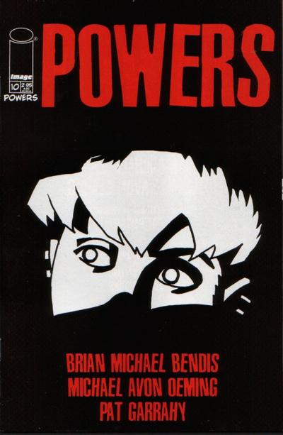
Powers #10.  Michael Avon Oeming. I am always intrigued when I see this cover.  The fact that Oeming has conveyed so much in a few black and white lines always blows me away.  I find the positive and negative space here to be gorgeous, and most importantly I want to know what Deena is seeing…I want to know what the story is…which at the end of the day is what comic covers are all about.

093.

093 John Byrne

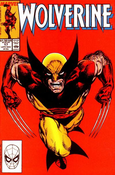
Wolverine #17.  John Byrne. Oh, Wolverine, how medium I feel about you.  Listen, I used to love you, just like everyone else, I mean you’re a complete badass.  And a great complicated character to boot.  However, you’re EVERYWHERE.  And I defy others not to admit that they too are a little sick of you.  You’re the guest star in every issue of everything, you were an Avenger for a while (and that is SO not a fit), you’re the star in the X-Men films (and cartoon) and then you get your own movie (and cartoon).  I mean ENOUGH.  You have over-saturated the market to the point where I almost hate you!  Stop it! I want to love you again…stop making it so hard!

Ahem.  Anyway, this is John Byrne, drawing what has become one of the quintessential ‘Wolverine poses’.

092.

092 Jeph Loeb

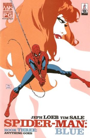
Spider-Man: Blue #3.  Tim Sale.  It’s a credit to this cover that though I never actually read Loeb’s Spider-Man: Blue, I never forgot this cover…and always wished I owned it.  I like the graphic elements that come together here  – the nice cartoon-y shape of the Mary Jane figure in the background – the all white positive/negative of her body, combined with the definition and expression in her face – and that awesome hair – very cool.  It skirts the line, with the posing and juxtaposition of figures as seeming a little sexual, but it doesn’t quite go over the line (at least not intentionally).

091.

091 Will Eisner

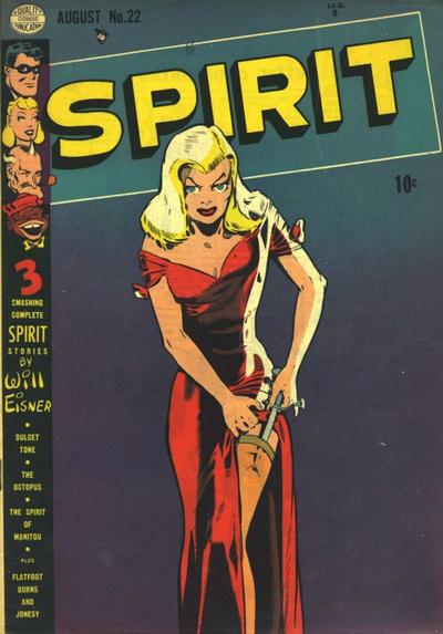
The Spirit #22.  Will Eisner. Ah, the birth of the femme fatale.  I guess I don’t know who REALLY invented femme fatales, but it’s safe to say that no one did them better in comics than Will Eisner.  That man loves him some femme fatales. That said, I’m not a big fan.  In general, it’s a pigeon-hole that female characters get trapped in.  The trap that says you are insignificant unless you are beautiful and sexy.  But, this is our history, and as such, to move beyond it, I guess we’ve got to embrace where we started.  Though the stereotypes are in full effect here (blonde bombshell?  check.  clingy red dress?  check.  thigh high stockings?  check.  knife in those stockings?  check!) I can still appreciate the beauty of the drawing, and the powerful simplicity of just a beautiful woman on the cover of a comic book…she owns that comic book cover if nothing else.

Read the rest of this entry »

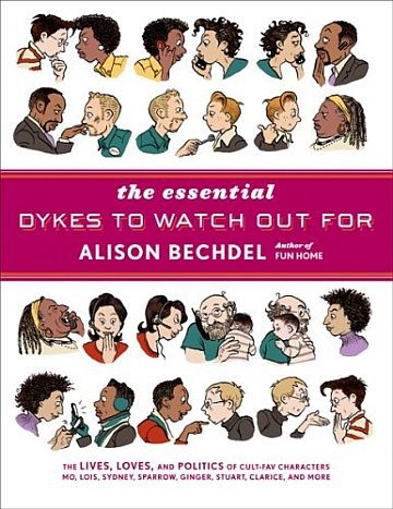
Essential Dykes to Watch Out For Cover

The Essential Dykes To Watch Out For.  Alison Bechdel (writer/artist).  Graphic Novels/Comics.

So I have a confession.  Though I have known Bechdel’s name for years and years (I went to art school and studied comics for christ’s sake), her book Fun Home: A Family Tragicomic was my first real immersion year into her work earlier this year.  If you read that review, you know I was pretty blown away.  This collection, blew me so away I don’t even know how to articulate it.

One advantage to learning about something suddenly and getting to absorb it all at once (or waiting for too long and absorbing it all at once – see my Y The Last Man post) is that you get the unique experience of just drowning in a new discovery – head first – and without having to look up.  I read Bechdel’s Essential Dykes in less than three days (and since it’s 390 full page, text heavy strips, that is no joke) but I could NOT put it down.  I just fell head over heels in love with these characters and all their beauty and flaws.

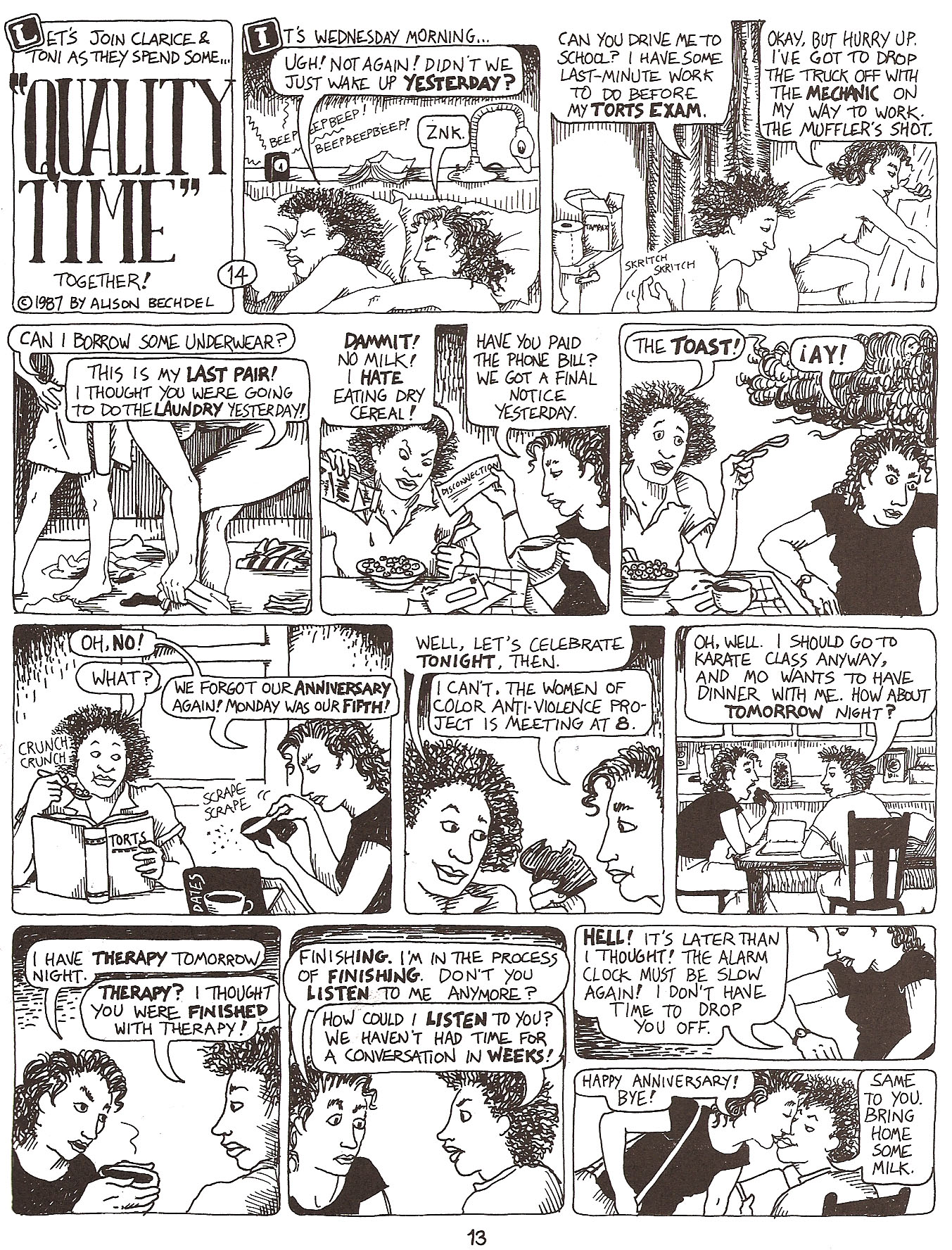
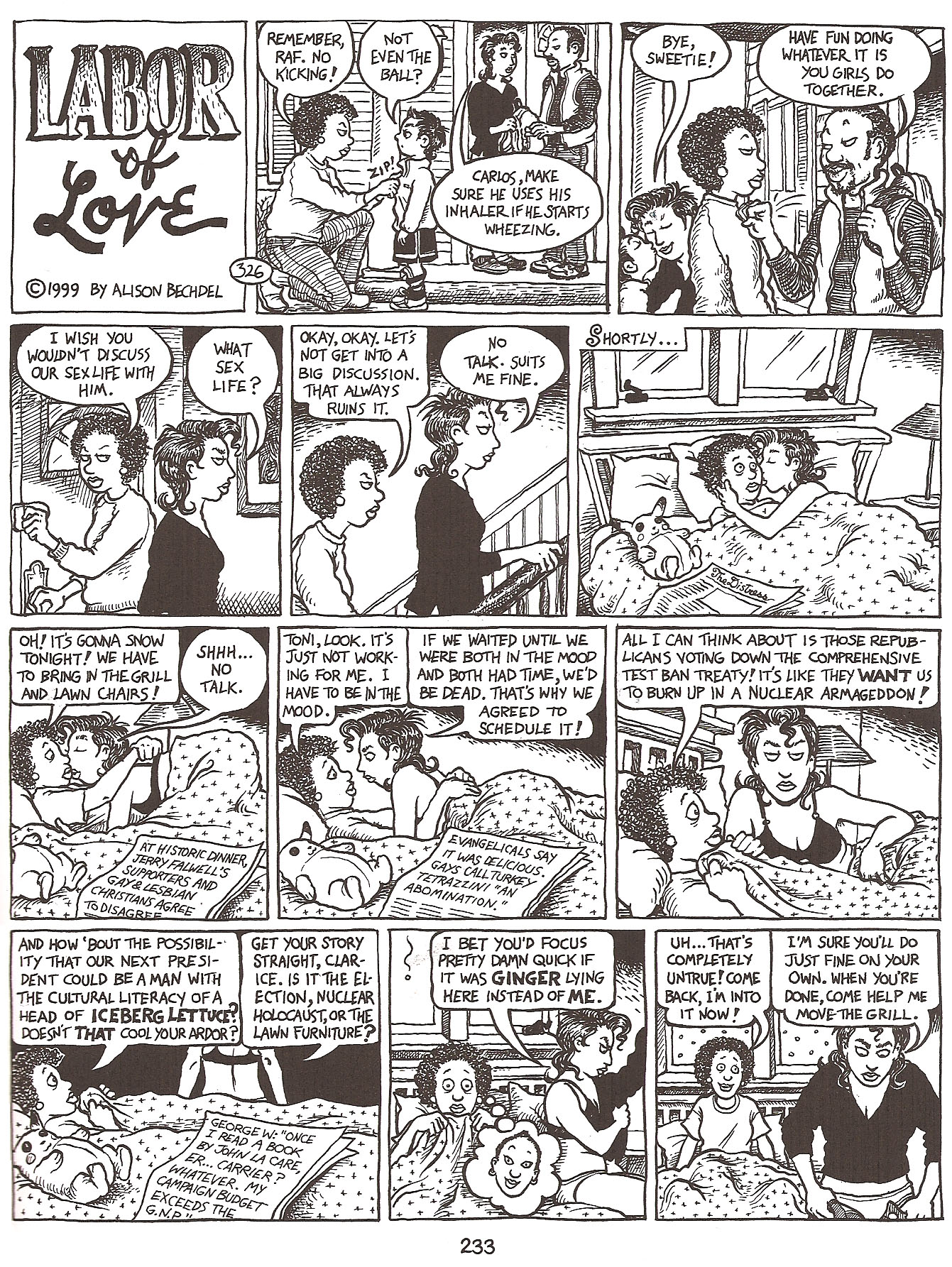
The Good: The absolute best thing about reading Bechdel’s work in a collection like this, maybe especially for me as an artist was the amazing experience of seeing her growth as an artist.  Read over time, because Bechdel was a great cartoonist from page one, I don’t know how obvious her evolution would be, but read all in a big chunk like this it was hard to miss the amazing transformation.  Check out the page below, an early strip in the collection from 1987 and featuring Clarice and Toni:

Bechdel 1

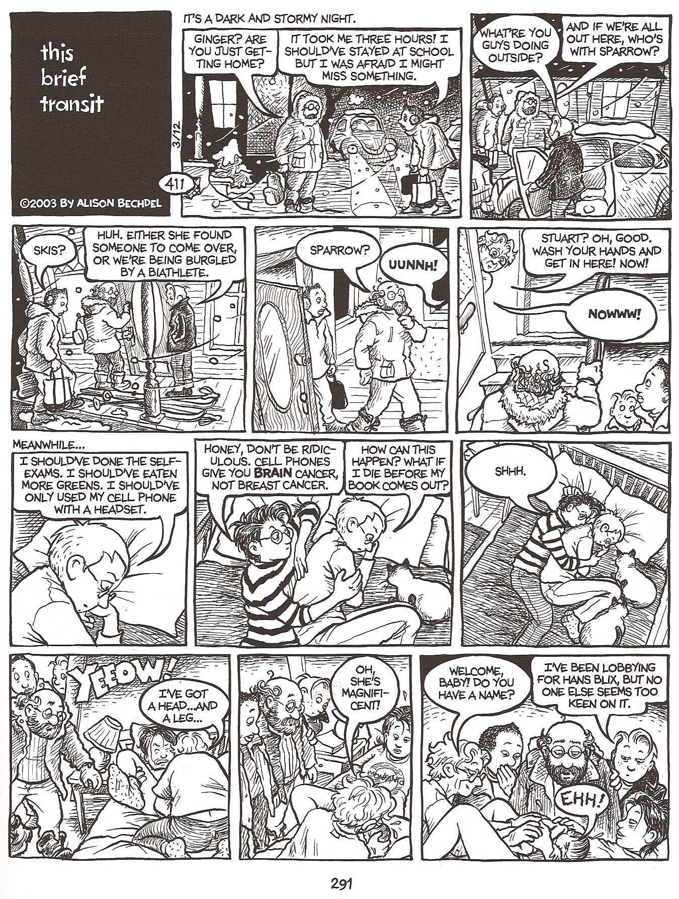
And a strip from 1999, featuring the same characters.

Bechdel 2

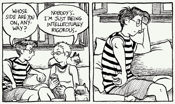
It’s just amazing to see the development, the characters are so much more refined (and defined) their looks really having settled in over the years, and Bechdel’s inking has so much more depth, and she’s willing (and able) to tackle much more complex panels, with greater depth of field, without confusing the eye – a real struggle for many cartoonists.  Every line seems considered and confident, unlike the early strips, where she was still incredibly competent, but in retrospect obviously still finessing her work.  It’s the kind of evolution that a cartoonist of Bechdel’s caliber will probably continue with her entire career and it’s a beautiful thing to behold.

Dykes Sample Panel1

Also fantastic is the subject matter, which Bechdel tackles unflinchingly, whether it be the intimate details of relationships, or potentially unpopular political issues.  It’s a slice of life that very few people ever get to see from the inside in such an honest and open way and we should all be grateful for the opportunity – I know I am.  I think because of Bechdel’s incredible talent as a cartoonist, her writing often gets ignored (I’m half doing it myself) but I do think it’s important to point out, that it’s the very subtlety with which she writes that is so brilliant.  I rarely think about her words – and that – in my opinion – means it’s working – they are effortless and real.  As it should be.

The Bad: Nothing bad to report.  There were times when the political tirades of Mo (or various others at different points in their lives) wore a little thin, but had I been reading the strips as they were released as opposed to in a couple high intensity sittings I don’t think I would have thought twice about them as anything other than an accurate and important reflection of what was going on in the strip.

The only other negative I can offer, is a completely personal reaction I had to some of the material.  Because it is so honest about relationships in particular, including the ways that people often cheat or stray when together for long periods of time, I found that aspect a little depressing.  As someone in a long term relationship, and someone who is too familiar with the horrors of cheating, I sometimes felt like giving up on my real life relationship…that if these amazing smart beautiful characters were incapable of staying faithful, maybe it was just an impossible task period…whether you’re real or fictional.  But, personal depression aside, Bechdel actually deals with all the relationships – cheating or no – so realistically (some characters work through those hurdles and stay together and others don’t) – that I can’t REALLY complain – it’s no fault of the material – but of the world we live in.  But it sometimes made me unbelievably sad.  But again, my reaction to those complex relationships was also likely a symptom of reading it in three giant sittings.

The Ugly:  Nothing.  Let’s look at another gorgeous strip, if only for proof of that:

Bechdel 3

4.5 Stars.

Funny Misshapen Body Cover

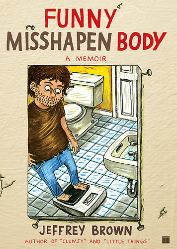
Funny Misshapen Body.  Jeffrey Brown (writer/illustrator).  Graphic Novel/Comics.

If you’re expecting an unbiased review of Brown’s latest book, Funny Misshapen Body, you’re totally in the wrong place.  I’m a huge Brown fan and really, he can pretty much do no wrong with me.  That said, I really enjoyed his latest offering.

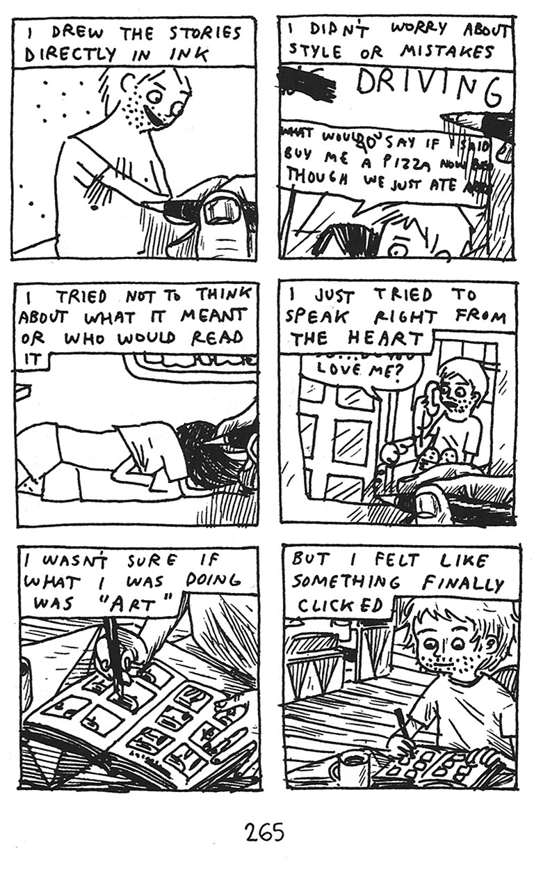
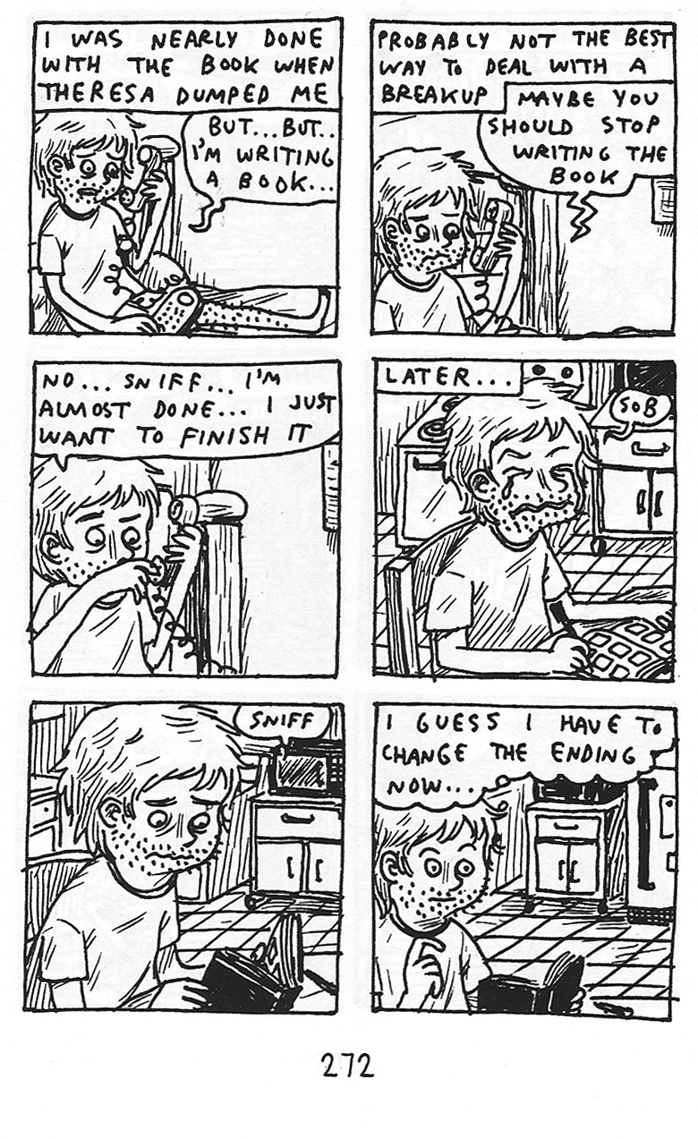
Funny Misshapen Body is essentially the story of Brown’s evolution as a cartoonist, and maybe a to a lesser degree his evolution as a person.  Like most of his work, the story is not told sequentially, but in random vignettes that shuttle back and forth in time.

Brown 1

The Good: As always with Brown, he has an incredible way of telling a story simply and honestly – no matter how embarrassing.  In Funny Misshapen Body he covers everything from having Crohn’s disease in highschool, to the break up of his first real relationship, and including the horror of trying to get started as an artist and going through the ‘drunk college experience’ – Brown cuts no corners and spares nobody – least of all himself – and it is that honest unflinching look at his life that so endears him to me time after time.

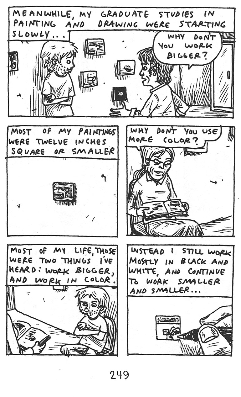
Brown’s signature scratchy style (which you get to see how he came to in this book) remains one of the many ways that I think Brown keeps things honest – drawing straight on the page in pen, with no pencils done beforehand – almost forces the authenticity of his work.  There’s no chance to filter, water down, or second guess it.  He just draws what he feels and for me, it just works on so many levels.

Brown 2

The Bad: I wouldn’t really rate this as bad, but though I found the subject matter here fascinating, it was slightly less effective for me than I expected, I think in part due to the non-sequential style.  I’m not exactly sure why, because even though an evolution seems like a sequential process, it’s really not.  There are so many ups and downs and back and forths as you try to figure out who you are in life, and what kind of artist you will be that the non-sequential aspect shouldn’t be a problem – and I have loved that unique element in his other works  – but it wasn’t as effective here for me.  I can’t quite put my finger on why it was less effective for me here.  Perhaps the fact that the vignettes seemed like more fleshed out fully realized stories – longer and more complex than his other stories – and so the out of sequence order became more confusing here, whereas in a work like Unlikely, it was almost impossible to tell things were out of order anyway…I’m really not sure.  But at the end of the day it was a bit less successful than I hoped.

Brown 3

The Ugly: For me, there’s not an ugly panel here.  For people that are not fans of Brown’s scratchy cartooning style I suppose this is not the book for them.  As I’ve said to people that are not on board with Brown’s style before, whether you like it or not, you have to remember that it is a stylistic choice he is making.  This is not the only way Brown draws, but he chooses to draw these small, kind of impromtu and unrehearsed panels as a way of further conveying his message.  It’s one of the best things about cartoonists that write and draw their own books – the art is so integral to whatever they are trying to tell you – and in my opinion it’s never more true than with Brown’s work.  If you don’t get it, you don’t get it, and that’s fine.  But for those of us who “get it” there’s nothing better.

4.0 Stars

monstersoftempleton

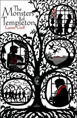
The Monsters of Templeton.  Lauren Groff.  Fiction.

The only real problem with Lauren Groff’s lovely debut novel is that I read her short fiction collection Delicate Edible Birds first and gave it 5 Stars (a rarity on this blog) – and so she had set the bar incredibly high in my mind.  She didn’t quite clear the bar of Delicate but I was thoroughly engrossed, enchanted, and enthralled by Groff’s Templeton world.

The Good: Groff sets the stage beautifully as Willie Upton returns to her childhood home in infamous Templeton (loosely based on James Fenimore Cooper’s Cooperstown) with her tail between her legs after an affair gone awry with her professor and a pregnancy to show for it.

The book opens with a Loch Ness type monster long believed to exist in the town’s nearly bottomless lake to be found dead.  It’s a great entry into the book – a book of myth, history, legend, and the loss of innocence that comes with development both in a town and in a person.  It sets a perfect stage for everything that Willie learns and the evolution that must come with those lessons.

Without a doubt however, the most fascinating aspect of Groff’s book – is her sublime blending of the contemporary story of Willie, with the history of Templeton as she searches for clues from the town’s past to find her real father.  It’s a rich tapestry that must have been quite an undertaking to weave so perfectly.  There were areas that dragged for me a little personally, but only I think because I was sometimes anxious to get back to Willie and her more present (and pressing) woes.  Overall, and especially as a framework to hang Willie’s story on, it worked tremendously.

The Bad: There is nothing really bad to report in this book.  The ending overall, is the only part that didn’t work for me as well as I would have liked.  I found myself disappointed in the final arc, particularly in how Groff handles the pregnancy, which toyed with my emotions unnecessarily and for me personally didn’t resolve as authentically as I had come to expect in the pages prior.

Additionally (and I won’t ruin the ending by getting too detailed) but I felt the resolution with Willie finding her father was a bit neat and phoned in considering it was the arc that held the entire book together.

Clarissa’s arc also faltered a bit at the end.  She’s a character I loved, but like the arc of Willie’s father, the end of Clarissa’s arc is a bit abrupt and too easy…it didn’t feel earned the way the rest of the book did.

So I suppose I did feel let down by the ending of Monsters in general, as I liked all of these arcs (the pregnancy, the father search, and Clarissa) but I didn’t feel they concluded with the same levels of excellence I had come to expect based on the rest of the book.  As complaints go, not so bad.

The Ugly. Nothing.  This book is stunningly written.  Groff’s prose is absolutely pitch perfect, with not a word out of place.

4.0 Stars

Batwoman

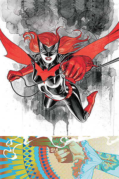
Detective Comics #854.  Greg Rucka (writer) J.H. Williams III (illustrator).  Fiction – Comics.

First, a confession.  I really haven’t been reading mainstream comics.  Sure every once in a while I pick up an issue of X-Men, Batman, or Wonder Woman and such, but with the exception of The Walking Dead (and until recently Buffy) I’m never that impressed and so I never bother to keep up.  Comics often disappoint me.  It’s possible my expectations are just way too high, but comics are just never quite what I want them to be…maybe more to the point…what they were to me in the beginning when I so fell in love.  So, especially unemployed, I can’t afford to spend the money unless I’m almost in love.  Did you know an average full color comic is four bucks?!  Ah, the good old days when they were $1.50…sigh…I’m so old…

Anyway, I only tell you this, so that my review can be taken in the full context of me as a comics reader…compared to the super committed fan.  But onward…

[SPOILERS]

The Good: It was well written and fairly easy to follow considering the fact that with most mainstream comics you need to pick up about a thousand issues to understand what’s going on if you just jump on board randomly.  I thought Rucka did a good job of juggling both the existing fans that maybe have read those thousand issues and new fans that might be trying out Detective Comics for the first time (since there has been such excitement over Batwoman’s premiere).

So the writing is solid throughout, but it’s the art that’s likely to bring fans back in droves.  The art is stunningly good.  From the Batwoman/Kate Kane basic design and execution to the individual pages and panels – really just gorgeous stuff.  Huge credit is also due to Dave Stewart who did the colors as they are just absolutely dead on and badass.

If we must deal with the whole ‘lesbian thing’ – and I think it would be the most progressive of us if we didn’t even have to talk about it – but we’re clearly not there yet as a society so I’ll comment.

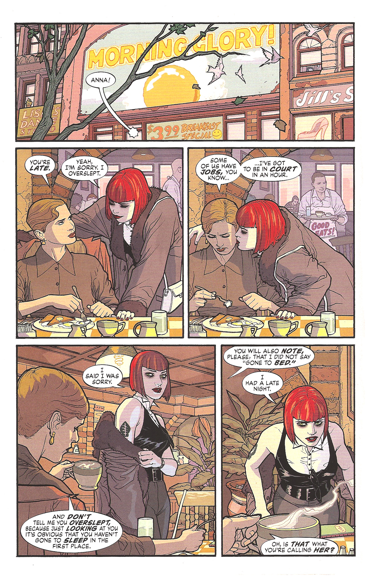
I think it was handled perfectly…in that it wasn’t really handled at all.  The scene that gives a glimpse into Kate Kane’s flailing personal life is honest and matter-of-fact, the way I’d expect any other relationship to be handled and so for that, I’m happy.  And I hope it continues as such.  Time will tell.  Rucka tends to write strong women well, whether lesbian or not, and so I have faith that he can handle Kate Kane and all her intricacies.

The Bad: The Batwoman costume design is so perfect – I mean look at those totally sensible – totally badass non-high heeled boots! – that I’m willing to forgive some sins.  I mean really…bright red?  It looks fantastic on the page, but let’s face it, what ‘creature of the night’ would wear fire engine red on their costume?  Anyway, I’m willing to forgive the red, because I am just that generous, but I’m not going to go along with this ‘hair piece thing’.

For those who haven’t seen the designs or read the issue yet, Kate Kane has short very red hair (see below), but as Batwoman she has this same very red hair, but very long and flow-y (see above).  They do make a minor plot point out of it in this issue as Batman makes an offhand remark about it (stating that the long hair is a liability), and it is revealed a few pages later to be a wig attached to the mask/helmet.  I suppose making Kane seem ‘oh so clever and unpredictable’.  But this is forced characterization to me, and one that doesn’t actually work, so I find this annoying and kind of frustrating. Let’s explore…

Do we have this hair situation just so we can have that moment between Batwoman and Batman?  If so, it’s not worth it.

Do we have the long hair because we “think it looks better on the page”, much like the fire engine red in the costume?  If so, I say we should have broken some boundaries there as well – like with the boots and gone for more realism…especially if you want me to buy all the bright red.

It should also be noted (as seen above) that it totally absolutely does NOT look like a wig attached to a helmet…it looks like hair, or MAYBE a wig attached to her head – which we all know would never stay on in a fight.

And as I obsess over this tiny (and really, let’s face it, totally insignificant detail) I realize (as we all eventually do) that Batman is still right.

The hair is a liability whether it’s real or not.  The hair getting pulled as real hair might hurt more – potentially ending a fight by taking our hero down – but if it’s a wig attached to the mask it’s highly likely to aid in yanking the mask off…which is a huge problem.

So at the end of the day, Batman is right (as always) and Kane actually ends up looking a little weak, which I think is probably the opposite of what Rucka intended.  Bottomline:  Kane should ditch the wig.  If she’s concerned about being identified I say she goes with a full head mask/helmet like Batman.  If that’s not the concern then no reason her regular awesome short hair can’t be the hair that goes with her badass costume.

But when this is the only complaint I can come up with for “The Bad” you know you’re doing something right.

Kate Kane page

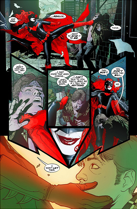
The Ugly: Not an ugly thing about this book.  Personally, I found the action page layouts to be a little fussy and unnecessarily difficult to follow.  But I think that’s personal taste.  I tend to prefer more standard/basic comic book layouts – whether action scene or not.  Although I have to give credit to Williams III, if you’re going to do crazy layouts, do them as well as he does – they’re well thought out and from a graphic design standpoint are quite frankly stunning.  I just happen to prefer readability to graphic design achievement (in comics that is).

batwoman action page

one of the less complicated action pages

Overall I give this issue 4.0 Stars (out of 5) and I will definitely be following along…until I’m totally hooked or until these guys screw up.  So I’m in for another hand…at least.*

*I didn’t want to confuse the issue by also talking about the “Second Feature – The Question” eight page story in the back of this issue, but it’s a good story – well written and well drawn and is something I’m excited to read – which is rare – usually those “second features” are total throwaways – so nice work Rucka and Hamner.

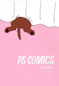
ps comics cover

P.S. Comics.  Melanie “Minty” Lewis.  Fiction – Graphic Novel/Comics

I picked this up totally randomly last week at the comic book store.  And it’s a great little book.  And completely what I was in the mood for.  I’m also glad I purchased it because these are the kind of books that I want (need!) to survive in comics.  Totally off the beaten path, with good, but ‘affordable’ production design (i.e. no color), etc.

After doing a little research I found that Lewis’ P.S. Comics started as mini-comics (I suppose self published) and have gained enough awards and recognition to make the leap to full blown book in local comic stores – which is fantastic.  Lewis’ issue #4 of the original mini-comic even won an Ignatz Award for ‘outstanding mini-comic’.

Lewis’ stories are mostly simple little tales that reveal tiny but important truths and are told via unconventional narrators – fruit, dogs, cats, and sometimes even humans.  My favorite tale of hers (available to read on her website if you’re so inclined) was about salt and sugar falling in love.  Their friends (pepper and coffee) of course make things a bit difficult for them, but their love prevails…at least for a little while.  It’s a great little story and I smiled all the way through.  Her dog and cat stories are good as well, but I personally found myself drawn more to her fruit stories – perhaps because I identified with poor apple – but that’s a whole other post.

Regardless, this is a great little book, and I encourage anyone that likes independent comics, or is looking to discover something new, to pick up P.S. Comics.

3.5 Stars

battle-royale

Battle Royale.  Koushun Takami.  Fiction

Wow.   I got through this puppy in like four days, which is fast even if it wasn’t over 600 pages.  It’s some of the most fun and most riveting reading I’ve done in a long time.  Just balls to the wall action from about page 30 on and I was literally compelled to turn every page, staying up all hours like I used to as a kid because I couldn’t put it down.

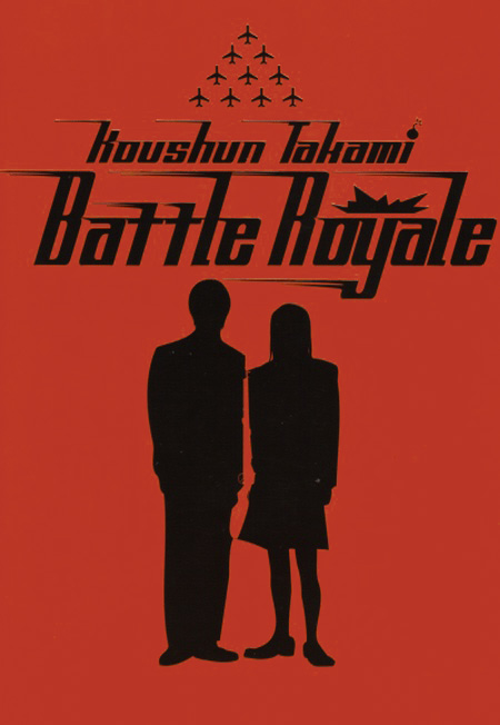
Every once in a while I get my pretentious hackles up about ‘commercial fiction’, and I’m not about to sell out my precious short fiction and literary novels or anything, but let’s face it, commercial fiction IS commercial fiction because sometimes it is just AWESOME.  Commercial fiction, when really good, can just be something that you throw yourself into with complete abandon (and want to tell everyone about while you’re reading it).  Also, while we’re talking about things that are awesome, can we discuss the cover?  Best. Cover. Ever. If this cover would make sense for my novel I’d steal it in a second.  Sadly there are no badass Japanese school kids in my novel.

The premise of Battle Royale, in brief, for the uninitiated, is that once a year a handful of junior high student classes (15 year olds) are chosen for a top secret program in which they are dropped off on an island, with only their own classmates and are each given a knapsack containing some supplies and a random weapon (ranging in lethality from machine guns to a dinner fork) and sent off on a mission to be ‘the last one standing’…literally.

They are to literally kill each other off until there is only one of them left, at which time the “winner” will be sent home with prize money (and probably a one way ticket to the loony bin).

Badass, right?  Totally.

So what are the problems with Battle Royale?  Not much. The first 30 pages are a bit of a challenge as Takami tries to introduce 42 characters by their full names – Shuya Nanahara, Norika Nakagawa, and Shogo Kawada being three of them – so you can see how it’s impossible to remember all 42 – don’t even try, just let the names flow over you – you’ll learn them later.  In fact, cruise through those first 30 pages, because after that you’re not going to want to put the book down.

There are a few wonky areas where the translation is not great, but overall it’s not too bad, just a few sticky spots.  Takami also has a bad habit of kind of force feeding us backstory – I suppose so we can care about his characters – but I found it a little forced and frustrating (though perhaps that this is also a problem in part with the translation?).

Regardless of the sometimes unnecessary backstory, the book buzzes along beautifully and I quite frankly recommend it to every single person that has not yet read it – except my mother, who doesn’t love violence so much – so if you’re like my mother, maybe it’s not for you, otherwise – run don’t walk to your nearest bookstore and buy a copy – if you don’t I’ll stab you with my dinner fork.  Seriously, I got one in my knapsack and I’m trying to work my way up to machine gun…

4.5 Stars

the-eternal-smile

The Eternal Smile.  Derek Kirk Kim and Gene Luen Yang.  Fiction – Graphic Novel/Comics.

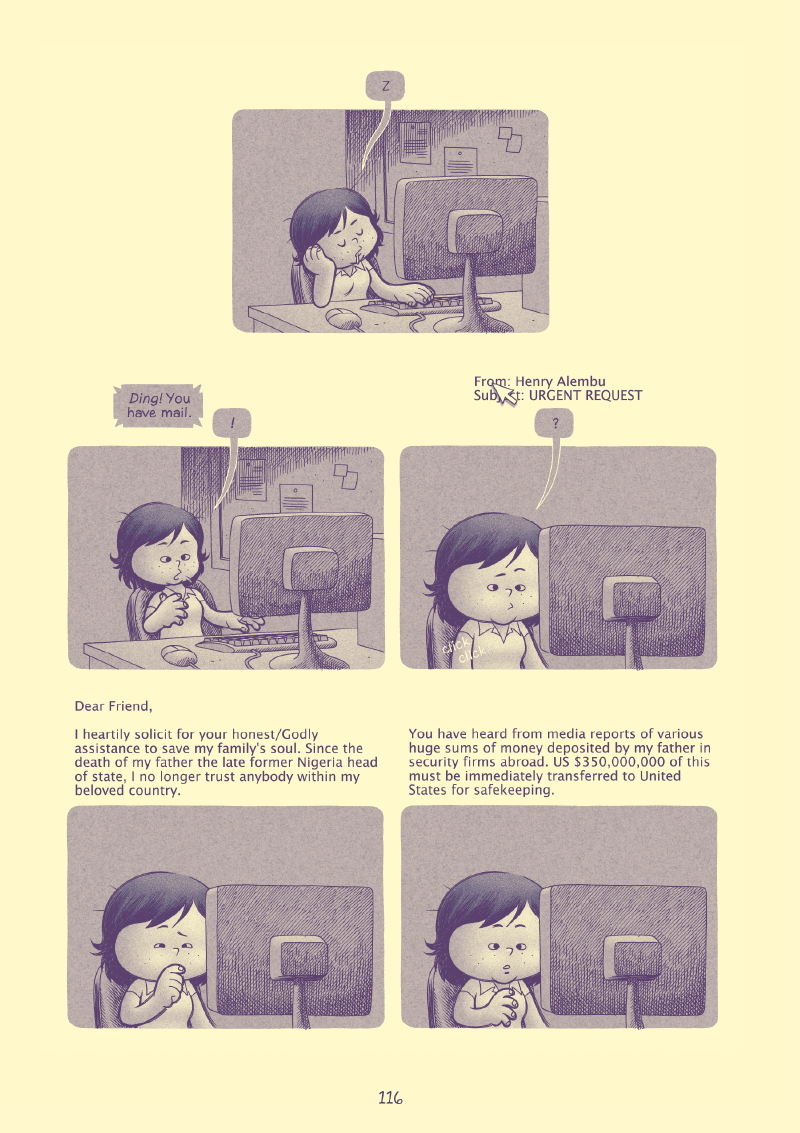
I picked up The Eternal Smile because of Vulture’s excerpt of one of the stories in this collection of three – and I was not disappointed (click on the Vulture link to read a large excerpt).  That story, Urgent Request, is one of my favorite short graphic stories I’ve ever read.  I loved the concept and the execution equally and had I liked all the stories in The Eternal Smile as much, I would have been hard pressed to give this collection anything less than a 5 star rating.

Unfortunately, and largely based I think, on personal preference alone, the other two stories just didn’t speak to me as Urgent Request did.  The art is well executed and lovely in all three stories, though different stylistically, which is a nice treat.  Urgent Request is the style that I personally find the most visually interesting and emotionally engaging, though Duncan’s Kingdom is drawn vividly and is complex in its own right.  The pages are really quite beautiful and I wish more mainstream comics were drawn as well as it is.  Gran’pa Greenbax and The Eternal Smile was the least interesting visually for me, though still, excellent in execution overall.

EternalSmileexcerpt

Excerpt from Urgent Request.

Unfortunately, though there is nothing wrong with Duncan’s Kingdom or Gran’pa Greenbax and The Eternal Smile and each bring nice stuff to the table, neither really did it for me plot/concept wise.  Neither story was as nuanced or poignant as Urgent Request and thus ended up suffering in comparison.  Urgent Request is a story about a shy, mild mannered office worker named Janet and her experiences with an urgent email request for assistance from Africa.  Janet makes unique choices and as such gets unique results and I found the story to be charming and innocent and missing the cynicism of ‘real life’ in all the good ways.  Duncan’s Kingdom is the story of a knight that makes good, but just can’t leave well enough alone, and through his own curiosity unravels the wonderful life he’s set up for himself.  Gran’pa Greenbax and The Eternal Smile is a loose parody of Uncle Scrooge and Ducktales (which I was never really a fan of – perhaps why this story didn’t hit home for me) and touches on interesting themes like money and religion.  The ‘Eternal Smile’ part of the Gran’pa Greenbax story is rather insightful and interesting, but that alone couldn’t save the story as a whole for me. But don’t get me wrongDuncan’s Kingdom and Gran’pa Greenbax and The Eternal Smile are not bad stories – not at all – they just didn’t live up to Urgent Request for me and so I was left feeling that Yang and Kim could have done better.

Even if you feel mixed about the collection, as I did, it’s still more than worth the $16.95 purchase price – beautiful packaging, stunning artwork, and thoughtful stories, and you never know, you may prefer different stories – or love them all.

Overall I give the collection 3.0 Stars, though if I was rating the pieces separately I’d break it down thus:

Urgent Request:  4.5 Stars

Duncan’s Kingdom:  3.5 Stars

Gran’pa Greenbax and The Eternal Smile:  3.0 Stars

« Older entries § Newer entries »