So in honor of the San Diego Comic Con which I am not attending (boo!) I took a little trip down memory lane, searching out all my favorite comic book covers over the years. And since I’ve got this blog and it needs content I thought I’d regale you all with my “100 Favorite Comic Book Covers Of All Time!”
A few things you should know:
1. I limited this list to US saddle stitched issues – so you won’t find any graphic novel, anthology, or non-US covers here.
2. A few of these covers are more about the sweet sweet memories of a more innocent (and awesome) time in my life when a great comic book could make my whole week. When thinking about a comic that was coming out made me so excited I’d get chills. When hunting down a back issue to catch up on something new I was discovering was literally the most important thing going on with me (sad, but true). And so a few of these covers are more about what they mean to me and less about how beautiful they look to the world at large.
3. As X-Men were my introduction to comics there is definitely a disproportionately high number of X-Men covers.
4. There’s also a high number of badass chick covers, as I, am a badass chick. 🙂
Annnnnd, we’re off…
100.
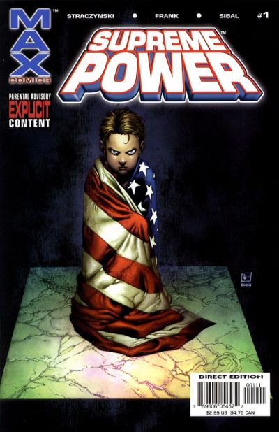
Supreme Power #1. Gary Frank. This is a good looking cover, but it’s at the bottom of the list because to truly appreciate what’s going on, you have to know that Supreme Power is basically about Superman, if he had been found by the government instead of Ma & Pa Kent. And then the government makes up a fake Ma & Pa Kent and raises him in a false environment designed to make him feel devoted to “American values” but it’s all a sham so that they can better hope to control him as a weapon. Yeah, before Supreme Power jumped the rails and became lame, it was AWESOME. Supreme Power was like Superman meets The Truman Show meets The X-Files and it was badass. Too bad they couldn’t maintain it.
099.
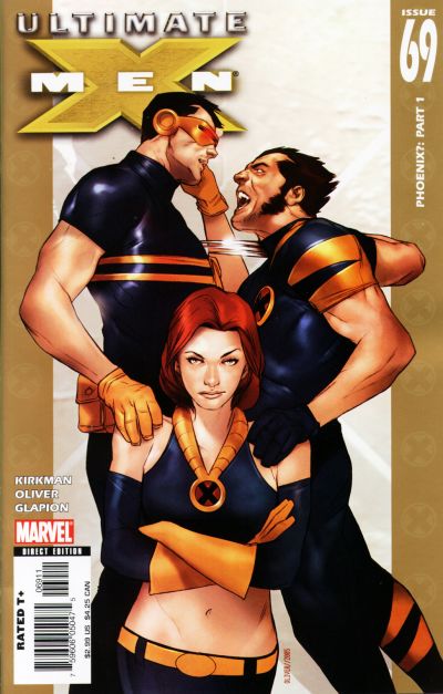
Ultimate X-Men #69. Ben Oliver. Surely many people would argue with me for putting this cover in a best of list, because frankly, there are far better covers out there. However, it’s the subtext that I love here. I’ve never been a big fan of Jean Grey, but she’s got a look on her face here that makes me finally ‘get’ her a little bit. She’s so nonplussed by these two superhero jackasses fighting over her, their hands literally on her and claiming her, meanwhile on a good day (or bad depending on how you look at it) she could sear the flesh off their bones without a thought. It made me think about that love triangle a little differently than I ever had before (which is saying something considering how long the shit has been going on). What each of the players want, and also what is really wrong with them inside on some level to want it. It’s an impressive cover that can do all that with a character’s expression. Also of note is that Jean, though drawn beautifully, is not looking weak and waif-y, but strong shoulder and wide-hipped, and just, well, powerful. Like a superhero should.
098.
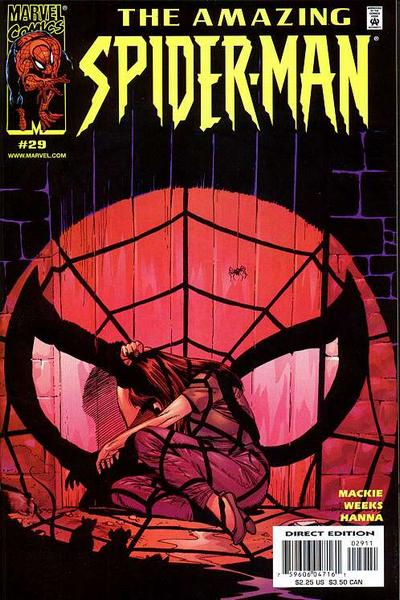
The Amazing Spider-Man #29. John Romita Jr. I think this cover is beautiful. The way the ‘spotlight effect’ falls on the wood and the floor is all really fantastic, and the almost entirely monochromatic look is great as well. Also, while I’ve never been a big fan of Mary Jane myself, this cover speaks volumes about what it might feel like to be the girlfriend (or boyfriend) of a superhero. Cowering and bathed in the oppressive light of their stardom, of the very largeness of their life…it’s interesting.
097.
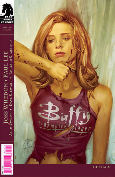
Buffy Season Eight #5. Jo Chen. Jo Chen does amazing cover work, and the beauty of this cover here is both Chen’s ability to make an illustration look so like Sarah Michelle Gellar and to also retain its own voice. This cover is made extra creepy by the aspect of Buffy tearing off her face, which I believe pertained to some ongoing aspect of this arc, but even if it didn’t, the concept would fit well into the Buffyverse. Buffy is always wearing masks and as such the cover really resonates.
096.
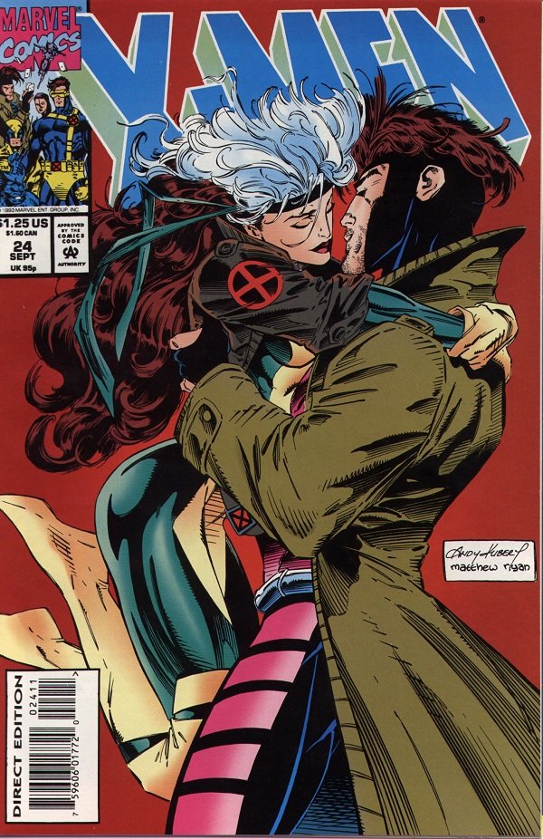
X-Men #24. Andy Kubert. Alright, you caught me. There is really nothing great about this cover. Nothing great except for how it tugs at my 16 year-old heart strings! Sixteen year old Kelly liked nothing better than some Rogue and Gambit action (there’s no accounting for taste I suppose). There are many visual problems with this cover, not the least of which is the absolute eyesore of a giant white artist signature box. However, despite this cover’s obvious flaws, the characters are still well drawn and the moment Kubert captured had fans everywhere on the edge of their romantic seats. Honestly, my 16 year old self is still happy whenever it sees this cover…so long as I can block out everything that writers (and artists) since have done to the characters. I was excited about Chris Claremont’s new run on X-Men Forever, hoping he could rekindle my love for this botched comic book romance, but so far Forever is a big dud. <Sigh>.
095.
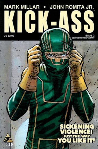
Kick-Ass #2. John Romita Jr. I’m a huge NON-fan of John Romita Jr. Whenever he draws those three lines on a woman’s cheek, I guess to define her cheekbones (?) I just want to gag. Who taught him that trick? I hate it! However, this cover (perhaps because there are no cheekbones present?) is pretty awesome. The colors are great and the drawing is nice. It’s a bit off the beaten path for a superhero cover, and since it’s Kick-Ass that’s no real surprise, but it’s nice to get something simple and unique. It looks straightforward and honest, like the book itself.
094.
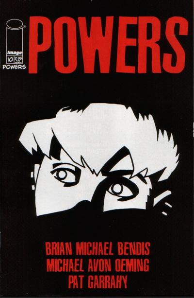
Powers #10. Michael Avon Oeming. I am always intrigued when I see this cover. The fact that Oeming has conveyed so much in a few black and white lines always blows me away. I find the positive and negative space here to be gorgeous, and most importantly I want to know what Deena is seeing…I want to know what the story is…which at the end of the day is what comic covers are all about.
093.
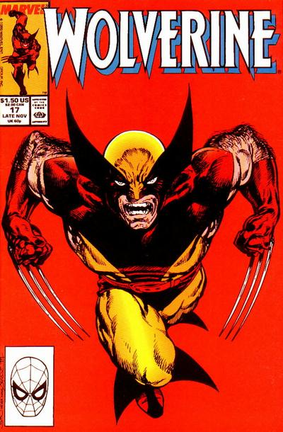
Wolverine #17. John Byrne. Oh, Wolverine, how medium I feel about you. Listen, I used to love you, just like everyone else, I mean you’re a complete badass. And a great complicated character to boot. However, you’re EVERYWHERE. And I defy others not to admit that they too are a little sick of you. You’re the guest star in every issue of everything, you were an Avenger for a while (and that is SO not a fit), you’re the star in the X-Men films (and cartoon) and then you get your own movie (and cartoon). I mean ENOUGH. You have over-saturated the market to the point where I almost hate you! Stop it! I want to love you again…stop making it so hard!
Ahem. Anyway, this is John Byrne, drawing what has become one of the quintessential ‘Wolverine poses’.
092.
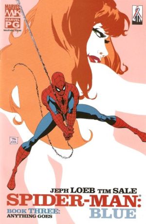
Spider-Man: Blue #3. Tim Sale. It’s a credit to this cover that though I never actually read Loeb’s Spider-Man: Blue, I never forgot this cover…and always wished I owned it. I like the graphic elements that come together here – the nice cartoon-y shape of the Mary Jane figure in the background – the all white positive/negative of her body, combined with the definition and expression in her face – and that awesome hair – very cool. It skirts the line, with the posing and juxtaposition of figures as seeming a little sexual, but it doesn’t quite go over the line (at least not intentionally).
091.
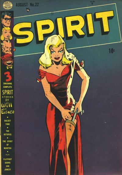
The Spirit #22. Will Eisner. Ah, the birth of the femme fatale. I guess I don’t know who REALLY invented femme fatales, but it’s safe to say that no one did them better in comics than Will Eisner. That man loves him some femme fatales. That said, I’m not a big fan. In general, it’s a pigeon-hole that female characters get trapped in. The trap that says you are insignificant unless you are beautiful and sexy. But, this is our history, and as such, to move beyond it, I guess we’ve got to embrace where we started. Though the stereotypes are in full effect here (blonde bombshell? check. clingy red dress? check. thigh high stockings? check. knife in those stockings? check!) I can still appreciate the beauty of the drawing, and the powerful simplicity of just a beautiful woman on the cover of a comic book…she owns that comic book cover if nothing else.
090.
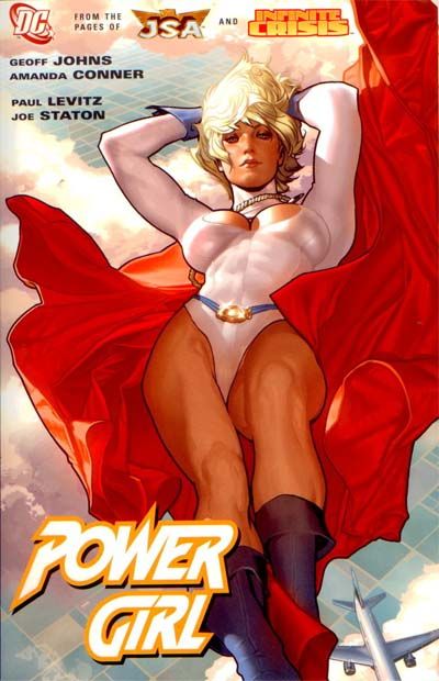
Power Girl. Adam Hughes. Hmmm. The feminist in me wants to hate this, but the artist in me is all, “But it’s SOOO damn beautiful!” I do like that though Power Girl’s breasts are on display (as always) because of her positioning, they’re not the focus, which is rare. Also, you can’t really fault an artist for drawing PG this way, because, well, sadly, that’s part of her “character”. So as much as I take umbrage with it as a “character design” the fault doesn’t live with the individual artists. It’s also great that Power Girl still looks, well, powerful. Her legs, arms, torso, etc., are not that of a supermodel (or porn star) as many women in comics are drawn, but are that of a supherhero. As it should be. So points for being just gorgeous and for giving me ways to rationalize including it despite my reservations. 🙂
089.
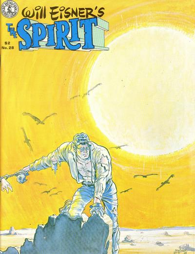
The Spirit #28. Will Eisner. My favorite thing about this cover is the way the title is pushed to the side and made less important than the art on the cover. Also, the way it has been pushed to the side is graphically interesting, and looks almost like the sun is beaming it outwards towards the reader. I tend to love books that play with titles. It’s really a great early representation of typography as art and this cover does it well. The second great thing about this cover, is that our hero is handcuffed to someone off panel, and I’m kind of dying to know what the story is. Again, the whole point of comics covers – get you to buy! Those two factors, combined with the great rendering and colors is enough to earn this cover a spot on the list.
088.
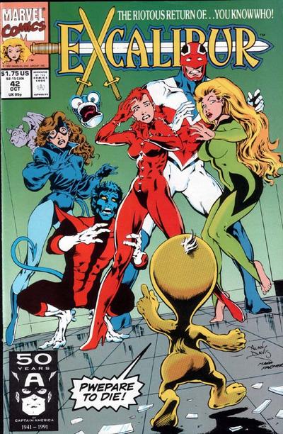
Excalibur #42. Alan Davis. Alan Davis is a fantastic illustrator and so this cover is just beautiful before we even start breaking it down, but the best thing about it is the sense of humor. Alan Davis’ work on Excalibur always had a great sense of humor – never afraid to poke fun at itself while being gorgeous.
087.
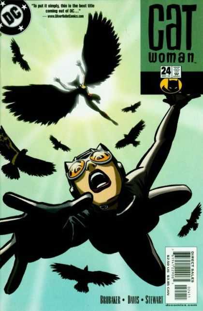
Catwoman #24. Cameron Stewart. I love this Catwoman cover. It totally draws the reader in and the cartooning/expression is fabulous. The juxtaposition is also great – a cat falling from a sky – surrounded by birds? Fantastic.
086.
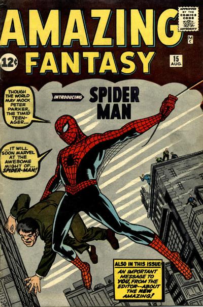
Amazing Fantasy #15. Jack Kirby. This cover is of course notable for being the first appearance of Spider-Man, but it’s also a benchmark iconic portrayal of Spidey that we will see re-invented hundreds of times over the years.
085.
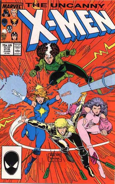
Uncanny X-Men #218. Art Adams. This is probably (certainly?) not the greatest example of Art Adams cover work, but for me it’s the most personally important. I discovered comics pretty late in the game, and so much of my teens was spent hunting down back issues – of which there sometimes seemed to be a limitless supply – and one of my favorite periods in time was around this issue. With Adams gorgeous covers, and stories often featuring my girl Rogue, this was one of my favorite comic books growing up, despite the fact that I never liked Dazzler and could never figure out (then or now) WTF is up with Psylocke’s pink/purple ruffled superhero costume. Seriously? WTF? But Rogue…she was never better than now. Good times.
084.
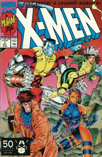
X-Men #1 (All New Relaunch). Jim Lee. Love it or hate it, you know why it’s here. It was a “mutant milestone” for christssake. It was also my introduction to “variant covers”. True story, my brother and I bought this issue very early in our comics experiment (I think it was my first time in a comic book store). My brother Scott bought a copy of X-Men #1 with Cyclops on the cover, and I got the one above (because it had Rogue on it – ‘natch). We both flipped through and started reading in the store, but then put the books away until we got to the car. In the car I hit him in the shoulder when I saw he was reading my book – I’m sure something eloquent followed – like – “That’s my book you’re reading you jerk!”, to which Scott (sensibly) replied…“but this was the story I was reading.” And I took out his Cyclops covered X-Men #1 and we realized the stories were the same. Hence our intro to variant covers. What rookies.
083.
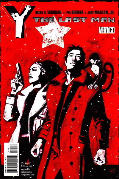
Y The Last Man #55. Massimo Carnevale. LOVE. IT. Love the use of only three colors. The stark whites and dark blacks. The composition is good and the texture is fantastic. So often on comic covers texture is ignored, so it’s great to see it utilized here. Also, there’s a monkey.
082.
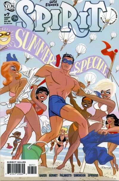
The Spirit #7. Darwyn Cooke. I know you probably think the feminist in me should hate this, but I really don’t. I can’t muster up one bit of hate for this because, well, look how damn fun it is? It’s all light and fluffy and it just looks so pretty and shiny (I should confess I am easily distracted by pretty shiny things – like this Darwyn Cooke cover…like Scarlett Johansson in that train wreck of a movie The Island…the list goes on and on). That said, beyond being pretty, the women also have the upper hand here, which is empowering in and of itself and our hero is equally as naked as the ladies, so it seems fairly even handed. Also, look at all the women parachuting down from the sky…and the translucent title block…? Like I said…very very pretty and shiny. Me likes.
081.
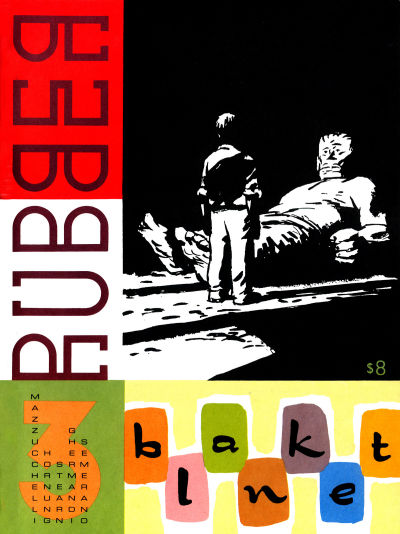
Rubber Blanket #3. David Mazzucchelli. I’m going to ask you one question in my defense of this cover. Are you or are you not dying to know what the story is inside? I know I am. What could this story be? I must know…I must have. In case that’s not enough – the use of text as design elements is also fantastic.
080.
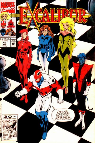
Excalibur #47, Alan Davis. Again, we’re talking beautiful art here, but with that excalibur-y sense of humor. I can’t get enough of this stuff.
079.
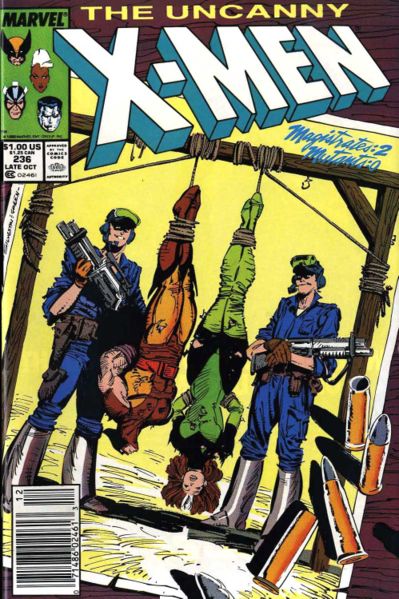
Uncanny X-Men #236. Marc Silvestri. This would be another cover that I love for personal reasons, although it’s a pretty great concept, pulled off well by Marc Silvestri. I always loved Silvestri’s punky black and green uniformed Rogue the most. Also, how great is it that when trussed up and hanging upside down it’s even more obvious how short Wolvie is? There’s a lot of love/hate with the Genosha storyline, but I happened to love it. I was (am) always a fan of the X stories that deal with human/mutant prejudice and fear as opposed to some huge villain, so I guess that leaves me firmly in the ‘yay Genosha stories’ camp. Which sounds bad if you know about Genosha.
078.
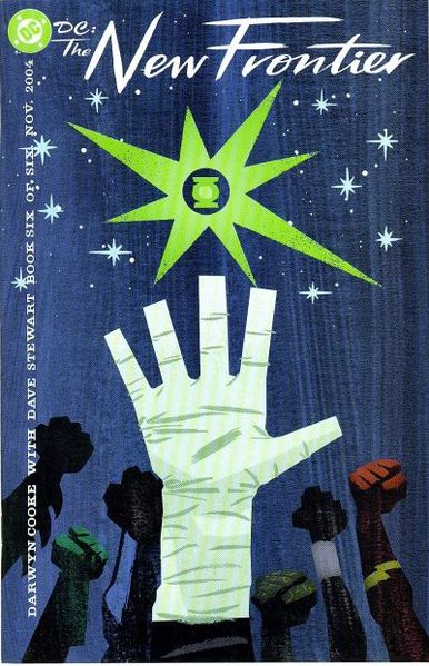
DC: The New Frontier #6. Darwyn Cooke. Seriously? I love the hell out of this cover. It’s so iconic. I love that you can tell who all the characters are just from their hands – if that’s not effective branding I don’t know what is. It’s incredibly powerful as just a straight graphic image, but my favorite aspects are the textures and the retro look of the stars and text. So great. In fact, I need to stop looking at it or I’m going to have to re-jigger this entire line up.
077.
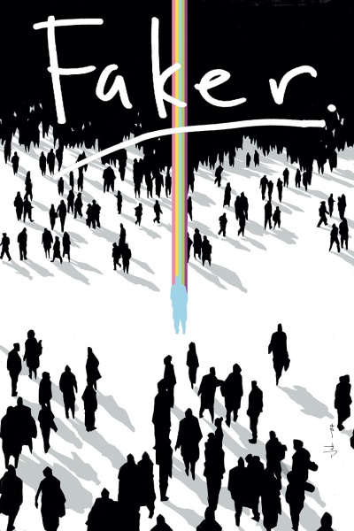
Faker #4. Jock. Much to my shame I never read the Faker mini-series. And this cover makes me feel super shameful about it – because it is just made of awesome. Jock is great at creating these fantastic iconic powerful silhouettes (you’ll see more of him as the list counts down). I don’t really know what is going on here, but I’m dying to.
076.
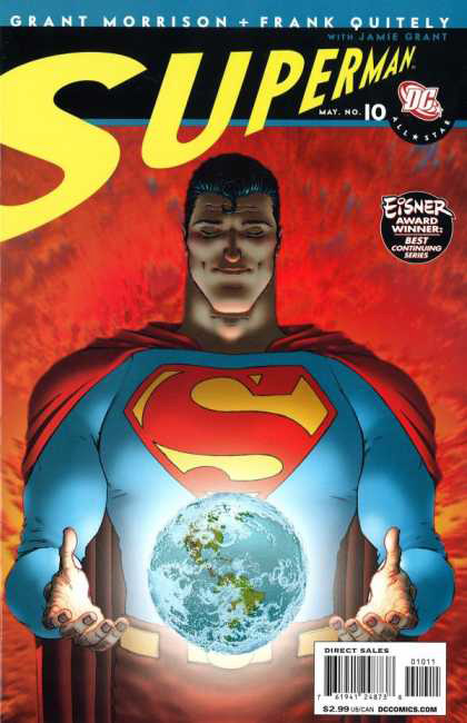
All Star Superman #10. Frank Quitely. I find people are of two minds about Frank Quitely’s artwork – love it or hate it. I’m firmly in the love it camp. It took a while to get used to (his faces have a pinched look that bothered me at first) but the amazing positives of Quitely’s work far outweigh any negatives I might find. And in the case of this cover – I mean just look at it – from concept (Superman holding the world in his hands!?) to execution – it’s just perfection. Well done sir, well done.
Make sure to tune in tomorrow – for #51 – #75 – and we’ll be doing 25 a day until we get to #1.
-
Aw man, this made me very happy. I, too, am unable to be at Comic Con.
Damn, the Jeph Loeb Spiderman cover REALLY strikes me, simply because Mary Jane looks like she belongs in a piece by Bob Peak.
Maybe I’m crazy, but have a look:
http://www.impawards.com/1967/posters/camelot.jpg
http://farm3.static.flickr.com/2088/2422348799_3554174538_b.jpgHe’s very big on using positive/negative space and I dunno why, but that cover just screams it.
I’m SO looking forward to the next group of covers!
-
I wondered where X-men 24 was gonna show up on this list. A little disappointed it shows up so low actually. It should read to the hopeless romantic in all of us.
Anyway, the Faker cover really makes me want to know what that is all about.
Also, as a significant part of the brother/X-Men #1 story, I can assure all readers that it happened. Ah how I remember that GMC suburban….and how angry we were when we realized that we paid an extra 1.50 for a book we already had.
Great times…
-
Scott: You know, at one point I had X-Men 24 really high – like top 25, solely based on my happy memories of it (not that it’s badly drawn) but the more covers I examined (thousands over the last few weeks) the less I was able to justify such a high ranking. It’s pretty and the figures are well drawn, but the solid red background is not a good color choice and that terrible white artist signature box – bah. Without the memories attached to it I couldn’t even justify keeping it in the top 100, but memory won out and so it still earned a place.
Re: Faker – I know, right? That Faker cover has me thinking all the time about that book – I think I’m going to have to search it out. All the Faker covers were good – and I almost included another one, but it got dropped at the last minute.
Thanks for verifying my X-Men #1 story 🙂 Although, I remember being angrier that I didn’t have as many stories to read as I thought, than being angry about the $1.50…but that makes sense considering how much better you are with money than me 🙂
-
I notice this error on the net quite frequently, but it’s not FRANK QUIETLY, it’s FRANK QUITELY (as in Quite Frankly). For the longest time, I also said and typed Frank Quietly, but I’m sure the man would really like people to start getting his name right.
Check the cover of All-Star Superman.
(If this came off sounding rude, I apologize for that was not my intent. Until it was pointed out to me, I was misspelling his name as well. Thought you’d like to know and perhaps help spread the correct spelling of his name!)
-
Oh yeah, and Faker: not as great as the covers make it out to seem. The art was wonderful, certainly, especially the covers. But I found the story to be…..quite odd, and at times downright nonsensical. Still, I don’t regret buying it. So clearly I have mixed feelings about the series.
-
Omar: Wow. I can’t believe I’ve never noticed that before. I guess it’s like that thing where as long as the words are there – even if they’re scrambled – you can still read the word because your brain just rearranges the letters. I’ve been looking at Quitely’s name for years and have never realized I’ve mentally had the spelling wrong. So weird. Thanks for the correction.
Bummer to hear that Faker isn’t all the cover makes it out to be. That happens a lot though I guess.
-
That Superman cover is so great. Every time I look at it I can hear Steve Buscemi and that cute little girl singing “He’s Got the Whole World in His Hands” from Con Air. Superman is Jesus.
-
Love the rundown so far, but I’m not so sure about #99, the Ultimate Xmen 69 cover, because frankly, it’s always looked to me like Cyclops is talking on a cell phone or listening to a Secret Service headset when he goes to push his visor button–so here Wolvie’s in his face, frothy, claws a’waving and Cyke’s like, “Hang, hang on a sec…What?”
-
🙂
-
Pingback from Top Five Iconic Covers « 1979 Semi-Finalist… on October 1, 2009 at 7:01 pm
-
Gabe M. Yeah, I have very few Superman covers in the running as he’s never really been my favorite character (I lean more towards Batman) but Superman is just SO iconic, that you can create some really powerful images using him – this one – with the whole world in his hands – is totally one of those images.
Joe Brown: I’m glad you’re enjoying it. I see what you mean about the Cyclops thing – very funny. I think I don’t even notice it because I’m so drawn to Jean on the cover (which never happens as I’m not her biggest fan). But you’re totally right. 🙂
-
That’s crazy about your story regarding the X-Men #1 relaunch covers, only because, word for word, it was the exact same story with my brother and I around that time, lol. He loved Cyclops and I adored (still do!) Rogue. Too funny, great list by the way!
X-Men #24’s cover used to make me swoon as well as a teenager, and I still get a little flustered when I see that comic, and also a little sad, considering the amazing chemistry between these two is so long gone now due to poor treatment. It’s a shame.
-
White Noise: That is so funny. I guess it really is a small world.
My X-Men #24 love is totally bittersweet because you’re right, back then, that relationship was so fascinating to watch. I was on the edge of my seat constantly to see if we would get a couple panels in an issue devoted to Rogue and Gambit’s developing relationship…and over time the handling of Rogue (and her relationship with Gambit) was one of the things that eventually drove me away from comics. I always come back, but never like I was before – all devoted and having a monthly pull list and everything 🙂
-
Love the snow effect on your site. I however, only saw one of them, and proceeded to follow it down the entire site trying to click on it, to no avail.
-
Hey, I really enjoyed this series of posts on your site. I kinda copied you, and did my own version of the best 100 covers. If you want to take a look, its at http://minorhenchman.wordpress.com/2010/01/31/the-100-best-comic-book-covers-pt-1/ The blog name is minor henchman and my name is matt jeske. Thanks for inspiring the post though, I thought your list was great, and it was really fun making my own.
-
Phil: wish I could take credit for the snow (and that I could keep it longer than a month) but alas it is just an optional feature of wordpress every year in december.
matthewjeske: I’m glad you enjoyed my list – I checked yours out and it looks like a great start – congratulations. May you be blessed with the insane hit numbers I was blessed with when I did mine! Course you’ll get some haters too, but that always comes with the price of “fame”.
-
thanks!
-
Hey, I just finished my series on the 100 best comic covers. check it out again, if you want. http://minorhenchman.wordpress.com/2010/03/03/the-100-best-comic-book-covers-pt-4/
-
Concerning your #98 pick…Lee Weeks art for cover & interior_ Not J. Romita.
-
Von Weeks: I’d be happy to consider changing it if you could link me to some backup. I originally had it as Weeks, and then found on GCD (and one other place) that the cover was listed as John Romita Jr., with Weeks on interiors.
But as I said, if you can link to something that says otherwise definitively, I’d appreciate it, as I obviously want accuracy.
-
@Karthickkmardotcom: Hmm. Cute is tough because everyone’s definition of cute seems to differ based on personal tastes.
I recently read Muppet Show #6 and thought it, especially the cover, was adorable. I also recently read Thor & The Warriors Four and it was cute from cover all the way through to the end…adorable really.
http://www.boom-studios.net/the-muppet-show-comic-book-ongoing-06-cover-a.html
http://marvel.wikia.com/Comics:Thor_and_the_Warriors_Four_Vol_1_3
I’m also always personally a sucker for x-babies (especially x-baby wolvie and cyclops):
http://cache.gawker.com/assets/images/io9/2009/06/x-babies.jpg
http://chud.com/articles/content_images/5/xbabies.jpg
http://www.fanboy.com/wp-content/uploads/2009/12/X-Babies-3-Cover.jpg
http://i.newsarama.com/preview_images/marvelnew/oct09/118_x_babies_1.jpg
http://marvelsuperstars.files.wordpress.com/2009/10/x-babies.jpg
In general both Skottie Young and Ross Campbell tend to do some super adorable characters…
Skottie Young:
http://dirkmancuso.files.wordpress.com/2009/09/skottieyoung-wizard-of-oz-2-400×507.jpghttp://www.comicsbulletin.com/title/images/100125/Cover.jpg
http://blog.newsarama.com/gallery/albums/userpics/10087/spidermandeadpool.jpg
http://www.fanboy.com/wp-content/uploads/2009/05/skottie-05.jpg
Ross Campbell:
http://mooncalfe.livejournal.com/105374.htmlhttp://www.shadoweyes.net/characterbios/sparkle-park/
Hope that helps you out.
-
Pingback from Third Anniversary For 1979 Semi-Finalist « on July 17, 2010 at 9:23 pm
-
Pingback from The 15 Covers I Wish I’d Included… « on July 20, 2010 at 5:37 pm
-
Pingback from 52 Favorite Comic Covers Of The Year « on July 24, 2010 at 6:36 pm
Comments are now closed.



34 comments