A year ago I posted a list of 100 of my favorite Comic Book Covers. But as with any list…as soon as you hit publish you can’t help but think what you’ve missed. I’ve been thinking a lot about what I missed and regret not including that first time around, so I decided, in honor of San Diego Comic Con 2010 and the three year anniversary of this blog, to give you the “15 Covers I Wish I’d Included”.
Now, some of my second guessing came immediately after locking the list (where was Skottie Young?) others came up later and some even from discussions others were having about my list (to say some discussions were more civil than others would be a massive understatement).
The biggest legitimate complaint I heard about the list beyond certain creators being missing was that there wasn’t enough diversity – and I agree. I don’t know if these covers will remedy that, but I think at the end of the day I’ll feel better about the list as a whole once it’s been modified.
The most interesting thing that happened while I was revising my list was the order. I was never that convinced that even if I had the right covers that I had them in the right order, and doing these new 15 really proved that out – because when I looked through the covers I didn’t feel confident just lopping off the last 15, instead I went through and picked out all the ones I was reconsidering, and replaced them.
In keeping with the rules of the original list, I limited this list to US saddle stitched issues – so you won’t find any graphic novel, anthology, or non-US covers here. And since comics from July 2009 to July 2010 weren’t eligible for the first attempt, I didn’t let them in this time either (but I do have a fun post for those ineligible covers coming up soon). As was true of the original list, the revised list continues to skew hard toward X-Men, badass chicks, some nostalgia and iconic imagery. What can I say? We all like what we like. 
You can find the original 100 here, here, here, and here.
#015.
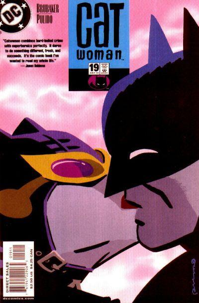
Catwoman 19. Javier Pulido. This Pulido cover looks like Cooke to me…but it’s not (see the update below) Regardless, what sells it for me, and why I think it belongs has more to do with this being a moment I have YEARNED for in comics, and that Pulido managed to turn it into a really iconic lasting image. The image of Batman and Catwoman, still masked, kissing on a cover is an image that will stay with me forever thanks to the iconic choices made here.
Update: I originally wrongly attributed this cover to Cooke…and honestly, if I tried 1,000 more times I’d still think it was Cooke’s work…but regardless it’s not and apologies to both Cooke and Pulido as well as to commenter Stuart that pointed out the error.
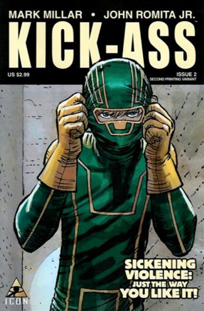
The cover it’s replacing? #95 – Kick-Ass #1 by John Romita Jr.
This was honestly the easiest cover to remove from list as I was never entirely convinced that it belonged there in the first place and I’m not personally a huge fan of John Romita Jr.’s style. It’s a solid cover, but does it belong on a 100 Favorites List? Not mine.
#014.
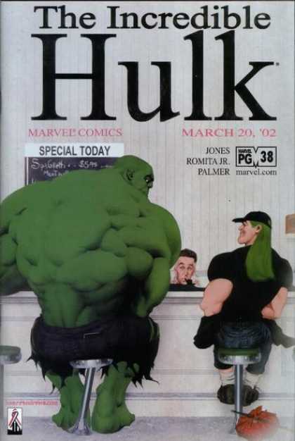
The Hulk #38. Kaare Andrews. I don’t read The Hulk, never have and I suppose it’s unlikely I ever will, yet this image totally calls to me. It’s got this great Norman Rockwell vibe, but with a massive Hulk plunked in the middle of it. It’s compelling and humorous and beautifully illustrated, but mostly it makes you wonder what’s inside, even me.
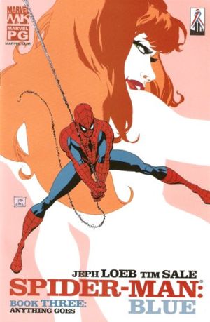
The cover it’s replacing? #92 – Spider-Man: Blue by Tim Sale.
I still love the graphic elements of the Tim Sale cover, but when I look at it it doesn’t really tell me anything or move me to feel anything. Which is okay, not every cover has to do that, but I think the Hulk cover DOES do that…and it does it powerfully, making it easy to switch them up.
#013.
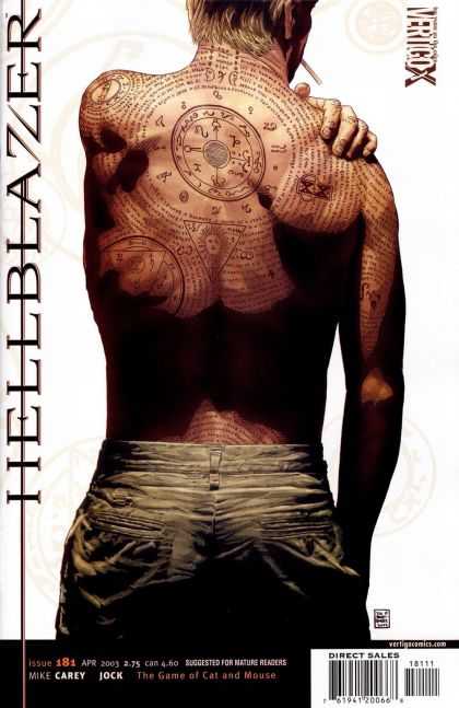
Hellblazer #181. Tim Bradstreet. I’m not as big a Tim Bradstreet fan as everyone else seems to be. I think his covers are generally pretty amazing and he’s obviously an artist of the highest order, but they’re usually just a little too real for me..it’s just not “my thing” I guess. However, this one stands out as a total win to me. It’s so effective in both its accurate anatomy and the precision with which the tattoos cover the skin. Pretty compelling work and visually very appealing.
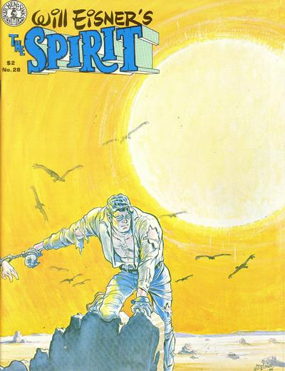
The cover it’s replacing? #91 – The Spirit 22 by Will Eisner.
I still love this for all the reasons I listed before, but I’m just not sure it can compete with super realistic style of Bradstreet’s Hellblazer.
#012.
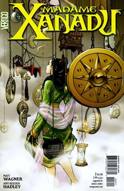
Madame Xanadu #3. Amy Reeder. Beautifully illustrated, excellent positive and negative space as well as use of white space. If I had to pick one thing about this cover that doesn’t quite work for me it’s the fact that one of the clocks hanging down is basically a cheap digital stop watch – and it doesn’t bother me that it’s there, I like the combination of all sorts of timing devices from sundials to hourglasses to cheap stop watches, but I don’t love the placement of it. Otherwise though, a completely compelling cover that makes me want to see what’s happening inside.
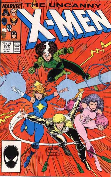
The cover it’s replacing? #85 – Uncanny X-Men #214 by Art Adams.
I still love this cover, and pretty much everything Art Adams draws, and this issue holds a special tug on my childhood (okay, teen) memories of falling in love with the X-Men, but on its merits I have to say the “non-background background” is a pet peeve of mine. This would have be stronger with just a bold white background I think. And so, despite my love of Adams (and ROGUE!) I’m removing it in lieu of the Madame Xanadu cover.
#011.
Kabuki #5 (2004 Series). David Mack. David Mack has A LOT of beautiful covers floating around out there, and a lot of them are Kabuki covers and I’m sure many people would pick a different cover if picking out a favorite Mack cover but this one just speaks to me, I’m not sure why. Mack is known for doing a lot of really beautiful layering, which I like, but the crisp cleanliness of this one appeals to me. I think the illustration of the woman inside the shape is phenomenal, and the choice of the shape is telling, and where the image breaks and doesn’t break the panels is visually very striking. Plus I’m just a huge fan of watercolor in comics…it really allows you to FEEL that color and texture so much better than digital painting or other more common comic book techniques. Yeah, I love this.
The cover it’s replacing? #73 – Buffy The Vampire Slayer #18 by Jo Chen.
It’s still a hella beautiful illustration, but the more I looked at it the more I felt it didn’t have the necessary iconic imagery that would keep me coming back, or the nostalgia factor necessary to pull on my heart strings to keep it in.
#010.
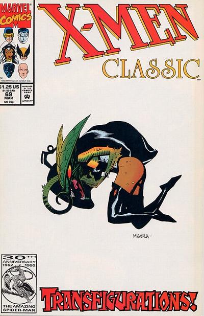
Classic X-Men #69. Mike Mignola. I know this is a weird pick for a Mignola cover considering how much great illustration work he has out there, but I love this. A lot of white space and lone figure is a look I tend to like, so it has that going for it. It’s also one of a surprising few covers that do Storm any justice. I mean, I know she has a Brood’s head, but it’s still completely recognizable as Storm…and it’s horrifying. Storm fighting the brood transformation is all captured so simply here on a white canvas. I love it.
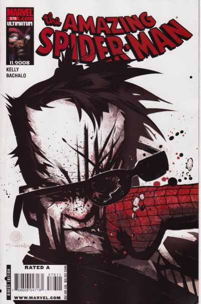
The cover it’s replacing? #71 – The Amazing Spider-Man #576 by Chris Bachalo
A totally kinetic cover that I love. But I’ve got more Bachalo on this list than I think is fair and balanced. I still love the hell out of this, and it’s only fitting that it’s being replaced by a Mignola cover that also embraces white space and great composition, but does it in an incredibly quiet way while this is loud and in your face (literally).
#009.
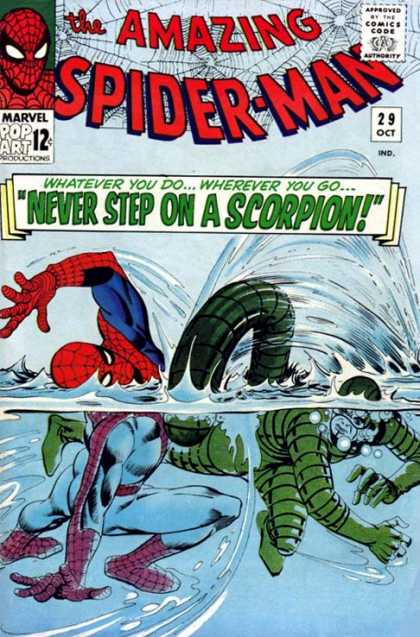
Amazing Spider-Man #29. Steve Ditko. I love the action in this cover, and maybe it’s just my thing for water (I totally have a thing for water) but I love that we’re getting a kind of totally unbelievable half under, half out of water shot. It’s really great. Unlike a lot of action covers I see today, this motion at least is believable. Great colors, great movement, great old school fun.
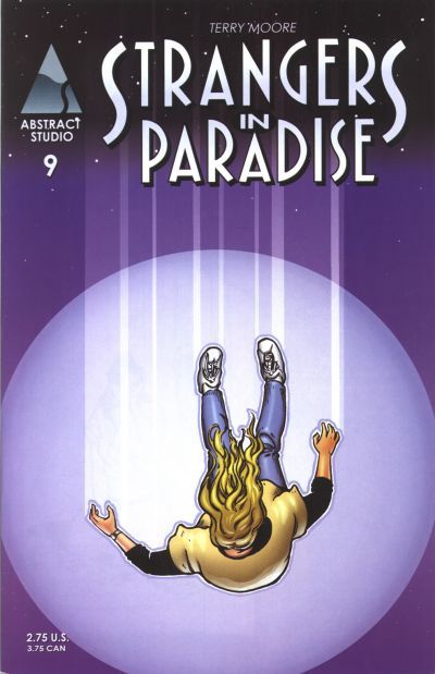
The cover it’s replacing? #66 – Strangers In Paradise #9 by Terry Moore.
I love Terry Moore’s art, but his covers never really wow me for some reason. This is one of my favorites, but it just can’t compete with the under water action awesomeness of Ditko’s Spider-Man v Scorpion.
#008.
100 Bullets #92. Dave Johnson. The question with 100 Bullets covers isn’t if they’ll be on the list, it’s which ones, or how many. There are so many really striking 100 Bullets covers – the best of graphic design and comics merging perfectly. This is one of my favorites. Sometimes with a more graphic cover you end up losing some of the storytelling, but not so here. This is striking and graphic while still telling an incredibly intense story. Great stuff.
The cover it’s replacing? #58 – The Amazing Spider-Man #556 by Chris Bachalo
Even if you have a hard on for white space on covers and lone figures like I do, I still don’t think this can compete with Johnson’s clever graphics that suggest a whole crazy story just from one cover image. Don’t worry though, there’s still an excellent Bachalo on the list at number 25.
#007.
Wolverine: First Class #18. Skottie Young. Funny goes a really long way with me on a cover. Maybe because we just don’t have a lot of examples of it being done well, maybe because it’s just not common for superhero comics to skew funny (as much as they should), but man do I love it when they do. And nobody does it better over the last five years or so than Skottie Young. This cover is smart, funny, and best of all, it’s ALSO gorgeous. The drawing is exceptional, the color choices are perfect, the negative space created by the wall of Maddrox and their text bubbles is strong, and the composition in general just works…all of that adds up to a fantastic looking cover. It was hard picking just one great Skottie Young cover, but this one consistently rises to the top for me, maybe just because I love when Wolverine is funny and I’ve loved Maddrox since my old X-Factor days in the 90’s.
The cover it’s replacing? #57 – Fables #51 by James Jean
James Jean remains one of my all time favorite cover artists (and even when removing this one he’s got more covers than any other single artist on the list – including my #1 pick) but I think Young’s funny Wolvie cover manages to outshine this beautiful one by Jean.
#006.
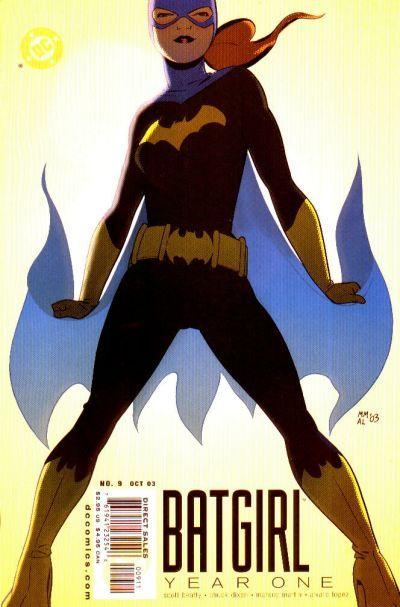
Batgirl Year One #9. Marcos Martin. This is iconic as hell. I love it everything about it.
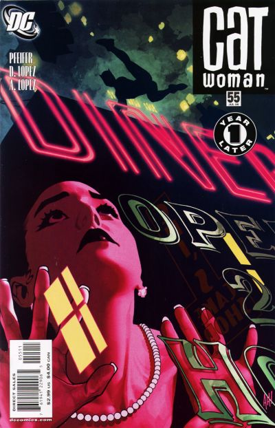
The cover it’s replacing? #50 – Catwoman #55 by Adam Hughes
It’s funny that these two matched up like this, because the reason I pulled Hughes cover from the list was that even though it’s a stunning illustration (and it may well fit the story inside perfectly) as a cover on its own the iconic aspect of it was a bit lost in the beauty of everything else going on. Selina is not the star, which is completely fine, and as I said, and may be appropriate considering the content, but it doesn’t stand out to me as powerfully because of that. While the Marcos Martin Batgirl cover above is nothing if not iconic.
#005.
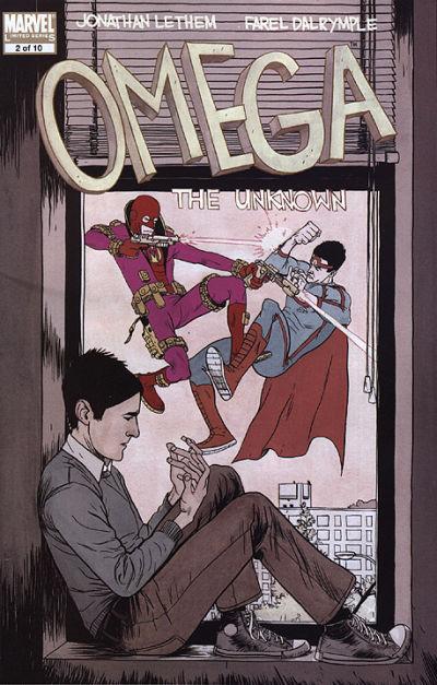
Omega The Unknown #2. Farel Dalrymple. Everything about this is good. The illustration is fantastic, but more importantly the staging of the boy in the foreground pondering his hands, while superheroes and villains battle outside his window? It says so much, without a word. Fantastic concept, perfect execution.
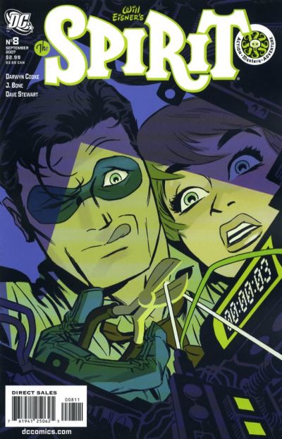
The cover it’s replacing? #42 – The Spirit #8 by Darwyn Cooke
Gods, it’s hard to take out a Cooke cover. Looking at it now I’m nearly hypnotized into not removing it. But in the end I think that the Omega cover is more interesting, and more important. Cooke’s using a great creative spin to make his mark with his cover (and I love the nearly monochromatic palette) but Omega is the stronger more lasting and important concept.
#004.
Demo Volume 1 #8. Becky Cloonan. Cloonan at her best. The colors on this are phenomenal, evoking both mood and story in that the character looks cold and maybe dead, and there’s a pool of blood under her head. Additionally that shock of red blood is made all the more impactful for the almost monochromatic blue of the rest of the piece. This tells the story so well you almost don’t need the actual story (though you totally should read it because it’s excellent). Particularly effective here I think are the character’s eyes. Half lidded and a combination of dreamy and lifeless. Excellent excellent stuff.
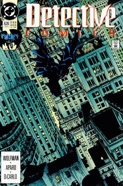
The cover it’s replacing? #38 – Detective Comics #626 by Michael Golden
I still love this, especially the placement of Batman really high in the frame, but it just can’t compete with Cloonan’s moody evocative piece.
#003.
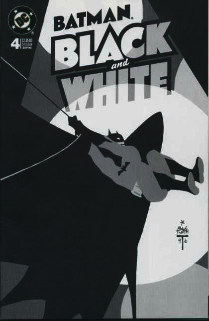
Batman: Black & White #4. Alex Toth. Talk about iconic. Look what can be done with just Black, white, and grey. Amazing. The posing is so great, perfectly chosen as that powerful coiled moment before release. Combining the iconic shapes of Batman’s cape and figure with the iconic shapes of a spotlight which evokes any number of images including the batsignal, hollywood, the circus, etc. All things tied to Batman in their own way.
The cover it’s replacing? #35 – Strangers In Paradise #81 by Terry Moore.
This is my favorite of Moore’s covers, mostly because it’s so unusual and as such I hate to lose it from the list, but I just can’t honestly say it competes with the iconic imagery of Toth’s Batman.
#002.
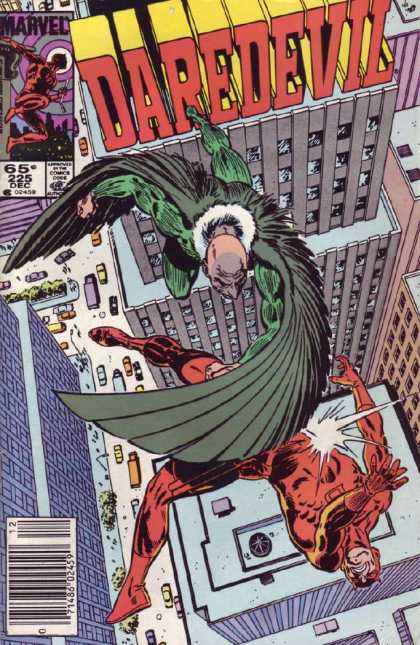
Daredevil #225. David Mazzucchelli. Man I love the crap out of this. I don’t read a lot of Daredevil so I missed this one the first time around, but now that I’ve found it I can’t get over how off the hook it is. The incredible nearly vertigo inducing birds eye view of the city; the title worked into the buildings and forced perspective; the action of the two characters fighting in mid-air (and one of them that can’t fucking fly!)…truly amazing stuff.
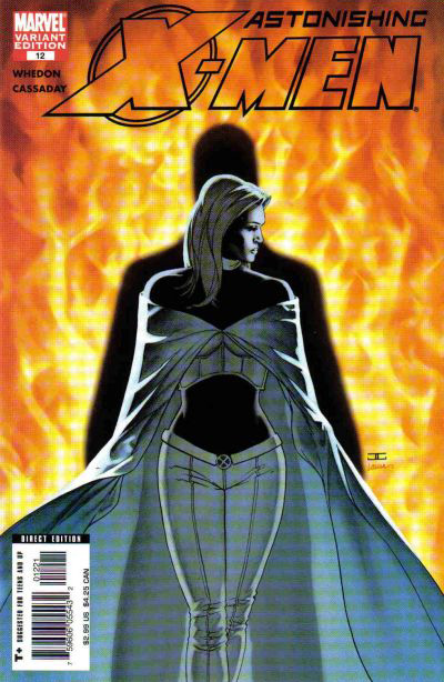
The cover it’s replacing? #34 – Astonishing X-Men #12 by John Cassaday
I mean, it’s John Cassaday so it goes without saying that it’s still completely badass, and it’s definitely well considered and beautifully illustrated, but pound for pound it’s just not as impressive to me as Mazzucchelli’s high flying Daredevil.
#001.
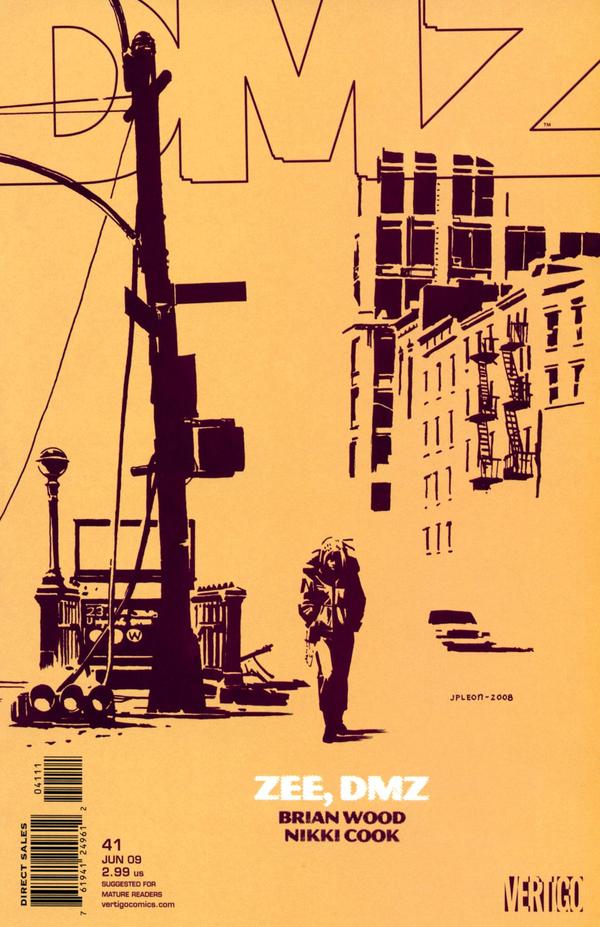
DMZ #41. John Paul Leon. Man, talk about less is more. This cover blows me away. The fact that with two simple colors Leon has created such a graphic and powerful image…it’s amazing. Everything is good here from the choice of colors to the scene that is set to the matching open title graphic. Brilliant.
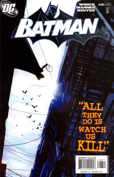
The cover it’s replacing? #16 – Batman #648 by Jock.
I still love this iconic Batman rooftop jumping imagery by Jock…it’s mostly getting bumped for that horrible “all they do is watch us kill” text that really throws the whole thing off, as well as the terrible Batman title/logo image (which I’ve never liked on any cover it’s on). Sorry Jock, it’s not really your fault though…and you make plenty of nice appearances elsewhere on the list.
Speaking of multiple appearances. With the updated list, James Jean has the most appearances with 7 covers including my number one pick. Surprisingly (to me) Frank Quitely ties with both Darwyn Cooke and John Byrne for second place with 4 each; while Jock, Adam Hughes, Jamie Hernandez, Jack Kirby and Alex Ross share a three-way tie for third place with 3 covers each.
Thanks for reading everyone, hope you enjoyed it. It took freaking forever. 
Tags: 100 Favorite Comic Covers, 100 Great Comic Covers, San Deigo Comic Con, SDCC
-
Nice to see the reivaluation. I still am compelled decades later by the Adams cover, and the spirit Cooke cover is perhaps his best…I am having a tough time with these choices. But I had never seen Martin’s Bat Girl and that maybe my favorite of the bunch. The Ditko cover is a nisesity, so glad it made it.
-
@Ben: Yeah, it was almost physically painful to loose the Cooke cover…I took it in and out about a dozen times. I’m still not sure I made the right decision. The Martin Batgirl is amazing, I just love the hell out of it.
@Tara: Make sure to come back later this week then as I’m doing “My Favorite 52 Covers Of The Year” (“the year” being defined as “since last year’s comic-con”).

-
Aw, I liked that Tim Sale painting! Oh, well.
And, yeah, kind of a weird choice for Mignola. I always felt like his X-Men Classic covers were a little rushed.
Great pickup adding the Mazzuchelli DD. Great shot, great composition, great energy, everything is terrific. Maz is the man!
-
Pingback from 52 Favorite Comic Covers Of The Year « on July 24, 2010 at 6:37 pm
-
Pretty sure the Catwoman cover is by Javier Pulido. He changed his style to ape Cooke a bit (hence the confusion).
Those first 24 issues of Brubaker’s run are really something special. -
@Adam: Fair enough. I’m not sure the Spirit/Hellblazer switch is entirely fair either. But I felt that Bradstreet deserved a spot and I love that cover.
@Josh: As do I (love the Tim Sale that is) but it didn’t create much emotional reaction in me, or much feeling of story, in the end it just seemed pretty…which is sometimes enough…sometimes not.
 I’m definitely aware other people would pick different Mignola, but there’s something about that cover that just works for me.
@Stuart: Thanks for the catch…I’m honestly shocked – despite the fact that Pudilo’s name is clearly marked on the cover! I didn’t even bother to look because I was so sure on sight it was Cooke. Crazy. Anyway, thanks again and I’ve updated the post!
Comments are now closed.









10 comments