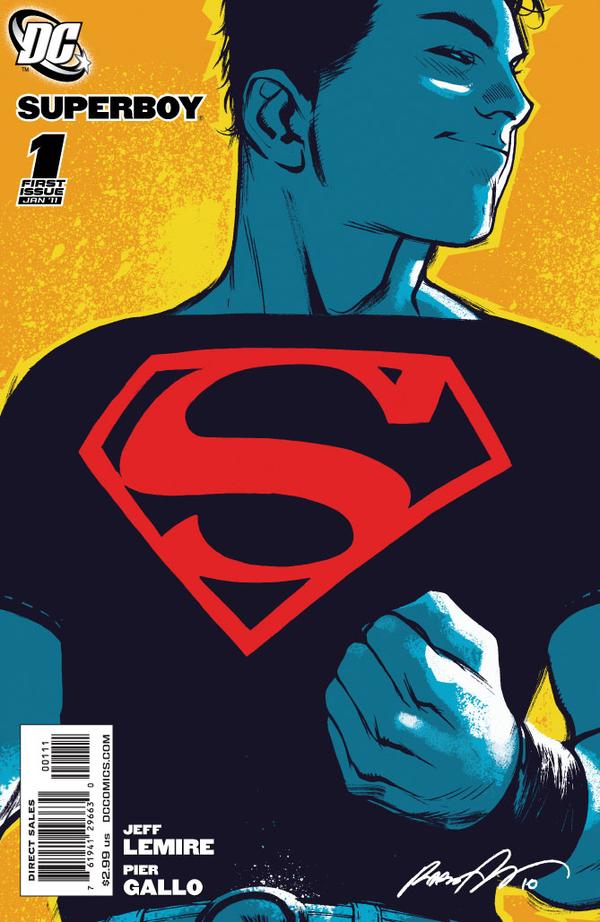
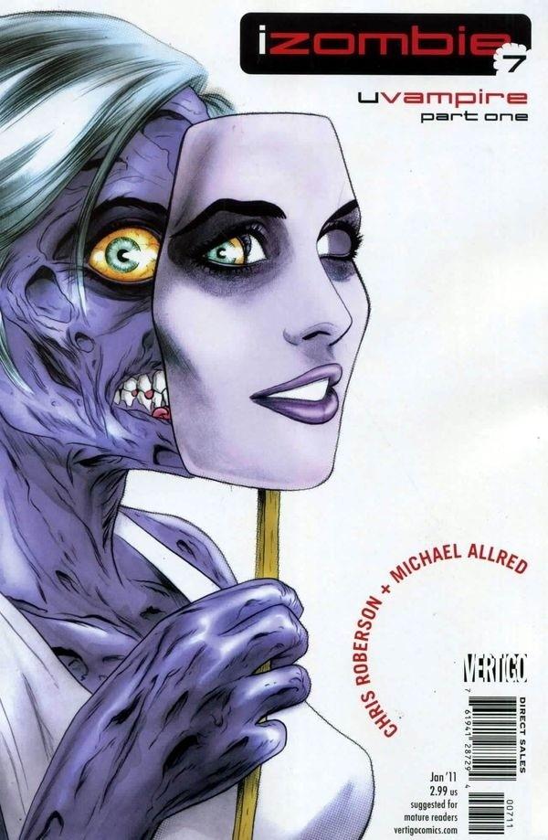
Any other week, either of these covers could have handily beat everyone else I think…but since they’re up on the same week, they’re just going to have to share.
First up, Rafael Albuqurque’s incredibly iconic and interesting Superboy #1. Let me be clear…I have absolutely ZERO interest in Superboy. ZERO. I still bought this comics. The color choices here, combined with composition and straight up beautiful figure work sell this SO HARD. Nice job boys.
Also brilliant is Mike Allred’s awesome I, Zombie #7. These covers have been a bit hit and miss for me, but when they are hits, they are home-freaking-runs. This is AMAZING.
Tags: comic covers, comics!, Cover Of The Week, things made of awesome
-
@ross: you’re right about Superboy’s ear! Totally didn’t even notice. Way to ruin things again Campbell!
That cover transcends all that purple.
 There is a lot of purple in the book though…maybe that’s part of my disconnect with it. Nah, I love the art, it’s the writing/plotting I can’t seem to get on board with. Bums me out every month.
 -
@ross: Nah, you’re totally right about that ear…and I find I can still love it anyway.

I’m hesitant to say there’s anything really WRONG with the writing/plotting in I, Zombie, I think maybe there’s just something about it that I’m not responding to. And in truth I really wanted to like Roberson’s Cinderella From Fabletown With Love trade and I didn’t like it either. So maybe just something about his writing, or the stories he chooses to tell, doesn’t work for me. Still might be worth taking a look as you might not agree, and the Allred art is undeniably great and it’s a nice lead role for a non-objectified strong female character (although it’s kind of turning into an ensemble cast).
-
Not a remarkable cover, but did you read the Emma Frost story in the new X-Men anthology? It made me think of your columns.
-
@optionalplayer. I looked Taskmaster 3 up just for you. Yikes!
@Mara: Are you talking about the disgusting utter train wreck that is Women of Marvel #1? Horrible! I bought it (probably shouldn’t have) intending to talk about it on here, but it just made me too goddamn sad. Comics drive me mad, giving with one hand, taking with the other. Bastards.
-
I meant X-Men: Serve and Protect. But I actually liked it. When Emma calls out the King of Queens double standard (gross guys should get the hot girls they like / hot girls shouldn’t care about looks) and its presence in comics, I thought of your writing.
-
@Bob the Chiropodist: I tend to go with smirking and an aside glance. But yeah, the ear.

@optiona player: Yes, you’re right – Serve & Protect #1.
@Mara: I agree with you that the story had some merits and I always enjoy when Emma puts people in their place with some cold hard facts…but the art undermined that entire story so badly that it was difficult (impossible for me) to get past it.
-
Pingback from Cover Of The Week – 11/10/10 « on November 11, 2010 at 9:49 am
-
Pingback from NaNoWriMo: DAY THIRTY « on December 1, 2010 at 2:27 am
Comments are now closed.


13 comments