A little late (and I missed a week), but here we are!
Rules: one cover from the “mainstream” (i.e. DC/Marvel) and one cover from the “indies” (i.e. anything NOT DC/Marvel).
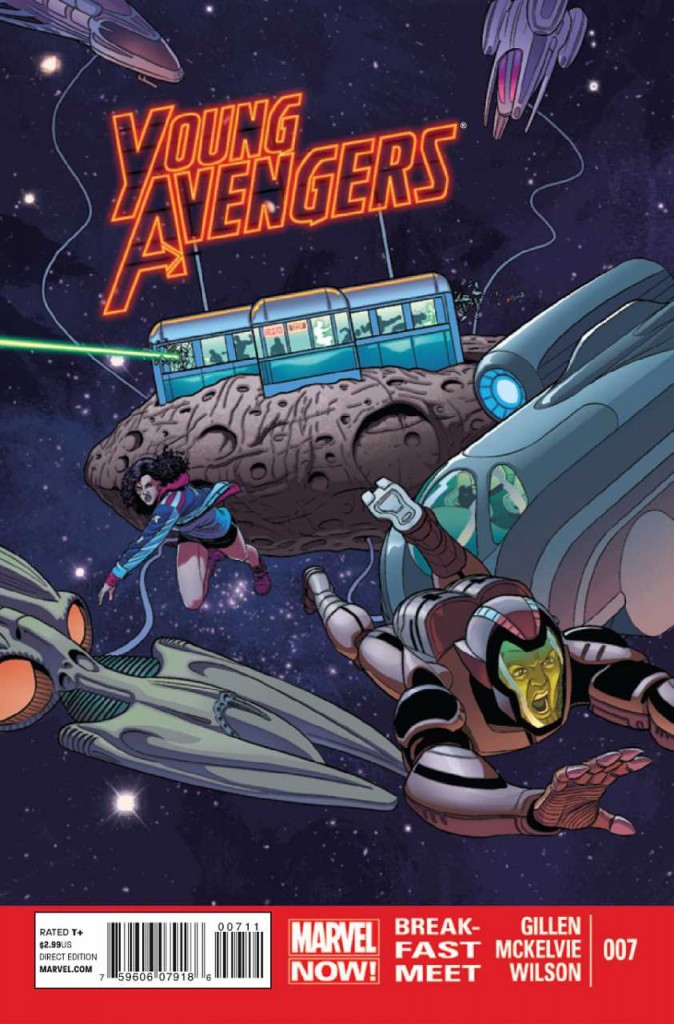
In the mainstream corner we have this absolutely stunning Young Avengers #7 cover from Jamie McKelvie and Matthew Wilson. The text integration alone – “Young Avengers” as an actual gorgeous part of the illustration warrants inclusion, but it also happens to just be a great illustration all around. The big red “Marvel Now” band at the bottom is annoying, but a necessary evil I’m afraid, and it’s honestly pretty mild, comparatively.
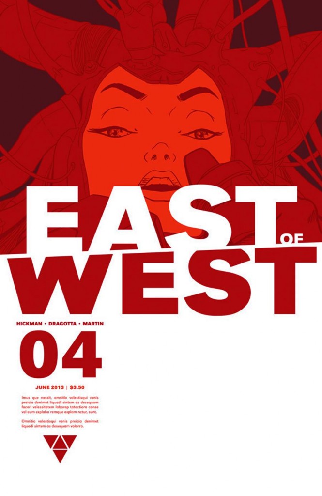
In the independent corner we have Image’s utterly fantastic East West #4 by Nick Dragotta. Man does this tick all my boxes! A lot of white space, limited use of color (monochromatic for bonus points!) exceptional graphic design on the text, and then superb text placement. In fact, the cover is so innovative in the way things are placed, it almost doesn’t look like a comic book cover. LOVE IT.

