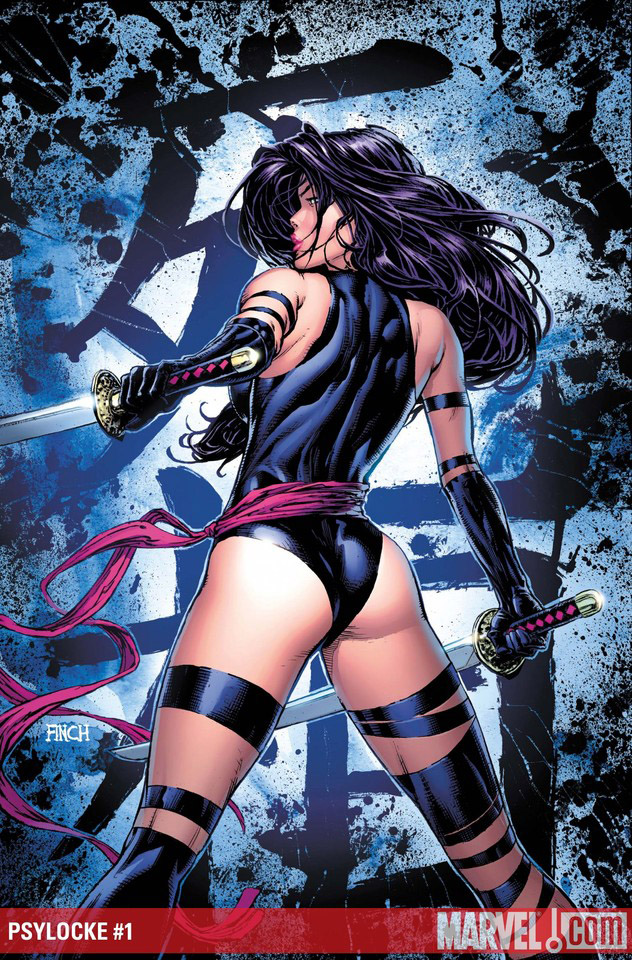
New She Has No Head! column up at CSBG. All about Wonder Woman and my long standing attempts to fall in love with her. Did it work? Click to find out.
You are currently browsing the archive for the comic reviews category.
New post up on my She Has No Head! Column. Check it out.
New She Has No Head! column up on Comics Should Be Good. Check it out.
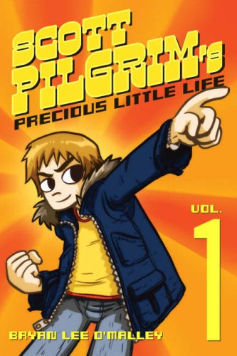
I know I’m coming really late to the party on this, but I finally got around to reading Scott Pilgrim Vol. 1 (which Adam got me for Christmas – thanks Adam!) and I pretty much loved it. It was so fun and light and enjoyable. Not that the other comics I read on a daily basis aren’t fun and light and enjoyable (although sometimes they are the exact opposite of that), but there was a real ease to the Pilgrim stuff that I realized I totally miss out on in most of the stuff I read these days.
There was also a moment…and it’s a moment that happens for me…or has happened for me in I think every comic I’ve ever ended up truly loving…where the writer/artist totally hooks me and allows me to commit wholeheartedly to the book. A moment where I say to myself, “Okay, I’m in…you’ve got me.”
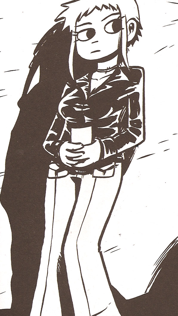
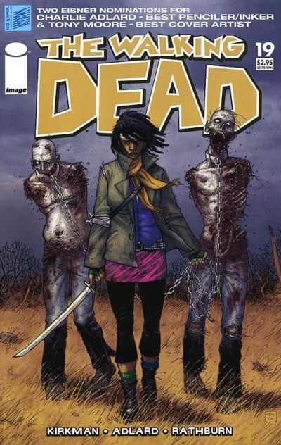
And Scott Pilgrim had that moment. It’s a really small thing, but it was just this one perfect panel that allowed me to open my heart to the book and characters and just love it. Let me show you. First you need to have a reference image for what the panel is talking about. This is Ramona Flowers.
She is a girl that has been showing up in Scott Pilgrim’s dreams of late, and he’s pretty smitten, though he doesn’t know who she is.
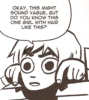
And this. This is Scott Pilgrim trying to figure out who she is by asking his friend Wallace.
OMG. I AM DYING FROM TEH CUTE! Ahem. No, seriously, there’s something about the realness and adorableness about that panel that just hooks me. Because first of all, though the dialogue is simple, it’s actually quite accurate I think to how a conversation like that goes…and it just feels SO real…like a conversation you have totally had before with your friend. It also immediately tells me so much about Scott Pilgrim in that one panel. That he’s a highly visual person because he uses his hands to describe this girl’s hair instead of explaining it. That he’s aware what a long shot it is with his “Okay, this might sound vague” but he’s still all optimistic with those giant excited hopeful eyes. I just love it. It’s a completely tiny thing in the scope of it all, but it’s what hooked me. It’s what will have me coming back for more.
All that said, I must admit that I was thrown by the whole superhero-y fighting stuff at the end. I wasn’t a big fan of it and preferred it as a slice of life book about Scott and his band and friends that it was for the first three quarters plus of the book. But the series is obviously much beloved and O’Malley certainly knows what he’s doing, so I’ll keep tuning in…mostly because of that one panel of hilarious perfection.
The latest She Has No Head! Column is up at CSBG. It’s yet another decade list..but .you know you love a list…check it out!
Find the right female positive comic book for everyone on your holiday shopping list with this week’s ‘She Has No Head!’ Column at CSBG.
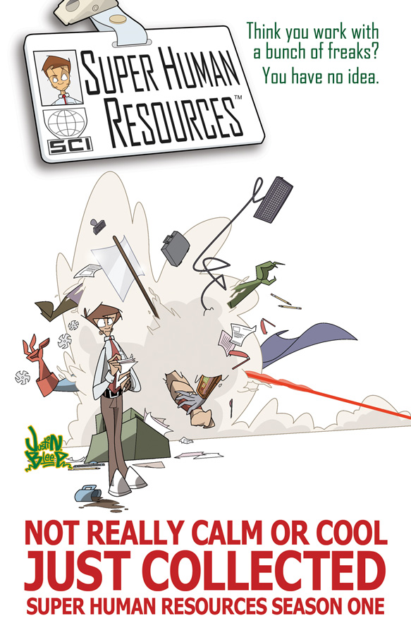
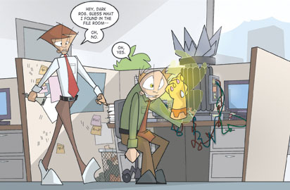
Super Human Resources: Season One. Ken Marcus (story). Justin Bleep (art). Joey Mason and Antonio Campo (colors). Jaque Nodell (letters). Ape Entertainment. $12.95 US.
I really hate writing this review, because I really wanted to love this comic, and while I liked it, it did fall short for me on a couple levels. I can’t remember how it came on my radar, but when it did I visited the website (which is great), and looked for it at my local comic book shop, and when I didn’t find it in single issues, I started looking for it as a trade (and was happy to hear it had made it to trade paperback status…as that doesn’t always get to happen for more independent books). Eventually I did find one copy at my local shop, and was excited to read it. I thought this book was going to be a hilarious mix – one part Office Space (or The Office, whichever tickles your fancy) and one part Superhero parody. And it is. But only sometimes. And not consistently enough that I can fully get on board.
The art. I like it. Mostly. The character design for the most part is unique and appealing, and the book has a really strong visual identity, which unfortunately cannot be said for many many books, especially little books without giant publishers. The color was solid throughout and really worked for the tone of the book. Another plus is that the art is incredibly consistent throughout with the exception of some obvious and deliberate evolution in the character design between the first two books. It’s really hard to find consistent artwork in comics, so this is commendable. The art was so consistent in fact, it almost looked like some crazy futuristic digital effects or something – like the entire book was conceived and drawn by a machine – which gave it a perfect but sometimes soulless quality.
Ironically I preferred the slightly toned down version of the character design in the first issue to the evolution that appeared later in the collected volume, but it wasn’t a big deal. One little design nit I had with the later evolution, was that all the characters remind me a little bit of bugs because of these two lines the Bleep draws extending dramatically off of characters eyes (and heads). It annoyed me more as the book progressed, but is a pretty superficial complaint, as complaints go.
A bigger complaint I had about the art is that the inking lineweights all feel the same, or at least similar…and with so much going on in every panel, that often made it difficult to understand what was going on. I think the artwork overall could benefit from some much more confident and dramatic inking which would help the clarity of individual panels. But it’s obvious Bleep is still evolving as an artist (which is of course true of most artists) and so I’ll be interested to see where he goes.
The biggest thing that didn’t work for me in this book, is the pacing, and that’s a problem of both story and art. And it’s hard to tell who is dropping the ball here or if it’s both of them. I tend to think it’s the artist’s job to get the panel pacing right so that the words work in their most effective way, but especially on an indie book, where creators are more likely involved in the eachothers’ processes, it feels a little like a shared problem.
There are some great little jokes in the script – in-jokes that are really enjoyable if you have ever worked in an office, or read a superhero comic, and they work really well together for some good times…but several of the jokes are nearly lost to the previously stated pacing issues…and it just isn’t funny enough overall to carry the book’s other weaknesses.
I think the biggest of those weaknesses is that the characters are pretty broadly sketched, we’re never able to attach much to any of them or to care about them beyond their ability to bring home the joke. Now, character building, especially for a large cast of characters in an office setting is hard to do and takes time…it’s easy to fall into cliches and hard to do unique things, especially when you’re already deliberately playing with cliche and parody, but I feel like Marcus should have given us at least someone to root for in these first four issues. It’s obviously supposed to be Tim that we’re rooting for, but he’s such a dull guy that I can’t find much to get behind. There’s no sense of humor in him like there is in everyday characters like Jim from The Office or Peter from Office Space…but when I look around to find someone else to connect to – there really aren’t any characters worth connecting to. Except Wombat. Wombat, a blatant and hilarious Batman parody is awesome, but mostly for jokes, and not for any emotional connection.
And while EVERY book I read doesn’t have to feature or star women or be “the best thing written about women since sliced bread” I find the female characters here to be pretty lacking. There’s a fairly interesting “office manager” named Helen that all but disappears as soon as she serves her function (introducing Tim to the craziness that is SCI in the first issue); the token “hot” superhero/alien Plasmarella complete with big boobs and sexy low cut clothing; another office worker named Sarah that gets a page or two of dialogue; and in a particularly bad move, there’s a giant female called Statuesque and you never see her head. She’s usually only shown (because of her size) in the torso/ass/breasts area (and a couple times down to her feet) but you never see her head. I get the joke, and I probably wouldn’t mind it so much if there were other more fully realized female characters in the book, but as there are not, it seems like a really big misstep to me.
I will admit that it’s likely I’m overly sensitive to this issue – considering I actually write a column on CBR’s Comics Should Be Good called “She Has No Head!”. The concept for the article is broadly “women in comics” and it’s safe to say I have strong feelings about the idea of women being so insignificant in comics that they seem to be nothing more than objects of desire that quite literally don’t need heads. And so Statuesque is a really unfortunate coincidence, and I urge you to take my criticism of this particular aspect of the book with a grain of salt.
I think overall, because the characters lacked much emotional charge for me, the story also lacked an emotional charge. The basic set up is that Tim (our “hero”) is a temp sent to SCI to work in “Super Human Resources”. He is surprised and at first put off by this idea, thinking it must be a mistake, but is quickly brought into the fold of regular folks, superheroes, villains, aliens, etc. that work there. [SPOILER] The four issue plot is basically that “corporate” is trying to get SCI shut down so they can farm their work out to cheaper Indian labor. Tim discovers a conspiracy in corporates’ attempt to get SCI shut down and is able to thwart it and save SCI. At the end of the book he is (naturally) viewed as a hero and given a full time gig at SCI. But I don’t really feel happy for him…and I’m not really sure why he wants to stay there…or why they want him to stay, as other than being a hero, he hasn’t really made any connections as far as I can tell. And perhaps most importantly, other than him being a template ‘good guy’ I’m not sure why he feels compelled to save SCI in the first place. And that is a failure.
The book just didn’t work on the all the levels it needed to…and with the exception of the laughs, some of which were great, I was pretty disappointed overall. I do hope Marcus and Bleep keep working and putting out books, and I will anxiously look for their next project, if only to see the next evolution.
I’d like to give it more, but unfortunately 2.5 Stars is the official 1979 Semi-Finalist rating.
My new column is up at CSBG, check it out if you get a chance. It’s a bit of a rant…so I’m trying to prepare myself for the inevitable hate mail…man, I’m so bad at hate mail…why doesn’t everyone just agree with me and be nice all the time? 🙂
Hello fans of 1979 Semi-Finalist…and by extension…ME!
I got an amazing offer last week from Brian Cronin over at CBR’s Comics Should Be Good to start contributing to their fantastic and wildly popular blog. I, of course giddily accepted, and so I’m going to be doing a regular column called ‘She Has No Head!’. The column will run on Mondays and will discuss the fairly broad topic of ‘women in comics’ – ranging from real world women creators to female characters and beyond.
I’ll let everyone know when the first post goes up – but in the meantime – check out the awesome announcement Brian put up – and the Comics Should Be Good blog in general – which is fantastic with or without a column from little ole me.
Thanks for all the support everyone – I hope I can do it justice!
Kelly
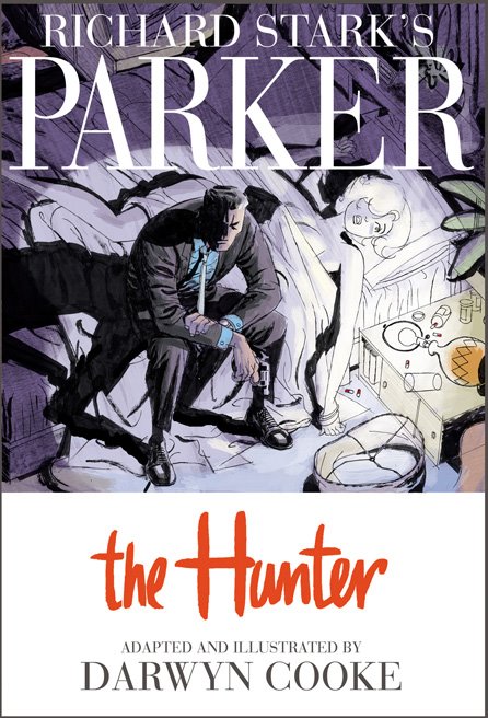
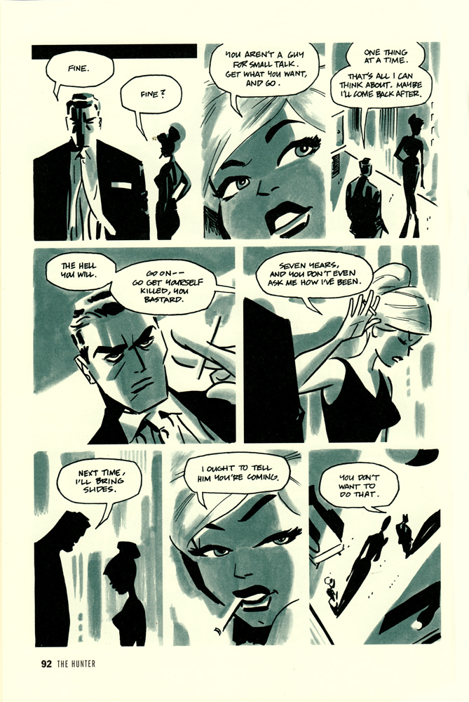
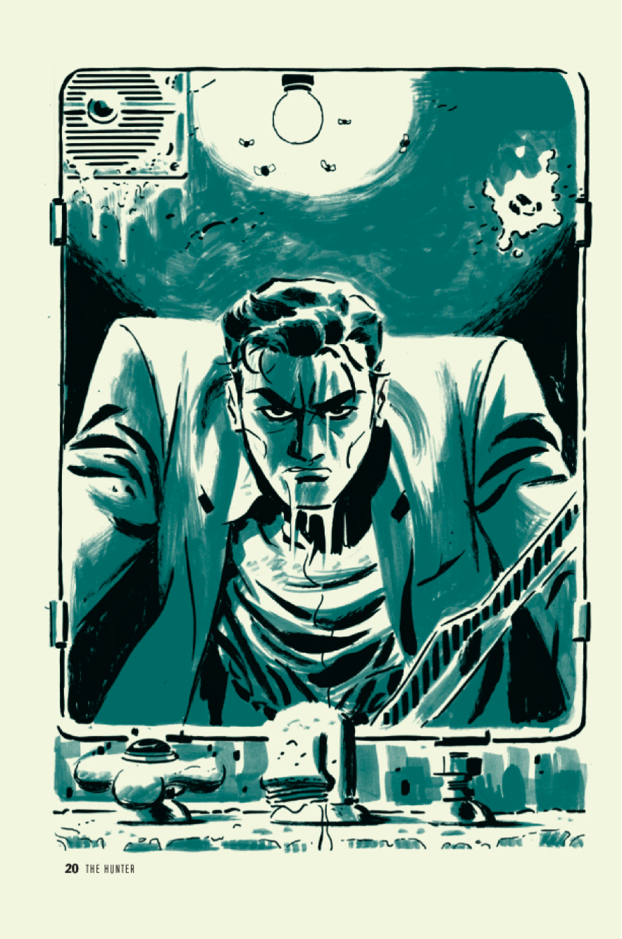
Parker: The Hunter. Darwyn Cooke (Writer/Artist). Comic Books/Graphic Novels.
I have been salivating over this new Darwyn Cooke adaption of Richard Stark’s Parker for months, and finally, to “reward” myself for finishing my big novel revision, purchased it at Jim Hanley’s last week and then devoured it in one sitting – my preferred method – swallowing it whole – going back for second reads later.
It’s a beautiful book. I’m a huge fan of Cooke’s illustration/penciling work (see his many covers in my Top 100 list – including one in the Top 25), and this is no exception as it is picture perfect. Individual panels being matched in beauty by the overall pacing and muted color palette.
I have not read the original material, but I assume Cooke was fairly faithful, it certainly feels authentic. I think my main issue with the book, lies not in Cooke’s hands but in Stark’s hands (though I cannot be 100% sure without having read the original material) and that issue is primarily that I tend to have some drama with these kinds of noir/detective-y books. I love a good detective yarn, and who doesn’t love noir? But as a card carrying (and ranty) feminist, it’s easy for me to get my hackles up about the female portrayals in the traditional noir style. They’re always gorgeous femme fatales and bitches that would betray you for a nickle. And while I’m happy to read that character, I get a bit annoyed when that’s all there is. And in this particular story all we have are a betraying wife and a handful of hookers. Now I suppose it’s a given that Parker runs with a more criminal crowd, but it would be nice to see SLIGHTLY more variety there…and perhaps more importantly all the women here are portrayed pretty strongly as victims. So it’s even a step down from the ‘betraying femme fatale’ type, who though not exactly revolutionary, is at least a strong woman with a plan, whereas here we have more of the ‘worthless beautiful victim’ type. Boring. At least as drawn by Cooke they are stunningly beautiful images.
[SPOILERS}
The story sets up well with the badass master thief Parker penniless and looking it, but thumbing his nose up at offers of a ride. Once in the city he fakes an i.d. (much easier back in the day) and makes off with someone’s entire bank account. Well on the road to being all fixed up – clean (ish) and in a suit, he hunts down his old flame, that has betrayed him – ‘natch. Parker does away with her in an extra special way and moves on, following the trail to the man that set him up, betrayed him, stole from him, and got him sent to prison.
My one complaint in the story (other than the female characters issue) is that everything comes REALLY easy to Parker. I mean, I love that he’s the ultimate badass, but there’s very little tension in that there’s just no doubt in your mind that he’s going to get his man and come out the other side smelling like roses. He is perfection…well when perfection comes as revenge and badassitude. And because of that, because there is no weak link in his armor – perhaps his one weak link is his presumably now dead feeling for his wife – but since he offs her first it leaves him free of any weakness – there’s not a lot of surprise in how it all works out.
If I hadn’t been spellbound by Cooke’s artwork, and drawn panel to panel by the beautiful pacing, I think I would have noticed that the actual story was leaving me pretty cold. it’s a masterful feat for Cooke, which makes me appreciate him all the more, but regardless of the skill involved, I didn’t think of the book once after putting it down, there just wasn’t enough story to stay with me.
Ultimately it made for a beautiful but uneventful read.
4.0 Stars*
*on illustration alone I’d give it 4.5 stars easily, but for story, I’d give it a 3.0. I’m going to give Cooke’s illustration the upper hand and split the difference at 4.0


