Asterios Polyp Cover

Asterios Polyp.  David Mazzucchelli (writer/artist).  Fiction.  Comics/Graphic Novels.

I am an idiot.  Why you ask?  Because I was not in favor of Adam buying this book.  You see, it’s thirty bucks and he’s trying to save up for a short film that he’s doing in September.  And so I was very naggy about the whole thing when he talked about how much he wanted to splurge and buy it.  Of course I never bothered to look it up.  If I had I could have saved us all a lot of naggy bitching.  Hell, I would have bought it myself and saved him the trouble.

HELLO GORGEOUS!

SOOOO worth the thirty bucks.  When I think of the other worthless things I’ve wasted thirty dollars on…oh the horror.   I have a secret Mr. Mazzucchelli…I would have paid $50…maybe even $75.  It’s stunning – the perfect blend of form and function…of art and content.

You want to see a little taste of what I’m raving about?  Here ya go:

asterios page

That’s not enough?  Okay, check out the Vulture Blog’s eight page excerpt.

I feel like just dispensing with the actual “review”, but for record’s sake, let’s do it.

The Good: Mazzucchelli’s use of color, use of panel, use of white space.  His pacing and storytelling abilities – my god!  His perfect cartooning.  The heartbreaking tale of Asterios Polyp and the writing that blends seamlessly with the art…sometimes becoming the art.  A tale that flies in the face of simple and easy ideas like “karma” but also has a light of hope and redemption for our hero.  There’s a reason some pieces of literature get called “masterpieces” and there’s a reason we don’t throw that term around all willy nilly.  Asterios Polyp is a masterpiece.

ap panel 1

The Bad: Nothing.  I mean really, I can’t think of anything negative.  I read this book in one sitting, spending most of a long afternoon totally engrossed.  And I have to say, I can’t wait to go back and read it again.  I know there are still literally dozens of hidden treasures that I missed on first reading that will reveal themselves to me in each new chance I get to sit with it.   It’s a book I will enjoy my entire life.  Unfortunately it belongs to Adam.  Damnit.  If we had room for two copies on our shelves I’d get my own copy…just in case.

ap panel 2

I mean look at this!  Illustrating different people (in a relationship no less) in not only different colors, but with completely different styles and they talk with different text.  It’s brilliant and important.

The Ugly: The word ugly and this book should never be used in the same sentence.  Ever.

5.0 Stars

And on the final day of Comic-Con, here are the top 25 Comic Covers.

For Part I, Part II, or Part III click the links.

025.

025 Chris Bachalo

X-Men #190.  Chris Bachalo. There’s something about this cover that I just can’t get out of my mind…but I have trouble putting my finger on what exactly it is that speaks to me.  I mean I love all the white (as mentioned previously) and I obviously adore the integration of the title into the illustration so we’ve got less crap covering it all up, and it’s a great concept, but I don’t know, there’s just something sweet about it.  That kiss, which maybe is supposed to look passionate…to me looks…compassionate.  It’s Bachalo’s best cover to date if you ask me.  And I’m a fan.

024.

024 James Jean

Fables #18.  James Jean. This one never fails to move me.  The vibrant luscious colors, the subtle but definite dark outline.  The composition.  The desire to get lost in whatever world that Jean creates.  This was the first of Jean’s covers I ever saw, and I think the first of his work I ever saw, and it shocked me with its stunning beauty on the stand.  If I recall correctly I said, “OH.” and dropped everything else I had to pick it up.  And such began a fervent love affair with James Jean’s work.

023.

023 John Cassady

Astonishing X-Men #2.  John Cassady. More monochromatic blues…YUM.  The dichotomy of the simplicity and complexity blended together here is what really does it for me I think though.  You’ve got the blank background, barely a different color than Emma, and with the title open and see through to that background.  The intensity of Emma’s eyes, commanding the reader’s attention.  The power of her over Cyclops optic beams, and the power of her over Scott himself.  It’s all rather brilliant while beautiful and because of how this story arc of Whedon’s plays out, it’s a great tease to the readers of all the complexities that are to come.

022.

022 Charlie Adlard

The Walking Dead #48,  Charlie Adlard. All of Aldard’s work is pretty wonderful, but I picked this one, because to me (and Mr. Adlard and I have of course had no actual conversations about this – so maybe I’m way off the mark) but to me, he’s placed the horizon line so high on the page because our characters become more and more enveloped by the dead around them with every issue.  As if they’re trapped in a room with a rising tide, and we just know that eventually, they will drown.  Our main character Rick is seen here, already missing a hand, burying the dead, and almost pushed off the page because the dead fill it.  It’s such a simple little thing, but is really an inspired and brilliant choice.

021.

021 Bob Kane

Batman #1.  Bob Kane. This iconic cover, portraying my favorite comic book hero Batman in his own comic’s first issue, is instantly recognizable.  And though the color scheme has changed much over the years (yellow and red in today’s Gotham?  Never!) the swinging into action position of Batman (and Robin) is dead on.  This issue is also notable for being the first appearance of Catwoman/Selina Kyle then known as The Cat in 1940.  Very cool stuff.

020.

020 Leo E O'Mealia

Action Comics #2.  Leo E. O’Mealia. It blows my mind how fantastic this cover is, and how overlooked is often is, simply because Action Comics #1 was the first appearance of Superman.  But really look at this cover – the movement, the composition, the positive and negative space, the color scheme, and really just the quality of the illustration work – it’s all quite stunning – and it was done in 1938…Amazing.

Although, it is worth noting that I also found this scan (see below) of Action Comics #2, with a decidedly different feel in the color work – no bad or worse than the one above, but decidedly different and since I’ve never seen an original I can’t say which is more accurate to the original color – anyone else know?  I personally prefer the first one, but both are nice and deserving of their place.

Action Comics #2 - 2

Read the rest of this entry »

And on we go…

For Part I and Part II click the links!

050.

050 Adam Hughes

Catwoman #55.  Adam Hughes.  So I think we should all just take a moment to appreciate the beauty of this illustration.  The detail of the signage painted on the glass, the neon light, the amazing colors, it’s all fantastic.  But the real beauty of ths is in the iconic Catwoman figure in silhouette acrobating across Gotham.  It’s a singular immediately identifiable figure and its powerful heroic (or anti-hero in this case) shape speaks volumes about superhero icons.

049.

10549_4_014

Fables #14.  James Jean. I wish I could explain to people (not you of course dear reader) but people that don’t understand misogyny in comics why this is NOT misogynistic, despite being a woman in basically underwear drawn from behind.  Because this is not exploitative.  But I’m not sure how to explain why not to people that don’t immediately see the difference.

I suppose the first thing you can say is that if you look at the body (no pun) of Jean’s work you’ll find very little to no unnecessary exploitation of the female figure…so he immediately gets the benefit of the doubt.  Secondly, the figure is not coyly looking over her shoulder with a “sexy face” smile…she’s also not arching her back provocatively…or jutting out all her “sexy’ “naughty” parts.  She’s just a figure drawn from behind.  She’s stylized and slightly idealized, but not drawn as a parody of a woman in underwear…or a young man’s wet dream of what a woman might look like in her underwear.  She’s also casually holding a badass weapon as if she absolutely knows how to use it.  And lastly, none of the characters on the cover with her are objectifying her either.

For all these reasons, this is the way a cover with a woman in underwear could/should be drawn.  Learn from this cover, artists…please.  It’s not that you can’t draw women in their underwear, but it’s HOW you draw a woman in her underwear.

Thank you.  *Steps off soapbox* 🙂

048.

048 Jack Kirby

X-Men #1.  Jack Kirby. You knew this one was coming.  And it deserves to be here.  And if Jean Grey wasn’t standing around like a moron in the background while the “men folk” fight the Master of Magnetism then perhaps I would have bumped it up several notches.  I’m willing to concede that her power is difficult to draw and Kirby may have just been at a loss here, but still, it pisses me off a little.

047.

047 Paul Smith

Uncanny X-Men #168.  Paul Smith. A totally iconic Uncanny X-Men cover.  You know I was never a big Kitty Pryde fan (sometimes bordering on hate) though there were times I enjoyed her in Excalibur and Joss Whedon’s run on Astonishing X-Men showed me a whole new side to her that I appreciated.  But regardless of how I feel about Kitty this cover is great – the expression and positioning – up against a wall in a Danger Room – totally makes me want to read the story.

046.

Frank Quietly

New X-Men #116.  Frank Quitely. Again we have Mr. Quitely, and again, people love it or hate it in my experience.  As my brother said “It looks like she’s smelling something nasty”…and he’s right, but y’know, that SHOULD be Emma Frost’s expression.  She’s pretty much a bitch, so I think that expression is just about dead on.  I love this cover because it just owns everything.  Emma’s skin is just alive on the page – it looks fleshy and real and spongy and not plastic and over processed and that is a rare rare thing in comics.  Also, the hot pink background is totally inspired.  I know Josh hates the crotch of her shorts, but honestly – that shit looks real too – if you put on some crazy costume like this, I guarantee you’d get some weird bunching…in strange places.  I much prefer the reality of the folds and imperfections in a costume than the usual which is supposed to be spandex, but just looks like colored body paint.  It just makes the cover all the more real for me.

Also, I suppose I should address the “is this exploitative” issue.  To me, no.  Largely because THIS is Emma Frost.  She’s like this.  She would TOTALLY wear this, and she would have that expression while you stared her down in this outfit trying to find your voice.  So for me, the character justifies the artwork here.

045.

045 Jack Kirby

Fantastic Four #1.  Jack Kirby.  This absolutely belongs on the list as one of the iconic superhero covers of our time.  It’s great – I just love that monster with the giant gaping mouth.  Though Kirby’s work is really beautiful I tend not to love Fantastic Four covers because they’re always covered with text balloons and I’m not a fan of that so much, but this is a benchmark cover and it deserves a spot in the top 100.  I suppose, much like with the X-Men #1 cover, I would give it a little more credit if Sue Storm didn’t seem so much like a worthless damsel in distress and more like the superhero that she is.

Read the rest of this entry »

And here we continue our list…!

Click here for Part I

075.

075 James Jean

Fables #25.  James Jean. Oh James Jean, how I love you.  Look at the use of color, the use of text as a design element.  The title and issue number all beautifully incorporated into the image flawlessly, rather than just being splashed across artwork without concern for what’s being destroyed.  He even manages to work in the creator names so it not only looks like part of the original illustration, but IS a part of it.  Fantastic.  If you don’t like James Jean you’re gonna hate this list – because his work appears many more times before we get to #1.

074.

Vaughn Bode

Vampirella #4.  Jeff Jones/Vaughn Bode. How can you not love this?  I mean, okay, she’s naked and straddling some kind of land monster, but she’s carrying a spear and looks like she would just as soon pierce you through the heart with that spear as look at you.

073.

073 Jo Chen

Buffy Season Eight #18.  Jo Chen. Another beautiful cover for Buffy by Chen.  Dawn as a horse?  Illustrated beautifully?  Well, you had me at hello.

Read the rest of this entry »

So in honor of the San Diego Comic Con which I am not attending (boo!) I took a little trip down memory lane, searching out all my favorite comic book covers over the years.  And since I’ve got this blog and it needs content I thought I’d regale you all with my 100 Favorite Comic Book Covers Of All Time!”

A few things you should know:

1. I limited this list to US saddle stitched issues – so you won’t find any graphic novel, anthology, or non-US covers here.

2. A few of these covers are more about the sweet sweet memories of a more innocent (and awesome) time in my life when a great comic book could make my whole week.  When thinking about a comic that was coming out made me so excited I’d get chills. When hunting down a back issue to catch up on something new I was discovering was literally the most important thing going on with me (sad, but true).  And so a few of these covers are more about what they mean to me and less about how beautiful they look to the world at large.

3. As X-Men were my introduction to comics there is definitely a disproportionately high number of X-Men covers.

4. There’s also a high number of badass chick covers, as I, am a badass chick.  🙂

Annnnnd, we’re off…

100.

100 Gary Frank

Supreme Power #1.  Gary Frank. This is a good looking cover, but it’s at the bottom of the list because to truly appreciate what’s going on, you have to know that Supreme Power is basically about Superman, if he had been found by the government instead of Ma & Pa Kent.  And then the government makes up a fake Ma & Pa Kent and raises him in a false environment designed to make him feel devoted to “American values” but it’s all a sham so that they can better hope to control him as a weapon.  Yeah, before Supreme Power jumped the rails and became lame, it was AWESOME.  Supreme Power was like Superman meets The Truman Show meets The X-Files and it was badass.  Too bad they couldn’t maintain it.

099.

099 Ben Oliver

Ultimate X-Men #69.  Ben Oliver. Surely many people would argue with me for putting this cover in a best of list, because frankly, there are far better covers out there. However, it’s the subtext that I love here.  I’ve never been a big fan of Jean Grey, but she’s got a look on her face here that makes me finally ‘get’ her a little bit.  She’s so nonplussed by these two superhero jackasses fighting over her, their hands literally on her and claiming her, meanwhile on a good day (or bad depending on how you look at it) she could sear the flesh off their bones without a thought.  It made me think about that love triangle a little differently than I ever had before (which is saying something considering how long the shit has been going on).  What each of the players want, and also what is really wrong with them inside on some level to want it.  It’s an impressive cover that can do all that with a character’s expression.  Also of note is that Jean, though drawn beautifully,  is not looking weak and waif-y, but strong shoulder and wide-hipped, and just, well, powerful.  Like a superhero should.

098.

098 Lee Weeks

The Amazing Spider-Man #29.  John Romita Jr. I think this cover is beautiful.  The way the ‘spotlight effect’ falls on the wood and the floor is all really fantastic, and the almost entirely monochromatic look is great as well.  Also, while I’ve never been a big fan of Mary Jane myself, this cover speaks volumes about what it might feel like to be the girlfriend (or boyfriend) of a superhero.  Cowering and bathed in the oppressive light of their stardom, of the very largeness of their life…it’s interesting.

097.

097 Jo Chen

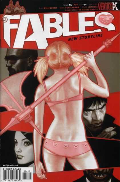
Buffy Season Eight #5.  Jo Chen. Jo Chen does amazing cover work, and the beauty of this cover here is both Chen’s ability to make an illustration look so like Sarah Michelle Gellar and to also retain its own voice.  This cover is made extra creepy by the aspect of Buffy tearing off her face, which I believe pertained to some ongoing aspect of this arc, but even if it didn’t, the concept would fit well into the Buffyverse.  Buffy is always wearing masks and as such the cover really resonates.

096.

096 Andy Kubert

X-Men #24.  Andy Kubert. Alright, you caught me.  There is really nothing great about this cover.  Nothing great except for how it tugs at my 16 year-old heart strings!  Sixteen year old Kelly liked nothing better than some Rogue and Gambit action (there’s no accounting for taste I suppose).  There are many visual problems with this cover, not the least of which is the absolute eyesore of a giant white artist signature box. However, despite this cover’s obvious flaws, the characters are still well drawn and the moment Kubert captured had fans everywhere on the edge of their romantic seats.  Honestly, my 16 year old self is still happy whenever it sees this cover…so long as I can block out everything that writers (and artists) since have done to the characters.  I was excited about Chris Claremont’s new run on X-Men Forever, hoping he could rekindle my love for this botched comic book romance, but so far Forever is a big dud.  <Sigh>.

095.

095 John Romita Jr

Kick-Ass #2.  John Romita Jr. I’m a huge NON-fan of John Romita Jr.  Whenever he draws those three lines on a woman’s cheek, I guess to define her cheekbones (?) I just want to gag.  Who taught him that trick?  I hate it!  However, this cover (perhaps because there are no cheekbones present?) is pretty awesome. The colors are great and the drawing is nice.  It’s a bit off the beaten path for a superhero cover, and since it’s Kick-Ass that’s no real surprise, but it’s nice to get something simple and unique.  It looks straightforward and honest, like the book itself.

094.

094 Michael Avon Oeming

Powers #10.  Michael Avon Oeming. I am always intrigued when I see this cover.  The fact that Oeming has conveyed so much in a few black and white lines always blows me away.  I find the positive and negative space here to be gorgeous, and most importantly I want to know what Deena is seeing…I want to know what the story is…which at the end of the day is what comic covers are all about.

093.

093 John Byrne

Wolverine #17.  John Byrne. Oh, Wolverine, how medium I feel about you.  Listen, I used to love you, just like everyone else, I mean you’re a complete badass.  And a great complicated character to boot.  However, you’re EVERYWHERE.  And I defy others not to admit that they too are a little sick of you.  You’re the guest star in every issue of everything, you were an Avenger for a while (and that is SO not a fit), you’re the star in the X-Men films (and cartoon) and then you get your own movie (and cartoon).  I mean ENOUGH.  You have over-saturated the market to the point where I almost hate you!  Stop it! I want to love you again…stop making it so hard!

Ahem.  Anyway, this is John Byrne, drawing what has become one of the quintessential ‘Wolverine poses’.

092.

092 Jeph Loeb

Spider-Man: Blue #3.  Tim Sale.  It’s a credit to this cover that though I never actually read Loeb’s Spider-Man: Blue, I never forgot this cover…and always wished I owned it.  I like the graphic elements that come together here  – the nice cartoon-y shape of the Mary Jane figure in the background – the all white positive/negative of her body, combined with the definition and expression in her face – and that awesome hair – very cool.  It skirts the line, with the posing and juxtaposition of figures as seeming a little sexual, but it doesn’t quite go over the line (at least not intentionally).

091.

091 Will Eisner

The Spirit #22.  Will Eisner. Ah, the birth of the femme fatale.  I guess I don’t know who REALLY invented femme fatales, but it’s safe to say that no one did them better in comics than Will Eisner.  That man loves him some femme fatales. That said, I’m not a big fan.  In general, it’s a pigeon-hole that female characters get trapped in.  The trap that says you are insignificant unless you are beautiful and sexy.  But, this is our history, and as such, to move beyond it, I guess we’ve got to embrace where we started.  Though the stereotypes are in full effect here (blonde bombshell?  check.  clingy red dress?  check.  thigh high stockings?  check.  knife in those stockings?  check!) I can still appreciate the beauty of the drawing, and the powerful simplicity of just a beautiful woman on the cover of a comic book…she owns that comic book cover if nothing else.

Read the rest of this entry »

supergirl shorts

Supergirl with her new shorts (above)

So I’ve been reading all the Supergirl’s shorts posts and posts and posts – there was even a bit about it on NPR apparently – and I wasn’t adding to the discussion because frankly, it’s been very well covered.  Also, I agree with the majority opinion (at least what I’ve read – I’ve not polled any actual fanboys to see if they disagree) that the shorts are a WAY overdue addition to Supergirl’s costume.

supergirl no shorts

For the uninformed – some wise men at DC have finally stated that they never want to see Supergirl’s panties again – thus she wears red biker shorts under her skirt from now on.  See image above in which Superman’s line of thinking is probably something like this:

“Oh, crap, gee, this is really uncomfortable, I’m supposed to be a hero for the entire planet and now I can see right up my teenage cousin’s skirt and I’m looking at her underwear and OHMIGOD is that her teenage lady parts? Crap…and I’m not looking away…crap…this went bad fast…mental note to never fly behind…or below her again…even in battle…crap – I’m still looking!”

Maybe I’m overstepping, in part because I’ve never been a true Supergirl fan, so I don’t feel like mine should be the voice of changing her, but aren’t the shorts – though totally a step in the right direction – still just a drop in the bucket?

birds and lady bits Birds…meet Supergirl’s lady bits!

I mean WHY THE HELL IS SHE WEARING A SKIRT AT ALL?  Honestly, I know it sounds petty but this is the single biggest reason I’ve never been able to be a true fan of Supergirl and take her seriously…what kind of superheroine wears a skirt to fight crime in?  Especially when one of your most valuable powers is the ability to fly.  How does this make any sense?!

Now I’m sure there are some purists out there that love Supergirl and feel that without the skirt she’s just not Supergirl, but c’mon. This costume was a mis-design from go…it might have made some sense forty years ago (though I doubt it) but it’s time to update.  REALLY update.  No self-respecting superheroine, especially one that by modern standards is relatively modest would be caught dead fighting crime in a miniskirt.  Plus, what’s progressive about a miniskirt anyway?  If you’re trying to get the teens to sit up an pay attention a flow-y miniskirt is not the ticket.  Let’s really take things to the next level and ditch the skirt…entirely.  In fact, let’s look at Project Rooftop’s recent request for a Supergirl redesign for inspiration.

Ross Campbell Supergirl

My personal favorite by far is Ross Campbell’s hardcore badass Supergirl (see above), I know the purists would likely have my (and Ross’s head) but it’s a step in the right direction if you ask me.  If you’re not ready for it then there are a few other skirtless examples on Project Rooftop, and even those that still employ the skirt, do so in a much more modest, practical, and updated way.

But still I say, let’s just slightly update this awesome cry from

“YES! SHORTS! FINALLY!” to

“YES! NO MINISKIRT! FINALLY!”

Our girl deserves it.  I might even start reading her books.

YAY!  Today is our two year anniversary!  YAY!

Also, we’re just about to cruise past 150,000 hits…which is awesome considering at the first anniversary we only had 42,000 hits.  Which means traffic more than doubled this year.  So the blog is definitely growing…baby step by baby step and I wanted to thank all of you for your support in making that happen.  Thanks!

Here’s a little something I made for all of you to show my appreciation. 🙂thank you postable

trueblood(5)

So here’s the first thing I really have to say about True Blood.  Alan Ball is a genius at keeping me around.  Because every episode, at some point, I think I can give up the show (this would generally be a part featuring Tara) and yet every cliff hanger-y ending has me going “AH!” and then “crap. I guess I’ll be tuning in next week.”

*slow clap*  Well played Mr. Ball, well played.

So since I’m watching the show (sometimes against my will) I decided it was high time to do an actual review, especially since True Blood searches (er, I mean Anna Paquin naked boob searches) have sent my blog hits into the stratosphere more than a few times this past spring.  So here it is.  A True Blood Review.

The Good:  This show is surprisingly good at turning me around on some things.  At first I was not a Bill fan, I wasn’t feeling all swoon-y and I didn’t really get the appeal.  But by episode three or four I was in love and couldn’t blame Sookie a bit.  There’s always something about the good guy that gets me, and Stephen Moyer’s Bill, despite his vampiric ways, is defiintely a bonefide good guy.

I like Anna Paquin.  I would watch Anna Paquin watch paint dry and probably be mightily entertained.  I think she’s lovely and a talented actress.  I don’t love the accent, but it’s better than a few others on the show and so I’m just deciding to accpet those accents as they are and be okay with it.  The Sookie character is a bit annoying and preachy, but I don’t think that’s Paquin’s fault.  I hope they’ll ease up on Sookie’s holier than thou attitude as it seems a little bratty and unlike the way she was originally portrayed.

true blood season 2

Jessica.  Oh Jessica, how you turned me around.  At the end of Season 1 there was no plot I was dreading more (except anything involving Tara) than seeing more of the whiny Jessica.  But she’s the absolute best thing Season 2 has going for it.  It’s wonderful to see a new vampire go through the trials and tribulations of being a vampire and also being a teenager.  I don’t know if it’s the writing or Deborah Ann Woll’s acting or a combination, but whatever it is I hope they keep it up.  What an amazing turnaround.

jessica

[SPOILERS]

Lafayette.  Nobody was happier to see Lafayette not be the dead body in the car at the end of Season 1 than me.  Of course he was chained up in a basement and the other characters didn’t seem overly concerned about finding him, which seems odd in a place where people show up in cars with their hearts missing, but whatever.  At least he’s alive.  And now that he’s linked to Eric I suspect all sorts of great stuff is in store for us.  Nelsan Ellis’ Lafayette is routinely the only actor/character that doesn’t let me down at some point or another.  His performances are always dead on.

Sam Merlotte.  Like Sookie I find Sam Tramwell’s Sam a bit whiny and brooding for my taste, but he’s a great character and I hope we’ll get to explore less of the brooding and more of the reality of Sam this year.

Michelle Forbes’ Maryann is a welcome addition this year and her arc is supremely interesting, except where it intersects with Tara, which unfortunately is constantly.  Adam and I were sure she was going to be some Circe type character, but this last episode has her looking more like a Minotaur, which is even better if you ask me.

Read the rest of this entry »

The Torture Continues Header postable

I’ve gotten a couple short fiction rejections recently, so I thought I’d update my stats for those of you keeping score.

Updated Stats:  8 of 11 rejected.  3 still out.

Mumble mumble…I’ll show you literary magazines that don’t want my work, cause someday I’m gonna be famous, that’s right and you’re gonna be begging to print my work and we’ll just see who’s rejecting who then…that’s right…We’ll JUST See!  Er…um…did I just say that out loud?  Uh, nevermind…and uh, as you were…

🙂

gs_daisy_de_la_hoya_081013_m*

Okay, so it’s confession time.

When I saw that Daisy, the “loser” from Rock Of Love was getting her own (appropriately titled) show Daisy Of Love I subjected Adam to at least a five minute rant about the downfall of society and more importantly women.  That rant surely included some version of the following “since when is it rewarded (with both money and recognition) to have no real redeeming qualities except sluttiness (and for that matter since when is ‘slut’ a redeeming quality) blah blah blah.”  All said while standing on my soapbox and making the world safe for sanity again.

Who knew I could be so wrong (and/or would fall so far from my soap box-y pedestal)?

Because while in a way Daisy’s show is just as bad as all the other dating reality shows that masquerade as being about love, but are really just about trying to outwit or out wait a handful of other morons for a cash prize, but in another way it’s kind of a good show.

And I think I’ve figured out why…let me break it down for you all scientific like.

1.  Despite the fact that Daisy is actually hard to look at (honey – please stop bleaching that broken hair and get a new weave while you’re at it; learn the roles about removing at least one accessory – or 12 – before you leave the house; and stop whatever botox shit you’re doing to your face/lips) she’s actually pretty likable and entertaining.  She’s certainly no rocket scientist, but she’s kinda sweet. It’s like she’s aware she’s not too smart and that in many ways she’s a parody of herself, but she just kinda shrugs her shoulders and goes, “well, this is what I got…so here we go.” There’s something honest and almost endearing about it.  Yes, I can’t believe I wrote that either.

2.  Additionally, unlike Bret Michaels and New York, who are clearly in it for the money (and fame) and are supremely unlikeable to boot, and Flava Flav who is supremely likeable but hard to take seriously, I believe that Daisy IS actually looking for love.  I doubt she’s stupid enough to think she’d find real love on TV, but to her surprise I think (and the viewers) she has a legitimate connection with at least one of the dudes and it’s kind of refreshing to watch.

3.  In shows like this, you spend more time with the contestants than the “star” and I have to admit that I’m finding Daisy’s dudes far more palatable than the usual skank fest that happens on Rock of Love and Flava (sorry to sell you out ladies – I recognize I’m a traitor if it’s any consolation).  But on the feminist side of things (yeah, I know feminism anywhere near this post is a stretch) there’s very little female objectification going on with Daisy’s show because she’s the only woman.  Instead it’s all about male objectification, which I don’t like to encourage as it’s just as wrong on some level, but considering how rare it is in comparision, there’s something almost progressive about it.  Like I said, progressive and feminism are a stretch in this post…but stay with me.

4.  Daisy has ended up a with a strange mixture of freaks and the meatheads that probably beat them up in high school which adds an extra fun element to watching them interact. Despite that strange mix though there are less unwarranted betrayals, conniving, and backstabbing than the shows stacked with female contestants.  Don’t get me wrong there’s still tons of drama (both manufactured and genuine) but it’s generally less gross than watching what the women contestants say and do to one another.  It’s also WAY more fun to watch these self proclaimed rock star badasses and tough guys crumble like little babies in the confessional after getting dumped by Daisy – it’s waterworks and blubbering oh my!

Daisy Of Love Contestants

5.  Lastly, unlike the unlikely pairings that resulted from Flava of Love and Rock of Love (I have no idea who ended up with the horror show that is New York) I could actually see Daisy with a guy or two from this show.  I’m sure it won’t work out that way as we all know real life has nothing to do with reality TV (there’s only one successful TV pairing ever, right?) but you really can see her falling for a guy on here (if you’re watching the show it’s obvious who) and legitimately trying to date him after the show.  And so it’s nice to see something at least CLOSER to real on reality TV for once.

So, now that I, a self-proclaimed hater of the majority of reality TV, has confessed to loving one of the worst kind of reality shows out there, I hope I’ll be able to sleep at night.

* Sadly of note is that this picture is the only non-exploitative, non over the top non naked/ridiculous picture I could find of Daisy in about nine pages of google web search.  This does not bode well for my liking of this show…but I guess I knew that already. On the plus side, she kind of looks like she’s doing an impression of a Chimp…hanging from the bars of her cage…which is sorta cool.

« Older entries § Newer entries »