art

You are currently browsing the archive for the art category.

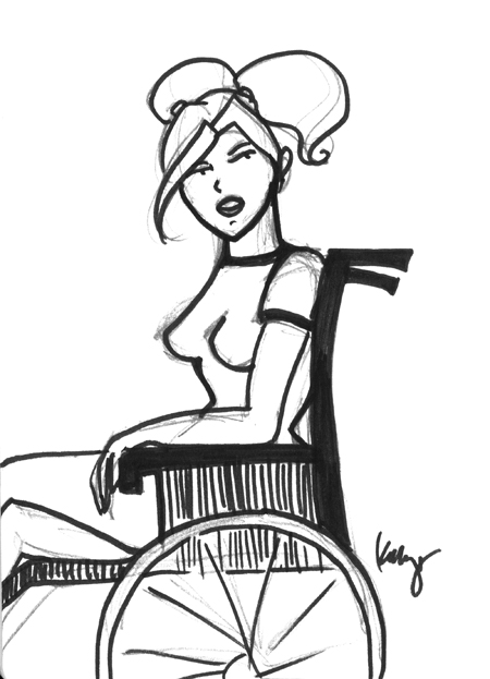
the-blonde

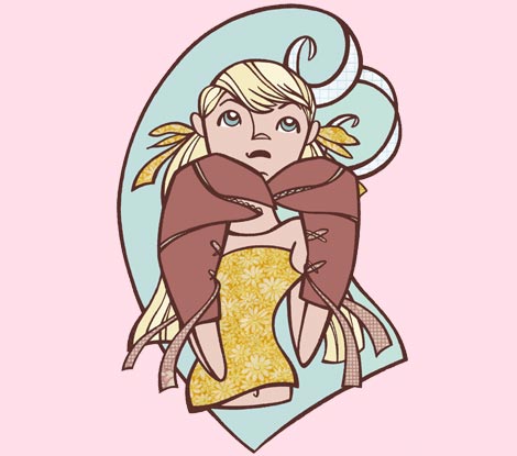
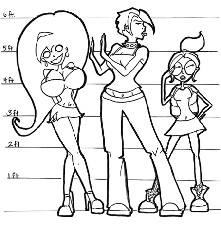
Daisy Davenport aka The Blonde

Powers:  None.  Paralyzed from the waist down.

Age: 23

Height: 5’6″

Weight: 131 lbs (not including chair)

Eye Color: Green

Hair Color: Blonde

Astrological Sign: Gemini

Favorite Band/Artist:  Daft Punk

Favorite Song: Technologic (Daft Punk)

Favorite Movie: The Usual Suspects

Favorite TV Show: Project Runway

Loves: Herself, surfer boys, dancing, the beach, surfing, money, cars, diamonds,…herself

Hates: Everyone but herself

Most Likely To: “Dump your ass”

Personal Quote: “Get away from me you sheep”

Nemesis: Stairs

Nicknames: Beauty, Blondie, Bitch

Significant Other: No comment

Accomplishments: Student Body President, Swim Team Captain,  Alpha Delta Pi Chapter President.

birdcloseup

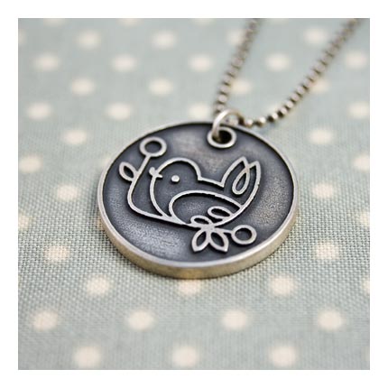
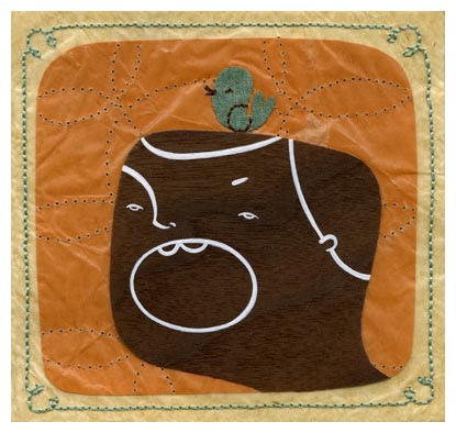
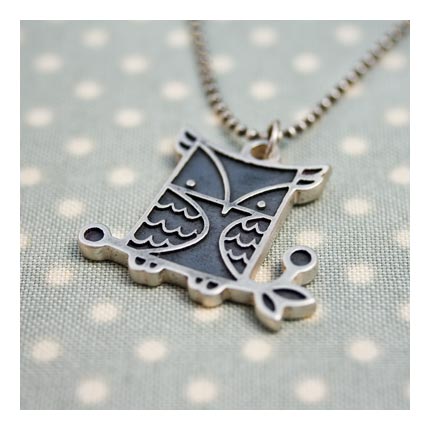
Just in time for the holidays I bring you our new Artist of the Week, REBECCA HAHN.  Full disclosure, Rebecca is a good friend of mine, but I think from looking at the images I’ve featured here, you can see that I don’t need to be her friend to be wowed by her talent. 

cold

Rebecca works in a variety of mediums from illustration and mixed media assemblage, to jewelry and t-shirts.  She’s expanding her brand quickly, and has really been focused in the last two years on getting all kinds of product out there.  You can buy her work at her Rottobee Shop, or at BuyOlympia.com, and you can puruse, learn, and admire at her website and blog.   

hey

I think my favorite thing about Rebecca’s work is simply her style.  A piece by Rebecca looks like nobody else’s work – it’s absolutely a Rebecca, whether it be a necklace or an illustration for a magazine.  It’s an amazing thing as an artist to have style that is so cohesive.  In addition to Rebecca’s singular style is the fact that though on the surface her work appears clean and almost simple, there is incredible depth to her work.  This is particularly true in her assemblage works in which she uses all sorts of unique layering and even sewing techniques to create one of a kind artworks.  On her website for many of her assemblage works, if you scroll over piece you can also see a detail shot – a great new feature to her website. 

cancer

I suppose really the greatest thing about Rebecca as an artist is that she is still affordable.  Original works at gallery shows are limited and more expensive, but on her website she has jewelry, t-shirts, prints, and cards all available for purchase at reasonable prices – and just in time for the holidays.  Get some before she becomes uber famous and the prices go through the roof 😉

owlcloseup

we-all-die

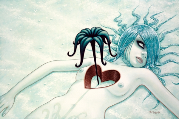
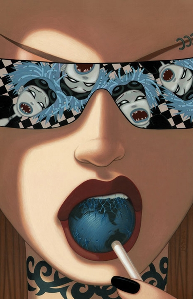
With TARA MCPHERSON, it’s not just a love I have for her art, it’s also that she so seems like the “whole artist package” with her awesome studio, badass tattoos, and constantly changing hair colors, she just LOOKS like what I think of when I think of modern female artists…or rather of the one I’d like to be (maybe in my next life).  So she is of course a shoe-in for Artist of the Week this week. 

comic-cover

I don’t remember how I first came upon McPherson’s work, I feel like it was through something silly like Myspace, but whatever it was, I’m grateful for it.  One of the things that is a bit revolutionary to me about McPherson’s work is that she seems to mostly draw women.  I’m not saying she can’t draw men, I’m sure she can, but she seems to prefer women, and I love that about her, mostly because I feel the same way.  Perhaps I’m overanalyzing and she’s just gotten a reputation for drawing women and now that is what people expect and really she’s secretly dying inside to draw some boys…anything is possible.  But she puts such love and thought into the women that she draws…I find it hard to believe she wants to be drawing anything else.   McPherson is supremely talented, and she has a real point of view, which is sometimes lacking in the supremely talented, but her work, much like JAMES JEAN to me, has something to say.  It’s beautiful work, yes, but it’s not just there to be pretty (or creepy depending on what you’re looking at), she is invested in telling a story and for me that’s the difference between so many mediocre artists working today and the truly exceptional ones. 

decemberists1

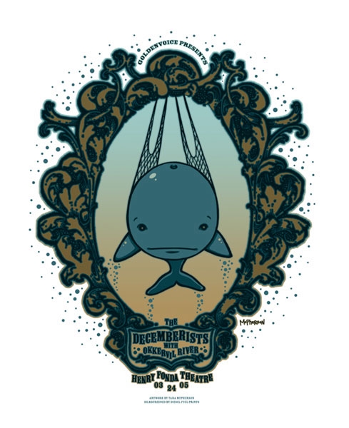
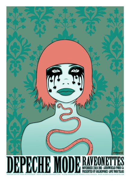
Another great thing about McPherson is that she’s really managed to capture a large market – currently she does fine art, comic book covers, painted illustrations, sketches, posters (many awesome band posters – see above and below!) as well as toys and even a coloring kit.  It’s really wonderful to see artists that also know how to market themselves and make themselves successful in such a competitive and unforgiving market.  Onward TARA MCPHERSON!  I’ve got my eye on a original of hers for someday…if someone doesn’t snatch it out from under me (probably they will).  Check out her website (linked above) to learn all about her – and to buy all sorts of goodies – just in time for the holidays.

depeche-mode

I’ve raved about JEFFREY BROWN on this site many times before as he is one of my all time favorite artist/writers…and I thought he was a great counterpoint this week for Artist of the Week to last week’s pick of JAMES JEAN. 

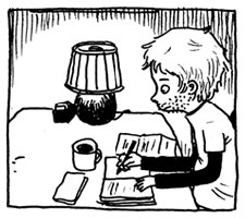
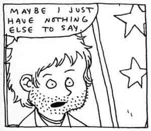
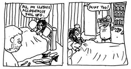
Brown and Jean really could not be more different, and yet their works are singularly powerful, emotional, and beautiful.  As a fan of clean lines and beautifully organized postive and negative spaces that artists such as JAMES JEAN and ADRIAN TOMINE and even ADAM HUGHES so excel at, I would never have thought years ago, before I discovered JEFFREY BROWN that I could fall in love with such a messy, sketchy, non-precise style.  But from the first pages of Brown’s UNLIKELY, I was absolutely in love.  I think the secret for me in what works in Brown’s style is the combination of story and art…the art on its own is easy to dismiss if you aren’t drawn to his style naturally, but combined with his poignant stories about love and loss and all the dimensions inbetween, it’s impossible not to appreciate the rawness of his style.  In simple black and white lines (and with not a ruler in sight) JEFFREY BROWN conveys more emotion in a single panel than most artist can manage in an entire book.  It’s a beautiful sight to behold, and I just never get sick of it. 

Discovering JEFFREY BROWN was one of those transformative moments for me as an artist, as a writer, as a reader, and even just as a person.  My whole world opened up to something I hadn’t even known existed.  It’s an amazing thing to just go to the comic book store one day and have an entire world open up to you in the pages of a simple book…it’s the kind of moment that doesn’t just come around every day and so when it does, you really must treasure it… 

Yeah, sorry about that my lambs, but we’re officially on hiatus again. I have both legitimate and totally non-legitimate excuses, none of which I’m going to bore you with, but instead of force feeing you more inadequate comics and making us both miserable I’ve decided to take a break.

The bad news is that Rabid Lamb may not be coming back, at least not in a daily format. I did Rabid Lamb basically every day for about a year October 2007 to October 2008, which was the original goal and I learned a lot and hopefully entertained at least a little in the process, but I think Rabid Lamb may have run its course.

The good news is that it will be replaced with something much more interesting. A project I have loved for almost ten years and have always wanted to explore, and I think maybe now is the time and this is the format…well, for it to get its feet wet. So what kind of good news would that be without at least a teaser image?  I present…THE JILTED LEAGUE (logo to follow!)

So there. Hopefully that will keep you guys coming back and checking in…although if Anna Paquin keeps showing her boobs on True Blood (yes, she did it again!) then I’m not going to need any of you! Bwahahaha! Seriously though, I’ll still be posting about all sorts of things, including updates on this new project as it comes to fruition, so don’t abandon ship just yet, okay?

Thanks for all the Rabid Lamb support over the last year…hopefully you’ll enjoy these new ventures equally as much…

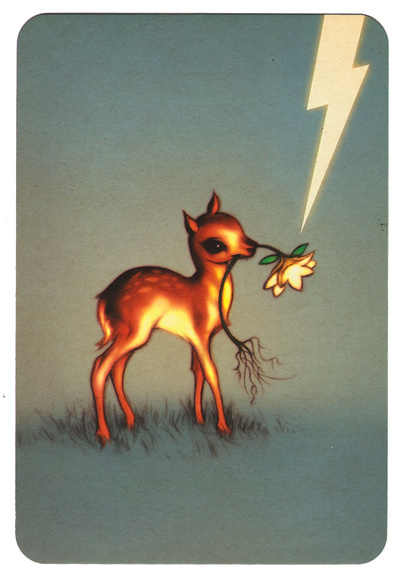
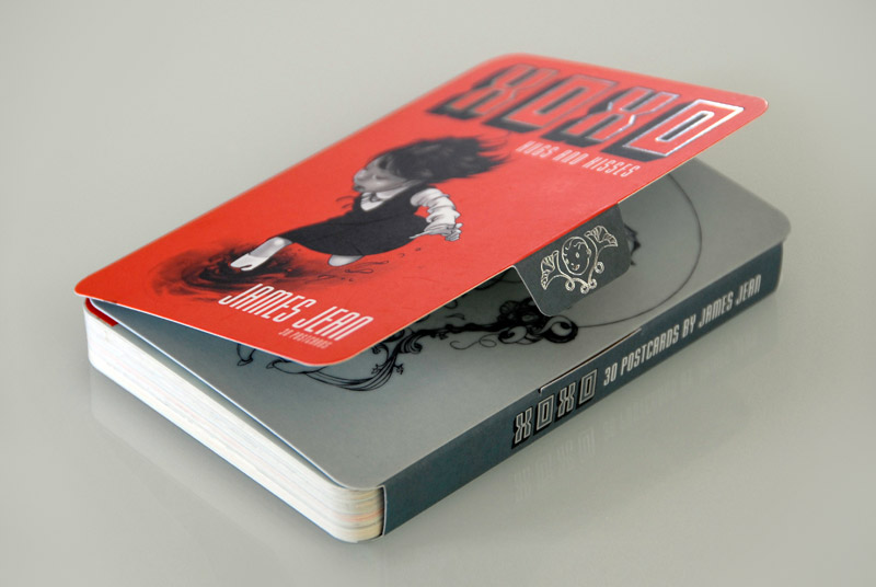
I’ve talked about JAMES JEAN a lot on this blog, I’ve also linked to him, and sadly, stolen from him (see my much missed old header image…oh how I miss you header image!). So it’s only fair that he is our second featured Artist Of The Week. But really it is this insanely cute image – so cute that it practically makes me want to kill, from his new XOXO Postcard set that I blogged about that prompted this feature.

I’ve been staring at this image constantly as it is pinned up near my computer and I just can’t get enough of it. It is simultaneously gorgeous and meaningful and also so cute I just can’t stand it (sorry Paul).

So here’s my final homage (for at least a month or so) to JAMES JEAN, one of my all time favorite artists.

Thank you James, for both inspiring me to continue drawing and depressing me, since I will never be remotely in your league…

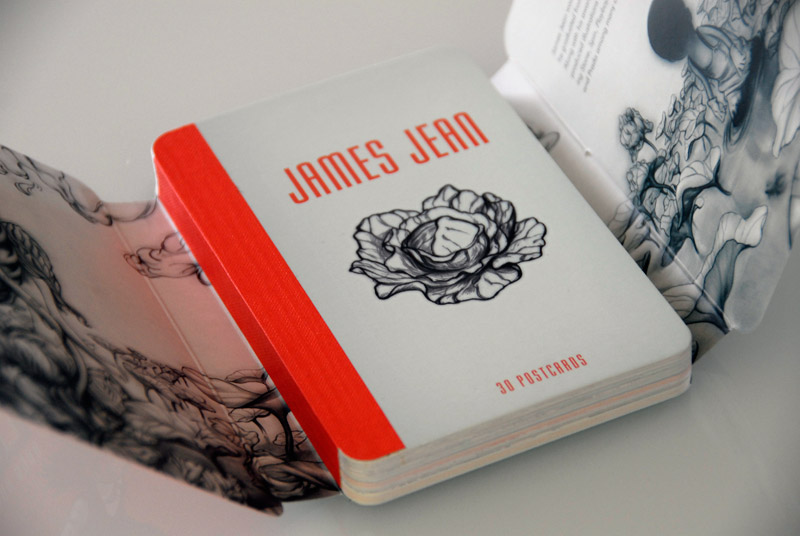
…with James Jean’s XOXO postcard book. Unfortunately for all my friends that would maybe receive a postcard from me…they will not be getting one of these, they’re too pretty to let go of…okay, maybe I’ll send a few…

GORGEOUS.

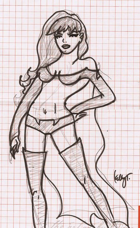
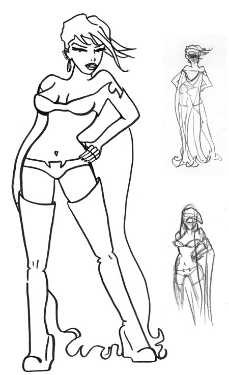
The Project:Rooftop VAMPIRELLA results are in. And below is the submission that I never submitted. I’m totally pissed at myself, but I was behind in getting it finished and then my confidence ebbed right away and then I shelved it. It would have been fun to participate…myabe next time.

Here’s the first sketch:

And this is the final version that remains, you guessed it…uncolored…

So I’ve got something up that I’m more happy with than the temporary one from the last couple months, but I’m still pretty dissatisfied, and it is really far from the original vision, so there are probably still more revisions to come until I land on something I’m content to keep up for awhile, but apparently this is going to happen in baby steps. And I blame James Jean for being such an amazing artist and setting the bar in my first (and stolen) header at a level I could never dream of reaching…thanks James. Thanks a lot.

Below is the full image that I took the new header from. The original vision was to include the entire drawing, but it was just not working. Stay tuned for future header drama…

Illustration Friday submission for Electricity! I like how this one turned out, but as usual with how things look in my head, versus how I can get them on the page, it’s not even close to what was in my imagination. Unfortunately (or maybe fortunately?) you guys can’t see how awesome this looks in my head. I’m really enjoying the challenge of Illustration Friday though, it’s giving me a chance to think (and draw) outside the ‘Rabid Lamb Comic Strip’ box… :)

« Older entries § Newer entries »